UWP开发入门(四)——自定义CommandBar
各位好,再次回到UWP开发入门系列,刚回归可能有些不适应,所以今天我们讲个简单的,自定义CommandBar,说通俗点就是自定义类似AppBarButton的东西,然后扔到CommandBar中使用。
话说为了在公司次世代平台级战略层产品上实现与水果和机器人一致的用户体验,美工把Win10 APP的AppBar也画成左右分开的了,好看是好看了,问题原生的ComandBar控件不支持这么排列啊……头疼归头疼,只能再次展开山寨之路……
初步思路是在CommandBar中塞进占位用的空白元素,我管它叫AppBarEmpty。那么能放进CommandBar中的元素需要符合什么样的规则呢?首先看一下CommandBar的用法:
<CommandBar>

    <AppBarToggleButton Icon="Shuffle" Label="Shuffle" Click="AppBarButton_Click" />

    <AppBarToggleButton Icon="RepeatAll" Label="Repeat" Click="AppBarButton_Click"/>

    <AppBarSeparator/>

    <AppBarButton Icon="Back" Label="Back" Click="AppBarButton_Click"/>

    <AppBarButton Icon="Stop" Label="Stop" Click="AppBarButton_Click"/>

    <AppBarButton Icon="Play" Label="Play" Click="AppBarButton_Click"/>

    <AppBarButton Icon="Forward" Label="Forward" Click="AppBarButton_Click"/>

    <CommandBar.SecondaryCommands>

        <AppBarButton Icon="Like" Label="Like" Click="AppBarButton_Click"/>

        <AppBarButton Icon="Dislike" Label="Dislike" Click="AppBarButton_Click"/>

    </CommandBar.SecondaryCommands>

    <CommandBar.Content>

        <TextBlock Text="Now playing..." Margin="12,14"/>

    </CommandBar.Content>

</CommandBar>
上面这个常规的Command显示效果如下图:

规律还是比较明显的,菜单“like”,“Dislike”均属于SecondaryCommands这个集合,和我们今天的主题关系不大。而最左侧的文字描述是放到CommandBar的Content属性中,也无需理睬。我们需要实现的是将AppButton左右分开,这部分的按钮均属于PrimaryCommands这个集合,XAML没有看到是因为简化写法的缘故。
既然属于PrimaryCommands集合的元素会被呈现在按钮区域,那么我们就检查一下该集合的类型定义:
public IObservableVector<ICommandBarElement> PrimaryCommands { get; }
很明显该集合的元素需要实现接口ICommandBarElement,而该接口又非常简单:
    //

    // Summary:

    //     Defines the compact view for command bar elements.

    [ContractVersion(typeof(UniversalApiContract), )]

    [GuidAttribute(, , , , , , , , , , )]

    [WebHostHidden]

    public interface ICommandBarElement

    {

        //

        // Summary:

        //     Gets or sets a value that indicates whether the element is shown with no label

        //     and reduced padding.

        //

        // Returns:

        //     true if the element is shown in its compact state; otherwise, false. The default

        //     is false.

        System.Boolean IsCompact { get; set; }

    }
这样我们的AppBarEmpty就好写了,仅仅需要实现一个IsCompact属性即可,而占位用的AppBarEmpty其实是没有内容的,连IsCompact的效果其实都省了……
    public class AppBarEmpty : FrameworkElement, ICommandBarElement

    {

        public bool IsCompact { get; set; }

    }
是不是有种骗钱的感觉?别走啊,这里还是有讲究的,首先为什么是继承自FrameworkElement呢?
1.AppEmpty是一个占位控件,基本不具备功能,应该从轻量级的基类继承
2.FrameworkElement提供了占位所有的Width和Height等属性,更基础的UIElement则没有这些
3.从FrameworkElement才开始支持的Binding
搞清楚了以上这些之后,我们兴冲冲的把XAML补完了:
        <CommandBar>

            <AppBarButton Icon="Accept" Label="Accept"></AppBarButton>

            <AppBarButton Icon="Accept" Label="Accept"></AppBarButton>

            <local:AppBarEmpty></local:AppBarEmpty>

            <AppBarButton Icon="Accept" Label="Accept"></AppBarButton>

        </CommandBar>
行云流水编译一次通过,嗷嗷的按下F5运行……结果傻眼了……什么效果也没有……介个是为什么呢?
只能通过Live Tree View来检查了(后面会写一篇介绍Live Tree View,这货简直是神器,现在没有它都不知道怎么调试了……),检查发现AppBarEmpty的Widht是0,而PrimaryCommands集合里的这些按钮又都是放在StackPanel里横向顺序排开的,悲剧的是StackPanle的Width就是几个AppBarButton的Width总和,完全没有留给AppBarEmpty一丝丝的宽度……设置AppBarEmpty的HorizontalAlignment=Stretch对StackPanel是然并卵……
CommanBar模板PrimaryCommands部分节选:
              <ItemsControl

                  x:Name="PrimaryItemsControl"

                  HorizontalAlignment="Right"

                  MinHeight="{ThemeResource AppBarThemeMinHeight}"

                  IsTabStop="False"

                  Grid.Column="1">

                <ItemsControl.ItemsPanel>

                  <ItemsPanelTemplate>

                    <StackPanel Orientation="Horizontal" />

                  </ItemsPanelTemplate>

                </ItemsControl.ItemsPanel>

              </ItemsControl>
悲剧啊!既然HorizontalAlignment不管用,无法自行撑开。那我们就只有给AppBarEmpty绑定一个确实的Width了。对应的XAML如下:
    <Grid Background="{ThemeResource ApplicationPageBackgroundThemeBrush}">

        <Grid.RowDefinitions>

            <RowDefinition></RowDefinition>

            <RowDefinition Height="Auto"></RowDefinition>

            <RowDefinition Height="Auto"></RowDefinition>

            <RowDefinition x:Name="RowBottom" Height="Auto"></RowDefinition>

        </Grid.RowDefinitions>

        <TextBox Grid.Row="1"> </TextBox>

        <CommandBar x:Name="commandBar" Grid.Row="2">

            <AppBarButton x:Name="appbarButton" Icon="Accept" Label="Accept"></AppBarButton>

            <AppBarButton Icon="Accept" Label="Accept"></AppBarButton>

            <local:AppBarEmpty Width="{x:Bind TestWidth,Mode=OneWay}"></local:AppBarEmpty>

            <AppBarButton Icon="Accept" Label="Accept"></AppBarButton>

        </CommandBar>

    </Grid>
为AppBarEmpty做了XBind到TestWidth属性上,相应的Page的代码里定义了该属性,并在Page的SizeChanged事件中计算了AppBarEmpty实际需要的宽度。
    public sealed partial class MainPage : Page, INotifyPropertyChanged

    {

        public double TestWidth { get; set; }

        public MainPage()

        {

            this.InitializeComponent();

            this.SizeChanged += MainPage_SizeChanged;

        }

        public event PropertyChangedEventHandler PropertyChanged;

        private void MainPage_SizeChanged(object sender, SizeChangedEventArgs e)

        {

            int count = this.commandBar.PrimaryCommands.Count-1;

            double width = (this.commandBar.PrimaryCommands[0] as AppBarButton).ActualWidth;

            TestWidth = e.NewSize.Width - count* width -48;

            this.OnPropertyChanged("TestWidth");

        }

        public void OnPropertyChanged([CallerMemberName]string name = null)

        {

            this.PropertyChanged?.Invoke(this, new PropertyChangedEventArgs(name));

        }

    }
代码中减掉的48是CommandBar最右边“…”按钮的宽度。实际显示如下图:
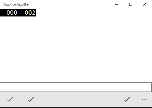
这里仍然存在几个问题:
1.有童鞋说为什么不自己写个RelativePanel,然后里面的按钮就可以随便对齐定位了。
该方法确实可行,但等于抛弃了CommandBar,也无法集成到Page的TopAppBar、BottomAppBar中使用。有点偏离了我们自定义CommadBar的初衷。并且要想完整实现一套CommandBar的工作量还是不小的
2.实现的方式不够优美,竟然使用了SizeChanged事件来计算Width。简直返古到了WinForm的时代。
哼哼,兄弟我不想好解决方案敢写这篇被你们骂?当然是已经准备好了完美的解决方案才来写这篇钓鱼咯,乖乖给我点个推荐,然后我们下周见……
UWP开发入门(四)——自定义CommandBar的更多相关文章
- UWP开发入门(十六)——常见的内存泄漏的原因
本篇借鉴了同事翔哥的劳动成果,在巨人的肩膀上把稿子又念了一遍. 内存泄漏的概念我这里就不说了,之前<UWP开发入门(十三)——用Diagnostic Tool检查内存泄漏>中提到过,即使有 ...
- UWP开发入门系列笔记之(一):UWP初览
标签: 随着微软Build2015带来的好消息,Win10正式版发布的日子已经离我们越来越近了,我们也终于欣喜地看到:一个统一的Windows平台对于开发人员来说充满了吸引力,这局棋下的好大的说--于 ...
- UWP开发入门(十)——通过继承来扩展ListView
本篇之所以起这样一个名字,是因为重点并非如何自定义控件,不涉及创建CustomControl和UserControl使用的Template和XAML概念.而是通过继承的方法来扩展一个现有的类,在继承的 ...
- UWP开发入门(25)——通过Radio控制Bluetooth, WiFi
回顾写了许久的UWP开发入门,竟然没有讲过通过Windows.Devices.Radios.Radio来控制Bluetooth和WiFi等功能的开关.也许是因为相关的API设计的简单好用,以至于被我给 ...
- UWP开发入门(五)——自定义Panel
各位好,终于讲到自定义Panel了.当系统自带的几个Panel比如Gird,StackPanel,RelativePanel不能满足我们的特定要求时(其实不常见啦),自定义Panel就显得非常必要,而 ...
- UWP开发入门(十一)——Attached Property的简单应用
UWP中的Attached Property即附加属性,在实际开发中是很常见的,比如Grid.Row: <Grid Background="{ThemeResource Applica ...
- UWP开发入门(七)——下拉刷新
本篇意在给这几天Win10 Mobile负面新闻不断的某软洗地,想要证明实现一个简单的下拉刷新并不困难.UWP开发更大的困难在于懒惰,缺乏学习的意愿.而不是“某软连下拉刷新控件都没有”这样的想法. 之 ...
- UWP开发入门(一)——SplitView
接下来会写一个UWP(Universal Windows Platform)开发入门的系列,自己学习到哪里,有什么心得总结,就会写到哪里.本篇对适用于顶层导航的SplitView控件展开讨论. 首先S ...
- UWP开发入门(二十三)——WebView
本篇讨论在UWP开发中使用WebView控件时常见的问题,以及一些小技巧. WebView是实际开发中常用的控件,很多大家抱怨的套网页的应用都是通过WebView来实现的.这里要澄清一个问题,套网页的 ...
随机推荐
- 5_bootstrap之响应式布局|列表|按钮
5.响应式工具 为针对性地在移动页面上展示和隐藏不同的内容,bootStrap提供响应式工具. 可以让开发人员通过该工具决定,在何种屏幕尺寸下,隐藏或者显示某些元素 帮助手册位置:全局CSS样式--- ...
- CentOS6系统优化
[root@xuliangwei ~]# cat /etc/redhat-release //系统环境CentOS6.6 CentOS release 6.6 (Final) [root@xulian ...
- C++builder XML XSL 代码生成
void __fastcall TFrmGenCode::XSLTxml1Click(TObject *Sender) { // XSLT转换xml文件格式 _di_IXMLDocument xml; ...
- tfrecord
制作自己的TFRecord数据集,读取,显示及代码详解 http://blog.csdn.net/miaomiaoyuan/article/details/56865361
- node升级更新最近稳定版
今天,又发现一个超级简单的升级Node.js的方法.一行命令搞定,省去了重新编译安装的过程. node有一个模块叫n(这名字可够短的...),是专门用来管理node.js的版本的. 首先安装n模块: ...
- OPENSSL 生成https 客户端证书
下面说下拿服务器证书.(前提是服务器是https,客户端认证用的时候),服务端不给的时候,我们自己去拿(不给怼他!,哈哈,开个玩笑,都会给的) openssl s_client -connect 域名 ...
- Ruby快速入门
Rb是什么 ? 交互式Ruby(IRB)为实验提供了一个shell.内置IRB shell,你可以立即一行行查看表达式的结果.该工具自带Ruby安装,所以你必须做一些额外的IRB工作无关.只需键入在命 ...
- Linux主流发行版本
一.简介 而工欲善其事,必先利其器,Linux的世界相當廣大,除了最著名的Ubuntu以外還有不少發行版.然文人相輕,自古皆然,了解不同發行版的優勢不只嘴上攻防用的上,也是學Linux一個有趣的地方! ...
- 转载:字符串hash总结(hash是一门优雅的暴力!)
转载自:远航休息栈 字符串Hash总结 Hash是什么意思呢?某度翻译告诉我们: hash 英[hæʃ] 美[hæʃ]n. 剁碎的食物; #号; 蔬菜肉丁;vt. 把…弄乱; 切碎; 反复推敲; 搞糟 ...
- AES CFB/OFB/ECB/CBC/CTR优缺点
AES CFB/OFB/ECB/CBC/CTR优缺点 摘自:http://www.metsky.com/archives/418.html 发表时间:2010年05月11 分类: 网络日志 作者: 天 ...