CSS魔法堂:重拾Border之——不仅仅是圆角
前言
当CSS3推出border-radius属性时我们是那么欣喜若狂啊,一想到终于不用再添加额外元素来模拟圆角了,但发现border-radius还分水平半径和垂直半径,然后又发现border-top-left/right-radius的水平半径之和大于元素宽度时,实际值会按比例分配元素宽度时,不禁会问"我真的懂border吗?"。本系列将稍微深入探讨一下那个貌似没什么好玩的border!
《CSS魔法堂:重拾Border之——解构Border》
《CSS魔法堂:重拾Border之——图片作边框》
《CSS魔法堂:重拾Border之——不仅仅是圆角》
《CSS魔法堂:重拾Border之——更广阔的遐想》
圆角进化论
当设计稿上出现圆角按钮/标签页时,我们会如何应对呢?CSS3到来之前最广为人知的应该就是"滑动门"(sliding door)实现方式了。
滑动门实现法

<style type="text/css">

ul{padding:0;margin:0;}

li{padding:0;margin:0;list-style:none;}

a{margin:0;text-decoration:none;}

/*clearfix*/

.nav{

  *zoom: 1;

}

.nav::after{

  content: ".";

  display: block;

  clear: both;

  line-height: 0;

  visibility: hidden;

}

/*滑动门实现Tab*/

.nav .nav-item{

  float: left;

  margin-right: 5px;

}

.nav .nav-item a{

  display: inline-block;

  background: url("./background.jpg") no-repeat;

  color:#333;

  font-size: 12px;

  line-height: 2;

}

.nav .nav-item a span{

  display: inline-block;

  background: url("./background.jpg") no-repeat right top;

  padding: 0 10px 0 5px;

  margin-left: 5px;

}

.nav .nav-item a:hover{

  background: url("./background.jpg") no-repeat left -30px;

}

.nav .nav-item a:hover span{

  background: url("./background.jpg") no-repeat right -30px;

}

</style>

<ul class="nav">

  <li class="nav-item"><a href="javascript:void 0"><span>首页</span></a></li>

  <li class="nav-item"><a href="javascript:void 0"><span>PDCA检验单查询</span></a></li>

  <li class="nav-item"><a href="javascript:void 0"><span>成品通用标准审核</span></a></li>

</ul>
border-radius实现法
border-top-left-radius: [<length>|<percentage>]{1,2}
border-top-right-radius: [<length>|<percentage>]{1,2}
border-bottom-left-radius: [<length>|<percentage>]{1,2}
border-bottom-right-radius: [<length>|<percentage>]{1,2}
设置左上/右上/左下/右下角水平和垂直椭圆半径
<length>:以带单位的绝对值作为半径;
<percentage>:以对应border box的尺寸(不是border-width)为参考系,设置半径;
注意:结果值为0(默认值)时,为直角边框
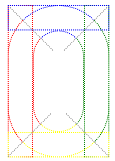
border-radius: [<length>|<percentage>]{1,4} [/[<length>|<percentage>]{1,4}]?:一次过设置4个角的椭圆半径
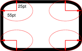
从上图我们可以看到4个角分别对应4个独立的椭圆形,而圆角正是4分之1个椭圆。
撸代码!

<style type="text/css">

/*clearfix*/

.nav3{

  *zoom: 1;

}

.nav3::after{

  content: ".";

  display: block;

  clear: both;

  line-height: 0;

  visibility: hidden;

}

/*border-radius实现Tab*/

.nav3 .nav-item3{

  float: left;

  margin-right: 5px;

}

.nav3 .nav-item3 a{

  font-size: 12px;

  line-height: 2;

  display: inline-block;

  background: #0ac;

  padding: 0 10px;

  border: 1px solid #eee;

  border-radius: 8px 8px 0 0;

}

.nav3 .nav-item3 a:hover{

  background: #eef;

}

</style>

<ul class="nav3">

  <li class="nav-item3"><a href="javascript:void 0">首页</a></li>

  <li class="nav-item3"><a href="javascript:void 0">PDCA检验单查询</a></li>

  <li class="nav-item3"><a href="javascript:void 0">成品通用标准审核</a></li>

</ul>
圆角的何止是border box啊

上图的content box变成椭圆形了,而且content box中的文字好像飘到content box外面。但确实是content box变为椭圆形还是说仅仅是背景色是如此而已呢?让我们添加overflow:hidden看看效果吧

看来border-radius确实影响到content box了。其实border-radius将会影响到box model中的所有box。当我们通过border-radius设置border box的椭圆半径后,CSS渲染引擎会根据公式自动计算出margin/padding/content box的椭圆半径,然后为它们渲染出圆角。
注意
- margin/border/padding/content box中相同方向的角的椭圆的圆心重叠;
- 当椭圆半径为0时,渲染为直角。
margin box圆角了
公式:margin-radius = border-radius + margin-width
当border-radius > margin-width时,margin-width=1 + (margin-width/border-radius-1)^3以确保margin-radius趋向于直角。
padding box圆角了
公式:padding-radius = border-radius + border-width
当padding-radius为0时,渲染为直角
<style type="text/css">

.s1{

background: #FEE;

width: 0;

padding: 50px;

border: 10px solid red;

border-radius: 10px;

float:left;

margin-right: 20px;

}

.s2{

background: #FEE;

width: 0;

padding: 50px;

border: 10px solid red;

border-radius: 20px;

float:left;

}

</style>

<div class="s1"></div>

<div class="s2"></div>
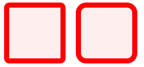
content box/area圆角了
公式:content-radius = border-radius + border-width - padding-width
当content-radius为0时,渲染为直角
<style type="text/css">

.s1{

background: #FEE;

width: 100px;

height: 100px;

border: 10px solid red;

border-radius: 10px;

float:left;

margin-right: 20px;

}

.s2{

background: #FEE;

width: 100px;

height: 100px;

border: 10px solid red;

border-radius: 20px;

float:left;

}

</style>

<div class="s1"></div>

<div class="s2"></div>
注意
由于margin区域无法触发点击等事件,而圆角border box所占面积必定小于直角border box,因此为保持可点击区域面积,圆角border box应设置更大的高宽值。
话说"大值特性"和"等比特性"
@张鑫旭老师在《秋月何时了,CSS3 border-radius知多少?》提到"大值特性"和"等比特性"两个特性。
<style type="text/css">

.s1{

box-sizing: border-box;

background: #FEE;

width: 100px;

height: 200px;

border: 10px solid red;

border-top-left-radius: 100px 200px;

float: left;

margin-right: 20px;

}

.s2{

box-sizing: border-box;

background: #FEE;

width: 100px;

height: 200px;

border: 10px solid red;

border-top-left-radius: 200px;

float: left;

}

</style>

<div class="s1"></div>

<div class="s2"></div>
你看div.s2明明把左上角的水平和垂直半径设置为200px,但实际效果却是两者结果值均为100px,难道这就是"大值特性"?
<style type="text/css">

.s1{

box-sizing: border-box;

background: #FEE;

width: 200px;

height: 100px;

border: 10px solid red;

border-top-left-radius: 300px 100px;

border-top-right-radius: 900px 100px;

}

</style>

<div class="s1"></div>
仅仅看div.s1水平方向的椭圆半径,left和right相加300+900=1200远远大于border box的宽度200px,也就是说两个椭圆将发生重叠。对于这种情况CSS渲染引擎到底是如何处理的呢?
- 首先明确的是
left+right必须小于等于border-box的宽度,也就是说两个椭圆不能发生重叠。 - 然后根据"等比例特性"得到
left/(left+right)=300/(300+900)=1/4,right/(left+right)=900/(300+900)=3/4,得到left结果值为200/4=50,right结果值为3*200/4=150。
通过"等比例特性"我们很好地解释了上图中水平方向的效果,但大家有没有发现垂直方向的半径有点奇怪呢?我们明明设置半径为100px,而且border box的高度恰好也是100px,按理应该是足够的,为何垂直半径的结果值不是100px呢?
其实W3C Spec中已经说得很清楚了!
Let f = min(Li/Si), where i ∈ {top, right, bottom, left}, Si is the sum of the two corresponding radii of the corners on side i, and Ltop = Lbottom = the width of the box, and Lleft = Lright = the height of the box. If f < 1, then all corner radii are reduced by multiplying them by f.
其实"最大值特性"和"等比例特性"只是上述规则的表象而已,最根本的公式为f=min(Li/Si)
以第二个示例来计算一下吧
计算f的值
- top-left和top-right的水平半径之和为1200px,而border box宽度为200px,那么f1=200/1200=1/6;
- top-left和bottom-left的垂直半径之和为400px,而border box高度为400px,那么f2=400/400=1;
- bottom-left和bottom-right的水平半径为0,忽略;
- top-right和bottom-right的垂直半径之和为400px,而border box高度为400px,那么f3=400/400=1;
- f=min(f1,f2,f3),结果为f=f1
缩放各半径
- top-left和top-right的水平半径分别乘以f,得到结果值
300/6=50,900/6=150; - top-left和top-right的垂直半径分别乘以f,得到结果值
400/6=66.66。
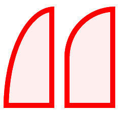
被忽视的猪脚——相交线
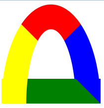
当设置border-left和border-top后,我们很容易预测到左边框和上边框的样式,但它俩相交部分的样式呢?这里就涉及到相交线的问题了!
通过直角边框找相交线
圆角边框是基于直角边框的,这一点也体现在相邻边框的相交线上。
<style type="text/css">

  .box{

    width: 100px;

    height: 200px;

    border: 50px solid;

    border-left-color: red;

    border-top-color: blue;

    border-right-color: green;

    border-bottom-color: yellow;

  }

</style>

<div class="box"></div>
我们可以看到两边相交所形成的矩形的对角线,将作为边的相交点。通过相交点判断边框样式应应用到哪一条边上。
透视图如下

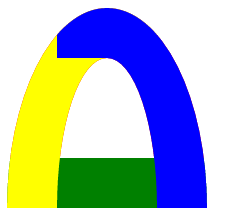
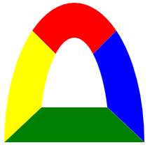
延长相交线
由于圆角边框不像直角边框那样有棱有角,因此更难以分辨边框样式所对应的边框。但只要我们沿直角边框的相交线向图形内延伸,一切则清晰明了了。
<style type="text/css">

  .rounded-box{

    width: 100px;

    height: 200px;

    border: 50px solid;

    border-left-color: red;

    border-top-color: blue;

    border-right-color: green;

    border-bottom-color: yellow;

    border-radius: 100px;

  }

</style>

<div class="rounded-box"></div>

透视图如下
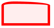
兼容性
虽然各大浏览器均支持border-radius属性,但其实现效果却不尽相同,我们拿极端情况来作试验,最能看出效果。结论是让我们大跌眼镜的:IE效果最为理想!!
<style type="text/css">

.s1{

  box-sizing: border-box;

  width: 200px;

  height: 200px;

  border: 50px solid;

  border-color: red blue green yellow;

  border-top-left-radius: 50% 100%;

  border-top-right-radius: 50% 100%;

}

</style>

<div class="s1"></div>
chrome34中
FF中
IE9
总结
尊重原创,转载请注明来自:http://www.cnblogs.com/fsjohnhuang/p/5458573.htm_肥仔John
感谢
CSS Backgrounds and Borders Module Level 3 4. Borders
秋月何时了,CSS3 border-radius知多少?
CSS滑动门Sliding door详解
《图解CSS3核心技术与案例实战》——第3章 CSS3边框
CSS魔法堂:重拾Border之——不仅仅是圆角的更多相关文章
- CSS魔法堂:重拾Border之——更广阔的遐想
前言 当CSS3推出border-radius属性时我们是那么欣喜若狂啊,一想到终于不用再添加额外元素来模拟圆角了,但发现border-radius还分水平半径和垂直半径,然后又发现border-t ...
- CSS魔法堂:重拾Border之——图片作边框
前言 当CSS3推出border-radius属性时我们是那么欣喜若狂啊,一想到终于不用再添加额外元素来模拟圆角了,但发现border-radius还分水平半径和垂直半径,然后又发现border-t ...
- CSS魔法堂:重拾Border之——解构Border
前言 当CSS3推出border-radius属性时我们是那么欣喜若狂啊,一想到终于不用再添加额外元素来模拟圆角了,但发现border-radius还分水平半径和垂直半径,然后又发现border-t ...
- CSS魔法堂:Box-Shadow没那么简单啦:)
前言 说起box-shadow那第一个想法当然就是用来实现阴影,其实它还能用于实现其他好玩的效果的,本篇就打算说说box-shadow的那些事. 二话不说看效果 3D小球 <style typ ...
- CSS魔法堂:display:none与visibility:hidden的恩怨情仇
前言 还记得面试时被问起"请说说display:none和visibility:hidden的区别"吗?是不是回答完display:none不占用原来的位置,而visibilit ...
- CSS魔法堂:一起玩透伪元素和Content属性
前言 继上篇<CSS魔法堂:稍稍深入伪类选择器>记录完伪类后,我自然而然要向伪元素伸出"魔掌"的啦^_^.本文讲讲述伪元素以及功能强大的Contet属性,让我们可以通 ...
- CSS魔法堂:小结一下Box Model与Positioning Scheme
前言 对于Box Model和Positioning Scheme中3种定位模式的细节,已经通过以下几篇文章记录了我对其的理解和思考. <CSS魔法堂:重新认识Box Model.IFC.B ...
- CSS魔法堂:说说Float那个被埋没的志向
前言 定位系统中第一难理解就是Normal flow,而第二就非Float莫属了,而Float难理解的原因有俩,1. 一开头我们就用错了:2. 它跟Normal flow靠得太近了.本文尝试理清Fl ...
- CSS魔法堂:你一定误解过的Normal flow
前言 刚接触CSS时经常听到看到一个词"文档流",那到底什么是"文档流"呢?然后会看到"绝对定位和浮动定位能脱离文档流",从这句可以看到文 ...
随机推荐
- ie8 jquery parents() 获取多个的问题
今天开发的时候碰到了一个奇怪的问题 <!DOCTYPE HTML PUBLIC "-//W3C//DTD HTML 4.01//EN" "http://www.w3 ...
- 混搭.NET技术
新闻 .NET技术+25台服务器怎样支撑世界第54大网站 再度燃起人们对.NET的技术热情.这篇新闻中透露了StackExchange 在技术方面的混搭,这也是我所崇尚的.因此我也在社区里极力推广Mo ...
- DevOps是云计算时代的开发与运营
DevOps(英文Development和Operations的组合)是一组过程.方法与系统的统称,用于促进开发(应用程序/软件工程).技术运营和质量保障(QA)部门之间的沟通.协作与整合.[1] 它 ...
- 夜深了,写了个JQuery的省市区三级级联效果
刚刚练手的JQuery,希望大神们指正 主要实现以下功能: 1.三级菜单级联加载数据 2.可以在不操作脚本的情况下,给元素加属性实现级联功能 3.自定义动态显示数据 咨询问题: 对于一般比较固定不变的 ...
- Net作业调度(三) — Quartz.Net进阶
介绍 前面介绍Quartz.Net的基本用法,但在实际应用中,往往有更多的特性需求,比如记录job执行的执行历史,发邮件等. 阅读目录 Quartz.Net插件 TriggerListener,Job ...
- MySQL HASH分区
200 ? "200px" : this.width)!important;} --> 介绍 基于给定的分区个数,将数据分配到不同的分区,HASH分区只能针对整数进行HASH ...
- 几个毫无节操纯属恶搞的JavaScript插件
fartscroll.js,为放屁而生 你知道么,有了这个js库,你的页面就可以——————————放屁勒! 打开下面的演示地址,然后滚动页面. 在线演示:http://theonion.github ...
- [ASP.NET MVC 小牛之路]04 - 依赖注入(DI)和Ninject
本人博客已转移至:http://www.exblr.com/liam 为什么需要依赖注入 在[ASP.NET MVC 小牛之路]系列的理解MVC模式文章中,我们提到MVC的一个重要特征是关注点分离( ...
- Step by step 活动目录中添加一个子域
原创地址:http://www.cnblogs.com/jfzhu/p/4006545.html 转载请注明出处 前面介绍过如何创建一个域,下面再介绍一下如何在该父域中添加一个子域. 活动目录中的森林 ...
- [大数据之Sqoop] —— Sqoop初探
Sqoop是一款用于把关系型数据库中的数据导入到hdfs中或者hive中的工具,当然也支持把数据从hdfs或者hive导入到关系型数据库中. Sqoop也是基于Mapreduce来做的数据导入. 关于 ...