
echarts x轴下绘制表
效果图:
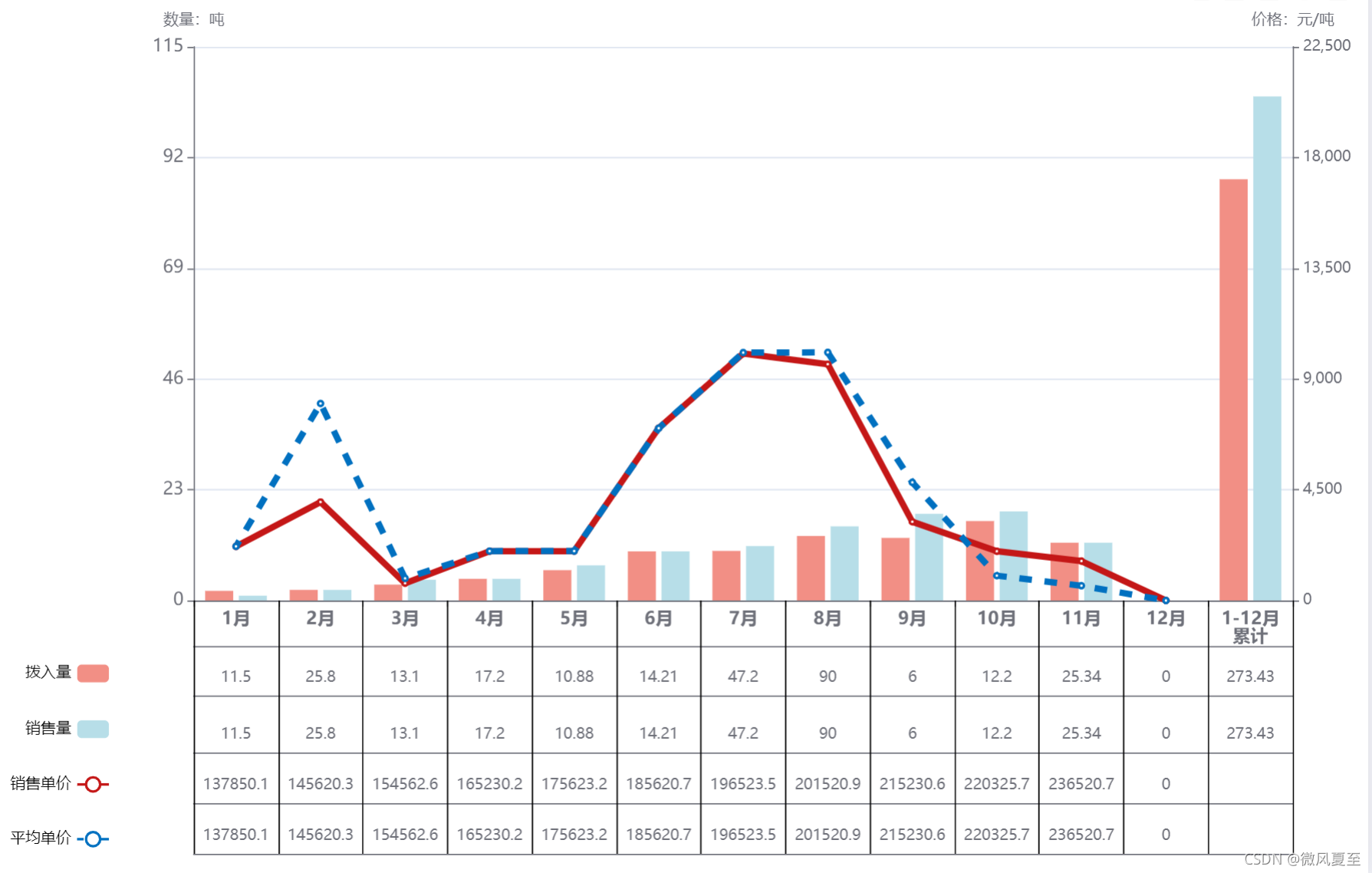
把下面代码复制到官网实例的js代码编辑中即可预览( 附连接:Examples - Apache ECharts)
let map = {

            销售单价: [2200.0,4000.9,700.0,2003.2,2005.6,7006.7,10035.6,9602.2,3200.6,2000.0,1602.4,0],

            市场价: [2200.6,8005.9,900.0,2006.4,2008.7,7000.7,10075.6,10082.2,4800.7,1008.8,600.0,0],

            拨入量: [2.0, 2.2,3.3,4.5,6.3,10.2,10.3,13.4,13.0,16.5,12.0,0,87.5],

            销售量: [1.0,2.2,4.3,4.5,7.3,10.2,11.3,15.4,18.0,18.5,12.0,0,104.7]

          };

 option = {

        title: {

          text: "2021年1-12月xxx量价对比图"

        },

        darkMode: true,

        grid: {

          x: 150,

          // y:45,

          x2: 50,

          y2: 210

          // borderWidth:1

        },

        tooltip: {

          trigger: "axis",

          axisPointer: {

            type: "cross",

            crossStyle: {

              color: "#999"

            }

          }

        },

        toolbox: {

          feature: {

            dataView: { show: true, readOnly: false },

            magicType: { show: true, type: ["line", "bar"] },

            restore: { show: true },

            saveAsImage: { show: true }

          }

        },

        legend: {

          align: "right",

          itemGap: 30,

          orient: "vertical",

          textStyle: { color: "#000" },

          bottom: 10,

          left: 0,

          data: ["拨入量", "销售量", "销售单价", "平均单价"]

        },

        xAxis: [

          {

            type: "category",

            max: 12,

            interval: Math.ceil(12) / 12,

            // axisTick: {

            //   interval: 12/12

            // },

            axisLabel: {

              fontWeight: "bold",

              show: true,

              textStyle: {

                // color: "#f4f4f4",

                fontSize: "14px"

              }

            },

            data: ["1月","2月","3月","4月","5月","6月","7月","8月","9月","10月","11月","12月","1-12月\n累计"],

            axisPointer: {

              type: "shadow"

            }

          },

          {

            position: "bottom", // 将分组x轴位置定至底部,不然默认在顶部

            offset: 45, // 向下偏移,使分组文字显示位置不与原x轴重叠

            // axisLine: {

            //   show: false // 隐藏分组x轴的轴线

            // },

            axisTick: {

              length: -200, // 延长刻度线做分组线

              inside: true, // 使刻度线相对轴线在上面与原x轴相接,默认在轴线下方

              lineStyle: { color: "#000" } // 非必须,仅为了演示,明显标示出分组刻度线

              // interval: function(index, value) {

              //   return index === 0 || index === 2 || index === 5; // 在0、5、6处各画一条刻度线

              // }

              // interval: 1,

            },

            // min: -30,

            max: 12,

            interval: 1,

            axisLabel: {

              inside: true, // 使刻度名称相对轴线在上面与原x轴相接,默认在轴线下方

              interval: 0 // 强制显示全部刻度名

            },

            data: [""]

          },

          {

            position: "bottom", // 将分组x轴位置定至底部,不然默认在顶部

            offset: 36, // 向下偏移,使分组文字显示位置不与原x轴重叠

            max: 12,

            interval: Math.ceil(12) / 12,

            axisTick: {

              length: 0, // 延长刻度线做分组线

              inside: true, // 使刻度线相对轴线在上面与原x轴相接,默认在轴线下方

              lineStyle: { color: "#000" } // 非必须,仅为了演示,明显标示出分组刻度线

            },

            axisLabel: {

              inside: true, // 使刻度名称相对轴线在上面与原x轴相接,默认在轴线下方

              interval: 0 // 强制显示全部刻度名

            }

          },

          {

            position: "bottom", // 将分组x轴位置定至底部,不然默认在顶部

            offset: 75, // 向下偏移,使分组文字显示位置不与原x轴重叠

            max: 12,

            interval: 1,

            axisTick: {

              length: 0, // 延长刻度线做分组线

              inside: true, // 使刻度线相对轴线在上面与原x轴相接,默认在轴线下方

              lineStyle: { color: "#000" } // 非必须,仅为了演示,明显标示出分组刻度线

            },

            axisLabel: {

              inside: true, // 使刻度名称相对轴线在上面与原x轴相接,默认在轴线下方

              interval: 0 // 强制显示全部刻度名

            },

            data: [

              11.5,

              25.8,

              13.1,

              17.2,

              10.88,

              14.21,

              47.2,

              90,

              6,

              12.2,

              25.34,

              0,

              273.43

            ]

          },

          {

            position: "bottom", // 将分组x轴位置定至底部,不然默认在顶部

            offset: 120, // 向下偏移,使分组文字显示位置不与原x轴重叠

            max: 12,

            interval: Math.ceil(12) / 12,

            axisTick: {

              length: 0, // 延长刻度线做分组线

              inside: true, // 使刻度线相对轴线在上面与原x轴相接,默认在轴线下方

              lineStyle: { color: "#000" } // 非必须,仅为了演示,明显标示出分组刻度线

            },

            axisLabel: {

              inside: true, // 使刻度名称相对轴线在上面与原x轴相接,默认在轴线下方

              interval: 0 // 强制显示全部刻度名

            },

            data: [

              11.5,

              25.8,

              13.1,

              17.2,

              10.88,

              14.21,

              47.2,

              90,

              6,

              12.2,

              25.34,

              0,

              273.43

            ]

          },

          {

            position: "bottom", // 将分组x轴位置定至底部,不然默认在顶部

            offset: 160, // 向下偏移,使分组文字显示位置不与原x轴重叠

            max: 12,

            interval: 1,

            axisTick: {

              length: 0, // 延长刻度线做分组线

              inside: true, // 使刻度线相对轴线在上面与原x轴相接,默认在轴线下方

              lineStyle: { color: "#000" } // 非必须,仅为了演示,明显标示出分组刻度线

            },

            axisLabel: {

              inside: true, // 使刻度名称相对轴线在上面与原x轴相接,默认在轴线下方

              interval: 0 // 强制显示全部刻度名

            },

            data: [

              137850.1,

              145620.3,

              154562.6,

              165230.2,

              175623.2,

              185620.7,

              196523.5,

              201520.9,

              215230.6,

              220325.7,

              236520.7,

              0

            ]

          },

          {

            position: "bottom", // 将分组x轴位置定至底部,不然默认在顶部

            offset: 200, // 向下偏移,使分组文字显示位置不与原x轴重叠

            max: 12,

            interval: 1,

            axisTick: {

              length: 0, // 延长刻度线做分组线

              inside: true, // 使刻度线相对轴线在上面与原x轴相接,默认在轴线下方

              lineStyle: { color: "#000" } // 非必须,仅为了演示,明显标示出分组刻度线

            },

            axisLabel: {

              inside: true, // 使刻度名称相对轴线在上面与原x轴相接,默认在轴线下方

              interval: 0 // 强制显示全部刻度名

            },

            data: [

              137850.1,

              145620.3,

              154562.6,

              165230.2,

              175623.2,

              185620.7,

              196523.5,

              201520.9,

              215230.6,

              220325.7,

              236520.7,

              0

            ]

          }

        ],

        yAxis: [

          {

            type: "value",

            name: "数量:吨",

            // min: 0,

            max: Math.ceil(115),

            interval: Math.ceil(115) / 5,

            axisLabel: {

              formatter: "{value}",

              textStyle: {

                // color: "#f4f4f4",

                fontSize: "14px"

              }

            }

          },

          {

            type: "value",

            name: "价格:元/吨",

            // min: 0,

            max: Math.ceil(22500),

            // splitNumber: 6,

            interval: Math.ceil(22500) / 5,

            axisLabel: {

              formatter: "{value}"

            }

          }

        ],

        series: [

          {

            name: "拨入量",

            type: "bar",

            unit: "吨",

            groupName: "拨入/销售量",

            data: map["拨入量"],

            itemStyle: {

              color: "rgb(242, 143, 133)"

            }

          },

          {

            name: "销售量",

            type: "bar",

            unit: "吨",

            groupName: "拨入/销售量",

            data: map["销售量"],

            itemStyle: {

              color: "rgb(183, 222, 232)"

            }

          },

          {

            name: "销售单价",

            type: "line",

            yAxisIndex: 1,

            unit: "元/吨",

            data: map["销售单价"],

            itemStyle: {

              color: "rgb(196, 23, 23)"

            },

            lineStyle: {

              width: 5

            }

          },

          {

            name: "平均单价",

            type: "line",

            yAxisIndex: 1,

            unit: "元/吨",

            data: map["市场价"],

            itemStyle: {

              color: "rgb(0, 112, 192)"

            },

            lineStyle: {

              width: 5,

              type: [10, 10],

              dashOffset: 5

            }

          }

        ]

      };
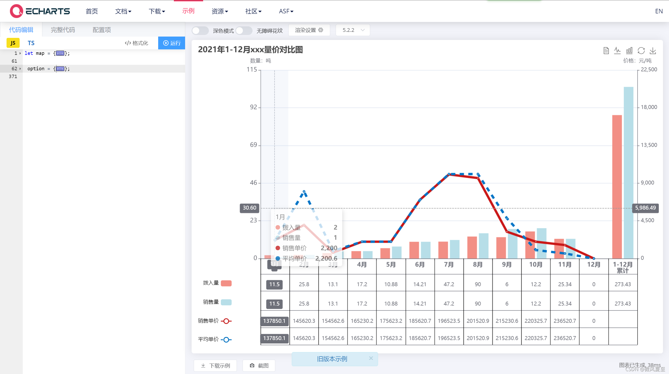
具体复制到如下图位置:
原文链接:https://blog.csdn.net/qq_38974073/article/details/121588908 【本文为转载学习,如需删除请联系】
echarts x轴下绘制表的更多相关文章
- [置顶]
echarts x轴文字显示不全(xAxis文字倾斜比较全面的3种做法值得推荐)
echarts x轴标签文字过多导致显示不全 如图: 解决办法1:xAxis.axisLabel 属性 axisLabel的类型是object ,主要作用是:坐标轴刻度标签的相关设置.(当然yAxis ...
- echarts x轴文字显示不全(解决方案)
echarts x轴标签文字过多导致显示不全 如图: 解决办法1:xAxis.axisLabel 属性 axisLabel的类型是object ,主要作用是:坐标轴刻度标签的相关设置.(当然yAxis ...
- echarts x轴标签文字过多导致显示不全
原文电梯:https://blog.csdn.net/kebi007/article/details/68488694 echarts x轴标签文字过多导致显示不全 如图: 解决办法1:xAxis.a ...
- echarts Y轴名称显示不全(转载)
转载来源:https://blog.csdn.net/qq8241994/article/details/90720657今天在项目的开发中遇到的一个问题,echarts Y轴左侧的文字太多了,显示不 ...
- echarts x轴文字显示不全解决办法
标题:echarts x轴文字显示不全(xAxis文字倾斜比较全面的3种做法值得推荐):http://blog.csdn.net/kebi007/article/details/68488694
- echarts x轴名称太长
echarts x轴名称太长了,隐藏一部分,鼠标移到名称上,显示全称 function extension(mychart, type) { let extension = document.getE ...
- echarts 让轴自适应数据为小数整数
echarts 让轴自适应数据为小数整数,以解决y轴数值重复的问题 工作中突然遇到这个问题 试了一下用formatter自适应 ok 在yAxis中提阿尼按键属性 axisLabel 1 axis ...
- echarts在IE8下遮挡其他组件的问题
echarts的图在IE8下会浮在上层遮挡住其他组件,解决方式是页面中引入 <meta http-equiv="X-UA-Compatible" content=" ...
- Echarts x轴文本内容太长的几种解决方案
Echarts 标签中文本内容太长的时候怎么办 ? - 1对文本进行倾斜 在xAxis.axisLabe中修改rotate的值 xAxis: { data: ["衬衫11111", ...
- Echarts X轴 Y轴 线的类型、颜色、及标签字体颜色 设置
// 人均效能 var initRjxnChart = function () { var rjxnChart = echarts.init(document.getElementById(" ...
随机推荐
- 一招解决github访问慢的问题
之前我在网上搜过解决办法,其中一个是修改 hosts 文件,但是效果不太理想.我在这里给大家推荐github上的一个开源项目:FastGithub .用了这个之后,效果就比较理想了,次次都能访问到 ...
- 两个防火墙的IPsec
首先要保证双面都能通信到对面! 拓扑图: P1 没有要求默认就行 P2 没有要求默认就行 对流体 对流体细节问题 预共享密钥要一致 IPsec 创建隧道 添加路由 Ping对方激活ipsec Ping ...
- WPF在.NET9中的重大更新:Windows 11 主题
在2023年的2月20日,在WPF的讨论区,WPF团队对路线的优先级发起了一次讨论. 对三个事项发起了投票. 第一个是Windows 11 主题 第二个是更新的控件 第三个是可空性注释 最终Windo ...
- C# pythonnet(3)_Butter-worth低通滤波
Python代码如下 import pandas as pd import numpy as np import matplotlib.pyplot as plt from scipy import ...
- debian11 简单搭建go环境
简单环境,目前仅支持单版本go,后续可以考虑直接把go环境放到docker中或podman中,这样每个容器都是一套go版本. 新建文件夹目录 # 我直接用的root账户 cd /root mkdir ...
- JavaSe 统计字符串中字符出现的次数
public static void main(String[] args) { // 1.字符串 String str = "*Constructs a new <tt>Has ...
- mybatis-plus的insert方法出现-id' doesn't have a default value问题
出现这个问题,只需把对应的字段注解设置为,例如: @TableId(value = "id",type = IdType.INPUT) private String id; 即可解 ...
- Nginx 高性能架构解析
本文详细探讨了Nginx的反向代理.负载均衡和性能优化技术,包括配置优化.系统优化.缓存机制和高并发处理策略,旨在帮助专业从业者深入理解并有效应用Nginx. 关注TechLead,复旦博士,分享云服 ...
- Jingle Bio:产品出海的最重要一课是「重营销轻技术」?
名字: Jingle Bio 开发者 / 团队: Luo Baishun 平台: Web 请简要介绍下这款产品 Jingle Bio 是一款不需要任何编程基础就可以轻松驾驭的个人网站制作工具,你可以使 ...
- TS:菜单数组转树形,支持多级(递归)
方法一 import {menus} from './menus.ts' function listToTree(list: any = [], options = {}, data = null) ...