【全】CSS动画大全之按钮【c】
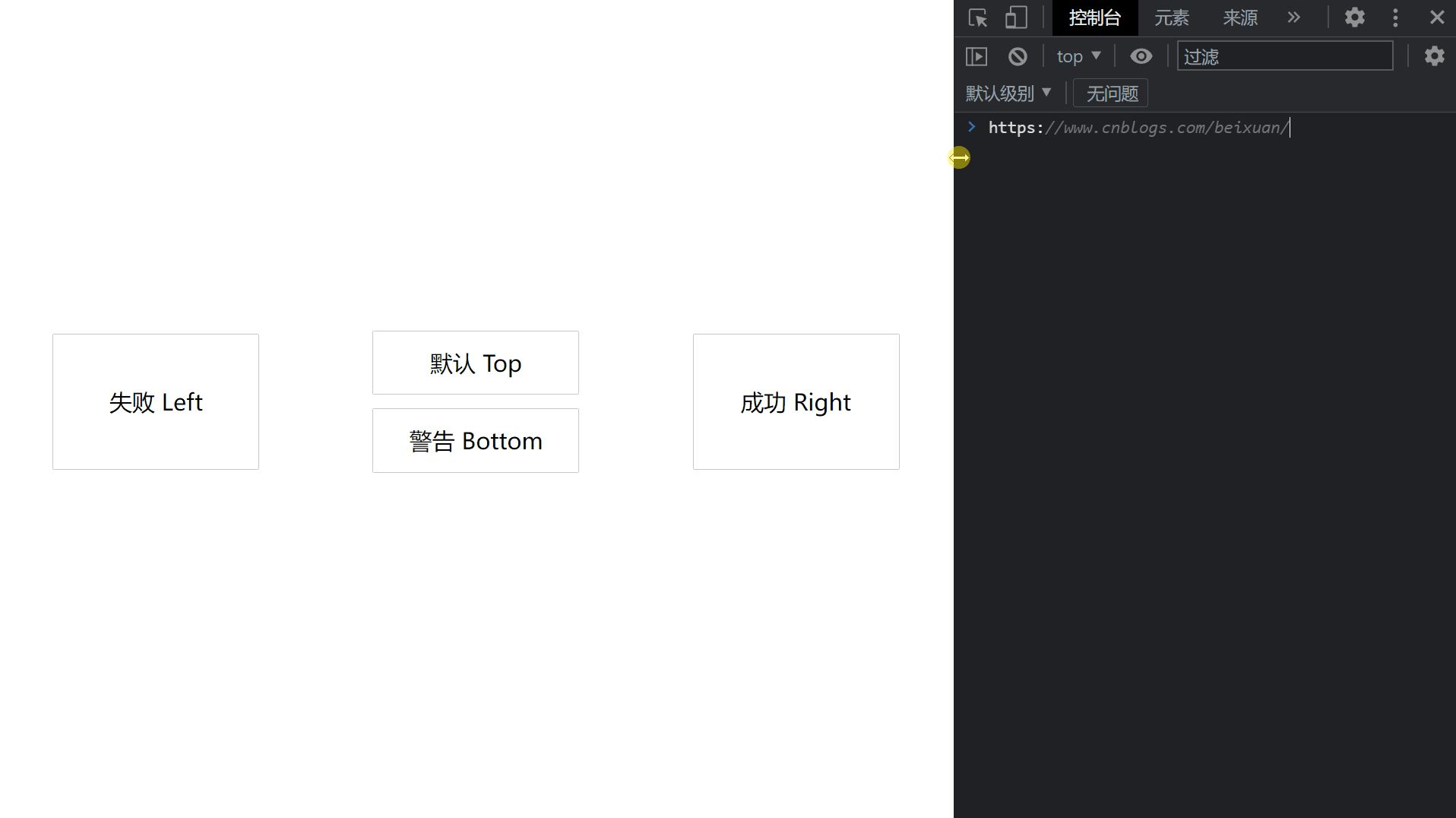
效果预览
代码
<!DOCTYPE html>

<html>

    <head>

        <meta charset="utf-8" />

        <meta name="author" content="https://www.cnblogs.com/beixuan">

        <meta name="version" content="1.0.0">

        <meta name="date" content="2021/12/01 18:00:26">

        <meta name="viewport" content="width=device-width, initial-scale=1">

        <title>CSS动画大全之按钮组[b]</title>

    </head>

    <style type="text/css">

      /* 设置 body 内、外边距为 0 */

      body {

        margin: 0;

        padding: 0;

        display: grid;

        grid-template-columns: 100%;

        grid-template-rows: 100%;

        justify-items: center;

        align-items: center;

        width: 100vw;

        height: 100vh;

        background-color: #FFF;

      }

      .page-wrapper {

        display: grid;

        grid-template-columns: 33% 34% 33%;

        grid-template-rows: 100%;

        justify-items: center;

        align-items: center;

        width: 100vw;

        height: 100vh;

      }

      .page-wrapper > div {

        display: inline-block;

      }

      .btn {

        width: 12.5rem;

        height: 3.125rem;

        line-height: 3.125rem;

        font-size: 1.5rem;

        padding: 0.5rem;

        text-align: center;

        box-shadow: 0 0 1px #000;

        position: relative;

        transition: all 0.5s;

        margin-bottom: 1rem;

        cursor: pointer;

        overflow: hidden;

      }

      .btn:hover {

        box-shadow: 0 0 0px #000;

      }

      .btn-danger, .btn-success {

        height: 7.85rem;

        line-height: 7.85rem;

      }

      /* 默认 */

      .btn-default:hover {

        color: #00aaff;

      }

      .btn-default::before {

        content: '';

        width: calc(100% - 10px);

        height: 100%;

        position: absolute;

        border-left: 5px solid #00aaff;

        border-right: 5px solid #00aaff;

        top: -100%;

        left: 0;

        transition: all 0.4s;

        z-index: -1;

      }

      .btn-default:hover::before {

        content: '';

        width: calc(100% - 10px);

        height: 100%;

        position: absolute;

        border-left: 5px solid #00aaff;

        border-right: 5px solid #00aaff;

        top: 0%;

        left: 0;

        transition: all 0.4s;

        z-index: -1;

      }

      .btn-default::after {

        content: '';

        width: 100%;

        height: calc(100% - 10px);

        position: absolute;

        border-top: 5px solid #00aaff;

        border-bottom: 5px solid #00aaff;

        top: 0;

        left: 100%;

        transition: all 0.4s;

        z-index: -1;

      }

      .btn-default:hover::after {

        content: '';

        width: 100%;

        height: calc(100% - 10px);

        position: absolute;

        border-top: 5px solid #00aaff;

        border-bottom: 5px solid #00aaff;

        top: 0;

        left: 0;

        transition: all 0.4s;

        z-index: -1;

      }

      /* 警告 */

      .btn-warning:hover {

        color: #ffaa00;

      }

      .btn-warning::before {

        content: '';

        width: calc(100% - 10px);

        height: 100%;

        position: absolute;

        border-left: 5px solid #ffaa00;

        border-right: 5px solid #ffaa00;

        top: 100%;

        left: 0;

        transition: all 0.4s;

        z-index: -1;

      }

      .btn-warning:hover::before {

        content: '';

        width: calc(100% - 10px);

        height: 100%;

        position: absolute;

        border-left: 5px solid #ffaa00;

        border-right: 5px solid #ffaa00;

        top: 0%;

        left: 0;

        transition: all 0.4s;

        z-index: -1;

      }

      .btn-warning::after {

        content: '';

        width: 100%;

        height: calc(100% - 10px);

        position: absolute;

        border-top: 5px solid #ffaa00;

        border-bottom: 5px solid #ffaa00;

        top: 0;

        left: 100%;

        transition: all 0.4s;

        z-index: -1;

      }

      .btn-warning:hover::after {

        content: '';

        width: 100%;

        height: calc(100% - 10px);

        position: absolute;

        border-top: 5px solid #ffaa00;

        border-bottom: 5px solid #ffaa00;

        top: 0;

        left: 0;

        transition: all 0.4s;

        z-index: -1;

      }

      /* 失败 */

      .btn-danger:hover {

        color: #e30000;

      }

      .btn-danger::before {

        content: '';

        width: calc(100% - 10px);

        height: 100%;

        position: absolute;

        border-left: 5px solid #e30000;

        border-right: 5px solid #e30000;

        top: -100%;

        left: 0;

        transition: all 0.4s;

        z-index: -1;

      }

      .btn-danger:hover::before {

        content: '';

        width: calc(100% - 10px);

        height: 100%;

        position: absolute;

        border-left: 5px solid #e30000;

        border-right: 5px solid #e30000;

        top: 0%;

        left: 0;

        transition: all 0.4s;

        z-index: -1;

      }

      .btn-danger::after {

        content: '';

        width: 100%;

        height: calc(100% - 10px);

        position: absolute;

        border-top: 5px solid #e30000;

        border-bottom: 5px solid #e30000;

        top: 0;

        left: -100%;

        transition: all 0.4s;

        z-index: -1;

      }

      .btn-danger:hover::after {

        content: '';

        width: 100%;

        height: calc(100% - 10px);

        position: absolute;

        border-top: 5px solid #e30000;

        border-bottom: 5px solid #e30000;

        top: 0;

        left: 0;

        transition: all 0.4s;

        z-index: -1;

      }

      /* 成功 */

      .btn-success:hover {

        color: #00d064;

      }

      .btn-success::before {

        content: '';

        width: calc(100% - 10px);

        height: 100%;

        position: absolute;

        border-left: 5px solid #00d064;

        border-right: 5px solid #00d064;

        top: 100%;

        left: 0;

        transition: all 0.4s;

        z-index: -1;

      }

      .btn-success:hover::before {

        content: '';

        width: calc(100% - 10px);

        height: 100%;

        position: absolute;

        border-left: 5px solid #00d064;

        border-right: 5px solid #00d064;

        top: 0%;

        left: 0;

        transition: all 0.4s;

        z-index: -1;

      }

      .btn-success::after {

        content: '';

        width: 100%;

        height: calc(100% - 10px);

        position: absolute;

        border-top: 5px solid #00d064;

        border-bottom: 5px solid #00d064;

        top: 0;

        left: -100%;

        transition: all 0.4s;

        z-index: -1;

      }

      .btn-success:hover::after {

        content: '';

        width: 100%;

        height: calc(100% - 10px);

        position: absolute;

        border-top: 5px solid #00d064;

        border-bottom: 5px solid #00d064;

        top: 0;

        left: 0;

        transition: all 0.4s;

        z-index: -1;

      }

    </style>

    <body>

      <!-- 页面容器 -->

      <div class="page-wrapper">

        <div class="btn btn-danger">失败 Left</div>

        <div>

          <div class="btn btn-default">默认 Top</div>

          <div class="btn btn-warning">警告 Bottom</div>

        </div>

        <div class="btn btn-success">成功 Right</div>

      </div>

    </body>

</html>
往期回顾
【全】CSS动画大全之按钮【c】的更多相关文章
- 【2016年特别福利】史上最全CSS学习资料大全
css学习篇 [2016年特别福利]史上最全CSS学习资料大全
- 原生html,css+js写下载按钮有提示动画效果的落地页
<!DOCTYPE html> <html lang="en"> <head> <meta charset="UTF-8&q ...
- 这样使用 GPU 渲染 CSS 动画(转)
大多数人知道现代网络浏览器使用GPU来渲染部分网页,特别是具有动画的部分. 例如,使用transform属性的CSS动画看起来比使用left和top属性的动画更平滑. 但是如果你问,“我如何从GPU获 ...
- Web高性能动画及渲染原理(1)CSS动画和JS动画
目录 一. CSS动画 和 JS动画 1.1 CSS动画 1.2 JS动画 1.3 小结 二. 使用Velocity.js实现动画 示例代码托管在:http://www.github.com/dash ...
- 高性能Web动画和渲染原理系列(1)——CSS动画和JS动画
[摘要] 介绍CSS动画和JS动画的基本特点,以及轻量级动画库velocity.js的基本用法. 示例代码托管在:http://www.github.com/dashnowords/blogs 博客园 ...
- JS框架_(JQuery.js)文章全屏动画切换
百度云盘 传送门 密码:anap 文章全屏动画切换效果 <!doctype html> <html lang="zh"> <head> < ...
- Css 动画的回调
在做项目中经常会遇到使用动画的情况.以前的情况是用js写动画,利用setTimeout函数或者window.requestAnimationFrame()实现目标元素的动画效果.虽然后者解决了刷新频率 ...
- [转]CSS hack大全&详解
转自:CSS hack大全&详解 1.什么是CSS hack? CSS hack是通过在CSS样式中加入一些特殊的符号,让不同的浏览器识别不同的符号(什么样的浏览器识别什么样的符号是有标准的, ...
- CSS动画与GPU
写在前面 满世界的动画性能优化技巧,例如: 只允许改变transform.opacity,其它属性不要动,避免重新计算布局(reflow) 对动画元素应用transform: translate3d( ...
- 15个来自 CodePen 的酷炫 CSS 动画效果【下篇】
CodePen 是一个在线的前端代码编辑和展示网站,能够编写代码并即时预览效果.你在上面可以在线分享自己的 Web 作品,也可以欣赏到世界各地的优秀开发者在网页中实现的各种令人惊奇的效果. 今天这篇文 ...
随机推荐
- kylin的除法函数的坑
1.select 1/6 (整数相除除不过直接就为0) 解决办法:select cast(1 as double)/6 2.select round (0/6,2) (0除以任何数都是0,无法 ...
- 详解Web应用安全系列(2)注入漏洞之XSS攻击
上一篇介绍了SQL注入漏洞,今天我们来介绍另一个注入漏洞,即XSS跨站脚本攻击.XSS 全称(Cross Site Scripting) 跨站脚本攻击, 是Web应用中常见的漏洞.指攻击者在网页中嵌入 ...
- injectionIII iOS代码注入工具(下)
injectionIII iOS代码注入工具(下) 本文将解决如何使用injectionIII对主页热重载,如果对injectionIII不了解的同学请回到上篇查看 Vaccine 简单地说Vacci ...
- xshell+ssh+网络+加密
使用xshell+ssh用于管理linux服务器,大概是目前最为流行的方式. 这个工具和技术涉及到: 计算机网络 加密解密 虽然不是专门的系统工程师,但还是相对频繁使用这套工具,有时候难免遇到一些不知 ...
- RIP总结
RIP 两种更新方式:定期更新和触发更新 管理距离为120,更新使用UDP520,更新周期30s,使用跳数作为度量值,最大15 RIP有三个版本RIPv1,RIPv2,RIPn ...
- 半夜被慢查询告警吵醒,limit深度分页的坑
分享是最有效的学习方式. 博客:https://blog.ktdaddy.com/ 故事 梅雨季,闷热的夜,令人窒息,窗外一道道闪电划破漆黑的夜幕,小猫塞着耳机听着恐怖小说,辗转反侧,终于睡意来了,然 ...
- .NET 个人博客-添加RSS订阅功能
个人博客-添加RSS订阅功能 前言 个人博客系列已经完成了 留言板 文章归档 推荐文章优化 推荐文章排序 博客地址:https://pljzy.top 然后博客开源的原作者也是百忙之中添加了一个名为R ...
- 配置 Nginx + PHP(FastCGI/FPM)
有关概念 Nginx是什么 Nginx ("engine x") 是一个高性能的HTTP和反向代理服务器,也是一个IMAP/POP3/SMTP服务器. Php-fpm是什么 1.c ...
- Simple WPF: WPF 自定义按钮外形
最新内容优先发布于个人博客:小虎技术分享站,随后逐步搬运到博客园. WPF的按钮提供了Template模板,可以通过修改Template模板中的内容对按钮的样式进行自定义,完整代码Github自取. ...
- RAG工程实践拦路虎之一:PDF格式解析杂谈
背景 PDF(Portable Document Format)是一种广泛用于文档交换的文件格式,由Adobe Systems开发.它具有跨平台性.固定布局和易于打印等特点,因此在商业.学术和个人领域 ...