
用css来写一个背景图片的切换
代码如下:
<!DOCTYPE HTML>
<htmllang="en-US">
<head>
<meta charset="UTF-8">
<title>CSS3 Full Background Slider </title>
<style type="text/css">
/*字体效果*/
@import url("http://www.w3cplus.com/demo/css3/base.css");
@import url("http://fonts.googleapis.com/css?family=Yesteryear");
html,body {
height: 100%;
}
/*设置背景图片全屏显示,并且居中*/
img.bg {
min-height: 100%;
min-width: 1024px;
width: 100%;
height: auto !important;
height: 100%;
position: fixed;
top: 0;
left: 0;
z-index:1;
-webkit-transform: translateX(-0);
-moz-transform: translateX(-0);
-o-transform: translateX(-0);
-ms-transform: translateX(-0);
}
/*设置背景图片从左向右移入显示的动画效果*/
/* Slide Left */ @-webkit-keyframes 'slideLeft' {
0% { left: -500px; }
100% { left: 0; }
}
@-moz-keyframes 'slideLeft' {
0% { left: -500px; }
100% { left: 0; }
}
@-o-keyframes 'slideLeft' {
0% { left: -500px; }
100% { left: 0; }
}
@-ms-keyframes 'slideLeft' {
0% { left: -500px; }
100% { left: 0; }
}
@keyframes 'slideLeft' {
0% { left: -500px; }
100% { left: 0; }
}
/*设置背景图像从底部向顶部移入的动画效果*/
/* Slide Bottom */ @-webkit-keyframes 'slideBottom' {
0% { top: 350px; }
100% { top: 0; }
}
@-moz-keyframes 'slideBottom' {
0% { top: 350px; }
100% { top: 0; }
}
@-ms-keyframes 'slideBottom' {
0% { top: 350px; }
100% { top: 0; }
}
@-o-keyframes 'slideBottom' {
0% { top: 350px; }
100% { top: 0; }
}
@keyframes 'slideBottom' {
0% { top: 350px; }
100% { top: 0; }
}
/*设置背景图片由小到大放大动画效果*/
/* Zoom In */ @-webkit-keyframes 'zoomIn' {
0% { -webkit-transform: scale(0.1); }
100% { -webkit-transform: none; }
}
@-moz-keyframes 'zoomIn' {
0% { -moz-transform: scale(0.1); }
100% { -moz-transform: none; }
}
@-ms-keyframes 'zoomIn' {
0% { -ms-transform: scale(0.1); }
100% { -ms-transform: none; }
}
@-o-keyframes 'zoomIn' {
0% { -o-transform: scale(0.1); }
100% { -o-transform: none; }
}
@keyframes 'zoomIn' {
0% { transform: scale(0.1); }
100% { transform: none; }
}
/*设置背景图像由大到小缩小动画效果*/
/* Zoom Out */ @-webkit-keyframes 'zoomOut' {
0% { -webkit-transform: scale(2); }
100% { -webkit-transform: none; }
}
@-moz-keyframes 'zoomOut' {
0% { -moz-transform: scale(2); }
100% { -moz-transform: none; }
}
@-ms-keyframes 'zoomOut' {
0% { -ms-transform: scale(2); }
100% { -ms-transform: none; }
}
@-o-keyframes 'zoomOut' {
0% { -o-transform: scale(2); }
100% { -o-transform: none; }
}
@keyframes 'zoomOut' {
0% { transform: scale(2); }
100% { transform: none; }
}
/*背景图像旋转出现动画效果*/
/* Rotate */ @-webkit-keyframes 'rotate' {
0% { -webkit-transform: rotate(-360deg) scale(0.1); }
100% { -webkit-transform: none; }
}
@-moz-keyframes 'rotate' {
0% { -moz-transform: rotate(-360deg) scale(0.1); }
100% { -moz-transform: none; }
}
@-ms-keyframes 'rotate' {
0% { -ms-transform: rotate(-360deg) scale(0.1); }
100% { -ms-transform: none; }
}
@-o-keyframes 'rotate' {
0% { -o-transform: rotate(-360deg) scale(0.1); }
100% { -o-transform: none; }
}
@keyframes 'rotate' {
0% { transform: rotate(-360deg) scale(0.1); }
100% { transform: none; }
}
/*设置背景图像不显示动画效果*/
@-webkit-keyframes 'notTarget' {
0% { z-index: 75; }
100% { z-index: 75; }
}
@-moz-keyframes 'notTarget' {
0% { z-index: 75; }
100% { z-index: 75; }
}
@-ms-keyframes 'notTarget' {
0% { z-index: 75; }
100% { z-index: 75; }
}
@-o-keyframes 'notTarget' {
0% { z-index: 75; }
100% { z-index: 75; }
}
@keyframes 'notTarget' {
0% { z-index: 75; }
100% { z-index: 75; }
} .slider {
position: absolute;
width: 100%;
text-align: center;
z-index: 9999;
bottom: 100px;
}
.slider li {
display: inline-block;
width: 170px;
height: 130px;
margin-right: 15px;
}
.slider a {
display: inline-block;
width: 170px;
padding-top: 70px;
padding-bottom: 20px;
position: relative;
cursor: pointer;
border: 2px solid #fff;
border-radius: 5px;
vertical-align: top;
color: #fff;
text-decoration: none;
font-size: 22px;
font-family: 'Yesteryear', cursive;
text-shadow: -1px -1px 1px rgba(0, 0, 0, 0.8),-2px -2px 1px rgba(0, 0, 0, 0.3),-3px -3px 1px rgba(0, 0, 0, 0.3);
}
/*任务一、设置不同列表的背景色*/
.slider li:nth-of-type(1) a{
background-color: #02646e;
}
.slider li:nth-of-type(2) a{
background-color: #eb0837;
}
.slider li:nth-of-type(3) a{
background-color: #67b374;
}
.slider li:nth-of-type(4) a{
background-color: #e6674a;
}
.slider li:nth-of-type(5) a{
background-color: #e61061;
}
/*任务二、设置缩略图形状*/
.slider li:nth-of-type(n) a::after{
content:"";
display: block;
height: 120px;
width: 120px;
border: 5px solid #fff;
border-radius: 50%;
position: absolute;
left: 50%;
margin-left: -60px;
z-index: 9999;
top: -80px;
}
/*任务三、设置缩略图背景图像*/
li:nth-of-type(1) a::after{
background: url(http://www.w3cplus.com/demo/css3/CSS3Fullbackground/sbg1.jpg) no-repeat center;
}
li:nth-of-type(2) a::after{
background: url(http://www.w3cplus.com/demo/css3/CSS3Fullbackground/sbg2.jpg) no-repeat center;
}
li:nth-of-type(3) a::after{
background: url(http://www.w3cplus.com/demo/css3/CSS3Fullbackground/sbg3.jpg) no-repeat center;
}
li:nth-of-type(4) a::after{
background: url(http://www.w3cplus.com/demo/css3/CSS3Fullbackground/sbg4.jpg) no-repeat center;
}
li:nth-of-type(5) a::after{
background: url(http://www.w3cplus.com/demo/css3/CSS3Fullbackground/sbg5.jpg) no-repeat center;
}
/*任务四、给缩略图添加蒙板效果*/
.slider li:nth-of-type(n) a::before{
content:"";
display: block;
height: 120px;
width: 120px;
border: 5px solid #fff;
border-radius: 50%;
position: absolute;
left: 50%;
margin-left: -60px;
z-index: 99999;
top: -80px;
background: rgba(0,0,0,0.3);
}
/*任务五、鼠标悬浮时,修改缩略图蒙板透明度*/
a:hover:before{
opacity:0;
}
/*任务六、点击综略图,切换背景图*/
/*背景图从左向右出现*/
.slideLeft:target{
z-index: 100;
-webkit-animation-name: slideLeft;
-webkit-animation-duration: 1s;
-webkit-animation-iteration-count: 1;
-moz-animation-name: slideLeft;
-moz-animation-duration: 1s;
-moz-animation-iteration-count: 1;
-ms-animation-name: slideLeft;
-ms-animation-duration: 1s;
-ms-animation-iteration-count: 1;
-o-animation-name: slideLeft;
-o-animation-duration: 1s;
-o-animation-iteration-count: 1;
animation-name: slideLeft;
animation-duration: 1s;
animation-iteration-count: 1;
}
/*背景图从下向上出现*/
.slideBottom:target{
z-index: 100; -webkit-animation-name: slideBottom;
-webkit-animation-duration: 1s;
-webkit-animation-iteration-count: 1;
-moz-animation-name: slideBottom;
-moz-animation-duration: 1s;
-moz-animation-iteration-count: 1;
-ms-animation-name: slideBottom;
-ms-animation-duration: 1s;
-ms-animation-iteration-count: 1;
-o-animation-name: slideBottom;
-o-animation-duration: 1s;
-o-animation-iteration-count: 1;
animation-name: slideBottom;
animation-duration: 1s;
animation-iteration-count: 1;
}
/*背景图由小到大出现*/
.zoomIn:target{
z-index: 100;
-webkit-animation-name: zoomIn;
-webkit-animation-duration: 1s;
-webkit-animation-iteration-count: 1;
-moz-animation-name: zoomIn;
-moz-animation-duration: 1s;
-moz-animation-iteration-count: 1;
-ms-animation-name: zoomIn;
-ms-animation-duration: 1s;
-ms-animation-iteration-count: 1;
-o-animation-name: zoomIn;
-o-animation-duration: 1s;
-o-animation-iteration-count: 1;
animation-name: zoomIn;
animation-duration: 1s;
animation-iteration-count: 1;
} /*背景图由大到小出现*/
.zoomOut:target{
z-index: 100;
-webkit-animation-name: zoomOut;
-webkit-animation-duration: 1s;
-webkit-animation-iteration-count: 1;
-moz-animation-name: zoomOut;
-moz-animation-duration: 1s;
-moz-animation-iteration-count: 1;
-ms-animation-name: zoomOut;
-ms-animation-duration: 1s;
-ms-animation-iteration-count: 1;
-o-animation-name: zoomOut;
-o-animation-duration: 1s;
-o-animation-iteration-count: 1;
animation-name: zoomOut;
animation-duration: 1s;
animation-iteration-count: 1;
} /*背景图旋转出现*/
.rotate:target{
z-index: 100;
-webkit-animation-name: rotate;
-webkit-animation-duration: 1s;
-webkit-animation-iteration-count: 1;
-moz-animation-name: rotate;
-moz-animation-duration: 1s;
-moz-animation-iteration-count: 1;
-ms-animation-name: rotate;
-ms-animation-duration: 1s;
-ms-animation-iteration-count: 1;
-o-animation-name: rotate;
-o-animation-duration: 1s;
-o-animation-iteration-count: 1;
animation-name: rotate;
animation-duration: 1s;
animation-iteration-count: 1;
}
/*任务七、设置不显示的背景图层级*/
/* Not Target */ .bg:not(:target){ -webkit-animation-name: notTarget;
-webkit-animation-duration: 1s;
-webkit-animation-iteration-count: 1;
-moz-animation-name: notTarget;
-moz-animation-duration: 1s;
-moz-animation-iteration-count: 1;
-ms-animation-name: notTarget;
-ms-animation-duration: 1s;
-ms-animation-iteration-count: 1;
-o-animation-name: notTarget;
-o-animation-duration: 1s;
-o-animation-iteration-count: 1;
animation-name: notTarget;
animation-duration: 1s;
animation-iteration-count: 1;
}
</style>
</head>
<body>
<div class="slider">
<ul class="clearfix">
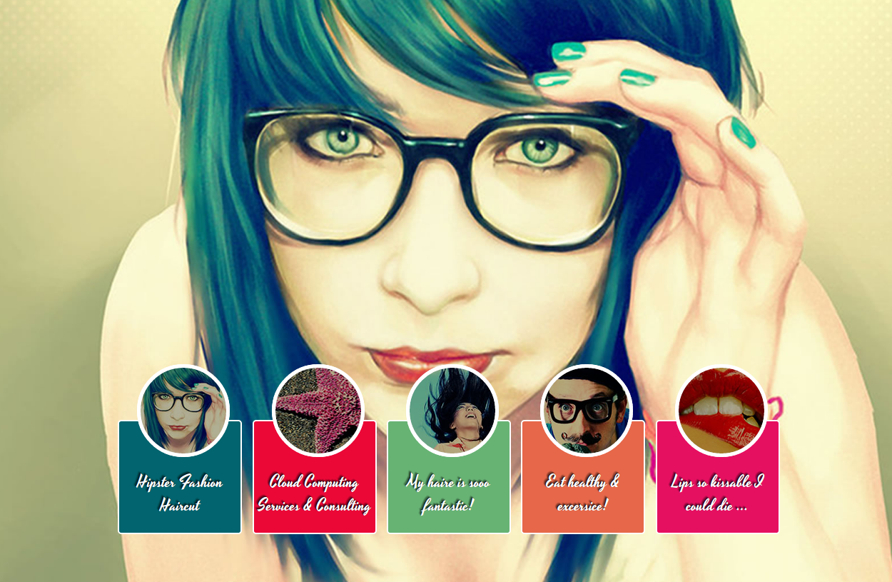
<li><a href="#bg1">Hipster Fashion Haircut </a></li>
<li><a href="#bg2">Cloud Computing Services & Consulting</a></li>
<li><a href="#bg3">My haire is sooo fantastic!</a></li>
<li><a href="#bg4">Eat healthy & excersice!</a></li>
<li><a href="#bg5">Lips so kissable I could die ...</a></li>
</ul>
</div>
<img src="http://www.w3cplus.com/demo/css3/CSS3Fullbackground/bg1.jpg" alt="" class="bg slideLeft" id="bg1" />
<img src="http://www.w3cplus.com/demo/css3/CSS3Fullbackground/bg2.jpg" alt="" class="bg slideBottom" id="bg2" />
<img src="http://www.w3cplus.com/demo/css3/CSS3Fullbackground/bg3.jpg" alt="" class="bg zoomIn" id="bg3" />
<img src="http://www.w3cplus.com/demo/css3/CSS3Fullbackground/bg4.jpg" alt="" class="bg zoomOut" id="bg4" />
<img src="http://www.w3cplus.com/demo/css3/CSS3Fullbackground/bg5.jpg" alt="" class="bg rotate" id="bg5" />
</body>
</html>
效果如图:
用css来写一个背景图片的切换的更多相关文章
- vue-cli || webpack 打包的时候css里面写的背景图片的路径出错问题
.bg width 100% position fixed left 0 top 0 height 100vh z-index -1 background url('~@/assets/imgs/bg ...
- css网页中设置背景图片的方法详解
在css代码中设置背景图片的方法,包括背景图片.背景重复.背景固定.背景定位等 用css设置网页中的背景图片,主要有如下几个属性: 1,背景颜色 {">说明:参数取值和颜色属性一样 ...
- swift 需求: 导航栏和HeaderView 使用一个背景图片。
问题界面 需求: 导航栏和HeaderView 使用一个背景图片.解决方案: 让 导航栏 变成透明. override func viewWillAppear(_ animated: Bool) { ...
- Android 自己写一个打开图片的Activity
根据记忆中eoe的Intent相关视频,模仿,写一个打开图片的Activity 1.在主Activity的button时间中,通过设置action.category.data打开一个图片.这时代码已经 ...
- CSS hack前传——背景图片全屏
在之前的博客CSS hack中我有提到,一个问题的解决让我对CSS hack的态度从不屑一顾,到认真研究了实验一下,事情是这样的,最近产品发布,向来狂妄的我被一个bug纠缠住了,甚至丧气的表示我做不出 ...
- CSS background-color 、image 背景图片
背景颜色 background-color 语法: background-color:<color> 默认值:transparent 透明 适用于:所有元素 继承性:无 动画性:是 计算 ...
- 不用css样式表和背景图片实现圆角矩形,超简洁!
当网站页面的整体布局设计好后,接下来有很多细节的实现是很让人头疼的.其中之一就是圆角矩形的实现. 在网上看了很多圆角矩形的实现方法,基本有两种,一种是用纯css实现,不需要背景图片:另一种是用背景图像 ...
- 【CSS学习笔记】背景图片
直接看代码: background: blue; /*页面背景为蓝色,很简单的代码*/background-image:url(small.jpg); /*页面背景是名字叫small.jpg的图片*/ ...
- CSS——精灵图与背景图片定位
精灵图产生背景: 1.网页上的每张图像都需要向服务器发送一次请求才能展现给用户.2.网页上的图像过多时,服务器就会频繁地接受和发送请求,大大降低页面的加载速度.为了有效地减少服务器接受和发送请求的次数 ...
随机推荐
- ThinkPHP关于模板的一些嵌套、IF判断使用
> ##### 前言,现在有一组数据(涉及到3个数据表,order订单表,order_process办理流程表,process_status流程描述表),根据当前订单,展示相应信息 1.办理流程 ...
- const作用
const有以下几个作用: 1. 定义const常量,具有不可变性.eg. const int MAX = 100; int Array[MAX]; 2. 进行类型检查,使编译器对处理内容有更多的了 ...
- Android中获取并设置屏幕亮度
最近在做一个Demo的时候用到了调节屏幕亮度的功能,于是上网搜索了一下,并且写了一个小Demo测试了一下,发现代码还是比较简单的.Android中的亮度调节,主要有三个方向,一个是针对于系统的亮度调节 ...
- Flume-NG源码阅读之SourceRunner,及选择器selector和拦截器interceptor的执行
在AbstractConfigurationProvider类中loadSources方法会将所有的source进行封装成SourceRunner放到了Map<String, SourceRun ...
- Pandas稀疏数据
当任何匹配特定值的数据(NaN/缺失值,尽管可以选择任何值)被省略时,稀疏对象被“压缩”. 一个特殊的SparseIndex对象跟踪数据被“稀疏”的地方. 这将在一个例子中更有意义. 所有的标准Pan ...
- Java多线程 - 线程同步
多线程操作同一个对象时,容易引发线程安全问题.为了解决线程安全问题,Java多线程引入了同步监视器. 同步代码块 同步代码块语法格式如下: synchronized(obj){ //此处的代码即为同步 ...
- ie if判断
<p> </p> <!--[if lt IE 7]> <html lang="en" ng-app="myApp" c ...
- python学习笔记(conf配置文件)
在优化自己的框架中发现一个问题 有很多参数在很多类中都要使用.是否有什么功能可以帮助优化这些功能 这里我就想到 conf配置文件.整理了下资料 总结下内容如下 #!/usr/bin/env pytho ...
- CodeForces 385 D.Bear and Floodlight 状压DP
枚举灯的所有可能状态(亮或者不亮)(1<<20)最多可能的情况有1048576种 dp[i]表示 i 状态时灯所能照射到的最远距离(i 的二进制中如果第j位为0,则表示第j个灯不亮,否则就 ...
- git网站
https://backlog.com/git-tutorial/cn/ ------------------------------------------------------------- ...