
CSS3进度条动画
<!DOCTYPE html>

<html>

<head>

<meta charset="utf-8" />

<title>CSS3进度条动画</title>

<script type="text/javascript" src="http://files.cnblogs.com/files/heyiming/jquery-2.1.4.min.js"></script>

<style>
  * {

             box-sizing: border-box;

         }

         html {

             height: 100%;

         }

         body {

             background: #efeeea;

             background: linear-gradient(#f9f9f9, #cecbc4);

             background: -moz-linear-gradient(#f9f9f9, #cecbc4);

             background: -webkit-linear-gradient(#f9f9f9, #cecbc4);

             background: -o-linear-gradient(#f9f9f9, #cecbc4);

             color: #757575;

             font-family: "HelveticaNeue-Light", "Helvetica Neue Light", "Helvetica Neue", Helvetica, Arial, "Lucida Grande", sans-serif;

             text-align: center;

         }

         h1, p {

             padding:; margin:;

         }

         .wrapper {

             width: 350px;

             margin: 200px auto;

         }

         .wrapper p a {color:#757575; text-decoration:none;}

         .wrapper .load-bar {

             width: 100%;

             height: 25px;

             border-radius: 30px;

             background: #dcdbd7;

             position: relative;

             box-shadow: 0 1px 0 rgba(255, 255, 255, 0.8),  inset 0 2px 3px rgba(0, 0, 0, 0.2);

         }

         .wrapper .load-bar:hover .load-bar-inner, .wrapper .load-bar:hover #counter {

             animation-play-state: paused;

             -moz-animation-play-state: paused;

             -o-animation-play-state: paused;

             -webkit-animation-play-state: paused;

         }

         .wrapper .load-bar-inner {

             height: 99%;

             width: 0%;

             border-radius: inherit;

             position: relative;

             background: #c2d7ac;

             background: linear-gradient(#e0f6c8, #98ad84);

             background: -moz-linear-gradient(#e0f6c8, #98ad84);

             background: -webkit-linear-gradient(#e0f6c8, #98ad84);

             background: -o-linear-gradient(#e0f6c8, #98ad84);

             box-shadow: inset 0 1px 0 rgba(255, 255, 255, 1),  0 1px 5px rgba(0, 0, 0, 0.3),  0 4px 5px rgba(0, 0, 0, 0.3);

             animation: loader 10s linear infinite;

             -moz-animation: loader 10s linear infinite;

             -webkit-animation: loader 10s linear infinite;

             -o-animation: loader 10s linear infinite;

         }

         .wrapper #counter {

             position: absolute;

             background: #eeeff3;

             background: linear-gradient(#eeeff3, #cbcbd3);

             background: -moz-linear-gradient(#eeeff3, #cbcbd3);

             background: -webkit-linear-gradient(#eeeff3, #cbcbd3);

             background: -o-linear-gradient(#eeeff3, #cbcbd3);

             padding: 5px 10px;

             border-radius: 0.4em;

             box-shadow: inset 0 1px 0 rgba(255, 255, 255, 1),  0 2px 4px 1px rgba(0, 0, 0, 0.2),  0 1px 3px 1px rgba(0, 0, 0, 0.1);

             left: -25px;

             top: -50px;

             font-size: 12px;

             font-weight: bold;

             width: 44px;

             animation: counter 10s linear infinite;

             -moz-animation: counter 10s linear infinite;

             -webkit-animation: counter 10s linear infinite;

             -o-animation: counter 10s linear infinite;

         }

         .wrapper #counter:after {

             content: "";

             position: absolute;

             width: 8px;

             height: 8px;

             background: #cbcbd3;

             transform: rotate(45deg);

             -moz-transform: rotate(45deg);

             -webkit-transform: rotate(45deg);

             -o-transform: rotate(45deg);

             left: 50%;

             margin-left: -4px;

             bottom: -4px;

             box-shadow:  3px 3px 4px rgba(0, 0, 0, 0.2),  1px 1px 1px 1px rgba(0, 0, 0, 0.1);

             border-radius: 0 0 3px 0;

         }

         .wrapper h1 {

             font-size: 28px;

             padding: 20px 0 8px 0;

         }

         .wrapper p {

             font-size: 13px;

         }

         @keyframes loader {

             from {

                 width: 0%;

             }

             to {

                 width: 100%;

             }

         }

         @-moz-keyframes loader {

             from {

                 width: 0%;

             }

             to {

                 width: 100%;

             }

         }

         @-webkit-keyframes loader {

             from {

                 width: 0%;

             }

             to {

                 width: 100%;

             }

         }

         @-o-keyframes loader {

             from {

                 width: 0%;

             }

             to {

                 width: 100%;

             }

         }

         @keyframes counter {

             from {

                 left: -25px;

             }

             to {

                 left: 323px;

             }

         }

         @-moz-keyframes counter {

             from {

                 left: -25px;

             }

             to {

                 left: 323px;

             }

         }

         @-webkit-keyframes counter {

             from {

                 left: -25px;

             }

             to {

                 left: 323px;

             }

         }

         @-o-keyframes counter {

             from {

                 left: -25px;

             }

             to {

                 left: 323px;

             }

         }

         @keyframes loader {

             from {

                 width: 0%;

             }

             to {

                 width: 100%;

             }

         }

         .load-bar-inner {

             height: 99%;

             width: 0%;

             border-radius: inherit;

             position: relative;

             background: #c2d7ac;

             background: linear-gradient(#e0f6c8, #98ad84);

             box-shadow: inset 0 1px 0 rgba(255, 255, 255, 1),  0 1px 5px rgba(0, 0, 0, 0.3),  0 4px 5px rgba(0, 0, 0, 0.3);

             animation: loader 10s linear infinite;

         }
/*css代码*/
</style>

</head>

<body>

<div class="wrapper">

    <div class="load-bar">

        <div class="load-bar-inner" data-loading="0"> <span id="counter"></span> </div>

    </div>

</div>

<script type="text/javascript">

$(function(){

  var interval = setInterval(increment,100);

  var current = 0;

  function increment(){

    current++;

    $('#counter').html(current+'%');

    if(current == 100) { current = 0; }

  }

  $('.load-bar').mouseover(function(){

            clearInterval(interval);

  }).mouseout(function(){

      interval = setInterval(increment,100);

         });

});

</script>

</body>

</html>
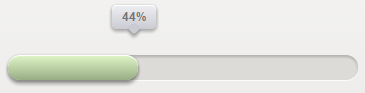
效果图:
CSS3进度条动画的更多相关文章
- 分享9款极具创意的HTML5/CSS3进度条动画
1.HTML5/CSS3图片加载进度条 可切换多主题 今天要分享的这款HTML5/CSS3进度条模拟了真实的图片加载场景,插件会默认去从服务器下载几张比较大的图片,然后让该进度条展现当前读取图片的进度 ...
- 9款极具创意的HTML5/CSS3进度条动画(免积分下载)
尊重原创,原文地址:http://www.cnblogs.com/html5tricks/p/3622918.html 免积分打包下载地址:http://download.csdn.net/detai ...
- 9款极具创意的HTML5/CSS3进度条动画
今天我们要分享9款极具创意的HTML5/CSS3进度条动画,这些进度条也许可以帮你增强用户交互和提高用户体验,喜欢的朋友就收藏了吧. 1.HTML5/CSS3图片加载进度条 可切换多主题 今天要分享的 ...
- JS框架_(JQuery.js)纯css3进度条动画
百度云盘 传送门 密码:wirc 进度条动画效果: <!DOCTYPE html> <html lang="zh"> <head> <me ...
- 【Web前沿技术】纯 CSS3 打造的10个精美加载进度条动画
之前向大家介绍8款优秀的 jQuery 加载动画和进度条插件,今天这篇文章向大家推荐10个纯 CSS3 代码实现精美加载进度条动画效果的方案.加载动画和进度条在网站和 Web 应用中的使用非常流行,特 ...
- 9个绚丽多彩的HTML5进度条动画赏析
进度条在网页应用中越来越广泛了,特别是现在的页面异步局部刷新时代,进度条可以让用户更好的等待操作结果.本文要分享9款绚丽多彩的HTML5进度条动画,有很多还是挺实用的,效果也非常不错. 1.CSS3发 ...
- 详解用CSS3制作圆形滚动进度条动画效果
主 题 今天手把手教大家用CSS3制作圆形滚动进度条动画,想不会都难!那么,到底是什么东东呢?先不急,之前我分享了一个css实现进度条效果的博客<CSS实现进度条和订单进度条>,但是呢, ...
- 纯CSS3实现圆形进度条动画
悄悄地,GIF 格式的进度条已经越来越少,CSS 进度条如雨后春笋般涌现.今天要介绍的这个 CSS3 进度条,效果和 Flyme OS 4 上的加载动画一样. 首先,来看下最终的效果: 它的 HTML ...
- 【常见】CSS3进度条Loading动画
现在,GIF 格式的进度条已经越来越少,CSS 进度条如雨后春笋般涌现.CSS3的崛起,更使得动态效果得以轻松实现,未来,必定是CSS3的天下,所以今天我就来分享一下几个常见的CSS3进度条Loadi ...
随机推荐
- 【Linux】CentOS6上安装Python3.7(config、make、make install)及“No module named '_ctypes'”/pip install时“ssl module in Python is not available.”的解决
1.下载安装包 https://www.python.org/ftp/python/ 该目录下选择所需要的版本进行下载.解压. wget https://www.python.org/ftp/pyth ...
- shell处理文件内容
1.head:输出前N行 2.tail:输出后N行 3.cat:查看文件所有内容 4.wc:统计文件内容相关信息(行数,字符数等) 5.
- GDKOI2016总结——被虐之旅
前言 一个被虐的旅程... 这次GDKOI的比赛虽然基本全上暴力,但是居然只有两道题得了分:30+30=60!我感觉整个人都不好了... day0 在去广州的路上,本来心情很好,但是坐在我斜后面的那位 ...
- 【leetcode】1122. Relative Sort Array
题目如下: Given two arrays arr1 and arr2, the elements of arr2 are distinct, and all elements in arr2 ar ...
- 【leetcode】1111. Maximum Nesting Depth of Two Valid Parentheses Strings
题目如下: A string is a valid parentheses string (denoted VPS) if and only if it consists of "(&quo ...
- 对拍程序 x
一.介绍 在做题或者正式比赛过程中总会把水题做水做乱,但因为样例有坑所以直接过了样例,然后拿去评测结果发现全WA.那如何在这种情况下检查自己程序或算法的正确性呢?对拍是一个简便省事的方案. 所谓“对拍 ...
- codevs 1160 蛇形矩阵x
题目描述 Description 小明玩一个数字游戏,取个n行n列数字矩阵(其中n为不超过100的奇数),数字的填补方法为:在矩阵中心从1开始以逆时针方向绕行,逐圈扩大,直到n行n列填满数字,请输出该 ...
- 【bzoj1975】[Sdoi2010]魔法猪学院
*题目描述: iPig在假期来到了传说中的魔法猪学院,开始为期两个月的魔法猪训练.经过了一周理论知识和一周基本魔法的学习之后,iPig对猪世界的世界本原有了很多的了解:众所周知,世界是由元素构成的:元 ...
- 【PowerOJ1744&网络流24题】方格取数问题(最小割)
题意: n,m<=30 思路: [问题分析] 二分图点权最大独立集,转化为最小割模型,从而用最大流解决. [建模方法] 首先把棋盘黑白染色,使相邻格子颜色不同,所有黑色格子看做二分图X集合中顶点 ...
- Finer Resolution Observation and Monitoring -Global Land Cover更精细的分辨率观测和监测-全球土地覆盖
http://data.ess.tsinghua.edu.cn/ 全球土地覆盖数据是了解人类活动与全球变化之间复杂互动的关键信息来源.FROM-GLC(全球土地覆盖的精细分辨率观测和监测)是首个使用陆 ...