
css 响应式(媒介查询)
1.CSS 来实现响应式
CSS实现响应式网站的布局要用到的就是CSS中的媒体查询接下来来简单介绍一下:
- @media 类型 and (条件1) and (条件二){css样式}
- <link rel="stylesheet" type="text/css" href="css/demo.css" media=“all and (max-width=980px)”/>
我们只需用到width衍生出的max-width这个属性,定义输出设备中的页面可见区域宽度来控制该改变的样式即可。
html代码如下:
<!doctype html>

<html>

<head>

    <meta charset="utf-8"/>

    <title>响应式</title>

    <link rel="stylesheet" type="text/css" href="demo01.css" media="screen and (min-width:1024px)"/>

    <link rel="stylesheet" type="text/css" href="demo03.css" media="screen and (max-width:1024px) and (min-width:450px)"/>

    <link rel="stylesheet" type="text/css" href="demo02.css" media="screen and (max-width:450px)"/>

</head>

<body>

    <div class="header">

        头部

    </div>

    <div class="container clearfix">

        <div class="left">左部</div>

        <div class="center">中部</div>

        <div class="right">右部</div>

    </div>

    <div class="footer">底部</div>

</body>

</html>
demo01.css样式如下:
body{

    margin:0;

    text-align:center;

}

.header{

    height:100px;

    background-color:red;

}

.container{

    height:400px;

    background-color:pink;

}

.clearfix:after{

    display:block;

    content:"";

    visibility:hidden;

    height:0;

    clear:both;

}

.footer{

    height:100px;

    background-color:blue;

}

.left{

    width:20%;

    background-color:orange;

    float:left;

    height:300px;

}

.center{

    width:55%;

    background-color:gray;

    float:left;

    height:300px;

    margin:0 2.5%;

}

.right{

    width:20%;

    background-color:yellow;

    float:left;

    height:300px;

}
demo02的样式如下:
body{

    margin:0;

    text-align:center;

}

.header{

    height:100px;

    background-color:red;

}

.container{

    height:400px;

    background-color:pink;

}

.clearfix:after{

    display:block;

    content:"";

    visibility:hidden;

    height:0;

    clear:both;

}

.footer{

    height:100px;

    background-color:blue;

}

.left{

    width:30%;

    background-color:orange;

    float:left;

    height:300px;

}

.center{

    width:70%;

    background-color:gray;

    float:left;

    height:300px;

}

.right{

    width:100%;

    background-color:yellow;

    height:300px;

}
demo03的样式:
body{

    margin:0;

    text-align:center;

}

.header{

    height:100px;

    background-color:red;

}

.container{

    background-color:pink;

}

.clearfix:after{

    display:block;

    content:"";

    visibility:hidden;

    height:0;

    clear:both;

}

.footer{

    height:100px;

    background-color:blue;

}

.left{

    width:100%;

    background-color:orange;

    height:300px;

}

.center{

    width:100%;

    background-color:gray;

    height:300px;

}

.right{

    width:100%;

    background-color:yellow;

    height:300px;

}
效果图:
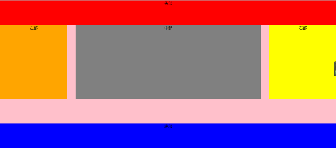
窗口大于1024px时显示的样子
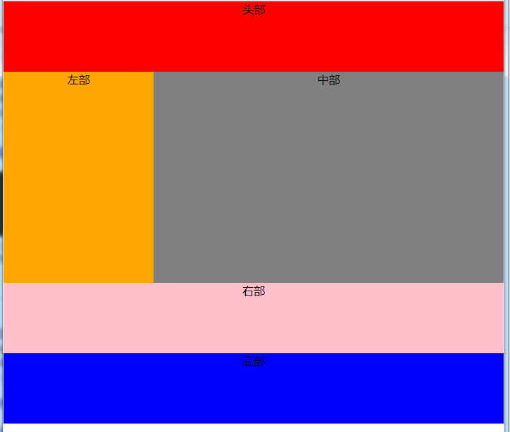
当大于640小于980时,右侧栏在底部
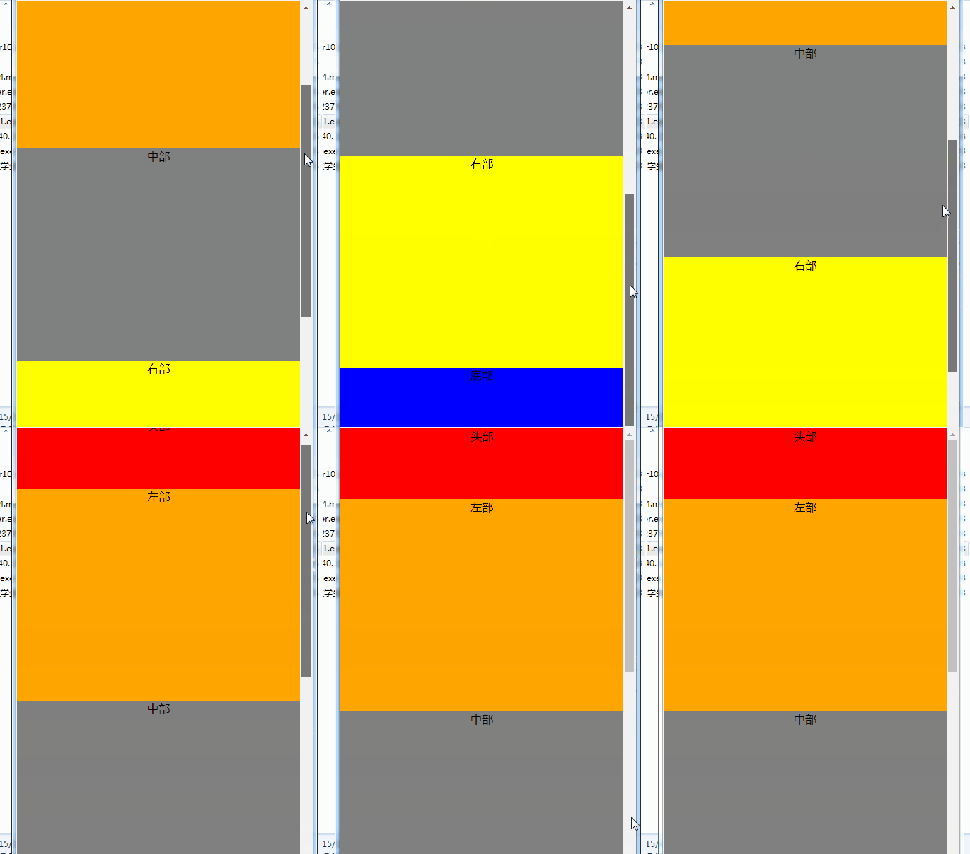
当小于480时,导航栏折叠,body三部分竖直排列显示,若窗口持续缩小,不在发生变化,区域被压缩
效果总图:
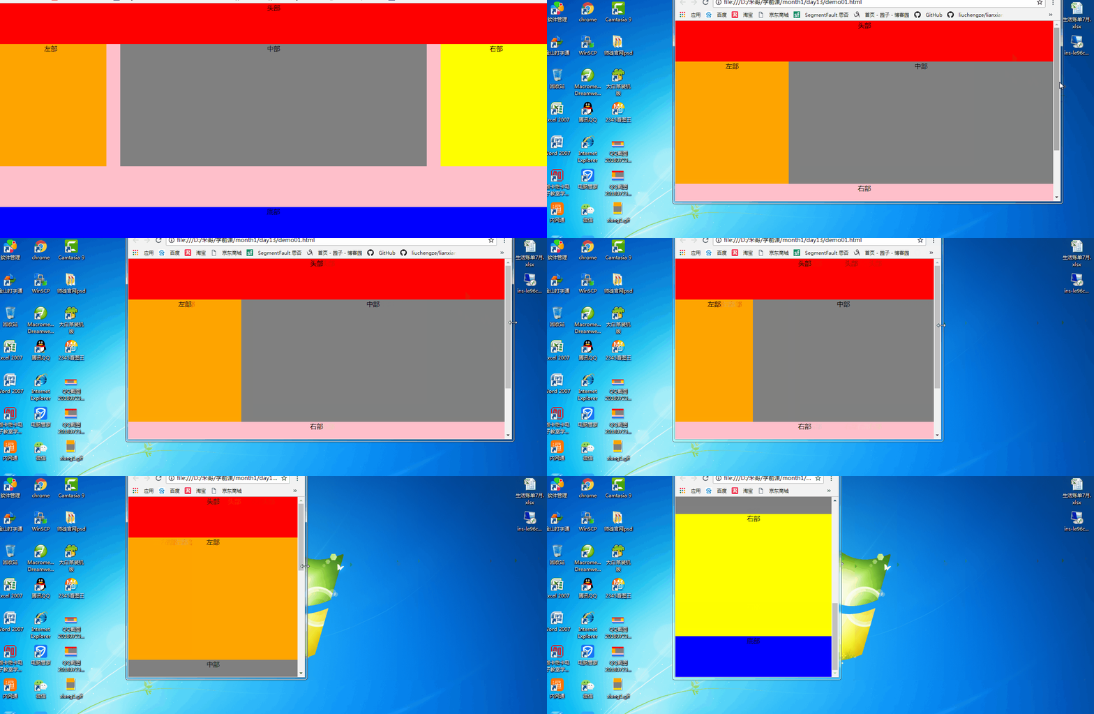
持续更新,欢迎大家!
css 响应式(媒介查询)的更多相关文章
- (原)css 响应式媒体查询 模板
@media only screen and (max-width:340px) { html,input{ font-size:80%; } } @media only screen and (ma ...
- CSS响应式布局到底是什么?
响应式布局是最近几年在前端开发中非常火热的词,它是相对于固定像素大小的网页而言的,那么CSS响应式布局到底是什么?顾名思义,响应式布局就是网页能够响应各种各样不同分辨率大小的设备,能够将网页很好的呈献 ...
- css - 响应式
css - 响应式 移动设备尺寸 移动设备的尺寸各不相同,大体上可以做如下划分: 768px以下的是手机屏幕 768px-991px是平板ipad屏幕 992px-1199是大平板屏幕 1200极其以 ...
- html响应式布局,css响应式布局,响应式布局入门
html响应式布局,css响应式布局,响应式布局入门 >>>>>>>>>>>>>>>>>>& ...
- Bulma CSS - 响应式
Bulma CSS框架教程 Bulma CSS – 简介 Bulma CSS – 开始 Bulma CSS – CSS类 Bulma CSS – 模块化 Bulma CSS – 响应式 Bulma是一 ...
- css响应式布局RWD
响应式布局结合了三大理念: 1)用于布局的弹性网络(百分比定义宽度) 2)用于图片和视频的弹性媒体 3)媒体查询 在布局中,需要注意的点有: 1)尽量用min-width/max-width,max- ...
- CSS 响应式设计
响应式设计是指在不同分辨率的设备中,网页布局可以自适应的调整.这种弹性化的布局使网站在不同设备中的布局都比较合理,可以为不同终端的用户提供更加舒适的界面和更好的用户体验,其根本理念是使原本 PC 上的 ...
- Bootstrap的介绍和响应式媒体查询
Bootstrap的介绍 凡是使用过Bootstrap的开发者,都不在乎做这么两件事情:复制and粘贴.哈哈~,是的使用Bootstrap非常简单,但是在复制粘贴之前,需要先对Bootstrap的用法 ...
- css响应式设计
响应式设计是指在不同分辨率的设备中,网页布局可以自适应的调整.这种弹性化的布局使网站在不同设备中的布局都比较合理,可以为不同终端的用户提供更加舒适的界面和更好的用户体验,其根本理念是使原本 PC 上的 ...
随机推荐
- 11年Macbook Air 安装win10 经验
11年macbook air安装win10折腾了好久,安装成功经验记录下. 1.使用BootCamp v6.0.6133 2.启动时U盘里面有两个引导Window和EFI,选择Windows启动.EF ...
- How to run a function when the page is loaded?
How to run a function when the page is loaded? window.onload = codeAddress; should work - here's a d ...
- React-Native 之 GD (十四)小时风云榜 及 当前时间操作 及 上一小时、下一小时功能实现
1.小时风云榜 GDHourList.js /** * 小时风云榜 */ import React, { Component } from 'react'; import { StyleSheet, ...
- CAS-4.2.7接入REST登录认证,移动端、C/S端登录解决方案
一.发送GET请求获取RSA公钥和JSESSIONID 请求地址:/cas/login,请求类型:GET curl -I http://cas.gfstack.geo:8080/cas/login 返 ...
- Linux文件系统启动过程及login的实现
1. busybox简介 busybox是一个集成了一百多个最常用linux命令和工具的软件,它将许多常用的LINUX命令和工具结合到了一个单独的可执行程序中.虽然与相应的GNU工具比较起来,busy ...
- 关闭Linux无用端口
关闭系统不必要的端口,增强系统安全,此处以关闭111端口为例进行说明. 1).查看本机正在监听的端口: [root@b ~]# netstat -tlnup Active Internet conne ...
- flex 垃圾回收
原文在这里:Garbage Collection with Flex and Adobe Air 我终于有时间来整理在flexcamp上演讲的东西并写篇博客了.就在flexcamp前一个月,我几乎天天 ...
- 阶段1 语言基础+高级_1-3-Java语言高级_08-JDK8新特性_第3节 两种获取Stream流的方式_11_练习:集合元素处理(Stream方式)
- 阶段1 语言基础+高级_1-3-Java语言高级_06-File类与IO流_05 IO字符流_5_flush方法和close方法的区别
flush之后,还可以继续使用流写文件
- day15生成器send方法,递归,匿名函数,max结合匿名工作原理,常用的内置函数
复习 ''' 1.带参装饰器 - 自定义 | wraps def wrap(info) def outer1(func): from functools import wraps @wraps(fun ...