css3响应式表格
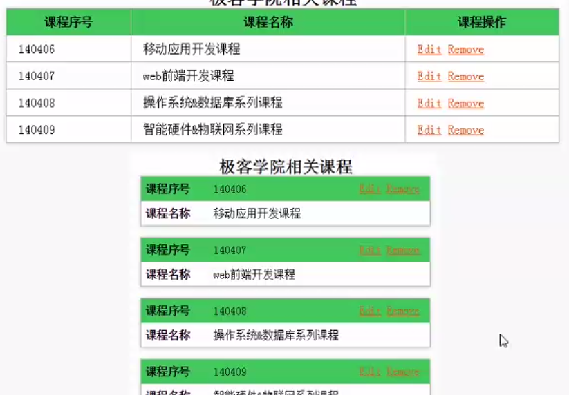
<h1>极客学院相关课程</h1>

<table class="responsive">

    <thead>

        <tr>

            <th>课程序号</th>

            <th>课程名称</th>

            <th>课程操作</th>

        </tr>

    </thead>

    <tbody>

        <tr>

            <td class="number">150406</td>

            <td class="name">移动应用开发课程</td>

            <td class="actions">

                <a href="#">修改</a><a href="del">删除</a>

            </td>

        </tr>

        <tr>

            <td class="number">150406</td>

            <td class="name">移动应用开发课程</td>

            <td class="actions">

                <a href="#">修改</a><a href="del">删除</a>

            </td>

        </tr>

        <tr>

            <td class="number">150406</td>

            <td class="name">移动应用开发课程</td>

            <td class="actions">

                <a href="#">修改</a><a href="del">删除</a>

            </td>

        </tr>

    </tbody>

</table>

h1{

font-size: 30px;

text-align: center;

color:#666666 ;

}

table.responsive{

width: 98%;

margin: 0 auto;

border: 1px solid #666666;

border-collapse:collapse;

box-shadow: 0 0 10px 0 rgba(0,0,0,5);

}

table.responsive th,table.responsive td{

border: 1px solid #666666;

padding: .5em 1em;

}

/*设置表头背景色*/

table.responsive th{

background-color: #35B558;

}

/*设置连接颜色*/

table.responsive .actions a{

color: #ff5c00;

text-decoration: none;

padding: 0 4px;

}

/*设置表格内容为居中对齐*/

table.responsive .number,table.responsive .actions{

text-align: center;

}

@media(max-width:480px){

table.responsive{

box-shadow: none;

border:none;

}

table.responsive thead{

display: none;

}

/*把所有的tr,td进行块状分布*/

 table.responsive tr,table.responsive td{

display: block;

border: none;

position: relative;

}

table.responsive tr{

margin-bottom: 1em;

box-shadow: 0 1px 10px 0 rgba(0,0,0,.2);

}

table.responsive .number{

text-align: left;

padding-left: 28%;

background-color: #35B558;

}

table.responsive .number::before{

content: "课程序号";

position: absolute;

left: .5em;

top:.5em;

font-weight: bold;

}

table.responsive .name{

text-align: left;

padding-left: 28%;

}

table.responsive .name::before{

content: "课程名称";

position: absolute;

left: .5em;

top:.5em;

font-weight: bold;

}

table.responsive .actions{

text-align: left;

padding-left: 28%;

}

table.responsive .actions::before{

content: "课程操作";

position: absolute;

left: .5em;

top:.5em;

font-weight: bold;

}

}
css3响应式表格的更多相关文章
- Bootstrap 响应式表格
响应式表格 通过把任意的 .table 包在 .table-responsive class 内,您可以让表格水平滚动以适应小型设备(小于 768px).当在大于 768px 宽的大型设备上查看时,您 ...
- 15款免费的 HTML5/CSS3 响应式网页模板
如果你想快速制作出一个优秀的网站,网站模板一定是必不可少的.网页设计师和开发人员也可以从网站模板入手,学习先进的布局方式和编码风格.下面这个列表为大家挑选了15款免费的 HTML5/CSS3 响应式网 ...
- RWD Table Patterns – 响应式表格解决方案
在显示复杂的表格数据的时候,相信 Web 开发人员都碰到过显示不下的情况.RWD Table Patterns 是一个很好的响应式表格解决方案.它采用移动优先以及渐进增强的设计理念,在不支持响应式的浏 ...
- [转]响应式表格jQuery插件 – Responsive tables
本文转自:http://www.shejidaren.com/responsive-tables-for-bootstrap-3.html 这个Responsive tables jQuery插件依赖 ...
- FooTable高级的响应式表格jQuery插件
FooTable是一个高级jQuery插件,允许开发者在触屏智能手机及平板电脑等小型设备上制作数据非常惊人的HTML表格.它可以将HTML表转换成可扩展的响应式表格,且通过单击某一行即可将该行数据隐藏 ...
- html5/css3响应式布局介绍及设计流程
html5/css3响应式布局介绍 html5/css3响应式布局介绍及设计流程,利用css3的media query媒体查询功能.移动终端一般都是对css3支持比较好的高级浏览器不需要考虑响应式布局 ...
- Bootstrap3 表格-响应式表格
将任何 .table 元素包裹在 .table-responsive 元素内,即可创建响应式表格,其会在小屏幕设备上(小于768px)水平滚动.当屏幕大于 768px 宽度时,水平滚动条消失. Fir ...
- html5/css3响应式页面开发总结
一,自适应和响应式的区别 自适应是一套模板适应所有终端,但每种设备上看到的版式是一样的,俗称宽度自适应. 响应式一套模板适应所有终端,但每种设备看到的版式可以是不一样的. 虽然响应式/自适应网页设计会 ...
- amaze ui响应式表格
amaze ui响应式表格 这里的div外嵌设置格式倒是不错的选择
随机推荐
- 理解I/O Completion Port(完成端口)
欢迎阅读此篇IOCP教程.我将先给出IOCP的定义然后给出它的实现方法,最后剖析一个Echo程序来为您拨开IOCP的谜云,除去你心中对IOCP的烦恼.OK,但我不能保证你明白IOCP的一切,但我会尽我 ...
- Eclipse设置:背景与字体大小、xml文件中字体大小调整和自动提示 SVN插件安装
Eclipse中代码编辑背景颜色修改: 代码编辑界面默认颜色为白色.对于长期使用电脑编程的人来说,白色很刺激我们的眼睛,所以改变workspace的背景色,可以使眼睛舒服一些.设置方法如下: 1.打开 ...
- 选中DataGrid的Cell而不是row
主要是针对DataGridCellsPresenter而不是SelectiveScrollingGrid,使用时DataGridRow应用这个style就可以了. <Style x:Key=&q ...
- Ubuntu Java环境变量配置
# java homeJAVA_HOME=/usr/local/jdk/jdk1.8.0_121JRE_HOME=JAVA_HOME/jreCLASSPATH=.:$JAVA_HOME/lib:$JR ...
- AngularJs(Part 3)--注册服务
有以下5中方法注册一个AngularJS可以识别的Service value和constant是两个极其简单的方法,只有少数情况下会使用. service已经开始复杂了起来.而factory是我认为既 ...
- Hibernate的auto-import属性详解
auto-import是什么意思呢? 我们经常会写这样一个HQL语句: from User u where u.name='罗灿锋'; 绝大多数时候,这样写是不会发生问题的. hibernate在处理 ...
- JNI初识
JNI:Java Native Interface 的简写,是Java语言提供的一种通用接口,用于Java代码与本地化代码的交互. 所谓本地化代码是指直接编译成的与计算机相关的二进制代码,而非Java ...
- RPC原理与实践(二)----Thrift分层模型
这一节我们从一下几个方面来讲一下Thrift的分层架构,按照官方的定义这是Thrift的网络栈,其中网络栈中分为一下几个部分,(由栈顶到栈底)server,processor,protocol,tra ...
- HDU 3410【单调栈】
思路: 单调栈. 鄙人的记忆:按当前为最大值的两边延伸就是维护单调递减栈. //#include <bits/stdc++.h> #include <iostream> #in ...
- 多媒体文件嵌入HTML中自动转码工具
神器网址:https://iframely.com/embed 首先上传视频文件到服务器,视频管理网址平台 比如: https://wistia.com/ 然后进入到 iframely 网址.复制 ...