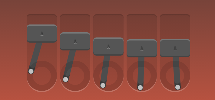
css3动画、边框、投影知识
<!doctype html>

<html lang="en">

<head>

    <meta charset="UTF-8">

    <title>Robot</title>

    <link rel="stylesheet" href="style.css">

</head>

<body>

    <div id="robot">

        <div class="piston"><!--外框-->

            <div class="block"><!--字母框-->

                A

                <div class="arm"></div><!--摆杆-->

            </div>

            <div class="rotator"><!--低圈-->

            </div>

        </div>

        <div class="piston"><!--外框-->

            <div class="block"><!--字母框-->

                A

                <div class="arm"></div><!--摆杆-->

            </div>

            <div class="rotator"><!--低圈-->

            </div>

        </div>

        <div class="piston"><!--外框-->

            <div class="block"><!--字母框-->

                A

                <div class="arm"></div><!--摆杆-->

            </div>

            <div class="rotator"><!--低圈-->

            </div>

        </div>

        <div class="piston"><!--外框-->

            <div class="block"><!--字母框-->

                A

                <div class="arm"></div><!--摆杆-->

            </div>

            <div class="rotator"><!--低圈-->

            </div>

        </div>

        <div class="piston"><!--外框-->

            <div class="block"><!--字母框-->

                A

                <div class="arm"></div><!--摆杆-->

            </div>

            <div class="rotator"><!--低圈-->

            </div>

        </div>

    </div>

</body>

</html>
css
/*定义动画*/

/*上下摆动*/

@-webkit-keyframes topbottom{

    0% { margin-top:; }

    50% { margin-top: 80px; }

    100% { margin-top:; }

}

@keyframes topbottom{

    0% { margin-top:; }

    50% { margin-top: 80px; }

    100% { margin-top:; }

}

/*左右摇摆*/

@-webkit-keyframes rightleft {

    0% { -webkit-transform: rotate(0); }

    25% { -webkit-transform: rotate(-18deg); }

    50% { -webkit-transform: rotate(0); }

    75% { -webkit-transform: rotate(18deg); }

    100% { -webkit-transform: rotate(0); }

}

@keyframes rightleft {

    0% { -webkit-transform: rotate(0); }

    25% { -webkit-transform: rotate(-18deg); }

    50% { -webkit-transform: rotate(0); }

    75% { -webkit-transform: rotate(18deg); }

    100% { -webkit-transform: rotate(0); }

}

*{

    margin:;

    padding:;

    list-style: none;

}

img{

    border:none;

}

body{

    text-align: center;

    margin: 60px 0 0;

    background:linear-gradient(to bottom, #333, tomato);

    /*渐变 上到下*/

}

html{

    height: 100%;

}

#robot{

    position: absolute;

    width: 540px;

    height: 250px;

    margin: auto;

    left:;

    top:;

    bottom:;

    right:;

    color: #444;

    font-weight:;

    text-shadow:0 -1px 1px rgba(0,0,0,0.7),0 1px 1px rgba(255,255,255,0.4);

    /*投影*/

    font-family: 'Oswald', sans-serif;

}

.piston{

    float: left;

    margin-right: 10px;

    position: relative;

    width: 100px;

    height: 250px;

    background: rgba(0,0,0,0.1);

    border-radius: 10px 10px 50px 50px;

    box-shadow: 0 -4px 0 rgba(0,0,0,0.2), 0 4px 0 rgba(255,255,255,0.2);

}

.piston:last-child{

    margin:;

}

.block{

    position: relative;

    width: 100px;

    height: 60px;

    line-height: 60px;

    background: #555;

    border-radius: 10px;

    animation:topbottom 1.2s cubic-bezier(0.5,0,0.5,1) infinite;

    /*cubic-bezier动画方式(曲线)*/

    -webkit-animation:topbottom 1.2s cubic-bezier(0.5,0,0.5,1) infinite;

    box-shadow: inset 0 -4px 0 rgba(0,0,0,0.2), inset 0 4px 0 rgba(255,255,255,0.2)

}

.piston:nth-child(1) .block { -webkit-animation-delay: 0s; animation-delay: 0s; }

.piston:nth-child(2) .block { -webkit-animation-delay: .1s; animation-delay: .1s; }

.piston:nth-child(3) .block { -webkit-animation-delay: .2s; animation-delay: .2s; }

.piston:nth-child(4) .block { -webkit-animation-delay: .3s; animation-delay: .3s; }

.piston:nth-child(5) .block { -webkit-animation-delay: .4s; animation-delay: .4s; }

.arm{

    position: absolute;

    top:50%; left:50%;

    margin: -10px 0 0 -10px;

    width: 20px;

    height: 150px;

    background: #555;

    border-radius: 10px;

    box-shadow: inset 0 -22px 0 rgba(0,0,0,.2);

    z-index: -110;

    -webkit-transform-origin: center 10px;

    -webkit-animation: arm 1.2s linear infinite;

    -webkit-animation-delay: inherit;

    transform-origin: center 10px;

    animation: rightleft 1.2s linear infinite;

    animation-delay: inherit;

}

.arm:before,.arm:after{

    content:"";

    position: absolute;

    left:;

    right:;

    height: 16px;

    width: 16px;

    border-radius: 50%;

    margin: 2px;

    background:#eee;

}

.arm:before{

    top:;

}

.arm:after{

    bottom:;

}

.rotator{

    position: absolute;

    bottom:;

    width: 100px;

    height: 100px;

    border:20px solid rgba(0,0,0,0.1);

    box-sizing:border-box;

    z-index: -110;

    border-radius: 50%;

}
css3动画、边框、投影知识的更多相关文章
- 鼠标悬停显示CSS3动画边框
效果体验:http://keleyi.com/keleyi/phtml/css3/14.htm 以下是代码: <!DOCTYPE html> <html xmlns="ht ...
- css3动画--超级基础知识
这么乱的笔记....供自己阅读!
- CSS3动画详解(结合实例)
一.使用CSS3动画代替JS动画 JS动画频繁操作DOM导致效率非常低 在频繁的操作DOM和CSS时,浏览器会不停的执行重排(reflow)和重绘(repaint) 可以避免占用JS主线程 这边就不细 ...
- 6种炫酷的CSS3按钮边框动画特效
6种炫酷的CSS3按钮边框动画特效Button border animate 用鼠标滑过下面的按钮看看效果! Draw Draw Meet Center Spin Spin Circle Spin T ...
- CSS3动画:流彩文字效果+图片模糊效果+边框伸展效果实现
前言 首先第一步,先布局html代码如下: <div class="wrap"> <img src="images/1.jpg" class= ...
- CSS3动画基本的转换和过渡
理论知识不扎实,在一定程度上能体现你解决问题的能力.今天我们拿CSS3动画来说,简单回忆下他的一些基本属性,这些我们在平常应用中会经常用到. 常用动画属性: transform:translate(x ...
- CSS3动画那么强,requestAnimationFrame还有毛线用?
一.哟,requestAnimationFrame, 新同学,先自我介绍下 Hello, 大家好,我就是风姿卓越,万种迷人的requestAnimationFrame,呵呵呵呵.很高兴和大家见面,请多 ...
- CSS3动画那么强,requestAnimationFrame还有毛线用--摘抄
CSS3动画那么强,requestAnimationFrame还有毛线用? 这篇文章发布于 2013年09月30日,星期一,19:12,归类于 web综合. 阅读 197124 次, 今日 84 次 ...
- JavaScript - 基于CSS3动画的实现
在痛苦的IE8时代,所有的动画都只能基于自己计算相关动画属性,开定时器setTimeout/setInterval轮询动画任务. 而肩负重任的HTML5,早已注意到了日益增强的动画,随着HTML5的降 ...
- css3动画简介以及动画库animate.css的使用
在这个年代,你要是不懂一点点css3的知识,你都不好意思说你是个美工.美你妹啊,请叫我前端工程师好不好.呃..好吧,攻城尸...呵呵,作为一个攻城尸,没有点高端大气上档次的东西怎么能行呢,那么css3 ...
随机推荐
- thinkphp 3.2.3 - Route.class.php 解析(路由匹配)
class Route { public static function check(){ $depr = C('URL_PATHINFO_DEPR'); // '/' $regx = preg_re ...
- springMVC中接收数组参数
方式一. 后台:public ResultBean queryItemRulesByItemIds(int userId, int[] itemIds) 方式二.
- Java集合---List、Set、Iterator、Map简介
1.List集合 1.1概念 List继承自Collection接口.List是一种有序集合,List中的元素可以根据索引(顺序号:元素在集合中处于的位置信息)进行取得/删除/插入操作. 跟Set集合 ...
- git上传自己的代码
感谢这个哥们的博客,不过里面有些错误. http://www.cnblogs.com/ruofengzhishang/p/3842587.html 下面是我自己的实践成功的: 这篇文章写得是windo ...
- vs code 快捷键总结
返回上个光标:alt + ←列编辑模式:shift + alt + 鼠标左键
- 设计模式之第10章-桥接模式(Java实现)
设计模式之第10章-桥接模式(Java实现) “一入软件深似海,从此早睡是路人.黑夜给了我黑色的眼睛,我却用他去寻找八阿哥.”“怎么了,又来那么多的感慨啊.”“还能有什么啊,老板是说让换个APP做,这 ...
- 15、响应式布局和BootStrap 全局CSS样式知识点总结-part2
1.表格 <div class="container"> <table class="table "> <thead> &l ...
- Python 3.6 性能测试框架Locust安装及使用
背景 Python3.6 性能测试框架Locust的搭建与使用 基础 python版本:python3.6 开发工具:pycharm Locust的安装与配置 点击“File”→“setting” 点 ...
- dotfiles项目
1.dotfile介绍 在linux中的各种软件配置文件大多是以.开头,以rc结尾,在第一次使用某一个软件比如vim的时候,通常会花大量时间配置,将所有的配置文件放到同一个目录下,方便在多台机器上同步 ...
- Jmeter随笔一
资料分享:http://www.cnblogs.com/yangxia-test/p/3964881.html