uniapp 自定义弹窗组件
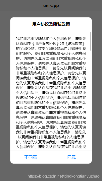
先上效果:
组件源码:slot-modal.vue
<template>

	<view class="modal-container" v-if="show" @click.stop="cancel(2)">

		<view class="modal-content">

			<view class="modal-head modal-title-padding">

				<slot name="modal-head"></slot>

			</view>

			<view class="modal-body">

				<slot name="modal-body"></slot>

			</view>

			<view class="modal-footer">

				<view class="modal-col" hover-class="modal-hover" v-if="cancelText" @click.stop="cancel('cancel')">

					<text :style="cancelStyle" class="modal-row-text">{{cancelText}}</text>

				</view>

				<view :style="confirmStyle" class="modal-col modal-confirm" hover-class="modal-hover" @click.stop="confirm">

					<text :style="confirmStyle" class="modal-row-text">{{confirmText}}</text>

				</view>

			</view>

		</view>

	</view>

</template>

<script>

	export default {

		name: 'modal',

		props: {

			//默认是否显示

			show: {

				type: Boolean,

				default: true

			},

			//取消按钮文字

			cancelText: {

				type: String,

				default: ''

			},

			//取消样式

			cancelStyle: {

				type: [String, Object]

			},

			//确定按钮文字

			confirmText: {

				type: String,

				default: '确定'

			},

			//确定样式

			confirmStyle: {

				type: [String, Object]

			},

			//阻止点击对话框外侧锁屏

			disableScreenClick: {

				type: Boolean,

				default: false

			}

		},

		methods: {

			confirm() {

				this.$emit('confirm')

			},

			cancel(type) {

				if (!this.disableScreenClick || type === 'cancel') {

					this.$emit('cancel')

				}

			}

		}

	}

</script>

<style lang="scss" scoped>

	$fontSizeLg:17px;

	$fontSizeSm:15px;

	.modal-container {

		position: fixed;

		top: 0;

		left: 0;

		right: 0;

		bottom: 0;

		z-index: 999;

		background-color: rgba(0, 0, 0, .6);

		transition: all 5s;

		display: flex;

		align-items: center;

		justify-content: center;

		.modal-content {

			width: 80%;

			border-radius: 26rpx;

			background: #FFFFFF;

			overflow: hidden;

			animation: fadeZoom .15s linear;

			.modal-head {

				padding: 30rpx 30rpx 0;

				text-align: center;

				color: #000;

				font-size: $fontSizeLg;

				font-weight: 700;

			}

			.modal-title-padding {

				padding-bottom: 30rpx;

			}

			.modal-body {

				overflow:auto;

				padding: 40rpx 30rpx;

				font-size: $fontSizeSm;

				color: #000;

				text-align: center;

			}

			.modal-footer {

				display: flex;

				position: relative;

				text-align: center;

				font-size: $fontSizeLg;

				line-height: 100rpx;

				color: #007AFF;

				border-top: 0.5px solid rgba(9, 20, 31, 0.13);

				.modal-col {

					flex: 1;

					width: 100%;

					position: relative;

				}

				.modal-col:first-child::after {

					content: '';

					position: absolute;

					top: 0;

					bottom: 0;

					right: 0;

					border-right: 1px solid rgba(9, 20, 31, 0.13);

					transform: scaleX(.36);

				}

				.modal-confirm {

					color: rgb(0, 122, 255);

				}

				.modal-hover {

					background-color: #f2f2f2;

				}

			}

			.modal-footer::after {

				content: '';

				position: absolute;

				left: 0;

				right: 0;

				top: 0;

				border-top: 0.5px solid rgba(9, 20, 31, 0.13);

				transform: scaleY(.36);

			}

		}

		@keyframes fadeZoom {

			0% {

				transform: scale(.7);

				opacity: .6;

			}

			80% {

				transform: scale(1.2);

				opacity: .3;

			}

			100% {

				transform: scale(1);

				opacity: 1;

			}

		}

	}

</style>
使用示例:
<template>

	<view class="content">

		<image class="logo" src="/static/logo.png"></image>

		<view class="text-area">

			<text class="title">{{title}}</text>

		</view>

		<view><button type="default" @click="privacyDialogShow=true">用户协议</button></view>

		<slot-modal

			class="modal-privacy"

			:show="privacyDialogShow"

			:disableScreenClick="true"

			confirmText="同意"

			cancelText="不同意"

			@cancel="cancelPrivacy"

			@confirm="confirmPrivacy">

			<template slot="modal-head">

				<text>用户协议及隐私政策</text>

			</template>

			<template slot="modal-body">

				<view class="index-content">

					<text>

						我们非常重视隐私和个人信息保护,请您先认真阅读

						<text class="privacyPolicy" @click.stop="goPage('agreement')">《用户服务协议》</text>和

						<text class="privacyPolicy" @click.stop="goPage('privacy')">《隐私政策》</text>的全部条款,接受全部条款后再开始使用我们的服务。

						<text v-for="item in 40">我们非常重视隐私和个人信息保护,请您先认真阅读我们非常重视隐私和个人信息保护,请您先认真阅读我们非常重视隐私和个人信息保护,请您先认真阅读</text>

					</text>

				</view>

			</template>

		</slot-modal>

	</view>

</template>

<script>

	export default {

		data() {

			return {

				title: 'Hello',

				privacyDialogShow:false

			}

		},

		onLoad() {

		},

		methods: {

			goPage(pageUrl){

				console.log(pageUrl)

				uni.navigateTo({

					url:'../agreement/agreement'

				})

			},

			confirmPrivacy(){

				console.log('同意了用户协议')

				console.log(this.privacyDialogShow)

				this.privacyDialogShow = false

				console.log(this.privacyDialogShow)

			},

			cancelPrivacy(){

				console.log('拒绝了用户协议')

				this.privacyDialogShow=false

			}

		}

	}

</script>

<style>

	.content {

		display: flex;

		flex-direction: column;

		align-items: center;

		justify-content: center;

	}

	.logo {

		height: 200rpx;

		width: 200rpx;

		margin-top: 200rpx;

		margin-left: auto;

		margin-right: auto;

		margin-bottom: 50rpx;

	}

	.text-area {

		display: flex;

		justify-content: center;

	}

	.title {

		font-size: 36rpx;

		color: #8f8f94;

	}

	.index-content{

		max-height: 800rpx;

	}

</style>
通过这次学习,遗留了一个问题还未解决:如何限制modal-body的高度为80%,尝试了多种方法无效,只能写固定高度了。
练习了
- (1). 组件自定义事件
- (2). 对话框的css布局
uniapp 自定义弹窗组件的更多相关文章
- 基于JQ的自定义弹窗组件
<!DOCTYPE html> <html lang="en"> <head> <meta charset="UTF-8&quo ...
- 微信小程序 - 自定义弹窗组件
2019-01-06:简化了一些代码,以及增加了可用性. // 弹窗配置 dialogConfig: { // 弹窗 dialogvisible: false, options: { // 显示关闭按 ...
- uni-app自定义Modal弹窗组件|仿ios、微信弹窗效果
介绍 uniapp自定义弹窗组件uniPop,基于uni-app开发的自定义模态弹窗|msg信息框|alert对话框|confirm确认框|toast弱提示框 支持多种动画效果.多弹窗类型ios/an ...
- 百度智能小程序弹窗组件wcPop|智能小程序自定义model弹窗模板
百度智能小程序自定义弹窗组件wcPop|百度小程序model对话框|智能小程序弹窗界面模板 最近百度也推出了自己的智能小程序,如是就赶紧去试了下,官方提供的api还不是狠完整.而且官方提供的弹窗组件也 ...
- 基于React.js网页版弹窗|react pc端自定义对话框组件RLayer
基于React.js实现PC桌面端自定义弹窗组件RLayer. 前几天有分享一个Vue网页版弹框组件,今天分享一个最新开发的React PC桌面端自定义对话框组件. RLayer 一款基于react. ...
- vue3系列:vue3.0自定义全局弹层V3Layer|vue3.x pc桌面端弹窗组件
基于Vue3.0开发PC桌面端自定义对话框组件V3Layer. 前两天有分享一个vue3.0移动端弹出层组件,今天分享的是最新开发的vue3.0版pc端弹窗组件. V3Layer 一款使用vue3.0 ...
- svelte组件:Svelte自定义弹窗Popup组件|svelte移动端弹框组件
基于Svelte3.x自定义多功能svPopup弹出框组件(组件式+函数式) 前几天有分享一个svelte自定义tabbar+navbar组件,今天继续带来svelte自定义弹窗组件. svPopup ...
- 支付宝小程序自定义弹窗插件|支付宝dialog插件|model插件
支付宝小程序自定义弹窗组件wcPop|小程序自定义对话框|actionSheet弹窗模板 支付宝小程序官方提供的alert提示框.dialog对话框.model弹窗功能比较有限,有些都不能随意自定义修 ...
- js实现自定义弹窗
众所周知,浏览器自带的原生弹窗很不美观,而且功能比较单一,绝大部分时候我们都会按照设计图自定义弹窗或者直接使用注入layer的弹窗等等.前段时间在慕课网上看到了一个自定义弹窗的实现,自己顺便就学习尝试 ...
随机推荐
- 虚函数表-C++多态的实现原理
目录 1.说明 2.虚函数表 3.代码示例 参考:http://c.biancheng.net/view/267.html 1.说明 我们都知道多态指的是父类的指针在运行中指向子类,那么它的实现原理是 ...
- Spring Boot 整合 Freemarker
Spring Boot 整合 Freemarker 1.Freemarker 简介 2.Spring Boot 整合 Freemarker 2.1 创建工程 2.2 创建类 2.3 其他配置 原文地址 ...
- (8)Linux文件目录结构一览表
1.使用 Linux 时,通过命令行输入 ls -l / 可以看到,在 Linux 根目录(/)下包含很多的子目录(称为一级目录),例如 bin.boot.dev 等.同时,各一级目录下还含有很多子目 ...
- jqXHR.fail()回调方法及其参数详细说明
jqXHR.fail()是一个可供选择的 error 回调选项的构造函数,.fail()方法取代了的过时的.error()方法.从 jQuery 1.5 开始,$.ajax()返回的jqXHR对象 实 ...
- 解决GraphViz's executables not found
用python做决策树可视化时,出现了下面的错误: 于是安装Graphviz,并将其添加到path的环境变量. Graphviz下载 提取码:fmst 但是已经安装了pydotplus且import之 ...
- 整理我的Git常见问题和命令
整理我的Git常见问题和命令 目录 整理我的Git常见问题和命令 提交注释规范 合并分支 clone & 切换分支 支持中文路径显示 账户及密码 基于远程分支创建本地分支 提交注释规范 举例: ...
- HDU 6762 Mow (2020 Multi-University Training Contest 1 1012) 半平面交
Mow 题目链接 分析 将多边形的边向内部缩 r 个单位长度,然后这些边所围成的内部区域,就是圆心的合法范围,该范围也是一个多边形,假设面积是\(a\),周长是\(b\),那么可以知道圆可以覆盖的面积 ...
- BZOJ-1086 [SCOI2005]王室联邦 (树分块)
递归处理子树,把当前结点当作栈底,然后递归,回溯回来之后如果栈中结点数量到达某一个标准时,弹出栈中所有的元素分到一个块中,最后递归结束了如果栈中还有元素,那么剩下的这些元素放在新的块中 题目:BZOJ ...
- 2019 Multi-University Training Contest 4.Divide the Stones(贪心)
题意:给你n和k (k|n) 有n个数 第i个数权值为i 要你求权值相同且分成k组 且每组的个数为n/k 思路:恶心构造题,首先对于总权值不能分为k份的 显然不能分成 然后 我们把n/k 分奇偶 我们 ...
- Grakn Forces 2020
比赛链接:https://codeforces.com/contest/1408 A. Circle Coloring 题意 给出三个长为 $n$ 的序列 $a,b,c$,对于每个 $i$,$a_i ...