[WPF 自定义控件]在MenuItem上使用RadioButton
1. 需求
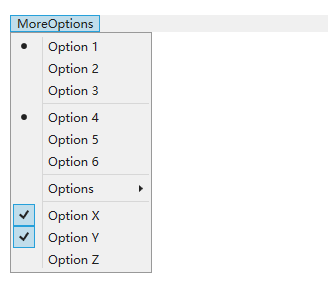
上图这种包含多选(CheckBox)和单选(RadioButton)的菜单十分常见,可是在WPF中只提供了多选的MenuItem。顺便一提,要使MenuItem可以多选,只需要将MenuItem的IsCheckable属性设置为True:
<MenuItem IsCheckable="True"/>
不知出于何种考虑,WPF没有为MenuItem提供单选的功能。为了在MenuItem中添加RadioButton,可以尝试修改样式并在CodeBehind找那个处理MenuItem的Click事件,但这种事做多了还是做成一个自定义控件比较方便。这篇文章将介绍如何自定义一个RadioButtonMenuItem控件实现MenuItem的单选功能。
2. 实现代码
RadioButtonMenuItem的代码比较简单(换言之,样式部分比较难),首先继承自MenuItem,然后模仿RadioButton添加一个GroupName属性:
public class RadioButtonMenuItem : MenuItem

{

    /// <summary>

    /// 标识 GroupName 依赖属性。

    /// </summary>

    public static readonly DependencyProperty GroupNameProperty =

        DependencyProperty.Register(nameof(GroupName), typeof(string), typeof(RadioButtonMenuItem), new PropertyMetadata(default(string)));

    static RadioButtonMenuItem()

    {

        DefaultStyleKeyProperty.OverrideMetadata(typeof(RadioButtonMenuItem), new FrameworkPropertyMetadata(typeof(RadioButtonMenuItem)));

    }

    /// <summary>

    /// 获取或设置GroupName的值

    /// </summary>

    public string GroupName

    {

        get { return (string)GetValue(GroupNameProperty); }

        set { SetValue(GroupNameProperty, value); }

    }
RadioButtonMenuItem的分组规则很简单,只要同一个MenuItem下的RadioButtonMenuItem为一组,然后再根据GroupName分组。因为我很少会更改GroupName,所以就难得监视GroupName的改变了。
因为MenuItem派生自ItemsControl,所以需要重写GetContainerForItemOverride以确定它的Items也是用RadioButtonMenuItem作为默认的ItemContainer:
protected override DependencyObject GetContainerForItemOverride()

{

    return new RadioButtonMenuItem();

}
然后重写OnClick,让RadioButtonMenuItem每次点击都被选中,这个行为和RadioButton一致:
protected override void OnClick()

{

    base.OnClick();

    IsChecked = true;

}
最后重写OnClick函数,在这个函数里面找出在同一个MenuItem下且GroupName一样的RadioButtonMenuItem,将他们的IsChecked 全部设置为False,这样就实现了MenuItem的单选功能:
protected override void OnChecked(RoutedEventArgs e)

{

    base.OnChecked(e);

    if (this.Parent is MenuItem parent)

    {

        foreach (var menuItem in parent.Items.OfType<RadioButtonMenuItem>())

        {

            if (menuItem != this && menuItem.GroupName == GroupName && (menuItem.DataContext == parent.DataContext || menuItem.DataContext != DataContext))

            {

                menuItem.IsChecked = false;

            }

        }

    }

}
3. 实现样式
MenuItem有一个Role属性,它的类型为MenuItemRole,定义如下:
//

// 摘要:

//     Defines the different roles that a System.Windows.Controls.MenuItem can have.

public enum MenuItemRole

{

    //

    // 摘要:

    //     Top-level menu item that can invoke commands.

    TopLevelItem = 0,

    //

    // 摘要:

    //     Header for top-level menus.

    TopLevelHeader = 1,

    //

    // 摘要:

    //     Menu item in a submenu that can invoke commands.

    SubmenuItem = 2,

    //

    // 摘要:

    //     Header for a submenu.

    SubmenuHeader = 3

}
根据MenuItem所处的位置,它的Role会有不同的值,大致上如下面例子所示:
<Menu x:Name="Men">

    <MenuItem Header="TopLevelItem" />

    <MenuItem Header="TopLevelHeader">

        <MenuItem Header="SubMenuHeader">

            <MenuItem Header="SubMenuItem" />

        </MenuItem>

        <MenuItem Header="SubMenuItem" />

    </MenuItem>

</Menu>
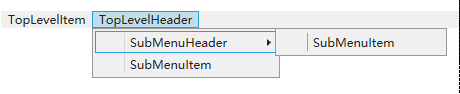
MenuItem的样式麻烦之处就在这里。因为微软并没有在文档中提供Aero2的样式,所以在以前要获取一个控件的样式标准的做法是使用Blend选中控件后编辑控件的模板,但因为MenuItem会有不同的Role,所以它当前的模板会不一样,用Blend很难获取到它的全部的模板。大致上它的样式定义如下:
<ControlTemplate x:Key="{ComponentResourceKey TypeInTargetAssembly={x:Type MenuItem}, ResourceId=TopLevelItemTemplateKey}"

                 TargetType="{x:Type MenuItem}">

</ControlTemplate>

<ControlTemplate x:Key="{ComponentResourceKey TypeInTargetAssembly={x:Type MenuItem}, ResourceId=TopLevelHeaderTemplateKey}"

                 TargetType="{x:Type MenuItem}">

</ControlTemplate>

<ControlTemplate x:Key="{ComponentResourceKey TypeInTargetAssembly={x:Type MenuItem}, ResourceId=SubmenuItemTemplateKey}"

                 TargetType="{x:Type MenuItem}">

</ControlTemplate>

<ControlTemplate x:Key="{ComponentResourceKey TypeInTargetAssembly={x:Type MenuItem}, ResourceId=SubmenuHeaderTemplateKey}"

                 TargetType="{x:Type MenuItem}">

</ControlTemplate>

<Style x:Key="{x:Type local:RadioButtonMenuItem}"

       TargetType="{x:Type local:RadioButtonMenuItem}">

    <Setter Property="Control.Template"

            Value="{StaticResource {ComponentResourceKey TypeInTargetAssembly={x:Type MenuItem}, ResourceId=SubmenuItemTemplateKey}}" />

    <Style.Triggers>

        <Trigger Property="MenuItem.Role"

                 Value="TopLevelHeader">

            <Setter Property="Control.Template"

                    Value="{StaticResource {ComponentResourceKey TypeInTargetAssembly={x:Type MenuItem}, ResourceId=TopLevelHeaderTemplateKey}}" />

            <Setter Property="Control.Padding"

                    Value="6,0" />

        </Trigger>

        <Trigger Property="MenuItem.Role"

                 Value="TopLevelItem">

            <Setter Property="Control.Template"

                    Value="{StaticResource {ComponentResourceKey TypeInTargetAssembly={x:Type MenuItem}, ResourceId=TopLevelItemTemplateKey}}" />

            <Setter Property="Control.Padding"

                    Value="6,0" />

        </Trigger>

        <Trigger Property="MenuItem.Role"

                 Value="SubmenuHeader">

            <Setter Property="Control.Template"

                    Value="{StaticResource {ComponentResourceKey TypeInTargetAssembly={x:Type MenuItem}, ResourceId=SubmenuHeaderTemplateKey}}" />

        </Trigger>

    </Style.Triggers>

</Style>
除了使用Blend,以前还可以使用ILSpy反编译出它的资源文件获取控件的样式。幸好现在WPF开元了,Aero2的样式也可以在 Github 上找到。大概500行的样子,虽然大致上只需要将CheckBox的✔换成一个圆点,但分别搞四次加上些细微的调整把我搞糊涂了。因为它只提供了Aero2的样式,如果要用在Win7最好再定义一个Aero的样式,或者直接将全局样式改为Aero2,我在 这篇文章 里介绍了如何在Win7使用Aero2的样式,可供参考。
修改完模板后效果就如文章开头的图片一样了,使用方法如下:
<kino:RadioButtonMenuItem Header="MoreOptions">

    <kino:RadioButtonMenuItem Header="Option 1"

                                  GroupName="GroupA" />

    <kino:RadioButtonMenuItem Header="Option 2"

                                  GroupName="GroupA" />

    <kino:RadioButtonMenuItem Header="Option 3"

                                  GroupName="GroupA" />

    <Separator />

    <kino:RadioButtonMenuItem Header="Option 4"

                                  GroupName="GroupB" />

    <kino:RadioButtonMenuItem Header="Option 5"

                                  GroupName="GroupB" />

    <kino:RadioButtonMenuItem Header="Option 6"

                                  GroupName="GroupB" />

    <Separator />

    <kino:RadioButtonMenuItem Header="Options ">

        <kino:RadioButtonMenuItem Header="Option 7"

                                      GroupName="GroupC" />

        <kino:RadioButtonMenuItem Header="Option 8"

                                      GroupName="GroupC" />

        <kino:RadioButtonMenuItem Header="Option 9"

                                      GroupName="GroupC" />

    </kino:RadioButtonMenuItem>

    <Separator />

    <MenuItem IsCheckable="True"

              Header="Option X" />

    <MenuItem IsCheckable="True"

              Header="Option Y" />

    <MenuItem IsCheckable="True"

              Header="Option Z" />

</kino:RadioButtonMenuItem>
4. 参考
MenuItem Class (System.Windows.Controls) _ Microsoft Docs
MenuItemRole Enum (System.Windows.Controls) _ Microsoft Docs
RadioButton Class (System.Windows.Controls) _ Microsoft Docs
» WPF MenuItem as a RadioButton WPF
wpf_MenuItem.xaml at master · dotnet_wpf
5. 源码
RadioButtonMenuItem.cs at master
[WPF 自定义控件]在MenuItem上使用RadioButton的更多相关文章
- WPF自定义控件与样式(4)-CheckBox/RadioButton自定义样式
一.前言 申明:WPF自定义控件与样式是一个系列文章,前后是有些关联的,但大多是按照由简到繁的顺序逐步发布的等,若有不明白的地方可以参考本系列前面的文章,文末附有部分文章链接. 本文主要内容: Che ...
- 【转】WPF自定义控件与样式(4)-CheckBox/RadioButton自定义样式
一.前言 申明:WPF自定义控件与样式是一个系列文章,前后是有些关联的,但大多是按照由简到繁的顺序逐步发布的等 本文主要内容: CheckBox复选框的自定义样式,有两种不同的风格实现: RadioB ...
- WPF自定义控件与样式(1)-矢量字体图标(iconfont)
一.图标字体 图标字体在网页开发上运用非常广泛,具体可以网络搜索了解,网页上的运用有很多例子,如Bootstrap.但在C/S程序中使用还不多,字体图标其实就是把矢量图形打包到字体文件里,就像使用一般 ...
- WPF自定义控件与样式(2)-自定义按钮FButton
一.前言.效果图 申明:WPF自定义控件与样式是一个系列文章,前后是有些关联的,但大多是按照由简到繁的顺序逐步发布的等,若有不明白的地方可以参考本系列前面的文章,文末附有部分文章链接. 还是先看看效果 ...
- WPF自定义控件与样式(15)-终结篇 & 系列文章索引 & 源码共享
系列文章目录 WPF自定义控件与样式(1)-矢量字体图标(iconfont) WPF自定义控件与样式(2)-自定义按钮FButton WPF自定义控件与样式(3)-TextBox & Ric ...
- WPF自定义控件与样式(5)-Calendar/DatePicker日期控件自定义样式及扩展
一.前言 申明:WPF自定义控件与样式是一个系列文章,前后是有些关联的,但大多是按照由简到繁的顺序逐步发布的等,若有不明白的地方可以参考本系列前面的文章,文末附有部分文章链接. 本文主要内容: 日历控 ...
- WPF自定义控件与样式(6)-ScrollViewer与ListBox自定义样式
一.前言 申明:WPF自定义控件与样式是一个系列文章,前后是有些关联的,但大多是按照由简到繁的顺序逐步发布的等,若有不明白的地方可以参考本系列前面的文章,文末附有部分文章链接. 本文主要内容: Scr ...
- WPF自定义控件与样式(8)-ComboBox与自定义多选控件MultComboBox
一.前言 申明:WPF自定义控件与样式是一个系列文章,前后是有些关联的,但大多是按照由简到繁的顺序逐步发布的等,若有不明白的地方可以参考本系列前面的文章,文末附有部分文章链接. 本文主要内容: 下拉选 ...
- WPF自定义控件与样式(9)-树控件TreeView与菜单Menu-ContextMenu
一.前言 申明:WPF自定义控件与样式是一个系列文章,前后是有些关联的,但大多是按照由简到繁的顺序逐步发布的等,若有不明白的地方可以参考本系列前面的文章,文末附有部分文章链接. 本文主要内容: 菜单M ...
随机推荐
- Django后台管理系统的使用
目录 django后台管理系统的使用 检查配置文件 检查根urls.py文件 启动项目,浏览器输入ip端口/admin 如: 127.0.0.1/8000/admin 回车 注册后台管理系统超级管理 ...
- 全网最详细!Centos7.X 搭建Grafana+Jmeter+Influxdb 性能实时监控平台
背景 日常工作中,经常会用到Jmeter去压测,毕竟LR还要钱(@¥&*...),而最常用的接口压力测试,我们都是通过聚合报告去查看压测结果的,然鹅聚合报告的真的是丑到家了,作为程序猿这当然不 ...
- restframework 分页组件、响应器
一.分页组件 1.PageNumberPagination a.全局配置 导入模块 from rest_framework.pagination import PageNumberPagination ...
- Qt Installer Framework翻译(7-2)
包文件夹 安装程序包含的组件,要么是内嵌的,要么可以从远程存储库加载.在这两种情况下,都需要为组件使用一种安装程序可以读取的文件格式和结构. 包文件夹结构 将所有组件放在相同的根文件夹中,即包文件夹. ...
- Creating Custom Helper Methods 创建自定义辅助器方法----辅助器方法 ------ 精通ASP.NET MVC 5
创建内联的辅助器方法 和 拓展方法 好像类似的功能. 不过写在前台更直观
- HGE引擎改进
基于HGEDX9版本修改. hge库: 1.全UNICODE化 2.增加时间模块:Timer_StartTick(),Timer_NowTick()等六个函数 3.增加服从正态分布的随机数生成函数:R ...
- PairProgramming 个人第三次作业
Github地址:主仓库 https://github.com/Yanyixiao/PairProgramming.git Partner博客园地址: https://www.cnblogs.com/ ...
- QDialog
QDialog设置setWindowFlags(Qt::FramelessWindowHint);后,dialog弹不出来,界面不显示: 在继承一个QDialog类并设置窗口为无边框时,如果调用set ...
- Android教程2020 - RecyclerView实际使用
示例,用RecyclerView的item做出一个列表. Android教程2020 - 系列总览 本文链接 前面我们已经知道如何用RecyclerView显示一列数据.这里我们做出一个具体的例子.尽 ...
- 理解Java虚拟机中的栈、堆、堆栈
JAVA的JVM的内存可分为3个区:堆(heap).栈(stack)和方法区(method) 栈区: 每个线程包含一个栈区,栈中只保存方法中(不包括对象的成员变量)的基础数据类型和自定义对象的引用(不 ...