
CSS3 Media Queries 片段
CSS3 Media Queries片段
在这里主要分成三类:移动端、PC端以及一些常见的响应式框架的Media Queries片段。
移动端Media Queries片段
iPhone5
@media screen and (device-aspect-ratio: 40/71) {}

或者:

@media screen and (device-width: 320px) and (device-height: 568px) and (-webkit-device-pixel-ratio: 2){}
iPhone 5 In Portrait & Landscape
@media only screen

and (min-device-width : 320px)

and (max-device-width : 568px){

// CSS Style

}
iPhone 5 In Landscape
@media only screen

and (min-device-width : 320px)

and (max-device-width : 568px)

and (orientation : landscape){

// CSS Style

}
iPhone 5 In Portrait
@media only screen

and (min-device-width : 320px)

and (max-device-width : 568px)

and (orientation : portrait){

// CSS Style

}
iPone4
@media only screen and (-webkit-min-device-pixel-ratio : 1.5), only screen and (min-device-pixel-ratio : 1.5) {}
iPhone 3G
@media screen and (device-width: 320px) and (device-height: 480px) and (-webkit-device-pixel-ratio: 1){}
iPhone
/*Landscape*/

@media screen and (max-device-width: 480px) {}

/*Portrait*/

@media screen and (max-device-width: 320px) {}
Blackberry Torch
@media screen and (max-device-width: 480px) {}
Samsung S3
@media only screen and (-webkit-device-pixel-ratio: 2) {}
Google Nexus 7
@media screen and (device-width: 600px) and (device-height: 905px) and (-webkit-min-device-pixel-ratio: 1.331) and (-webkit-max-device-pixel-ratio: 1.332) {}
Samsung Galaxy S3
@media only screen and (-webkit-device-pixel-ratio: 2) {}
Samsung Galaxy S2
@media screen and (device-width: 320px) and (device-height: 533px) and (-webkit-device-pixel-ratio: 1.5) {}
Galaxy Tab 10.1
/*Landscape*/

@media (max-device-width: 1280px) and (orientation: landscape) {}

/*Portrait*/

@media (max-device-width: 800px) and (orientation: portrait) {}
iPad In Portrait & Landscape
@media only screen

and (min-device-width : 768px)

and (max-device-width : 1024px){

// CSS Styles

}
iPad In Landscape
@media only screen

and (min-device-width : 768px)

and (max-device-width : 1024px)

and (orientation : landscape){

// CSS Styles

}
iPad In Portrait
@media only screen

and (min-device-width : 768px)

and (max-device-width : 1024px)

and (orientation : portrait){

// CSS Styles

}
Retina iPad In Portrait & Landscape
@media only screen

and (min-device-width : 768px)

and (max-device-width : 1024px)

and (-webkit-min-device-pixel-ratio: 2){

// CSS Styles

}
Retina iPad in landscape
@media only screen

and (min-device-width : 768px)

and (max-device-width : 1024px)

and (orientation : landscape)

and (-webkit-min-device-pixel-ratio: 2){

// CSS Styles

}
Retina iPad in portrait
@media only screen

and (min-device-width : 768px)

and (max-device-width : 1024px)

and (orientation : portrait)

and (-webkit-min-device-pixel-ratio: 2){

// CSS Styles

}
iPad Mini In Portrait & Landscape
@media only screen

and (min-device-width : 768px)

and (max-device-width : 1024px)

and (-webkit-min-device-pixel-ratio: 1){

// CSS Style

}
iPad Mini In Landscape
@media only screen

and (min-device-width : 768px)

and (max-device-width : 1024px)

and (orientation : landscape)

and (-webkit-min-device-pixel-ratio: 1){

// CSS Style

}
iPad Mini In Portrait
@media only screen

and (min-device-width : 768px)

and (max-device-width : 1024px)

and (orientation : portrait)

and (-webkit-min-device-pixel-ratio: 1) {

// CSS Style

}
桌面端
320px
@media screen and (max-width: 320px) {}
640px
@media screen and (max-width: 640px) {}
800px
@media screen and (max-width: 800px) {}
1024px
@media screen and (max-width: 1024px) {}
1028px
@media screen and (max-width: 1028px) {}
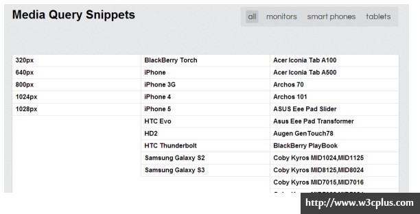
除了上面的常见Media Queries片段之外,下面的网站还提供了一些其他的片段:
框架Media Queries片段
Boilerplate
/*URL:http://html5boilerplate.com/*/

/* Smartphones (portrait and landscape) ----------- */

@media only screen

and (min-width : 320px)

and (max-width : 480px) {

/* Styles */

}

/* Smartphones (landscape) ----------- */

@media only screen

and (min-width : 321px) {

/* Styles */

}

/* Smartphones (portrait) ----------- */

@media only screen

and (max-width : 320px) {

/* Styles */

}

/* iPads (portrait and landscape) ----------- */

@media only screen

and (min-width : 768px)

and (max-width : 1024px) {

/* Styles */

}

/* iPads (landscape) ----------- */

@media only screen

and (min-width : 768px)

and (max-width : 1024px)

and (orientation : landscape) {

/* Styles */

}

/* iPads (portrait) ----------- */

@media only screen

and (min-width : 768px)

and (max-width : 1024px)

and (orientation : portrait) {

/* Styles */

}

/* Desktops and laptops ----------- */

@media only screen

and (min-width : 1224px) {

/* Styles */

}

/* Large screens ----------- */

@media only screen

and (min-width : 1824px) {

/* Styles */

}

/* iPhone 4 ----------- */

@media

only screen and (-webkit-min-device-pixel-ratio : 1.5),

only screen and (min-device-pixel-ratio : 1.5) {

/* Styles */

}
Bootstrap的Media Queries
/*URL:http://twitter.github.com/bootstrap*/

/* Large desktop */

@media (min-width: 1200px) { ... }

/* Portrait tablet to landscape and desktop */

@media (min-width: 768px) and (max-width: 979px) { ... }

/* Landscape phone to portrait tablet */

@media (max-width: 767px) { ... }

/* Landscape phones and down */

@media (max-width: 480px) { ... }
Foundation的Media Queries
/*URL:http://foundation.zurb.com/*/

/* We use this media query to add styles to any device that supports media queries */

@media only screen { }

/* Used to alter styles for screens at least 768px wide. This is where the grid changes. */

@media only screen and (min-width: 768px) {}

/* Used to alter styles for screens at least 1280px wide. */

@media only screen and (min-width: 1280px) {}

/* Used to alter styles for screens at least 1440px wide. */

@media only screen and (min-width: 1440px) {}

/* Apply styles to screens in landscape orientation */

@media only screen and (orientation: landscape) {}

/* Apply styles to screens in portrait orientation */

@media only screen and (orientation: portrait) {}
Skeleton的Media Queries
/*URL:http://www.getskeleton.com*/

/* Smaller than standard 960 (devices and browsers) */

@media only screen and (max-width: 959px) {}

/* Tablet Portrait size to standard 960 (devices and browsers) */

@media only screen and (min-width: 768px) and (max-width: 959px) {}

/* All Mobile Sizes (devices and browser) */

@media only screen and (max-width: 767px) {}

/* Mobile Landscape Size to Tablet Portrait (devices and browsers) */

@media only screen and (min-width: 480px) and (max-width: 767px) {}

/* Mobile Portrait Size to Mobile Landscape Size (devices and browsers) */

@media only screen and (max-width: 479px) {}
FRAMELESS的Media Queries
/*URL:http://framelessgrid.com/*/

@media screen and (max-width: 16.875em){}

@media screen and (min-width: 32.5em) and (max-width: 37.4375em),

screen and (min-width: 45em) and (max-width: 56.9375em),

screen and (min-width: 77.5em) and (max-width: 102.4375em),

screen and (min-width: 135em){}

@media screen and (min-width: 102.5em) and (max-width: 117.9375em),

screen and (min-width: 150em){}

@media screen and (min-width: 15em){}

@media screen and (min-width: 30em){}

@media screen and (min-width: 37.5em){}

@media screen and (min-width: 57em){}

@media screen and (min-width: 57em) and (max-width: 117.9375em){}

@media screen and (min-width: 118em){}
Susy的Media Queries
/*URL:http://susy.oddbird.net/*/

@media (min-width: 29em) {}

@media (min-width: 30em) and (max-width: 60em) {}

@media (min-width: 119em) {}

@media (min-width: 33.75em) and (max-width: 67.5em) {}

@media (min-width: 33.75em) and (max-width: 67.5em) {}
Less Framework 4
/*URL:http://lessframework.com/*/

@media only screen and (min-width: 768px) and (max-width: 991px) {}

/*		Mobile Layout: 320px (20em).		*/

@media only screen and (max-width: 767px) {}

/*Wide Mobile Layout: 480px (30em)*/

@media only screen and (min-width: 480px) and (max-width: 767px) {}
Golden Grid System的Media Queries
/*URL:http://goldengridsystem.com/*/

/* @media screen and (min-width: 640px) */

@media screen and (min-width: 40em) {}

/* @media screen and (min-width: 720px) */

@media screen and (min-width: 45em) {}

/* @media screen and (min-width: 888px) */

@media screen and (min-width: 55.5em) {}

/* @media screen and (min-width: 984px) */

@media screen and (min-width: 61.5em) {}

/* @media screen and (min-width: 1200px) */

@media screen and (min-width: 75em) {}

/* @media screen and (min-width: 1392px) */

@media screen and (min-width: 87em) {}

/* @media screen and (min-width: 1680px) */

@media screen and (min-width: 105em) {}

/* @media screen and (min-width: 1872px) */

@media screen and (min-width: 117em) {}

/* @media screen and (min-width: 2080px) */

@media screen and (min-width: 130em) {}
Fluid baseline的Media Queries
/*URL:http://fluidbaselinegrid.com/*/

/* MOBILE PORTRAIT */

@media only screen and (min-width: 320px) {}

/* MOBILE LANDSCAPE */

@media only screen and (min-width: 480px) {}

/* SMALL TABLET */

@media only screen and (min-width: 600px) {}

/* TABLET/NETBOOK */

@media only screen and (min-width: 768px) {}

/* LANDSCAPE TABLET/NETBOOK/LAPTOP */

@media only screen and (min-width: 1024px) {}

@media only screen and (min-width: 1280px) {}

/* WIDESCREEN */

/* Increased body size for legibility */

@media only screen and (min-width: 1400px) {}
320andUP
/*URL:http://stuffandnonsense.co.uk/projects/320andup*/

@media only screen and (min-width: 480px) {

  /* 480 */

}

@media only screen and (min-width: 600px) {

  /* 600 */

}

@media only screen and (min-width: 768px) {

  /* 768*/

}

@media only screen and (min-width: 992px) {

  /* 992*/

}

@media only screen and (min-width: 1382px) {

  /* 1382 */

}

@media only screen and (-webkit-min-device-pixel-ratio: 1.5),

only screen and (min--moz-device-pixel-ratio: 1.5),

only screen and (min-device-pixel-ratio: 1.5) {

  /* 2x*/

}
Gridless
/* URL:http://thatcoolguy.github.com/gridless-boilerplate/ */

@media only screen and (min-width: 480px) {

	/* Wide mobile (480px+) styles go here */

}

@media only screen and (min-width: 768px) {

	/* Tablets/netbooks (768px+) styles go here */

}

@media only screen and (min-width: 1024px) {

	/* Desktops (1024px+) styles go here */

}
TotanTHEMES
/*URL:http://titanthemes.com/*/

/* Smaller than standard 960 (devices and browsers) */

@media only screen and (max-width: 959px) {}

/* Tablet Portrait size to standard 960 (devices and browsers) */

@media only screen and (min-width: 768px) and (max-width: 989px) {}

/* All Mobile Sizes (devices and browser) */

@media only screen and (max-width: 767px) {}

/* Mobile Landscape Size to Tablet Portrait (devices and browsers) */

@media only screen and (min-width: 480px) and (max-width: 767px) {}

/* Mobile Portrait Size to Mobile Landscape Size (devices and browsers) */

@media only screen and (max-width: 479px) {}
Responsive Grid System
/*URL:http://responsive.gs/*/

 @media (max-width: 480px) {}

 @media (min-width: 480px) and (max-width: 768px) {}

 @media (min-width: 768px) {}

 @media (min-width: 1024px) {}

 @media (min-width: 1200px) {}
本文搜集的是Media Queries在各种设备下的代码片段,希望这些片段能帮大家更好的理解Responsive断点的设置。如果大家有更好的方案,希望能在评论中分享。
2014年04月19日更新
基于视窗宽度的媒体查询断点设置
前提设置body的字体为100%。其具有一个简单的计算公式:100% = 16px = 1em = 14pt
/*Viewport = 1920px*/

@media screen and (max-width: 120em){

}

/*Viewport = 1680px*/

@media screen and (max-width: 105em){

}

/*Viewport = 1400px*/

@media screen and (max-width: 87.5em){

}

/*Viewport = 1200px*/

@media screen and (max-width: 75em){

}

/*Viewport = 1024px*/

@media screen and (max-width: 64em){

}

/*Viewport = 960px*/

@media screen and (max-width: 60em){

}

/*Viewport = 800px*/

@media screen and (max-width : 50em){

}

/*Viewport = 768px*/

@media screen and (max-width : 48em){

}

/*Viewport = 600px*/

@media screen and (max-width: 37.5em){

}

/*Viewport = 480px*/

@media screen and (max-width: 30em){

}

/*Viewport = 320px*/

@media screen and (max-width: 20em){

}

/*Viewport = 240px*/

@media screen and (max-width: 15em){

}

/*

	High Resolution/Retina Display Media Queries

*/

/*Pixel Density 3*/

@media(-webkit-min-device-pixel-ratio: 3),(min-resolution: 192dpi){

}

/*Pixel Density 2*/

@media(-webkit-min-device-pixel-ratio: 2),(min-resolution: 192dpi){

}

/*Pixel Density 1.5*/

@media(-webkit-min-device-pixel-ratio: 1.5),(min-resolution: 124.8dpi){

}

/*Pixel Density 1.25*/

@media(-webkit-min-device-pixel-ratio: 1.25),(min-resolution: 120dpi){

}

/*

	Printed Style Media Queries

*/

/*Print Resolution 300 dpi*/

@media print and (min-resolution: 300dpi){

}

/*Print Resolution 144 dpi*/

@media print and (min-resolution:144dpi){

}

/*Print Resolution 96 dpi*/

@media print and (min-resolution:96dpi){

}

/*Print Resolution 72 dpi*/

@media print and (resolution:72dpi){

}
更新:iPhone6
@media only screen and (min-device-width: 375px) and (max-device-width: 667px) and (orientation : portrait) {

     /*iPhone 6 Portrait*/

}

@media only screen and (min-device-width: 375px) and (max-device-width: 667px) and (orientation : landscape) {

     /*iPhone 6 landscape*/

}

@media only screen and (min-device-width: 414px) and (max-device-width: 736px) and (orientation : portrait) {

     /*iPhone 6+ Portrait*/

}

@media only screen and (min-device-width: 414px) and (max-device-width: 736px) and (orientation : landscape) {

     /*iPhone 6+ landscape*/

}

@media only screen and (max-device-width: 640px), only screen and (max-device-width: 667px), only screen and (max-width: 480px){

     /*iPhone 6 and iPhone 6+ portrait and landscape*/

}

@media only screen and (max-device-width: 640px), only screen and (max-device-width: 667px), only screen and (max-width: 480px) and (orientation : portrait){

     /*iPhone 6 and iPhone 6+ portrait*/

}

@media only screen and (max-device-width: 640px), only screen and (max-device-width: 667px), only screen and (max-width: 480px) and (orientation : landscape){

     /*iPhone 6 and iPhone 6+ landscape*/

}
如需转载,烦请注明出处:http://www.w3cplus.com/css3/media-query-snippets.html
CSS3 Media Queries 片段的更多相关文章
- CSS3教程:Responsive框架常见的Media Queries片段
CSS3 Media Queries片段在这里主要分成三类:移动端.PC端以及一些常见的响应式框架的Media Queries片段.移动端Media Queries片段iPhone5@media sc ...
- CSS3 Media Queries 实现响应式设计
在 CSS2 中,你可以为不同的媒介设备(如屏幕.打印机)指定专用的样式表,而现在借助 CSS3 的 Media Queries 特性,可以更为有效的实现这个功能.你可以为媒介类型添加某些条件,检测设 ...
- 【CSS3 入门教程系列】CSS3 Media Queries 实现响应式设计
在 CSS2 中,你可以为不同的媒介设备(如屏幕.打印机)指定专用的样式表,而现在借助 CSS3 的 Media Queries 特性,可以更为有效的实现这个功能.你可以为媒介类型添加某些条件,检测设 ...
- HTML5实践 -- 使用CSS3 Media Queries实现响应式设计
CSS3 Media用法介绍:http://www.w3cplus.com/content/css3-media-queries 转载请注明原创地址:http://www.cnblogs.com/so ...
- CSS3 Media Queries模板
使用max-width @media screen and (max-width: 600px) { //你的样式放在这里.... } 使用min-width @media screen and (m ...
- CSS3 Media Queries在iPhone4和iPad上的运用
CSS3 Media Queries的介绍在W3CPlus上的介绍已有好几篇文章了,但自己碰到的问题与解决的文章还是相对的较少.前几天在<修复iPhone上submit按钮bug>上介绍了 ...
- Css3 Media Queries移动页面的样式和图片的适配问题(转)
CSS3 Media Queries 摘自:http://www.w3cplus.com/content/css3-media-queries Media Queries直译过来就是“媒体查询”,在我 ...
- 移动终端学习1:css3 Media Queries简介
移动终端学习之1:css3 Media Queries简介 1.简介 这篇文章写的不错,我就不重复了,来个链接:http://www.w3cplus.com/content/css3-media-qu ...
- 移动终端学习一:css3 Media Queries简介
移动终端学习之一 css3 Media Queries简介 1.简介 别人写过的我就不重复了,来个链接:http://www.w3cplus.com/content/css3-media-querie ...
随机推荐
- unity安卓和IOS读写目录
StreamingAssets文件夹下的只读不可写路径: 安卓读:filePath = Application.streamingAssetsPath + "/文件名.格式名"; ...
- C# 依赖缓存
使用轮询的方式 数据库: 在VS的命令里面输入 aspnet_regsql.exe -S (local) -U sa -P 123456 -d ERP_SQL -ed 上面这句是用来设置哪个服务器上的 ...
- 单例模式-用GCD实现
用GCD实现单例模式的步骤: 步骤1. 创建头文件 XZSingleton.h,里面代码如下: // .h文件 #define XZSingletonH(name) + (instancetype)s ...
- 《AngularJS高级程序设计》学习笔记
一.AngularJS应用剖析 AngularJS存在一些最主要的构件,如模型,视图和控制器.但AngularJS中也有许多其他可供灵活使用的部件,包括模块,指令,过滤器,工厂和服务. 一 . 1 ...
- 系统吞吐量、TPS(QPS)、用户并发量、性能测试概念和公式
PS:下面是性能测试的主要概念和计算公式,记录下: 一.系统吞度量要素: 一个系统的吞度量(承压能力)与request对CPU的消耗.外部接口.IO等等紧密关联.单个reqeust 对CPU消耗越高, ...
- #VSTS日志# 2015/12/10 – 终于可以删除工作项了
最近的更新不少,废话少说,直接上干货 定制工作项字段 本周的更新后,所有的用户都可以在vsts上直接给工作项添加字段了,具体内容包括– 添加新字段(日期,字符串,整形,数字)– 字段显示位置配置– 过 ...
- JavaScript Patterns 6.1 Classical Versus Modern Inheritance Patterns
In Java you could do something like: Person adam = new Person(); In JavaScript you would do: var ada ...
- Windows Server 2012 Recycle Bin corrupted
在Windows Server 2012 上遇到了“The Recycle Bin On E:\ is corrupted. Do you want to empty the Recycle Bin ...
- JavaScript(二)——语法
1.基本数据类型: 字符串.小数.整数.日期时间.布尔型等. 2.类型转换: 分为自动转换和强制转换,一般用强制转换. 其他类型转换为整数:parseint(): 其他类型转换为小数:parseflo ...
- mvn archetype:create和mvn archetype:generate
create is deprecated in maven 3.0.5 and beyond,在maven3.0.5以上版本舍弃了create,使用generate生成项目 before:mvn ar ...