CSS 布局整理
1.css垂直水平居中
效果:

HTML代码:
<div id="container">

    <div id="center-div"></div>

</div>
CSS实现:
都设置居中 div块的宽高和背景色。
#center-div { width: 100px; height: 100px; background: #2b669a;}
a.用inline-block和vertical-align来实现居中:
#container { text-align: center; height: 200px; background: #cccccc;}

#container:before { content: ""; height: 100%; display: inline-block; vertical-align: middle;margin-right: -0.25em;}

#center-div { display: inline-block; vertical-align: middle;}
b.用相对绝对定位和负边距实现上下左右居中
/* 首先相对父元素top,left定位在50%的位置,这时候只是图片左上角居中,而中心点还没居中,

* 加上margin: -50px 0 0 -50px;利用负边距把图片的中心点位于父元素的中心点,从而实现垂直水平居中 */

#container {height: 200px;position: relative; background: #ccc;}

#center-div { display: inline-block; position: relative;top: 50%;left: 50%;margin: -50px 0 0 -50px;}
c.利用绝对定位来实现居中
#container { text-align: center; height: 200px; background: #cccccc; position: relative;}

#center-div { position: absolute; margin: auto;top:;right:;left:;bottom:; }
d.使用table-cell,inline-block实现水平垂直居中
#container { display: table-cell; text-align: center; vertical-align: middle; width: 600px; height: 200px; background: #ccc;}

#center-div { display: inline-block; }
因为 display:table-cell ,所以可以通过JS设置 #container 的固定宽度:
window.onload = function () {

var pageWidth = document.documentElement.clientWidth || document.body.clientWidth;

document.getElementById('container').style.width = pageWidth+"px";

}
e.使用css3中的transform来时实现水平垂直居中
#container { position: relative; height: 200px; background: #cccccc;}

#center-div {position: absolute; top: 50%; left:50%;transform: translate(-50%,-50%);}
f.使用Flex来实现水平垂直居中
#container { display: flex;justify-content: center; align-items: center; height: 200px;background: #cccccc;}
相关链接:用css实现垂直水平居中的几种方法 || Centering in the Unknown
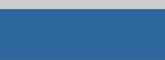
2.两行布局:头部高度固定,尾部高度为剩余高度
效果:
代码:
<!DOCTYPE html>

<html lang="en">

<head>

    <meta charset="UTF-8">

    <title>两行布局:头部高度固定,尾部高度为剩余高度</title>

    <style>

        * { padding: 0;margin: 0;}

        header { width: 100%; height: 60px; background: #cccccc;}

        footer { width: 100%; background: #2b669a;position: absolute;top: 60px;bottom: 0;}

    </style>

</head>

<body>

<header></header>

<footer></footer>

</body>

</html>
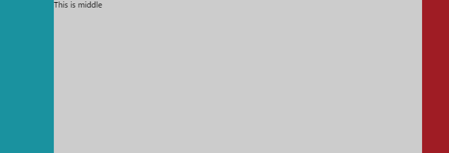
3.双飞翼布局:左右宽度固定,中部自适应
效果:
HTML代码:
<div class="container">

    <div class="left"></div>

    <div class="right"></div>

    <div class="middle">This is middle</div>

</div>
简单的CSS Reset:
html,body { padding:;margin:;width: 100%;height: 100%;}

.container { height: 100%; width: 100%;}
a.利用中部元素左右margin+左右元素的绝对定位:
.left { width: 120px;  height: 100%;background: #1a929f; position: absolute; left:;top:;}

.right { width: 60px; height: 100%; background: #9f1c24;position: absolute;right:;top:;}

.middle { background: #cccccc; height: 100%;margin: 0 60px 0 120px;}
b.利用中部元素左右margin+左右元素的浮动(注意 html中类名为"middle"的div在最后面):
.left { width: 120px;  height: 100%;background: #1a929f;float: left;}

.right { width: 60px; height: 100%; background: #9f1c24;float: right;}

.middle { background: #cccccc; height: 100%;margin: 0 60px 0 120px;}
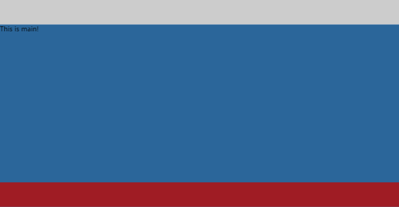
4.头部,尾部高度固定,中间自适应布局
效果:
代码:
<!DOCTYPE html>

<html lang="en">

<head>

    <meta charset="UTF-8">

    <title>头部,尾部高度固定,中间自适应布局</title>

    <style>

        * { padding: 0;margin: 0;}

        header { width: 100%; height: 60px; background: #cccccc;}

        main { width: 100%; background: #2b669a;position: absolute;top: 60px;bottom: 60px;}

        footer {width: 100%;height:60px;background: #9f1c24; position: absolute;bottom: 0;}

    </style>

</head>

<body>

<header></header>

<main>This is main!</main>

<footer></footer>

</body>

</html>
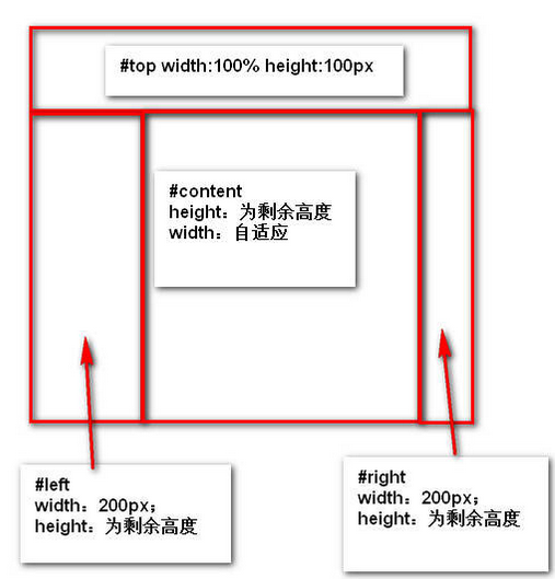
5. 见下图:
效果:
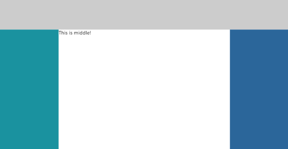
代码:
<!DOCTYPE html>

<html lang="en">

<head>

    <meta charset="UTF-8">

    <title>header-fixed-else-3-cols</title>

    <style>

        html,body { padding: 0;margin: 0;height: 100%;width: 100%;}

        header { width: 100%; height: 100px; background: #cccccc;}

        /*main { height: 100%;margin-top: -60px; width: 100%;}*/

        .left { width: 200px; position: absolute; top: 100px; bottom: 0;background: #1a929f;}

        .middle { position: absolute; left: 200px;right: 200px;top: 100px;bottom: 0;}

        .right { width: 200px;position: absolute; top: 100px; right: 0;bottom: 0; background: #2b669a;}

    </style>

</head>

<body>

<header></header>

<main>

    <section class="left"></section>

    <section class="middle">This is middle!</section>

    <section class="right"></section>

</main>

</body>

</html>
相关链接:常见的CSS布局总结
6.实现垂直居中水平居中的绝对定位居中技术
我们经常用 margin:0 auto来实现水平居中,而一直认为margin:auto不能实现垂直居中……实际上,实现垂直居中仅需要声明元素高度和下面的CSS:
.Absolute-Center {

  margin: auto;

  position: absolute;

  top:; left:; bottom:; right:;

}
优点:
1.支持跨浏览器,包括IE8-IE10.

2.无需其他特殊标记,CSS代码量少

3.支持百分比%属性值和min-/max-属性

4.只用这一个类可实现任何内容块居中

5.不论是否设置padding都可居中(在不使用box-sizing属性的前提下)

6.内容块可以被重绘。

7.完美支持图片居中。
缺点:
1.必须声明高度(查看可变高度Variable Height)。

2.建议设置overflow:auto来防止内容越界溢出。(查看溢出Overflow)。

3.在Windows Phone设备上不起作用。
浏览器兼容性:
Chrome,Firefox, Safari, Mobile Safari, IE8-10.
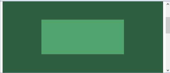
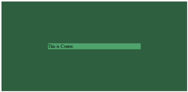
a.容器内(Within Container)
内容块的父容器设置为position:relative,使用上述绝对居中方式,可以使内容居中显示于父容器()。
显示效果:

HTML代码:
<div class="container">

    <div class="center"></div>

</div>
CSS代码:
.container { background: #2E5F3F;position: relative; height: 300px;}

.center { margin: auto;position: absolute;top:; left:; bottom:; right:;}

.center { background: #4FA46B; ;width: 50%;height: 120px; }
源码:absolute-centering-in-css-01.html
b.视区内(Within Viewport)
想让内容块一直停留在可视区域内?将内容块设置为position:fixed;并设置一个较大的z-index层叠属性值。
.center.is-Fixed {position: fixed;z-index:;}
显示效果:
源码:absolute-centering-in-css-02.html
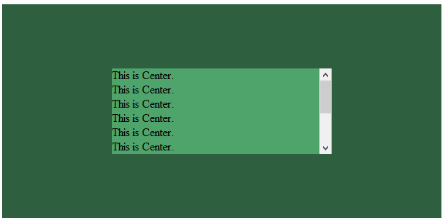
c.边栏 (Offsets)
如果你要设置一个固顶的头或增加其他的边栏,只需要在内容块的样式中加入像这样的CSS样式代码:top:70px;bottom:auto;由于已经声明了margin:auto;,该内容块将会垂直居中于你通过top,left,bottom和right属性定义的边界框内。
你可以将内容块固定与屏幕的左侧或右侧,并且保持内容块垂直居中。使用right:0;left:auto;固定于屏幕右侧,使用left:0;right:auto;固定与屏幕左侧。
.center.is-Left { right:auto; left:;text-align: left; width: 40%;}

.center.is-Right { left:auto; right:;text-align: right; width: 40%;}
显示效果:

源码:absolute-centering-in-css-03.html
d.响应式(Responsive)
绝对居中最大的优势应该就是对百分比形式的宽高支持的非常完美。甚至min-width/max-width 和min-height/max-height这些属性在自适应盒子内的表现也和预期很一致。
.center.is-Responsive { width: 60%;height: 60%;min-width: 200px;max-width: 400px;padding: 40px;}
源码:absolute-centering-in-css-04.html
e.溢出情况(Overflow)
内容高度大于块元素或容器(视区viewport或设为position:relative的父容器)会溢出,这时内容可能会显示到块与容器的外面,或者被截断出现显示不全(分别对应内容块overflow属性设置为visible和hidden的表现)。
加上overflow: auto会在内容高度超过容器高度的情况下给内容块显示滚动条而不越界。
.center.is-Overflow { overflow: auto; }
源码:absolute-centering-in-css-05.html
f.重绘(Resizing)
你可以使用其他class类或JavaScript代码来重绘内容块同时保证居中,无须手动重新计算中心尺寸。当然,你也可以添加resize属性来让用户拖拽实现内容块的重绘。
绝对居中(Absolute Centering)可以保证内容块始终居中,无论内容块是否重绘。可以通过设置min-/max-来根据自己需要限制内容块的大小,并防止内容溢出窗口/容器。
.center.is-Resizable {min-width: 20%;max-width: 80%;min-height: 20%;max-height: 80%;resize: both;overflow: auto;}
源码:absolute-centering-in-css-06.html
g.图片(Images)
绝对居中(AbsoluteCentering)也适用于图片。
源码:absolute-centering-in-css-07.html
h.可变高度(Variable Height)
这种情况下实现绝对居中(AbsoluteCentering)必须要声明一个高度,不管你是基于百分比的高度还是通过max-height控制的高度,还有,别忘了设置合适的overflow属性。对自适应/响应式情景,这种方法很不错。
与声明高度效果相同的另一种方法是设置display:table;这样无论实际内容有多高,内容块都会保持居中。
.center.is-Variable { display: table; height: auto;}
源码:absolute-centering-in-css-08.html
相关链接:盘点8种CSS实现垂直居中水平居中的绝对定位居中技术 || Absolute Horizontal And Vertical Centering In CSS
(待续。。。)
CSS 布局整理的更多相关文章
- CSS 布局整理(************************************************)
1.css垂直水平居中 效果: HTML代码: <div id="container"> <div id="center-div">&l ...
- CSS布局整理
目录 常用居中方法 水平居中 垂直居中 单列布局 二列&三列布局 float+margin position+margin 圣杯布局(float+负margin) 双飞翼布局(float+负m ...
- html+css布局整理笔记
基本概念 布局模型 流动模型(Flow) 浮动模型(Float) 层模型(Layer) 流动模型 默认的网页布局模式,流动布局模型有两个比较典型的特征: 第一,块级元素都会在所处的包含元素内自上而下按 ...
- css布局知识点汇总
昨天早上看到了一篇很棒的文章,这篇文章将布局的一些知识点整理的很不错.我也想整理一下,这样在以后的项目中可以活学活用,避免只用一种方式. 参考文章:https://segmentfault.com/a ...
- CSS 布局经典问题初步整理
CSS 定位问题 主要就是经典的绝对定位,相对定位问题. 10个文档学布局:通过十个例子讲解布局,主要涉及相对布局,绝对布局,浮动. 百度前端学院笔记 – 理解绝对定位:文章本身一般,几篇参考文献比较 ...
- 界面设计技法之css布局
css布局之于页面就如同ECMAScript之于JS一般,细想一番,html就如同语文,css就如同数学,js呢,就是物理,有些扯远,这里就先不展开了. 回到主题,从最开始的css到如今的sass(l ...
- CSS 布局
近日开发中,总感觉页面布局方面力不从心.以前也曾学过这方面的内容,但是不够系统,因此我打算整理一下. 在web 页面中一般有 table 和 css+div 两种布局方式. 其中css+div 又分为 ...
- 《深入理解bootstrap》读书笔记:第三章 CSS布局
一. 概述一下理念 bootstrap基于H5开发.提倡移动先行(媒询声明是必须的),对浏览器支持面不是很广. 响应式图片:max-width:100% height:auto; 可以加上:.img- ...
- div+css 布局下兼容IE6 IE7 FF常见问题
div+css 布局下兼容IE6 IE7 FF常见问题 收藏 所有浏览器 通用 (市面上主要用到的IE6 IE7 FF)height: 100px; IE6 专用 _height: 100px; IE ...
随机推荐
- hdu1561 树形dp,依赖背包
多重背包是某个物品可以选择多次,要把对物品数的枚举放在对w枚举外面 分组背包是某组的物品只能选一个,要把对每组物品的枚举放在对w枚举内侧 依赖背包是多层的分组背包,利用树形结构建立依赖关系,每个结点都 ...
- for..in 遍历js对象
for..in 遍历js对象 利用for in 给对象遍历:
- Codeforces 757 C Felicity is Coming!
题目大意:有n个训练营,m种宠物,每个训练营里里面有gi 个宠物,现在每只宠物都要完成一次进化,种类 相同的宠物进化之后,种类还是相同,种类不同的宠物不能进化成相同种类,且要求所有宠物进化之后,每个 ...
- POJ2115 C Looooops 扩展欧几里德
欢迎访问~原文出处——博客园-zhouzhendong 去博客园看该题解 题目传送门 - POJ2115 题意 对于C的for(i=A ; i!=B ;i +=C)循环语句,问在k位存储系统中循环几次 ...
- 【Java】 剑指offer(24) 反转链表
本文参考自<剑指offer>一书,代码采用Java语言. 更多:<剑指Offer>Java实现合集 题目 定义一个函数,输入一个链表的头结点,反转该链表并输出反转后链表的头 ...
- C++雾中风景12:聊聊C++中的Mutex,以及拯救生产力的Boost
笔者近期在工作之中编程实现一个Cache结构的封装,需要使用到C++之中的互斥量Mutex,于是花了一些时间进行了调研.(结果对C++标准库很是绝望....)最终还是通过利用了Boost库的share ...
- Oracle - Dbms Output window
Ensure that you have your Dbms Output window open through the view option in the menubar. Click on t ...
- ASP.net MVC把Html Table导出Excel
[HttpPost] public ActionResult ExportExcel(FormCollection form) { string strHtml = form["hHtml& ...
- AGC027 E - ABBreviate
目录 题目链接 题解 代码 题目链接 AGC027 E - ABBreviate 题解 神仙啊 建议查看https://img.atcoder.jp/agc027/editorial.pdf 定义a ...
- AGC 019F.Yes or No(思路 组合)
题目链接 \(Description\) 一共有\(n+m\)道判断题,其中有\(n\)个答案为"YES",\(m\)个为"NO".现在以随机顺序给你这\(n+ ...