CSS ? Layout Module : CSS 布局模型
1
1
1
https://www.w3.org/TR/css-grid-1/
CSS Grid Layout Module Level 1
W3C Working Draft, 19 May 2016
1
https://www.w3.org/TR/css3-multicol/
CSS Multi-column Layout Module
W3C Candidate Recommendation 12 April 2011
1
https://www.w3.org/TR/css-ruby-1/
CSS Ruby Layout Module Level 1
W3C Working Draft, 5 August 2014
1
https://www.w3.org/TR/css-inline-3/
CSS Inline Layout Module Level 3
W3C Working Draft, 24 May 2016
1
https://www.w3.org/TR/css-flexbox-1/
CSS Flexible Box Layout Module Level 1
W3C Candidate Recommendation, 26 May 2016
“Old” Flexbox and “New” Flexbox
1
https://drafts.csswg.org/css-position/#sticky-pos
CSS Positioned Layout Module Level 3
Editor’s Draft, 19 August 2016
1
https://www.w3.org/TR/css-flexbox-1/
CSS Template Layout Module
W3C Working Group Note 26 March 2015
9.3.1 Choosing a positioning scheme: 'position' property
The 'position' and 'float' properties determine which of the CSS 2.1 positioning algorithms is used to calculate the position of a box.
- 'position'
Value: static | relative | absolute | fixed | inherit Initial: static Applies to: all elements Inherited: no Percentages: N/A Media: visual Computed value: as specified 9.2.4 The 'display' property
- 'display'
Value: inline | block | list-item | inline-block | table | inline-table | table-row-group | table-header-group | table-footer-group | table-row | table-column-group | table-column | table-cell | table-caption | none | inherit Initial: inline Applies to: all elements Inherited: no Percentages: N/A Media: all Computed value: see text 1. Introduction
This section is not normative.
CSS 2.1 defined four layout modes — algorithms which determine the size and position of boxes based on their relationships with their sibling and ancestor boxes:
block layout, designed for laying out documents
inline layout, designed for laying out text
table layout, designed for laying out 2D data in a tabular format
positioned layout, designed for very explicit positioning without much regard for other elements in the document
This module introduces a new layout mode, flex layout, which is designed for laying out more complex applications and webpages.
1
https://developer.mozilla.org/zh-CN/docs/Web/CSS/Layout_mode
Layout mode
CSS 布局模式, 有时简称为布局, 是一种基于盒子与其兄弟姐妹盒子和祖辈盒子的交互方式,来确定盒子的位置和框的大小的算法. 有以下几种不同形式:
- 块布局(block layout), designed for laying out documents. The block layout contains document-centric features, like the ability to float elements or to lay them out over multiple columns.
- 行内布局(inline layout), designed for laying out text.
- 表格布局(table layout), designed for laying out tables.
- 定位布局(positioned layout), designed for positioning elements without much interaction with other elements.
- 弹性盒子布局( flexible box layout), designed for laying out complex pages that can be resized smoothly.
- 网格布局(grid layout), designed for laying out elements relative to a fixed grid.
1
1
1
1
https://www.w3.org/TR/css-overflow-3/
CSS Overflow Module Level 3
W3C Working Draft, 31 May 2016
1
1
学习CSS布局
http://zh.learnlayout.com/
"display"属性
displayCSS property specifieshttps://developer.mozilla.org/zh-CN/docs/Web/CSS/display
display是CSS中最重要的用于控制布局的属性。每个元素都有一个默认的 display 值,这与元素的类型有关。对于大多数元素它们的默认值通常是
block或inline。一个 block 元素通常被叫做块级元素,一个 inline 元素通常被叫做行内元素。
一个块级元素会新开始一行并且尽可能撑满容器。
一个行内元素可以在段落中 <span> 像这样 </span>包裹一些文字而不会打乱段落的布局。
另一个常用的display值是
none。一些特殊元素的默认 display 值是它,例如
script。display:none;通常被用于JavaScript 中,来实现在不删除元素的情况下,隐藏/显示 元素。
display: none; (真隐藏元素,不占空间)与visibility: hidden; (假隐藏元素,占空间)。
display:none; 看不到元素,且不会保留元素原来占用的显示空间,
visibility: hidden;看不到元素,但是仍会保留元素原来占用的显示空间.tips:
每个元素都有一个默认的 display 类型,不过你可以随时随地的重写它!
虽然“人工制造”一个行内元素可能看起来很难以理解,不过你可以把有特定语义的元素改成行内元素。
常见的例子是:使用
li{display: inline},制作成水平菜单。
margin: auto;
设置块级元素的
width可以阻止它从左到右撑满容器,然后你就可以设置左右外边距为auto来使其水平居中。元素会占据你所指定的宽度width(像素/百分百),剩余的宽度(window.width-div.width)会被左右外边距平均分配。
唯一的问题是,当浏览器窗口比元素的宽度还要窄时(指定的宽度?px;),浏览器会显示一个水平滚动条来容纳页面。
让我们再来改进下这个方案...(指定的宽度 ?%;)
使用
max-width替代width可以使浏览器更好地处理小窗口的情况。(min-width)?这点在移动设备上显得尤为重要,调整下浏览器窗口大小检查下吧!
demo:
<!DOCTYPE html>

<html lang="en">

<head>

	<meta charset="UTF-8">

	<title>margin center</title>

	<style>

		*{

			margin: 0;

			padding: 0;

		}

		.box{

			background: rgba(0,0,0,0.7);

		}

		.d{

			border: 1px solid red;

			margin: 0 0 10px;

		}

		.d1{

			background: rgba(0,255,0,0.7);

			/*width: 700px;*/

			/*

				唯一的问题是,当浏览器窗口比元素的宽度还要窄时(指定的宽度?px;),浏览器会显示一个水平滚动条来容纳页面。

				改进方案...(指定的宽度 ?%;)

			*/

			width: 70%;

			margin: 0 auto 10px;

			/*

				div 自动居中(设置width=?,margin=auto)

				width: 50%;

				margin: auto;

			*/

		}

	</style>

</head>

<body>

	<div class="box">

		<div class="d d1">

			<h1>title</h1>

		</div>

	</div>

</body>

</html>
image:
1
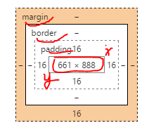
盒子模型
在我们讨论宽度的时候,我们应该讲下与它相关的一个重点知识:盒子模型。
margin = margin-top + margin-bottom ;
border = border-top +border-bottom ;
padding = padding-top + padding-bottom ;
盒子长度: (margin+border+padding)+height ;
盒子宽度:(margin+border+padding)+width ;
当你设置了元素的长度,宽度,实际展现的元素可能会超出你设置的width:因为元素的边框和内边距可能会撑爆元素width,height。
两个盒子设置相同(width)宽度的元素,实际显示的盒子宽度却不一样。
? padding: auto 15px//Error: Invalid property value
demo:
<!DOCTYPE html>
<html lang="en">
<head>
<meta charset="UTF-8">
<title>BOX</title>
<style>
*{
margin: 0;
padding: 0;
}
.box{
background: rgba(0,0,0,0.7);
width: 702px;
/*height: 300px;*/
margin: 10px auto;
padding: 1px 0;
}
.d{
border: 1px solid red;
text-align: center;
margin: 0 auto 10px;
background: rgba(0,255,0,0.7);
color: rgba(255,0,255,0.7);
}
.d0{
color: rgba(255,255,255,0.7);
}
.d1{
width: 700px;
/*margin: auto;
padding: auto;*/
}
.d2{
width: 700px;
margin: auto 30px;
padding: 15px;
/*
存在bug,优先级 ?
padding: 0 15px;
//OK
padding: auto 15px;
//Error: Invalid property value(Chrome 测试)
*/
}
</style>
</head>
<body>
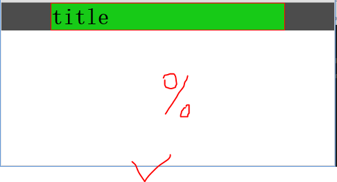
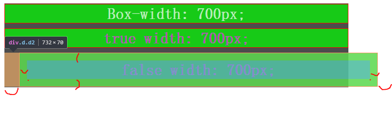
<div class="box">
<div class="d d0">
<h1>Box-width: 700px;</h1>
</div>
<div class="d d1">
<h1>true width: 700px;</h1>
</div>
<div class="d d2">
<h1>false width: 700px;</h1>
</div>
</div>
</body>
</html>image:
以前有一个代代相传的解决方案是数学计算。CSS开发者需要用比他们实际想要的宽度小一点的宽度,需要减去内边距和边框的宽度。
值得庆幸地是你不需要再这么做了...
所以他们新增了一个叫做
box-sizing的CSS属性。当你设置一个元素为
box-sizing: border-box;时,此元素的内边距和边框不再会增加它的宽度。? margin ?
1
1
1
1
1
1
1
1
1
1
1
1
1
1
1
1
1
1
1
1
Create fluid layouts with HTML5 and CSS3
http://www.creativebloq.com/css3/create-fluid-layouts-html5-and-css3-3142768A Complete Guide to Grid
https://css-tricks.com/snippets/css/complete-guide-grid/CSS Layout - inline-block
http://www.w3schools.com/css/css_inline-block.asp学习CSS布局
http://zh.learnlayout.com/toc.html学习CSS布局
http://zh.learnlayout.com/使用CSS3 Flexbox布局
http://www.w3cplus.com/css3/css3-flexbox-layout.html
https://developer.mozilla.org/zh-CN/docs/Web/CSS/CSS_Flexible_Box_Layout
https://developer.mozilla.org/zh-CN/docs/Web/CSS/CSS_Flexible_Box_Layout/使用弹性盒子进行高级布局
https://developer.mozilla.org/zh-CN/docs/Web/CSS/CSS_Flexible_Box_Layout/Using_flexbox_to_lay_out_web_applications
1
1
1
1
1
CSS ? Layout Module : CSS 布局模型的更多相关文章
- CSS——NO.7(布局模型)
*/ * Copyright (c) 2016,烟台大学计算机与控制工程学院 * All rights reserved. * 文件名:text.cpp * 作者:常轩 * 微信公众号:Worldhe ...
- 从零开始学习前端开发 — 6、CSS布局模型
一.css布局模型 1.流动模型(Flow) 元素在不设置css样式时的布局模型,是块元素就独占一行,是内联元素就在一行逐个进行显示 2.浮动模型(Float) 使用float属性来进行网页布局,给元 ...
- 深入理解 CSS3 弹性盒布局模型
Web 应用的样式设计中,布局是非常重要的一部分.布局用来确定页面上不同组件和元素的尺寸和位置.随着响应式用户界面的流行,Web 应用一般都要求适配不同的设备尺寸和浏览器分辨率.响应式用户界面设计中最 ...
- CSS3 弹性盒布局模型(转)
简介 引入弹性盒布局模型的目的是提供一种更加有效的方式来对一个容器中的条目进行排列. 对齐和分配空白空间.即便容器中条目的尺寸未知或是动态变化的,弹性盒布局模型也能正常的工作.在该布局模型中,容器会根 ...
- 前端开发:css基础知识之盒模型以及浮动布局。
前端开发:css基础知识之盒模型以及浮动布局 前言 楼主的蛮多朋友最近都在学习html5,他们都会问到同一个问题 浮动是什么东西? 为什么这个浮动没有效果? 这个问题楼主已经回答了n遍.今天则是把 ...
- html学习第三天—— 第12章——css布局模型
清楚了CSS 盒模型的基本概念. 盒模型类型, 我们就可以深入探讨网页布局的基本模型了.布局模型与盒模型一样都是 CSS 最基本. 最核心的概念. 但布局模型是建立在盒模型基础之上,又不同于我们常说的 ...
- 熟悉HTML CSS布局模型
HTML最难的地方来了!这个我反复了很多遍, 包括现在写博客, 也对我自己算是一种温习, 我这块怕是没办法写的很好懂, 因为我自己还不能把我学到的准确通俗易懂的表达出来, 给自己记个笔记, 以后再来一 ...
- css布局模型
---恢复内容开始--- 在清楚了CSS盒模型的基本概念,盒模型类型,我们就可以深入探讨网页布局的基本模型了.布局模型与盒模型一样都是CSS最基本,最核心的概念.但布局模型是建立在盒型基础之上,又不同 ...
- 浅析css布局模型1
css是网页的外衣,好不好看全凭css样式,而布局是css中比较重要的部分,下面来分析一下常见的几种布局. 流动模型 流动模型是网页布局的默认模式,也是最常见的布局模式,他有两个特点: 1.块状元素都 ...
随机推荐
- 宝塔Linux命令
安装宝塔 Centos安装脚本 5.7:yum install -y wget && wget -O install.sh http://download.bt.cn/install/ ...
- 简话http请求
一.http请求概念: 1.是指从客户端到服务器端的请求消息.包括:消息首行中,对资源的请求方法.资源的标识符及使用的协议. 包括请求(request)和响应(response) 2.过程: 域名解析 ...
- 题解 P3833 【[SHOI2012]魔法树】
题目 直通车 很显然这是个树刨的板子,树上链查询和子树查询 注意: 1.这个点的树根为 0 而不是 1 所以注意读图时点标号 +1 就解决了 2.注意数据范围\(2^{32}\) 然后板子就能过了 n ...
- Java 学习之路 -- day00
Java 学习之路 -- day00 Typora 快捷键操作 标题:#+空格 2. *斜体* 3. **加粗** 4. **斜体加粗*** 5. ~~删除线~~ 6. > 引用 7. ···分 ...
- Excel 多种粘贴方式
一.粘贴为数值. 这个功能是选择性粘贴中最常用的功能.因为excel主要功能之一就是用来做数据分析,把其他格式粘贴为数据格式才能进行数据运算,把带有公式的计算结果粘贴为数值格式可以使复制后的内容不会变 ...
- MySql(一)表类型(存储引擎)
MySql(一)表类型(存储引擎) 一.MYSQL存储引擎概述 二.存储引擎的特性对比 2.1 MyISAM 2.2 InnoDB 2.2.1 自动增长列 2.2.2 外键约束 2.2.3 存储方式 ...
- 关于webservice实现web接口
package service; import java.util.List; import javax.jws.WebMethod;import javax.jws.WebService; /** ...
- vscode开发vue,热更新
1.首先用vscode去安装热更新插件 2.vscode安装后默认修改的文件是没有开启自动保存的,需要将自动保存勾选 这样就不用每次修改都去open with live server:
- Jenkins(3)拉取git仓库代码,执行python自动化脚本
前言 python自动化的脚本开发完成后需提交到git代码仓库,接下来就是用Jenkins拉取代码去构建自动化代码了 新建项目 打开Jenkins新建一个自由风格的项目 源码管理 Repository ...
- jQuery读取数据
1.jQuery读取JSON <!DOCTYPE html PUBLIC "-//W3C//DTD XHTML 1.0 Transitional//EN" "htt ...