iPhoneX页面安全区域与内容重叠问题
转载自:https://www.cnblogs.com/lolDragon/p/7795174.html
1. iPhoneX的介绍
屏幕尺寸
我们熟知的iPhone系列开发尺寸概要如下:
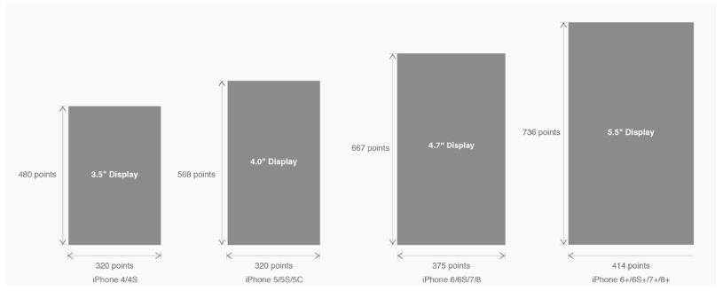
△ iPhone各机型的开发尺寸
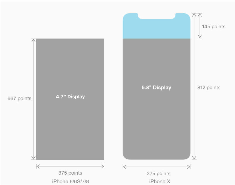
转化成我们熟知的像素尺寸:

△ 每个机型的多维度尺寸
倍图其实就是像素尺寸和开发尺寸的倍率关系,但这只是外在的表现。倍图核心的影响因素在于PPI(DPI),了解屏幕密度与各尺寸的关系有助于我们深度理解倍率的概念:《基础知识学起来!为设计师量身打造的DPI指南》
iPhone8在本次升级中,屏幕尺寸和分辨率都遗传了iPhone6以后的优良传统;
然而iPhone X 无论是在屏幕尺寸、分辨率、甚至是形状上都发生了较大的改变,下面以iPhone 8作为参照物,看看到底iPhone X的适配我们要怎么考虑。
我们看看iPhone X尺寸上的变化:
2. iPhoneX的适配---安全区域(safe area)
苹果对于 iPhone X 的设计布局意见如下:
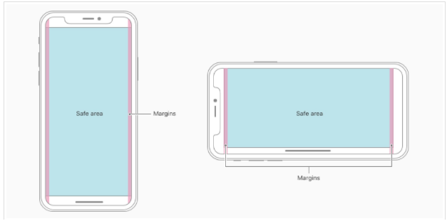
核心内容应该处于 Safe area 确保不会被设备圆角(corners),传感器外壳(sensor housing,齐刘海) 以及底部的 Home Indicator 遮挡。也就是说 我们设计显示的内容应该尽可能的在安全区域内;
3. iPhoneX的适配---适配方案viewport-fit
3.1 PhoneX的适配,在iOS 11中采用了viewport-fit的meta标签作为适配方案;viewport-fit的默认值是auto。
viewport-fit取值如下:
 auto:    默认:viewprot-fit:contain;页面内容显示在safe area内

 cover:    viewport-fit:cover,页面内容充满屏幕
viewport-fit meta标签设置(cover时)
<meta name="viewport" content="width=device-width,initial-scale=1.0, minimum-scale=1.0, maximum-scale=1.0, user-scalable=no, viewport-fit=cover">
3.2 css constant()函数 与safe-area-inset-top & safe-area-inset-left & safe-area-inset-right & safe-area-inset-bottom的介绍
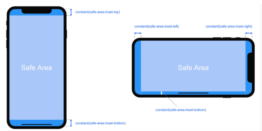
如上图所示 在iOS 11中的WebKit包含了一个新的CSS函数constant(),以及一组四个预定义的常量:safe-area-inset-left, safe-area-inset-right, safe-area-inset-top和 safe-area-inset-bottom。当合并一起使用时,允许样式引用每个方面的安全区域的大小。
3.1当我们设置viewport-fit:contain,也就是默认的时候时;设置safe-area-inset-left, safe-area-inset-right, safe-area-inset-top和 safe-area-inset-bottom等参数时不起作用的。
3.2当我们设置viewport-fit:cover时:设置如下
body {
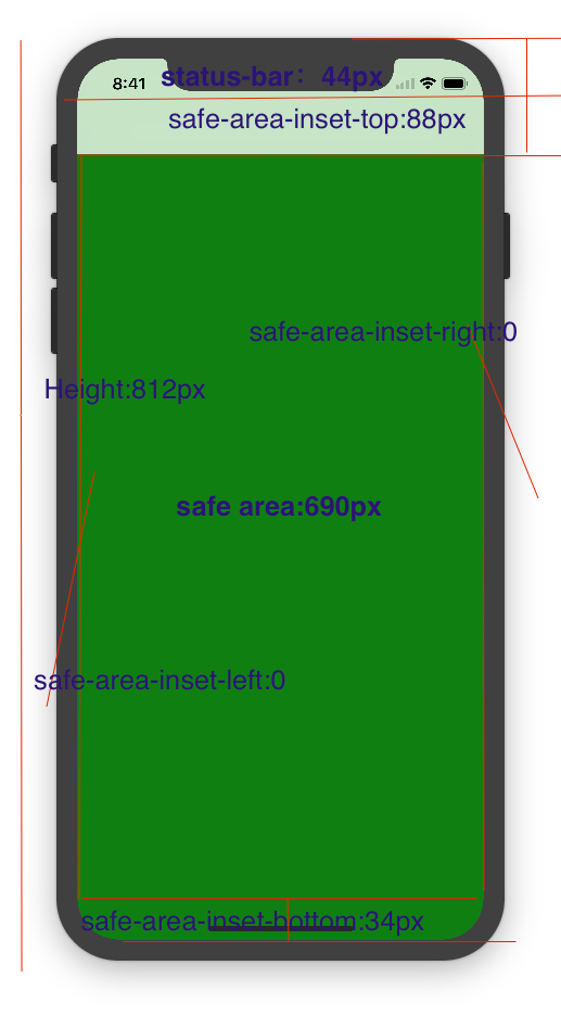
padding-top: constant(safe-area-inset-top); //为导航栏+状态栏的高度 88px
padding-left: constant(safe-area-inset-left); //如果未竖屏时为0
padding-right: constant(safe-area-inset-right); //如果未竖屏时为0
padding-bottom: constant(safe-area-inset-bottom);//为底下圆弧的高度 34px
}
4. iPhoneX的适配---高度统计
viewport-fit:cover + 导航栏
5.iPhoneX的适配---媒体查询
注意这里采用的是690px(safe area高度),不是812px;
@media only screen and (width: 375px) and (height: 690px){

    body {

        background: blue;

    }

}
6.iphoneX viewport-fit 问题总结
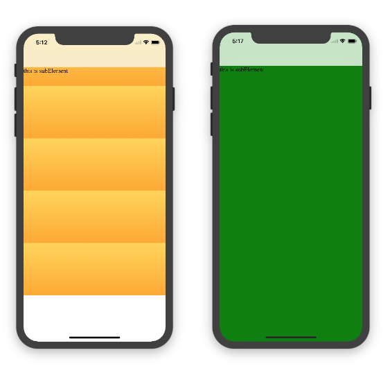
1.关于iphoneX 页面使用了渐变色时;如果viewport-fit:cover;
1.1在设置了背景色单色和渐变色的区别,如果是单色时会填充整个屏幕,如果设置了渐变色 那么只会更加子元素的高度去渲染;而且页面的高度只有690px高度,上面使用了padding-top:88px;
body固定为:
<body><div class="content">this is subElement</div></body>
1.单色时:
       * {

           padding:;

           margin:;

       }

       body {

           background:green;

           padding-top: constant(safe-area-inset-top); //88px

           /*padding-left: constant(safe-area-inset-left);*/

           /*padding-right: constant(safe-area-inset-right);*/

           /*padding-bottom: constant(safe-area-inset-bottom);*/

       }
2.渐变色
       * {

           padding:;

           margin:;

       }

       body {

           background:-webkit-gradient(linear, 0 0, 0 bottom, from(#ffd54f), to(#ffaa22));

           padding-top: constant(safe-area-inset-top); //88px

           /*padding-left: constant(safe-area-inset-left);*/

           /*padding-right: constant(safe-area-inset-right);*/

           /*padding-bottom: constant(safe-area-inset-bottom);*/

       }
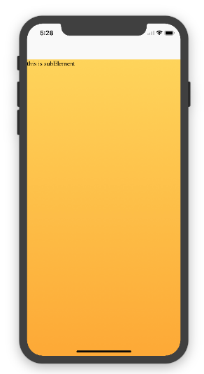
解决使用渐变色 仍旧填充整个屏幕的方法;CSS设置如下
<!DOCTYPE html>

<html>

<head>

   <meta name="viewport" content="initial-scale=1, viewport-fit=cover">

   <title>Designing Websites for iPhone X: Respecting the safe areas</title>

   <style>        * {

       padding: 0;

       margin: 0;

   }

   html, body {

       height: 100%;

   }

   body {

       padding-top: constant(safe-area-inset-top);

       padding-left: constant(safe-area-inset-left);

       padding-right: constant(safe-area-inset-right);

       padding-bottom: constant(safe-area-inset-bottom);

   }

   .content {

       background: -webkit-gradient(linear, 0 0, 0 bottom, from(#ffd54f), to(#ffaa22));

       width: 100%;

       height: 724px;

   }    </style>

</head>

<body>

<div class="content">this is subElement</div>

</body>

</html>
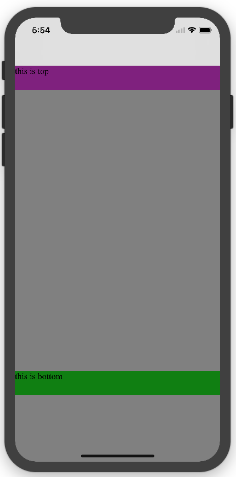
2.页面元素使用了固定定位的适配即:{position:fixed;}
2.1 子元素页面固定在底部时;使用viewport-fit:contain时;可以看到bottom:0时只会显示在安全区域内;

<!DOCTYPE html>

<html>

<head>

   <meta name="viewport" content="initial-scale=1">

   <!--<meta name="viewport" content="initial-scale=1, viewport-fit=cover">-->

   <title>Designing Websites for iPhone X: Respecting the safe areas</title>

   <style>

       * {

           padding: 0;

           margin: 0;

       }

       /*html,body {*/

           /*height: 100%;*/

       /*}*/

       body {

           background: grey;

           /*padding-top: constant(safe-area-inset-top);*/

           /*padding-left: constant(safe-area-inset-left);*/

           /*padding-right: constant(safe-area-inset-right);*/

           /*padding-bottom: constant(safe-area-inset-bottom);*/

       }

       .top {

           width: 100%;

           height: 44px;

           background: purple;

       }

       .bottom {

           position: fixed;

           bottom: 0;

           left: 0;

           right: 0;

           height: 44px;

           color: black;

           background: green;

       }

   </style>

</head>

<body>

   <div class="top">this is top</div>

   <div class="bottom">this is bottom</div>

</body>

</html>
2.1 子元素页面固定在底部时;使用viewport-fit:cover时;可以看到bottom:0时只会显示在安全区域内;
* {

    padding:;

    margin:;

}

/*html,body {*/

    /*height: 100%;*/

/*}*/

body {

    background: grey;

    padding-top: constant(safe-area-inset-top);

    /*padding-left: constant(safe-area-inset-left);*/

    /*padding-right: constant(safe-area-inset-right);*/

    /*padding-bottom: constant(safe-area-inset-bottom);*/

}

.top {

    width: 100%;

    height: 44px;

    background: purple;

}

.bottom {

    position: fixed;

    bottom:;

    left:;

    right:;

    height: 44px;

    color: black;

    background: green;

}
添加html,body {width:100%;heigth:100%}
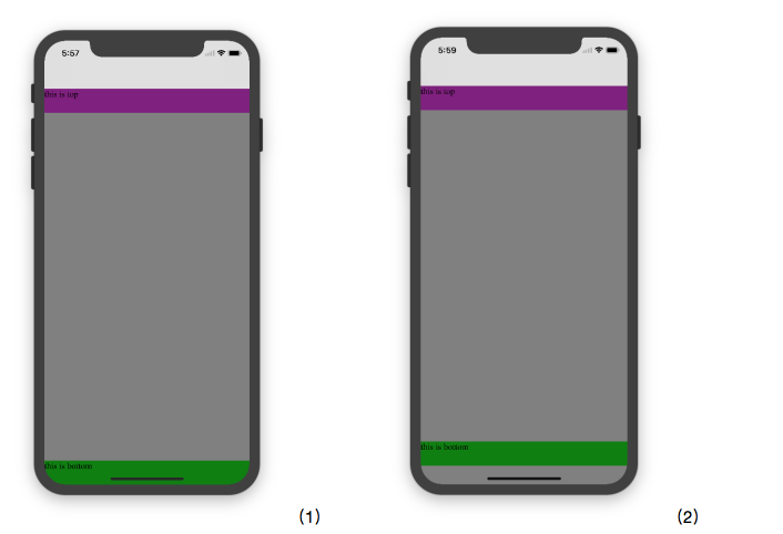
图1:
* {

           padding:;

           margin:;

       }

       html,body {

           height: 100%;

       }

       body {

           background: grey;

           padding-top: constant(safe-area-inset-top);

           padding-left: constant(safe-area-inset-left);

           padding-right: constant(safe-area-inset-right);

           padding-bottom: constant(safe-area-inset-bottom);

       }

       .top {

           width: 100%;

           height: 44px;

           background: purple;

       }

       .bottom {

           position: fixed;

           bottom:;

           left:;

           right:;

           height: 44px;

           color: black;

           background: green;

       }
图2:
 * {

           padding:;

           margin:;

       }

       html,body {

           height: 100%;

       }

       body {

           background: grey;

           padding-top: constant(safe-area-inset-top);

           padding-left: constant(safe-area-inset-left);

           padding-right: constant(safe-area-inset-right);

           /*padding-bottom: constant(safe-area-inset-bottom);*/

       }

       .top {

           width: 100%;

           height: 44px;

           background: purple;

       }

       .bottom {

           position: fixed;

           bottom:;

           left:;

           right:;

           height: 44px;

           color: black;

           background: green;

       }
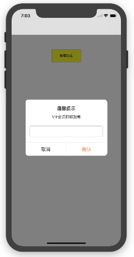
2.3 关于alertView弹框 遮罩层的解决方案
<!DOCTYPE html>

<html lang="en">

<head>

   <meta charset="UTF-8">

   <!--<meta name="viewport" content="width=device-width, initial-scale=1.0, minimum-scale=1.0, maximum-scale=1.0, user-scalable=no">-->

   <meta name="viewport" content="width=device-width,initial-scale=1.0, minimum-scale=1.0, maximum-scale=1.0, user-scalable=no, viewport-fit=cover">

   <meta http-equiv="pragma" content="no-cache">

   <meta http-equiv="cache-control" content="no-cache">

   <meta http-equiv="expires" content="0">

   <title>alertView</title>

   <script data-res="eebbk">

       document.documentElement.style.fontSize = window.screen.width / 7.5 + 'px';

   </script>

   <style>

       * {

           margin: 0;

           padding: 0;

       }

       html,body {

           width: 100%;

           height: 100%;

       }

       body {

           font-size: 0.32rem;

           padding-top: constant(safe-area-inset-top);

           padding-left: constant(safe-area-inset-left);

           padding-right: constant(safe-area-inset-right);

           padding-bottom: constant(safe-area-inset-bottom);

       }

       .content {

           text-align: center;

       }

       .testBut {

           margin: 50px auto;

           width: 100px;

           height: 44px;

           border: 1px solid darkgray;

           outline:none;

           user-select: none;

           background-color: yellow;

       }

   </style>

   <link href="alertView.css" rel="stylesheet" type="text/css">

</head>

<body>

   <section class="content">

       <button class="testBut" onclick="showLoading()">弹框加载</button>

   </section>

   <script type="text/javascript" src="alertView.js"></script>

   <script>

       function showLoading() {

           UIAlertView.show({

               type:"input",

               title:"温馨提示",              //标题

               content:"VIP会员即将到期",     //获取新的

               isKnow:false

           });

           var xx = new UIAlertView();

          console.log(xx);

       }

   </script>

</body>

</html>
iPhoneX页面安全区域与内容重叠问题的更多相关文章
- CSS侧边栏宽度不动(更改页面宽度时),内容区宽度自适应
一个页面,左栏是内容栏content,右栏是侧边栏sidebar.如何使侧边栏宽度不动(更改页面宽度时),内容区宽度自适应呢?为了保证内容区宽度自适应,先不设定其宽度,使其填充整个DIV区域,设定足够 ...
- JS打印页面指定区域
错误的写法: //打印 function printPage(areaId) { if (parent.$("#PrinFrame").length == 0) { parent. ...
- .net开发---自定义页面打印区域
自定义页面打印区域 有3种办法: 办法一:将不需要打印的部位隐藏掉 Examp: <%-- (1)使用css样式,定义一个.noprint的class,将不打印的内容放入这个class内. -- ...
- BOM 窗体相关属性以及页面可见区域的获取方式
1 在IE Safari Oper Chrome 都提供了screenLeft和screenTop属性: screenLeft : 相对于屏幕左边的距离 screenTop : 相对于屏幕上边的距离 ...
- vue 打印页面部分区域
1. vue项目打印页面部分区域 2. 原生js实现页面局部打印功能 3. vue项目中将table组件导出Excel表格以及打印页面内容
- JS获取中文拼音首字母,并通过拼音首字母高速查找页面内的中文内容
实现效果: 图一: 图二: watermark/2/text/aHR0cDovL2Jsb2cuY3Nkbi5uZXQvdGVzdGNzX2Ru/font/5a6L5L2T/fontsize/400/f ...
- 一天JavaScript示例-判定web页面的区域
<!DOCTYPE html> <html> <head> <meta http-equiv="Content-Type" content ...
- Axure 页面内多组内容切换的实现 + 利用一个内联框架实现百度地图访问
Axure 页面内多组内容切换的实现,场景:点击某个元件的时候,会显示响应的页面 操作:将显示的页面设置为动态面板,如图所示应该设置动态面板的状态为三个状态,分别为点击qq账号.手机账号.邮箱账号时 ...
- 微信小程序导出当前画布指定区域的内容并生成图片保存到本地相册(canvas)
最近在学小程序,在把当前画布指定区域的内容导出并生成图片保存到本地这个知识点上踩坑了. 这里用到的方法是: wx.canvasToTempFilePath(),该方法作用是把当前画布指定区域的内容导出 ...
随机推荐
- python 读取 log日志的编码问题
1.我要读取log日志的”执行成功”的个数,log日志编码格式为GBK 2.显示报错,大致意思是说utf-8的代码不能解析log日志 3.后来想想把log日志用GBK编码读出来,写到新文件中,用utf ...
- 统计学习五:3.决策树的学习之CART算法
全文引用自<统计学习方法>(李航) 分类与回归树(classification and regression tree, CART)模型是由Breiman等人于1984年提出的另一类决策树 ...
- 1.EOS源码编译运行
目前网络上都是针对老版EOS2.0源码编译的文章,我在mac上参考这些文章编译,最后发现根本就不对,最新版本只需一条命令(./eosio_build.sh,依赖库会自动安装的)即可.我根据这些文章手动 ...
- Python3 小工具-僵尸扫描
僵尸机的条件: 1.足够闲置,不与其他机器进行通讯 2.IPID必须是递增的,不然无法判断端口是否开放 本实验僵尸机选择的是Windows2003 from scapy.all import * im ...
- 【转】Backbone.js学习笔记(二)细说MVC
文章转自: http://segmentfault.com/a/1190000002666658 对于初学backbone.js的同学可以先参考我这篇文章:Backbone.js学习笔记(一) Bac ...
- Sublime Text 插件推荐——for web developers
楼主向高大上的: web front-end development engineer (好吧,google就是这样翻译的 ^_^)们推荐 ST 插件,在此抛砖引玉: NO.1 :Emmet (原名: ...
- Sublime Text 插件之:MarkDown
Sublime Text 插件之:MarkDown 喜欢写文档的同学应该离不开 MarkDown ,ST(Sublime Text)的插件 Markdown Preview 就支持实时在浏览器中预览p ...
- 感谢信——Alpha版
作为Thunder团队的leader,当时担任组长,说实话,确实是头脑一热,可后来,在确定选题时,看着大家都有自己的想法,看着大家都那么踊跃,而我因为性格的原因,总是难以做决定,导致选题这件事就开了几 ...
- c# CLR无法从 COM 上下文 0x51cd20 转换为 COM 上下文 0x51ce90
调试菜单--->异常---->managed debugging assistants栏下ContextSwitchDeadlock 前面的√去掉
- Where to go from here
Did you get through all of that content? Congratulations! You've learnt the fundamentals of algorith ...