
css绘制内扣圆角
纯静态的一种效果绘制,避免使用图标浪费内存。效果如下
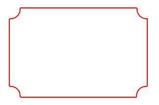
废话不多说,代码如下:
<!DOCTYPE html>

<html lang="en">

<head>

    <meta charset="UTF-8">

    <title>circle</title>

    <style type="text/css">

        #app{

            width:300px;height:200px;position: relative;box-sizing: border-box;padding:10px;

        }

        .box{

            width:100%;height:100%;border:2px solid #f00;

        }

        .circle{

            display: block;width:20px;height:20px;border:2px solid transparent;position: absolute;z-index: 1;background:#fff;

        }

        .top-left{

            left:10px;top: 10px;border-right-color: #f00;border-bottom-color: #f00;border-radius:0 0 20px 0;

        }

        .top-right{

            right: 5px;top: 10px;border-left-color: #f00;border-bottom-color: #f00;border-radius:0 0 0 20px;

        }

        .btm-left{

            left: 10px;bottom:6px;border-right-color: #f00;border-top-color: #f00;border-radius:0 20px 0 0;

        }

        .btm-right{

            right: 6px;bottom: 6px;border-left-color: #f00;border-top-color: #f00;border-radius:20px 0 0 0;

        }

    </style>

</head>

<body>

    <div id="app">

        <div class="box"></div>

        <i class="circle top-left"></i>

        <i class="circle top-right"></i>

        <i class="circle btm-left"></i>

        <i class="circle btm-right"></i>

    </div>

</body>

</html>
效果二:
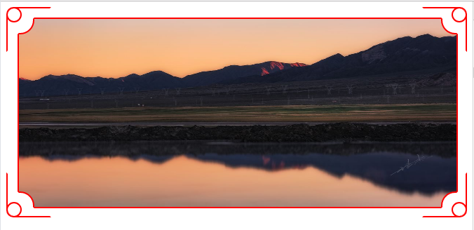
相比第一种效果,增加了四角的曲别针效果,完整代码为:
<!DOCTYPE html>

<html lang="en">

<head>

    <meta charset="UTF-8">

    <title>circle</title>

    <style type="text/css">

        .cont{

            height:300px;

            box-sizing: border-box;padding:10px;

            position: relative;

        }

        .icon-box{

            width:60px;height:60px;border:2px solid #f00;position: absolute;overflow: hidden;

        }

        .icon-top-left{

            left: 0;top: 0;border-right-color: transparent;border-bottom-color: transparent;border-radius:10px 0 0 0;

        }

        .icon-top-right{

            right: 0;top: 0;border-left-color: transparent;border-bottom-color: transparent;border-radius:0 10px 0 0;

        }

        .icon-btm-left{

            left: 0;bottom: 0;border-right-color: transparent;border-top-color: transparent;border-radius:0 0 0 10px;

        }

        .icon-btm-right{

            right: 0;bottom: 0;border-left-color: transparent;border-top-color: transparent;border-radius:0 0 10px 0;

        }

        .icon-box i{

            display: block;width:18px;height:18px;border-radius:50%;border:2px solid #f00;position: absolute;z-index: 2;

        }

        .icon-top-left i{

            left: -2px;top: -2px;

        }

        .icon-top-right i{

            right: -2px;top: -2px;

        }

        .icon-btm-left i{

            left: -2px;bottom: -2px;

        }

        .icon-btm-right i{

            right: -2px;bottom: -2px;

        }

        .app{

            width:100%;height:100%;

            position: relative;box-sizing: border-box;padding:5px 7px 7px 6px;

        }

        .box{

            width:100%;height:100%;border:2px solid #f00;

        }

        .circle{

            display: block;width:20px;height:20px;border:2px solid transparent;position: absolute;z-index: 1;background:#fff;

        }

        .top-left{

            left:6px;top: 5px;border-right-color: #f00;border-bottom-color: #f00;border-radius:0 0 20px 0;

        }

        .top-right{

            right: 3px;top:5px;border-left-color: #f00;border-bottom-color: #f00;border-radius:0 0 0 20px;

        }

        .btm-left{

            left: 6px;bottom:3px;border-right-color: #f00;border-top-color: #f00;border-radius:0 20px 0 0;

        }

        .btm-right{

            right: 3px;bottom: 3px;border-left-color: #f00;border-top-color: #f00;border-radius:20px 0 0 0;

        }

        .box img{

            display: block;width:100%;height:100%;

        }

    </style>

</head>

<body>

    <div class="cont">

        <div class="icon-box icon-top-left"><i></i></div>

        <div class="icon-box icon-top-right"><i></i></div>

        <div class="icon-box icon-btm-left"><i></i></div>

        <div class="icon-box icon-btm-right"><i></i></div>

        <div class="app">

            <div class="box"><img src="img_src" alt=""></div>

            <i class="circle top-left"></i>

            <i class="circle top-right"></i>

            <i class="circle btm-left"></i>

            <i class="circle btm-right"></i>

        </div>

    </div>

</body>

</html>
css绘制内扣圆角的更多相关文章
- css边框内凹圆角,解决优惠券的边框问题
关于css边框内凹圆角,找了好久才找到的 <html <head> <title>无标题页</title> <style> body{ backg ...
- CSS实现多重边框和内凹圆角
CSS实现多重边框 <!DOCTYPE html> <html lang="zh-cn"> <head> <meta charset=&q ...
- CSS布局技巧 -- 内凹圆角
圆角,相信每一个了解CSS属性的都知道,通过border-radius实现圆角(外凸圆角),但是如果需要实现内凹圆角怎么办呢?比如四角内凹的元素,比如如下所示这样的内凹圆角 对于这种问题,很多人的反应 ...
- CSS-论css如何纯代码实现内凹圆角
background-image: radial-gradient(200px at 50px 0px, #fff 50px, #4169E1 50px); 这是做内凹圆角的核心代码,就是背景图的ra ...
- CSS 魔法系列:纯 CSS 绘制三角形(各种角度)
我们的网页因为 CSS 而呈现千变万化的风格.这一看似简单的样式语言在使用中非常灵活,只要你发挥创意就能实现很多比人想象不到的效果.特别是随着 CSS3 的广泛使用,更多新奇的 CSS 作品涌现出来. ...
- 摘记 史上最强大的40多个纯CSS绘制的图形(一)
今天在国外的网站上看到了很多看似简单却又非常强大的纯CSS绘制的图形,里面有最简单的矩形.圆形和三角形,也有各种常见的多边形,甚至是阴阳太极和网站小图标,真的非常强大,分享给大家. Square(正方 ...
- 史上最强大的40多个纯CSS绘制的图形
Square(正方形) #square { width: 100px; height: 100px; background: red; } Rectangle(矩形) #rectangle { wid ...
- 40多个纯CSS绘制的图形
本文由码农网 – 陈少华原创,转载请看清文末的转载要求. 今天在国外的网站上看到了很多看似简单却又非常强大的纯CSS绘制的图形,里面有最简单的矩形.圆形和三角形,也有各种常见的多边形,甚至是阴阳太极和 ...
- css绘制三角形原理
1.新建一个元素,将它的宽高都设置为0:然后通过设置border属性来实现三角形效果,下面是css绘制三角形的原理: <!DOCTYPE html> <html> <he ...
随机推荐
- ELK基础原理
搜索引擎 索引组件: 获取数据-->建立文档-->文档分析-->文档索引(倒排索引) 搜索组件: 用户搜索接口-->建立查询(将用户键入的信息转换为可处理的查询对象) ...
- Go 初体验 - channel.1 - 基本用法
channel 分为两种: 1. 无缓冲 channel 2. 缓冲 channel 无缓冲 channel 的使用必须遵循一个原则:推送和读取必须同时存在,否则就发生死锁 先上代码: 这里定义了一个 ...
- 笔记-ASP.NET WebApi
本文是针对ASP.NET WepApi 2 的笔记. Web API 可返回的结果: 1.void 2.HttpResponseMessage 3.IHttpActionResult 4.其他类型 返 ...
- caffe-ssd编译runtest时候报错:g++: internal compiler error: Killed (program cc1plus)
大哥,你的内存不够了,删点儿东西吧
- Windows下静态库与动态库的创建与使用
Windows下静态库与动态库的创建与使用 学习内容:本博客介绍了Windows下使用Visual C++ 6.0制作与使用静态库与动态库的方法. --------CONTENTS-------- 一 ...
- 什么是软件开发工具包(SDK)
开发一个软件,需要经过编辑.编译.调试.运行几个过程. 编辑:使用编程语言编写程序代码的过程. 编译:如上一节所讲,就是将编写的程序进行翻译. 调试:程序不可能一次性编写成功,编写过程中难免会出现语法 ...
- c#阿里云服务器发送邮件
public static void SendMailUse() { string host = "smtp.lotusest.com";// 邮件服务器smtp.163.com表 ...
- Oarcle 入门之注释与关键字
--1.--单行注释 *输入法应定要为英文 --2./*多行注释 *与java相似*/ ------------------------------------------------------ ...
- 写Java代码分别使堆溢出,栈溢出
首先要搞清楚堆栈里放的什么东西: 栈存储运行时声明的变量——对象引用(或基础类型, primitive)内存空间,堆分配每一个对象内容(实例)内存空间. 一个变量可以先后指向多个对象实例:数组.链表等 ...
- 【题解】Luogu P3287 [SCOI2014]方伯伯的玉米田
原题传送门 一眼就能看出来这是一道dp题 显而易见每次操作的右端点一定是n,每株玉米被拔高的次数随位置不下降 用f(i,j) 表示以第i 株玉米结尾它被拔高了j 次的最长序列长度. \(f(i,j)= ...