RDMBorderedButton
RDMBorderedButton
https://github.com/reesemclean/RDMBorderedButton
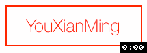
效果:
源码:
RDMBorderedButton.h + RDMBorderedButton.m
//

//  RDMBorderedButton.h

//  RDMBorderedButton

//

//  Created by Reese McLean on 6/12/14.

//  Copyright (c) 2014 Reese McLean. All rights reserved.

//

#import <UIKit/UIKit.h>

@interface RDMBorderedButton : UIButton

///Adjusting corner radius manually turns off automatic corner radius updating.

@property (nonatomic, assign) CGFloat cornerRadius;

///Determines whether the buttons corner radius is adjusting based on frame changes. Default = YES.

@property (nonatomic, assign) BOOL adjustsCornerRadiusBasedOnFrame;

///Approximate ratio of corner radius to smallest side of button frame. Default = 1.0/6.0.

@property (nonatomic, assign) CGFloat cornerRadiusRatioToSmallestSide;

@end
//

//  RDMBorderedButton.m

//  RDMBorderedButton

//

//  Created by Reese McLean on 6/12/14.

//  Copyright (c) 2014 Reese McLean. All rights reserved.

//

#import "RDMBorderedButton.h"

@implementation RDMBorderedButton

-(id) init {

    return [self initWithFrame:CGRectZero];

}

- (id)initWithFrame:(CGRect)frame {

    self = [super initWithFrame:frame];

    if (self) {

        // Initialization code

        [self commonSetup];

    }

    return self;

}

-(id) initWithCoder:(NSCoder *)aDecoder {

    self = [super initWithCoder:aDecoder];

    if (self) {

        NSAssert(self.buttonType == UIButtonTypeCustom, @"RDMBorderedButton's created in interface builder must be set to type custom.");

        [self commonSetup];

    }

    return self;

}

-(void) commonSetup {

    [self setTitleColor:self.tintColor forState:UIControlStateNormal];

    [self setTitleColor:[UIColor whiteColor] forState:UIControlStateHighlighted];

    [self setTitleColor:[UIColor grayColor] forState:UIControlStateDisabled];

    _adjustsCornerRadiusBasedOnFrame = YES;

    _cornerRadiusRatioToSmallestSide = 1.0/6.0;

    [self adjustCornerRadius];

    self.layer.cornerRadius = _cornerRadius;

    self.layer.borderWidth = 1.0;

    self.layer.borderColor = self.tintColor.CGColor;

}

-(void) layoutSubviews {

    [super layoutSubviews];

    if (self.adjustsCornerRadiusBasedOnFrame) {

        [self adjustCornerRadius];

    }

}

-(void) tintColorDidChange {

    [super tintColorDidChange];

    [self setTitleColor:self.tintColor forState:UIControlStateNormal];

    [self updateBorderAndFill];

}

-(void) adjustCornerRadius {

    _cornerRadius = roundf(MIN(CGRectGetHeight(self.frame), CGRectGetWidth(self.frame)) * self.cornerRadiusRatioToSmallestSide);

    self.layer.cornerRadius = _cornerRadius;

}

-(void) setTitleColor:(UIColor *)color forState:(UIControlState)state {

    if ([[self titleColorForState:state] isEqual:color]) {

        return;

    }

    [super setTitleColor:color forState:state];

    if (state == UIControlStateNormal) {

        self.tintColor = color;

    }

    [self updateBorderAndFill];

}

-(void) setTintColor:(UIColor *)tintColor {

    if ([[self tintColor] isEqual:tintColor]) {

        return;

    }

    [super setTintColor:tintColor];

    [self setTitleColor:self.tintColor forState:UIControlStateNormal];

    [self updateBorderAndFill];

}

-(void) setCornerRadius:(CGFloat)cornerRadius {

    self.adjustsCornerRadiusBasedOnFrame = NO;

    _cornerRadius = cornerRadius;

    self.layer.cornerRadius = _cornerRadius;

}

-(void) setEnabled:(BOOL)enabled {

    [super setEnabled:enabled];

    [self updateBorderAndFill];

}

-(void) updateBorderAndFill {

    self.layer.borderColor = self.enabled ? self.tintColor.CGColor : [self titleColorForState:UIControlStateDisabled].CGColor;

    self.backgroundColor = self.highlighted ? self.tintColor : [UIColor clearColor];

}

-(void) setHighlighted:(BOOL)highlighted {

    if (self.highlighted == highlighted) {

        return;

    }

    [super setHighlighted:highlighted];

    [UIView animateWithDuration:0.2f

                          delay:0.0f

                        options:UIViewAnimationOptionAllowUserInteraction | UIViewAnimationOptionBeginFromCurrentState

                     animations:^{

                         self.backgroundColor = highlighted ? self.tintColor : [UIColor clearColor];

                     }

                     completion:nil];

}

@end
显示的代码:
//

//  RootViewController.m

//

//  http://home.cnblogs.com/u/YouXianMing/

//

//  Copyright (c) 2014年 Y.X. All rights reserved.

//

#import "RootViewController.h"

#import "RDMBorderedButton.h"

@interface RootViewController ()

@end

@implementation RootViewController

- (void)viewDidLoad

{

    [super viewDidLoad];

    // 初始化

    RDMBorderedButton *button = \

        [[RDMBorderedButton alloc] initWithFrame:CGRectMake(, , , )];

    button.center             = self.view.center;

    // 设置圆角

    button.cornerRadius       = .f;

    // 设置字体

    button.titleLabel.font    = [UIFont fontWithName:@"HelveticaNeue-Thin"

                                                size:.f];

    // 设置标题

    [button setTitle:@"YouXianMing"

            forState:UIControlStateNormal];

    // 设置标题颜色

    [button setTitleColor:[UIColor redColor]

                 forState:UIControlStateNormal];

    [self.view addSubview:button];

}

@end
附录:
Usage
In code: Use initWithFrame to create a button and add to a subview.
Interface Builder: Add a button as usual. Set the class to RDMBorderedButton — there are some bugs with iOS 7.1 that require you to set the buttom type to Custom in Interface Builder. Also note that you can use the "User Defined Runtime Attributes" in Interface Builder to set the corner radius (key: "cornerRadius"). The example project shows this with the black and yellow buttons.
Corner Radius
By default, RDMBorderedButton will adjusts the corner radius of its border based on its frame. You can turn this off with:
button.adjustsCornerRadiusBasedOnFrame = NO; //Default is YES
You can also change the ratio of the corner radius of this automatic adjustment:
button.cornerRadiusRatioToSmallestSide = 1.0/4.0; //Default is 1.0/6.0
Note that changes to Corner Radius will not be animated. If you would like a corner radius change to be animated you will need to animate the key path using CoreAnimation. See the programatic view controller in the example project to see an example of this.
The corner radius can be adjusted manually (this turns off automatic adjustments):
//This will forward the cornerRadius to the button's layer and turn off automatic adjustments

button.cornerRadius = 6.0;
Color
The text and border color are adjusted together. For normal state they can be changed using either:
button.tintColor = [UIColor greenColor];
or:
[button setTitleColor:[UIColor greenColor] forState:UIControlStateNormal];
Disabled state can be adjusted using:
[button setTitleColor:[UIColor grayColor] forState:UIControlStateDisabled]; //Default is [UIColor grayColor]
The text color when highlighted should be changed using:
[self setTitleColor:[UIColor blueColor] forState:UIControlStateHighlighted]; //Default is [UIColor whiteColor]
RDMBorderedButton的更多相关文章
随机推荐
- ActiveMQ开发注意要点
目录1.如何保证消息的成功处理2.避免消息队列的并发3.消息有效期的管理4.过期消息,处理失败的消息如何处理 1.保证消息的成功处理消息发送成功后,接收端接收到了消息.然后进行处理,但是可能由于某种原 ...
- mongodb-mongotemplate进行地理坐标操作
因为项目中使用的springboot + mongotemplate, 所以还是需要mongotemplate的操作方式 首先建立一个bean: package com.iwhere.easy.tra ...
- Java 并行编程!
多核处理器现在已广泛应用于服务器.台式机和便携机硬件.它们还扩展到到更小的设备,如智能电话和平板电脑.由于进程的线程可以在多个内核上并行执行,因此多核处理器为并发编程打开了一扇扇新的大门.为实现应用程 ...
- Maven 添加 Tomcat 插件
若想在 Maven 中使用 Tomcat 服务器,需要在 pom.xml 文件中的 <build></build> 标签中添加以下代码 <!-- Maven项目编译插件 ...
- MySQL 继续-- Win7 安装及后续工作
学MySQL 差不多了,就要实战,实战怎么能少得了软件. 一 : 下载软件 可以到 MySQL 官网直接下载 (社区版) : http://dev.mysql.com/downloads/mysql ...
- How系列-公网如何ssh到内网的Linux系统中?
起因 最近碰到一件事:B同学在他电脑的Ubuntu虚拟机中学习搭建服务器碰到了问题,要我帮他看下.我总不能一个QQ远程桌面连过去,那样操作会卡到崩溃.ssh过去是最好的方法,不过他的电脑跟我不在一个局 ...
- C#字符串中的中文逗号转英文逗号
public static string ToDBC(string input) { char[] c = input.ToCharArray(); for (int i = 0; i < c. ...
- hdu 3295 模拟过程。数据很水
An interesting mobile game Time Limit: 3000/1000 MS (Java/Others) Memory Limit: 65535/32768 K (Ja ...
- 郭霖 - MVVM开源项目学习
https://blog.csdn.net/guolin_blog/article/details/87900605 https://medium.com/androiddevelopers/view ...
- html 里面的 role 属性是什么意义和用途
使用role属性告诉辅助设备(如屏幕阅读器)这个元素所扮演的角色,属于WAI-ARIA. 例如点击的按钮,就是role="button":会让这个元素可点击:本质上是增强语义性,当 ...