
css基础--常用css属性01
1 背景相关
背景颜色 background-color = 颜色名称/rgb值/十六进制值
背景图片 background-image = url('')
背景图片平铺方式 background-repeat = repeat-x(仅水平平铺) repeat-y(仅垂直平铺) no-repeat(不平铺)
设置背景图片位置 background-position = 数字+单位/center/top/bottom/left/right 同上。 例如:50px 50px
背景图片是否滚动 background-attachment = fixed(不滚动) scroll(滚动)
<!DOCTYPE html>

<html lang="en">

<head>

    <meta charset="UTF-8">

    <title>first page</title>

    <style>

        body{

            background-color: aliceblue;

            background-image: url('l.jpg');

            background-repeat: no-repeat;

            background-position: right top;

            background-attachment: fixed;

        }

    </style>

</head>

<body>

<h1 >hello world</h1>

<p >this paragra is only used for test</p>

<br>

<p>hello world</p>

<p>hello world</p><p>hello world</p><p>hello world</p><p>hello world</p><p>hello world</p>

<p>hello world</p><p>hello world</p><p>hello world</p><p>hello world</p><p>hello world</p>

<p>hello world</p><p>hello world</p><p>hello world</p><p>hello world</p><p>hello world</p>

<p>hello world</p><p>hello world</p><p>hello world</p><p>hello world</p><p>hello world</p>

<p>hello world</p><p>hello world</p><p>hello world</p><p>hello world</p>

</body>

</html>
2 文本相关
文本颜色: color = 颜色名称/rgb值/十六进制值
文本对齐方式:text-align = center(居中) right(右对齐) justify(两端对齐)
通过使用text-align:center; 可以将该元素中的 行内元素 居中显示,也就是图片字体都可以居中显示。
文本加工: text-decoration = underline(下划线)
文本缩进: text-indent = 十进制值+单位。例如:50px
文本大小写: text-transform = uppercase(大写) lowercase(小写) capitalize(首字母大写)
文本阴影: text-shadow = num1(左右) num2(上下) num3(粗细) color
<!DOCTYPE html>

<html lang="en">

<head>

    <meta charset="UTF-8">

    <title>first page</title>

    <style>

        .first{

            color:red;

            text-align: center;

            text-transform: uppercase;

            text-decoration: none;

        }

        #sencend{

            color:green;

            text-transform: capitalize;

            text-align: right;

            text-decoration: underline;

            text-indent: 50px;

        }

        .third{

            color:yellow;

            text-indent: 100px;

        }

    </style>

</head>

<body>

<h1 class="first">hello world</h1>

<p id="sencend">this paragra is only used for test</p>

<p class="third">this paragra is only used for test</p>

<p>this paragra is only used for test</p>

</body>

</html>
所有文本属性:
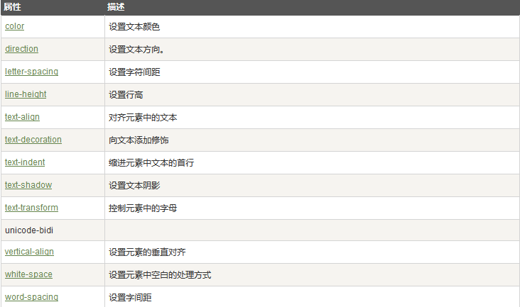
3 字体相关
字体系列 font-family 属性应该设置几个字体名称作为一种"后备"机制,如果浏览器不支持第一种字体,他将尝试下一种字体。注意: 如果字 体系列的名称超过一个字,它必须用引号,如Font Family:"宋体"。多个字体系列是用一个逗号分隔指明:
字体样式 font-style = normal(正常) italic(斜体) oblique (粗体)
字体大小 font-size = 数字+单位
<!DOCTYPE html>

<html lang="en">

<head>

    <meta charset="UTF-8">

    <title>first page</title>

    <style>

        body{

            font-family: Sans-serif,Monospace;

            font-style: italic;

            font-size: 16px;

        }

    </style>

</head>

<body>

<h1 >hello world</h1>

<p >this paragra is only used for test</p>

<br>

<p>hello world</p>

</body>

</html>
4 链接
a:link {} 未访问过的链接
a:visited {} 已访问过的链接
a:hover {} 鼠标放在链接时
a:active {} 链接被点击时
<!DOCTYPE html>

<html lang="en">

<head>

    <meta charset="UTF-8">

    <title>first page</title>

    <style>

        a:link{color:mediumvioletred;font-size: 16px;text-decoration: none}

        a:visited{color:blue;font-size:16px;text-decoration: none}

        a:hover{color:darkgreen;font-size:24px;text-decoration: underline;background-color: aquamarine;padding: 4px}

        a:active{color:darkgoldenrod;font-size: 44px;text-decoration: overline}

    </style>

</head>

<body>

<h1 >hello world</h1>

<p >this paragra is only used for test</p>

<a href="http://baidu.com" target="_blank">百度</a>

<br>

<p>hello world</p>

</body>

</html>
5 列表
列表项样式 list-style-type = disc(默认实心圆)/circle(空心圆)/square(方块)/decimal(数字)……
列表项图片 list-style-image = url('')
<!DOCTYPE html>

<html>

<head>

<style>

ul.a {list-style-type:circle;}

ul.b {list-style-type:square;}

ol.c {list-style-type:upper-roman;}

ol.d {list-style-type:lower-alpha;}

</style>

</head>

<body>

<p>Examples of a and b:</p>

<ul class="a">

  <li>Coffee</li>

  <li>Tea</li>

  <li>Coca Cola</li>

</ul>

<ul class="b">

  <li>Coffee</li>

  <li>Tea</li>

  <li>Coca Cola</li>

</ul>

<p>Examples of c and d </p>

<ol class="c">

  <li>Coffee</li>

  <li>Tea</li>

  <li>Coca Cola</li>

</ol>

<ol class="d">

  <li>Coffee</li>

  <li>Tea</li>

  <li>Coca Cola</li>

</ol>

</body>

</html>
6 表格
边框全面设置: border = 1px solid(实线) 颜色 后两个属性可以省略
边框颜色: border-color = 颜色
边框样式: border-style = solid(只记住这一个就可以了)
单独边框: border-top
border-top-color
border-top-style
border-top-width
详情请看:http://www.w3school.com.cn/cssref/index.asp
<!DOCTYPE html>

<html>

<head>

<style>

#customers

{

font-family:"Trebuchet MS", Arial, Helvetica, sans-serif;

width:100%;

border-collapse:collapse;

}

#customers td, #customers th

{

font-size:1em;

border:1px solid #98bf21;

padding:3px 7px 2px 7px;

}

#customers th

{

font-size:1.1em;

text-align:left;

padding-top:5px;

padding-bottom:4px;

background-color:#A7C942;

color:#ffffff;

}

#customers tr.alt td

{

color:#000000;

background-color:#EAF2D3;

}

</style>

</head>

<body>

<table id="customers">

<tr>

  <th>Company</th>

  <th>Contact</th>

  <th>Country</th>

</tr>

<tr>

<td>Alfreds Futterkiste</td>

<td>Maria Anders</td>

<td>Germany</td>

</tr>

<tr class="alt">

<td>Berglunds snabbköp</td>

<td>Christina Berglund</td>

<td>Sweden</td>

</tr>

<tr>

<td>Centro comercial Moctezuma</td>

<td>Francisco Chang</td>

<td>Mexico</td>

</tr>

<tr class="alt">

<td>Ernst Handel</td>

<td>Roland Mendel</td>

<td>Austria</td>

</tr>

<tr>

<td>Island Trading</td>

<td>Helen Bennett</td>

<td>UK</td>

</tr>

<tr class="alt">

<td>Königlich Essen</td>

<td>Philip Cramer</td>

<td>Germany</td>

</tr>

<tr>

<td>Laughing Bacchus Winecellars</td>

<td>Yoshi Tannamuri</td>

<td>Canada</td>

</tr>

<tr class="alt">

<td>Magazzini Alimentari Riuniti</td>

<td>Giovanni Rovelli</td>

<td>Italy</td>

</tr>

<tr>

<td>North/South</td>

<td>Simon Crowther</td>

<td>UK</td>

</tr>

<tr class="alt">

<td>Paris spécialités</td>

<td>Marie Bertrand</td>

<td>France</td>

</tr>

</table>

</body>

</html>
个性表格
7 轮廓
轮廓(outline)是绘制于元素周围的一条线,位于边框边缘的外围,可起到突出元素的作用。
可以对轮廓指定样式,颜色和外边框的宽度。

<!DOCTYPE html>

<html lang="en">

<head>

<style>

    .b{

        outline:10px solid black;

    }

</style>

</head>

<body>

<p><span class="b">hello world</span></p>

</body>

</html>
轮廓演示
8 盒子模型
边框:
-border: 2px solid red; 表示边框宽度(border-width)为2px,边框样式(border-style)为实线,边框颜色(border-color)为红色
-其中常用的边框样式有:solid 实线 dashed 虚线 dotted 点线
-可以单独设置上右下左边框:border-top/border-right/border-bottom/border-left
外边距 margin:
-若margin后面跟一个数字,则表示上右下左外边距相同,且值为该数字;若margin后面跟两个数字,第一个表示垂直,第二个表示水平;若 margin后面跟4个数字,则按照 上 右 下 左 的顺序设置。
-可以单独设置上右下左外边距:margin-top/margin-right/margin-bottom/margin-left
-使用margin:0px auto;可以将 定宽 的 块元素 设置为居中显示
内边距 padding:
同上。
<!DOCTYPE html>

<html lang="en">

<head>

<style>

    .a{

        padding:10px;

        border:1px solid red;

        width:100px;

    }

    p {

        margin:50px;

        width:200px

    }

</style>

</head>

<body>

<p class="a">hello world </p>

</body>

</html>
9 尺寸

vertical-align 属性设置元素的垂直对齐方式。该属性定义行内元素的基线相对于该元素所在行的基线的垂直对齐。
10 元素分类
html元素分为三类:
块元素 block:如<div>、<p>、<h1>...<h6>、<ol>、<ul>、<dl>、<table>、<address>、<blockquote> 、<form>等。
特点: 每个块级元素都从新的一行开始,其后的元素另起一行,也就是说,块级元素很霸道,要占一整行。
块级元素可以设置 宽 高 行高 顶边距 和底边距
元素宽度在不设置的情况下,是其父容器的100%
行内(内联)元素 inline:如<a>、<span>、<br>、<i>、<em>、<strong>、<label>、<q>、<var>、<cite>、<code>等
特点: 前后无换行符
元素的高 宽 顶边距和底边距不可设置
元素的宽度就是他包含的文本或者图片的宽度。
行内块元素 inline-block:如<img>、<input>
特点: 前后无换行符
元素的 高 宽 顶边距和底边距可以设置
我们可以使用css中的display属性改变元素类型:
display = inline 默认。此元素会被显示为内联元素,元素前后没有换行符。
block 此元素将显示为块级元素,此元素前后会带有换行符。
none 此元素会被隐藏,且隐藏的元素不会占用任何空间
inline-block 设置为行内块元素
css中的display属性对元素进行转换,也可以隐藏元素。
 <!DOCTYPE html>

 <html lang="en">

 <head>

 <style>

 li{

     display: inline;

     background-color: #A7C942;

     font-size: 28px;

 }

 </style>

 </head>

 <body>

 <ul >

     <li>a</li>

     <li>b</li>

     <li>c</li>

     <li>d</li>

 </ul>

 </body>

 </html>
块元素转为行内元素
 <!DOCTYPE html>

 <html lang="en">

 <head>

 <style>

 span{

     display: block;

     background-color: #A7C942;

     font-size: 28px;

 }

 </style>

 </head>

 <body>

 <p><span>hello</span><span>world</span></p>

 </body>

 </html>
行内元素转换为块元素
<!DOCTYPE html>

<html lang="en">

<head>

<style>

    span{

        display: block;

        background-color: #A7C942;

        font-size: 28px;

    }

    .a{

        display: none;

    }

</style>

</head>

<body>

<p><span class="a">hello</span><span>world</span></p>

</body>

</html>
隐藏元素
11 布局模型
CSS 有三种基本的定位机制:普通流、绝对定位、浮动。
css中有三种布局模型:
1 流动模型,默认模型。在这种模型下:
1 块元素都会在所处的包含元素自上而下按照顺序垂直延伸分布,因此在默认状态下,块元素的宽度都是100%
2 内联元素则会在所处的包含元素内从左到右水平分布显示
2 浮动模型,float
使用float属性可以让两个块元素并排显示,浮动的元素脱离标准文档流中。
(1)元素在脱离文档流就是说,float使html元素脱离文档流浮动起来,导致其后面的(在文档流中的)元素占据了float元素的原位置。
(2)内容仍然在文档流就是说,虽然承载内容的元素脱离了文档流,但是其内部内容仍然在文档流中,后续的元素即使占据了我元素的位置,也要为了其中的内容留空间。
示例:


3 层模型,使用css中的position
css的position属性有四个值:
static:HTML元素的默认值,即没有定位,元素出现在正常的流中,也就是普通流。静态定位的元素不会受到top, bottom, left, right影响。
fixed:元素的位置相对于浏览器窗口是固定位置,相当于定位基准为视窗本身的绝对定位。即使窗口是滚动的它也不会移动。通过 left right top bottom 来确定元素在正常流中的偏移位置。
relative:相对定位元素的定位是相对其正常位置,也是出现在普通流。如果对一个元素进行相对定位,它将出现在它所在的位置上。然后,可以通过设置垂直或水平位置,让这个元素“相对于”它的起点进行移动,相对定位元素它原本占的空间不会改变(也就是在普通流中原来的位置仍保留)。通过 left right top bottom 来确定元素在正常流中的偏移位置。
absolute:绝对定位的元素的位置相对于最近的已定位父元素,如果元素没有已定位的父元素,那么它的位置相对于<html>。absolute定位的元素会和其他元素重叠。Absolute定位使元素的位置与文档流无关,因此不占据空间。通过 left right top bottom 来确定元素在正常流中的偏移位置。
absolute可以和relative组合使用,定位元素以某个元素作为参照物进行定位。但有几个前提条件:
1 参照元素必需是定位元素的父元素
2 参照元素必需使用position:relative
3 定位元素使用position:absolute进行定位
另外,我们可以使用z-index属性来设置元素的堆叠次序(垂直方向的前后)
<!DOCTYPE html>

<html lang="en">

<head>

<style>

    .b{

        position:fixed;

        z-index: -1;

    }

</style>

</head>

<body>

<img class='b' src="l.jpg">

<p>hello world</p><p>hello world</p><p>hello world</p><p>hello world</p><p>hello world</p>

<p>hello world</p><p>hello world</p><p>hello world</p><p>hello world</p><p>hello world</p>

<p>hello world</p><p>hello world</p><p>hello world</p><p>hello world</p><p>hello world</p>

<p>hello world</p><p>hello world</p><p>hello world</p><p>hello world</p><p>hello world</p>

<p>hello world</p><p>hello world</p><p>hello world</p><p>hello world</p><p>hello world</p>

<p>hello world</p><p>hello world</p><p>hello world</p><p>hello world</p><p>hello world</p>

<p>hello world</p><p>hello world</p><p>hello world</p><p>hello world</p><p>hello world</p>

<p>hello world</p><p>hello world</p><p>hello world</p><p>hello world</p><p>hello world</p>

<p>hello world</p><p>hello world</p><p>hello world</p><p>hello world</p><p>hello world</p>

<p>hello world</p><p>hello world</p><p>hello world</p><p>hello world</p><p>hello world</p>

<p>hello world</p><p>hello world</p>

</body>

</html>
position=fixed实例
<!DOCTYPE html>

<html lang="en">

<head>

<style>

    .b{

        position:relative;

        top: 30px;

    }

</style>

</head>

<body>

<p class="b">test  test test</p><p>hello world</p><p>hello world</p><p>hello world</p><p>hello world</p>

<p>hello world</p><p>hello world</p><p>hello world</p><p>hello world</p><p>hello world</p>

</body>

</html>
position=relative实例
注意:在relative介绍中,有这样一句话“相对定位元素它原本所占的空间不会改变(也就是在普通流中原来的位置仍保留)”。这句话在relative实例中,得到了体现。hello world并不会占用第一行,而是从第二个段落位置开始排列。
<!DOCTYPE html>

<html lang="en">

<head>

<style>

    .b{

        position:absolute;

        top: 30px;

    }

</style>

</head>

<body>

<p class="b">test  test test</p><p>hello world</p><p>hello world</p><p>hello world</p><p>hello world</p>

<p>hello world</p><p>hello world</p><p>hello world</p><p>hello world</p><p>hello world</p>

</body>

</html>
position=absolute实例
Absolute定位使元素的位置与文档流无关,因此不占据空间。可以和relative的实例结果进行比较。
<!DOCTYPE html>

<html lang="en">

<head>

<style>

    .b{

        position:absolute;

        z-index: -1;

    }

</style>

</head>

<body>

<img class='b' src="l.jpg">

<p>hello world</p>

</body>

</html>
z-index实例
浏览器显示:

另外,定位属性还有很多,贴张图:


<!DOCTYPE html>

<html>

<body>

<p>Mouse over the words to change the cursor.</p>

<span style="cursor:auto">auto</span><br>

<span style="cursor:crosshair">crosshair</span><br>

<span style="cursor:default">default</span><br>

<span style="cursor:e-resize">e-resize</span><br>

<span style="cursor:help">help</span><br>

<span style="cursor:move">move</span><br>

<span style="cursor:n-resize">n-resize</span><br>

<span style="cursor:ne-resize">ne-resize</span><br>

<span style="cursor:nw-resize">nw-resize</span><br>

<span style="cursor:pointer">pointer</span><br>

<span style="cursor:progress">progress</span><br>

<span style="cursor:s-resize">s-resize</span><br>

<span style="cursor:se-resize">se-resize</span><br>

<span style="cursor:sw-resize">sw-resize</span><br>

<span style="cursor:text">text</span><br>

<span style="cursor:w-resize">w-resize</span><br>

<span style="cursor:wait">wait</span><br>

</body>

</html>
更改光标cursor实例
<!DOCTYPE html>

<html>

<head>

<style>

div.scroll

{

background-color:#00FFFF;

width:200px;

height:100px;

overflow:scroll;

}

div.hidden

{

background-color:#00FF00;

width:100px;

height:100px;

overflow:hidden;

}

</style>

</head>

<body>

<p>The overflow property specifies what to do if the content of an element exceeds the size of the element's box.</p>

<p>overflow:scroll</p>

<div class="scroll">You can use the overflow property when you want to have better control of the layout. The default value is visible.</div>

<p>overflow:hidden</p>

<div class="hidden">You can use the overflow property when you want to have better control of the layout. The default value is visible.</div>

</body>

</html>
溢出overflow实例

css基础--常用css属性01的更多相关文章
- css基础--常用css属性02
上篇地址:css基础--常用css属性01 本文参考菜鸟教程和w3school 1 浮动和清除浮动 在上篇的第十一节--定位中说道: CSS 有三种基本的定位机制:普通流.浮动和绝对定位. 普通流和 ...
- HTML&CSS基础-常用选择器
HTML&CSS基础-常用选择器 作者:尹正杰 版权声明:原创作品,谢绝转载!否则将追究法律责任. 一.html源代码 <!DOCTYPE html> <html> & ...
- HTML&CSS基础-标签的属性
HTML&CSS基础-标签的属性 作者:尹正杰 版权声明:原创作品,谢绝转载!否则将追究法律责任. 一.html源代码 <!-- html 根标签,一个页面中有且只有一个根标签,网页中的 ...
- HTML&CSS基础-边框简写属性
HTML&CSS基础-边框简写属性 作者:尹正杰 版权声明:原创作品,谢绝转载!否则将追究法律责任. 一.HTML源代码 <!DOCTYPE html> <html> ...
- CSS基础--常用样式
一.背景相关 背景颜色 background-color :颜色名称/rgb值/十六进制值 背景图片 background-image :url('') 背景图片平铺方式 background-rep ...
- CSS基础-行快属性,hover
CSS基础 1.行快属性 在css中有很多标签,分为行内标签,块标签,标签行内块标签,他们有着不同的属性. 块标签 div,ul,li,ol,h1~h6,p 可 ...
- HTML5 -入门 (---css样式-------------(css基础与css选择器)---------------------—)
---恢复内容开始--- 一css基础入门与css选择器 CSS英文全拼:cascading style sheet 层叠样式表. 在html中使用:要在head中写style标签,所有样式放在sty ...
- Html+CSS基础之CSS样式
认识CSS样式 CSS全称为“层叠样式表 (Cascading Style Sheets)”,它主要是用于定义HTML内容在浏览器内的显示样式,如文字大小.颜色.字体加粗等. 如下列代码: p{ fo ...
- 一、HTML和CSS基础--HTML+CSS基础课程--第2部分
第三章 与浏览器交互,表单标签 使用表单标签,与用户交互 网站怎样与用户进行交互?答案是使用HTML表单(form).表单是可以把浏览者输入的数据传送到服务器端,这样服务器端程序就可以处理表单传过来的 ...
随机推荐
- mysql/mybatis之合并两个表的查询结果
下面这段sql是把两个表中各自符合条件的count值相加,返回结果是两个之和 SELECT sum(result) FROM ( SELECT COUNT(*) result FROM TEST_A ...
- Daily Scrum 11.7
明后两天周六日,按照TFS的日常安排应该是休息,所以让他们自由完成已经分配的任务. 姓名 今日任务 黄新越 提取爬取网页的关键字并输出到接口 刘垚鹏 程序总架构的修改与多线程的学习 王骜 多线程学习 ...
- Scrum Meeting 11.07
成员 今日任务 明日计划 用时 徐越 赵庶宏 薄霖 卞忠昊 JOSN数据解析 WebView和JavaScript交互基础 3h 武鑫 设计界面:独立完成一些简 ...
- java程序设计课程实验报告3
北京电子科技学院(BESTI) 实 验 报 告 课程:java程序设计 班级:1353 姓名:陈都 学号:20135328 成绩: 指导教师:娄 ...
- JAVA实验报告三:敏捷开发与XP实践
实验内容 1. XP基础 2. XP核心实践 3. 相关工具 实验步骤 (一)敏捷开发与XP 软件工程是把系统的.有序的.可量化的方法应用到软件的开发.运营和维护上的过程.软件工程包括下列领域:软件需 ...
- 20172321『Java程序设计』课程 结对编程练习_四则运算第二周阶段总结
20172321『Java程序设计』课程 结对编程练习_四则运算第二周阶段总结 结对伙伴 学号 :20172324 姓名 :曾程 伙伴第一周博客地址: 对结对伙伴的评价:一个很优秀的同学,在这次项目中 ...
- c# combobox向上展开
1.问题情境:实际中的下拉框默认向下扩展,如果屏幕下方空间不足,会向上扩展. 向下扩展情况下,有时候会超出form窗体. 2.解决办法: 寻找相关属性无果. 退而求其次,重画item的框.发现Draw ...
- 第二阶段Sprint冲刺会议4
进展:主要实现调取手机摄像头录制,能够实现“开始”及“暂停”功能.
- ARP 询问之 校级路由器的猫腻
前情 我为什么选定 172.17.174.73 这个 ip 来进行测试.戳前情 Scapy之ARP询问 前言 在一般家用路由器局域网下,进行 arp 广播,说:我是192.168.1.100,你们谁的 ...
- salt-api使用
salt-api 基本使用 目前salt API 支持的web模块如下: CherryPy Tornado WSGI 1.安装salt-api salt 使用 CherryPy来实现restful的a ...