一款纯css3实现的机器人看书动画效果
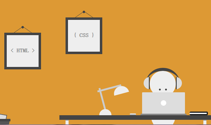
今天要给大家介绍一款纯css3实现的机器人看书动画效果。整个画面完全由css3实现的绘制,没有使用任何图片元素。机器人的眼睛使用了动画元素。我们一起看下效果图:
实现的代码。
html代码:
 <div class='szene'>

        <div class='image i1'>

            < HTML >

            <div class='nail'>

            </div>

        </div>

        <div class='image i2'>

            { CSS }

            <div class='nail'>

            </div>

        </div>

        <div class='head'>

            <div class='eyes'>

            </div>

        </div>

        <div class='body'>

        </div>

        <div class='table'>

        </div>

        <div class='laptop'>

        </div>

        <div class='mouse'>

        </div>

        <div class='notes'>

        </div>

        <div class='lamp'>

            <div class='top'>

            </div>

        </div>

        <div class='headphones'>

        </div>

        <div class='trash'>

            <div class='paper p1'>

            </div>

            <div class='paper p2'>

            </div>

            <div class='paper p3'>

            </div>

            <div class='paper p4'>

            </div>

        </div>

    </div>
css代码:
* {

  margin:;

  padding:;

  -moz-box-sizing: border-box;

       box-sizing: border-box;

}

*:before, *:after {

  content: '';

  display: block;

  position: absolute;

  -moz-box-sizing: border-box;

       box-sizing: border-box;

}

html, body {

  height: 100%;

}

body {

  background: #d93;

}

.szene {

  position: absolute;

  left: 50%;

  bottom:;

  width: 800px;

  height: 400px;

  margin-left: -400px;

  overflow: hidden;

}

.szene div {

  position: absolute;

}

.image {

  width: 120px;

  height: 120px;

  line-height: 100px;

  text-align: center;

  font-family: 'Open Sans', sans-serif;

  font-size: 18px;

  font-weight:;

  color: #888;

  border: 8px solid #444;

  background: #eee;

}

.image.i1 { top: 100px; left: 100px; }

.image.i2 { top: 50px; left: 300px; }

.image .nail {

  top: -30px;

  left: 50%;

  width: 8px;

  height: 8px;

  margin-left: -4px;

  border-radius: 50%;

  background: #444;

}

.image .nail:before,

.image .nail:after {

  top: -5px;

  width: 1px;

  height: 35px;

  background: #444;

}

.image .nail:before { left: -11px; -webkit-transform: rotate(55deg); -ms-transform: rotate(55deg); transform: rotate(55deg); }

.image .nail:after { left: 19px; -webkit-transform: rotate(-55deg); -ms-transform: rotate(-55deg); transform: rotate(-55deg); }

.head {

  bottom: 90px;

  left: 575px;

  width: 85px;

  height: 85px;

  border-radius: 50%;

  background: #eee;

}

.head .eyes {

  top: 58px;

  left: 30px;

  width: 6px;

  height: 6px;

  border-radius: 50%;

  background: #444;

  box-shadow: 20px 0 0 #444;

  -webkit-animation: 8s eyes ease infinite;

          animation: 8s eyes ease infinite;

}

@-webkit-keyframes eyes {

  0% { -webkit-transform: translate3d(0,0,0); transform: translate3d(0,0,0); }

  5% { -webkit-transform: translate3d(0,-18px,0); transform: translate3d(0,-18px,0); }

  10% { -webkit-transform: translate3d(0,-19px,0); transform: translate3d(0,-19px,0); }

  15% { -webkit-transform: translate3d(-15px,-18px,0); transform: translate3d(-15px,-18px,0); }

  20% { -webkit-transform: translate3d(-15px,-18px,0); transform: translate3d(-15px,-18px,0); }

  25% { -webkit-transform: translate3d(15px,-18px,0); transform: translate3d(15px,-18px,0); }

  30% { -webkit-transform: translate3d(15px,-18px,0); transform: translate3d(15px,-18px,0); }

  35% { -webkit-transform: translate3d(0,-18px,0); transform: translate3d(0,-18px,0); }

  40% { -webkit-transform: translate3d(0,-18px,0); transform: translate3d(0,-18px,0); }

  45% { -webkit-transform: translate3d(0,0,0); transform: translate3d(0,0,0); }

  100% { -webkit-transform: translate3d(0,0,0); transform: translate3d(0,0,0); }

}

@keyframes eyes {

  0% { -webkit-transform: translate3d(0,0,0); transform: translate3d(0,0,0); }

  5% { -webkit-transform: translate3d(0,-18px,0); transform: translate3d(0,-18px,0); }

  10% { -webkit-transform: translate3d(0,-19px,0); transform: translate3d(0,-19px,0); }

  15% { -webkit-transform: translate3d(-15px,-18px,0); transform: translate3d(-15px,-18px,0); }

  20% { -webkit-transform: translate3d(-15px,-18px,0); transform: translate3d(-15px,-18px,0); }

  25% { -webkit-transform: translate3d(15px,-18px,0); transform: translate3d(15px,-18px,0); }

  30% { -webkit-transform: translate3d(15px,-18px,0); transform: translate3d(15px,-18px,0); }

  35% { -webkit-transform: translate3d(0,-18px,0); transform: translate3d(0,-18px,0); }

  40% { -webkit-transform: translate3d(0,-18px,0); transform: translate3d(0,-18px,0); }

  45% { -webkit-transform: translate3d(0,0,0); transform: translate3d(0,0,0); }

  100% { -webkit-transform: translate3d(0,0,0); transform: translate3d(0,0,0); }

}

.body {

  bottom: -20px;

  left: 578px;

  width: 82px;

  height: 110px;

  border-radius: 0 0 50% 50%;

  background: #eee;

}

.table {

  bottom: 15px;

  left: 280px;

  width: 500px;

  height: 15px;

  background: #444;

}

.table:before,

.table:after {

  top: 15px;

  width: 10px;

  height: 20px;

  border-top: 3px solid #aaa;

  background: #eee;

}

.table:before { left: 20px; }

.table:after { right: 20px; }

.laptop {

  bottom: 35px;

  left: 550px;

  width: 140px;

  height: 70px;

  border-radius: 2px 2px 0 0;

  background: #ddd;

}

.laptop:before {

  top: 50%;

  left: 50%;

  width: 18px;

  height: 18px;

  margin: -9px 0 0 -9px;

  border-radius: 50%;

  background: #fff;

}

.laptop:after {

  top: 70px;

  left: -5px;

  width: 150px;

  height: 5px;

  border-radius: 2px 2px 0 0;

  background: #888;

}

.mouse {

  bottom: 30px;

  left: 510px;

  width: 20px;

  height: 6px;

  border-bottom: 2px solid #888;

  border-radius: 25%;

  background: #ddd;

}

.notes {

  bottom: 30px;

  left: 705px;

  width: 60px;

  height: 12px;

  background: #fff;

  border: 4px solid #222;

  border-radius: 4px;

  border-left:;

}

.lamp {

  bottom: 30px;

  left: 410px;

  width: 40px;

  height: 20px;

  border-radius: 80px 80px 0 0;

  background: #eee;

}

.lamp:before,

.lamp:after {

  z-index: -1;

  width: 6px;

  height: 80px;

  background: #ccc;

}

.lamp:before { top: -70px; left: 8px; -webkit-transform: rotate(-15deg); -ms-transform: rotate(-15deg); transform: rotate(-15deg); }

.lamp:after { top: -108px; left: 30px; -webkit-transform: rotate(75deg); -ms-transform: rotate(75deg); transform: rotate(75deg) }

.lamp .top {

  top: -75px;

  left: 45px;

  width: 50px;

  height: 25px;

  border-radius: 100px 100px 0 0;

  background: #eee;

  -webkit-transform: rotate(-15deg);

      -ms-transform: rotate(-15deg);

          transform: rotate(-15deg);

}

.headphones {

  bottom: 85px;

  left: 563px;

  width: 110px;

  height: 100px;

  border-radius: 50%;

  border-top: 10px solid #444;

}

.headphones:before,

.headphones:after {

  width: 20px;

  height: 40px;

  top: 20px;

  background: #ddd;

}

.headphones:before {

  left: -8px;

  border-radius: 80px 0 0 80px;

  border-right: 3px solid #444;

}

.headphones:after {

  right: -7px;

  border-radius: 0 80px 80px 0;

  border-left: 3px solid #444;

}

.trash {

  bottom: 10px;

  left: 20px;

  width: 100px;

  height: 8px;

  background: #444;

}

.trash:after {

  top: 8px;

  left: 3px;

  width: 94px;

  height: 25px;

  border-radius: 0 0 50px 50px;

  background: #555;

}

.trash .paper {

  z-index: -1;

  width: 25px;

  height: 50px;

  border: 2px solid #555;

  background: #ddd;

}

.trash .paper.p1 {

  top: -15px;

  left: 10px;

  -webkit-transform: rotate(-20deg);

      -ms-transform: rotate(-20deg);

          transform: rotate(-20deg);

}

.trash .paper.p2 {

  top: -12px;

  left: 30px;

  -webkit-transform: rotate(-40deg);

      -ms-transform: rotate(-40deg);

          transform: rotate(-40deg);

}

.trash .paper.p3 {

  top: -15px;

  left: 60px;

  -webkit-transform: rotate(10deg);

      -ms-transform: rotate(10deg);

          transform: rotate(10deg);

}

.trash .paper.p4 {

  top: -12px;

  left: 30px;

  -webkit-transform: rotate(65deg);

      -ms-transform: rotate(65deg);

          transform: rotate(65deg);

}
注:本文爱编程原创文章,转载请注明原文地址:http://www.w2bc.com/Article/8316
一款纯css3实现的机器人看书动画效果的更多相关文章
- 16款纯CSS3实现的loading加载动画
分享16款纯CSS3实现的loading加载动画.这是一款实用的可替代GIF格式图片的CSS3加载动画代码.效果图如下: 在线预览 源码下载 实现的代码. html代码: <div clas ...
- 纯css3圆形从中心向四周扩散动画效果
查看效果:http://hovertree.com/texiao/css3/37/ 先来个简单的示例,例如: @keyframes hovertreemove{from {top:30px;}to { ...
- 纯css3实现的win8加载动画
今天给大家分享一款纯css3实现的win8加载动画.在这款实例中动画效果完全由css3实现.一起看下效果图: 在线预览 源码下载 实现的代码. html代码: <div class=&quo ...
- 一款纯css3实现的漂亮的404页面
之前为大家分享了那些创意有趣的404页面, html5和css3打造一款创意404页面, HTML5可爱的404页面动画很逗的机器人.今天再给大家分享一款纯css3实现的漂亮的404页面.效果图如下: ...
- 一款纯css3实现的动画按钮
今天给大家分享一款纯css3实现的动画按钮.第一排的按钮当鼠标经过的背景色动画切换,图标从右侧飞入,第二排的按钮当鼠标经过的时候边框动画切换,图标右侧飞入,效果非常好,一起看下效果图: 在线预览 ...
- 一款纯css3实现的颜色渐变按钮
之前为大家分享了推荐10款纯css3实现的实用按钮,今天给大家带来一款纯css3实现的颜色渐变按钮.这款按钮的边框和文字的颜色通过css3实现两种颜色的渐变,效果非常好看,一起看下效果图: 在线预览 ...
- 推荐10款纯css3实现的实用按钮
在2014年的双11即将来临之季,爱编程小编为大家整理10款纯css3实现的按钮.希望这对坚守在前端的码农们有所帮助.亲,如果你有好的资源也可在本文留言,让从事编码的程序员们抱团.工作更轻松. No1 ...
- 一款纯css3实现的数字统计游戏
今天给大家分享一款纯css3实现的数字统计游戏.这款游戏的规则的是将所有的数字相加等于72.这款游戏的数字按钮做得很美观,需要的时候可以借用下.一起看下效果图: 在线预览 源码下载 实现的代码. ...
- 一款纯css3实现的鼠标经过按钮特效
今天再给大家带来一款纯css3实现的鼠标经过按钮特效.这款按钮非常简单,但效果很好,非常漂亮.一起看下效果图: 在线预览 源码下载 实现的代码. html代码: <div align=&qu ...
随机推荐
- Java中将InputStream读取为String, 各种方法的性能对比
如下, 一共存在11种实现方式及其对应的性能测试结果: 1. 使用IOUtils.toString (Apache Utils) String result = IOUtils.toString(in ...
- 小白心目中的Java抽象类(abstract class)
在java开发中,我们有时会定义了一个父类,这个父类只有对方法的描述,但却没有在父类中写出对方法的实现,这种被定义的方法称为抽象方法.那么理所当然,含有抽象方法的类就称为抽象类.用关键字abstrac ...
- mysql中的order by
一.order by的原理 1.利用索引的有序性获取有序数据 当查询语句的 order BY 条件和查询的执行计划中所利用的 Index 的索引键(或前面几个索引键)完全一致,且索引访问方式为 ran ...
- eclipse 无代码自动提示
http://blog.csdn.net/wgw335363240/article/details/6235427eclipse 无代码提示,显示No Default Proposals,Conten ...
- 【js】appendChild
appendChild主要是用来追加节点插入到最后:循环的时候由于不停的搬家导致length在改变. 使用for循环 <!Doctype html> <html xmlns= ...
- pdb文件 PDB文件:每个开发人员都必须知道的 .NET PDB文件到底是什么?
pdb文件包含了编译后程序指向源代码的位置信息,用于调试的时候定位到源代码,主要是用来方便调试的. 在程序发布为release模式时,建议将 pdb文件删除, 同时,对外发布的时候,也把 pdb删除, ...
- python学习笔记011——内置函数dir()
1 描述 dir()函数可以查看(打印)对象的属性和方法.不管时那种对象(python中一切皆对象)类型(数据,模块)都有自己的属性和方法. dir() 函数不带参数时,返回当前范围内的变量.方法和定 ...
- oc 目录结构
最顶级的oc2是一个项目名,下级的oc2下面的文件是一些程序文件(.m或者.h的文件)和一些界面文件(.xib或者storyboard文件),supporting files文件下面的是资源文件,可以 ...
- 什么是FSK制式?什么是DTMF制式?
目前国内来电显示制式有FSK.DTMF(双音频)两种,普通推广的是FSK."来电显示"又称"主叫号码显示"(Calling Identity Delivery) ...
- 后缀crt证书转换
转换地址:https://www.chinassl.net/ssltools/convert-ssl.html 转换成功后点下载即可