深入理解BootStrap Item1-- 列表组(list-group)
class=”pull-right”:右对齐下拉菜单
list-group-item:列表组,控制列表,以及添加列表徽章
1、列表组
列表组是Bootstrap框架新增的一个组件,可以用来制作列表清单、垂直导航等效果,也可以配合其他的组件制作出更漂亮的组件。由于其在Bootstrap是一个独立的组件,所以也对应有自己独立源码:
☑ LESS版本:对应的源码文件 list-group.less
☑ Sass版本:对应的源码文件是 _list-group.scss
☑ 编译出的Bootstrap版本:对应的源码bootstrap.css文件第4820行~第4994行
2、列表组–基础列表组
基础列表组,看上去就是去掉了列表符号的列表项,并且配上一些特定的样式。在Bootstrap框架中的基础列表组主要包括两个部分:
☑ list-group:列表组容器,常用的是ul元素,当然也可以是ol或者div元素
☑ list-group-item:列表项,常用的是li元素,当然也可以是div元素
来看一个简单的示例:
<ul class="list-group">

    <li class="list-group-item">揭开CSS3的面纱</li>

    <li class="list-group-item">CSS3选择器</li>

    <li class="list-group-item">CSS3边框</li>

    <li class="list-group-item">CSS3背景</li>

    <li class="list-group-item">CSS3文本</li>

</ul>
运行效果如下:
这里写图片描述

原理分析:
对于基础列表组并没有做过多的样式设置,主要设置了其间距,边框和圆角等:
/bootstrap.css文件第4820行~第4840行/
.list-group {

  padding-left: 0;

  margin-bottom: 20px;

}

.list-group-item {

  position: relative;

  display: block;

  padding: 10px 15px;

  margin-bottom: -1px;

  background-color: #fff;

  border: 1px solid #ddd;

}

.list-group-item:first-child {

  border-top-left-radius: 4px;

  border-top-right-radius: 4px;

}

.list-group-item:last-child {

  margin-bottom: 0;

  border-bottom-right-radius: 4px;

  border-bottom-left-radius: 4px;

}
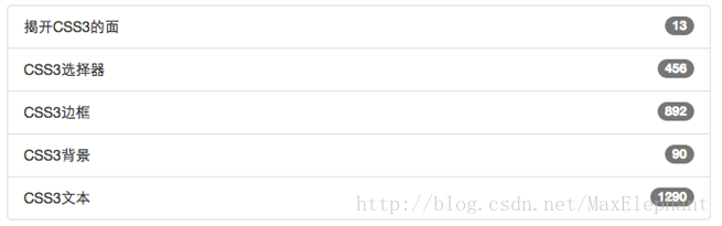
3、列表组–带徽章的列表组
带徽章的列表组其实就是将Bootstrap框架中的徽章组件和基础列表组结合在一起的一个效果。具体做法很简单,只需要在“list-group-item”中添加徽章组件“badge”:
<ul class="list-group">

    <li class="list-group-item">

        <span class="badge">13</span>揭开CSS3的面

    </li>

    <li class="list-group-item">

        <span class="badge">456</span>CSS3选择器

    </li>

    <li class="list-group-item">

        <span class="badge">892</span>CSS3边框

    </li>

    <li class="list-group-item">

        <span class="badge">90</span>CSS3背景

    </li>

    <li class="list-group-item">

        <span class="badge">1290</span>CSS3文本

    </li>

</ul>
运行效果如下:
实现原理:
实现效果非常简单,就是给徽章设置了一个右浮动,当然如果有两个徽章同时在一个列表项中出现时,还设置了他们之间的距离:
/bootstrap.css文件第4841行~第4846行/
.list-group-item > .badge {

  float: right;

}

.list-group-item > .badge + .badge {

  margin-right: 5px;

}
4、列表组–带链接的列表组
带链接的列表组,其实就是每个列表项都具有链接效果。大家可能最初想到的就是在基础列表组的基础上,给列表项的文本添加链接:
<ul class="list-group">

    <li class="list-group-item">

        <a href="##">揭开CSS3的面</a>

    </li>

    <li class="list-group-item">

        <a href="##">CSS3选择器</a>

    </li>

    ...

</ul>
运行效果如下:

这样做有一个不足之处,就是链接的点击区域只在文本上有效.

但很多时候,都希望在列表项的任何区域都具备可点击。这个时候就需要在链接标签上增加额外的样式:“display:block”;
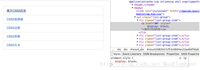
虽然这样能解决问题,达到需求。但在Bootstrap框架中,还是采用了另一种实现方式。就是将ul.list-group使用div.list-group来替换,而li.list-group-item直接用a.list-group-item来替换。这样就可以达到需要的效果:
<div class="list-group">

    <a href="##" class="list-group-item">图解CSS3</a>

    <a href="##" class="list-group-item"><span class="badge">220</span>Sass教程</a>

    <a href="##" class="list-group-item">玩转Bootstrap</a>

</div>
运行效果如下:

原理实现:
如果使用a.list-group-item时,在样式需要做一定的处理,比如说去文本下划线,增加悬浮效果等:
/bootstrap.css文件第4847行~第4858行/
a.list-group-item {

  color: #555;

}

a.list-group-item .list-group-item-heading {

  color: #333;

}

a.list-group-item:hover,

a.list-group-item:focus {

  color: #555;

  text-decoration: none;

  background-color: #f5f5f5;

}
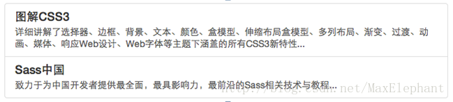
5、列表组–自定义列表组
Bootstrap框加在链接列表组的基础上新增了两个样式:
☑ list-group-item-heading:用来定义列表项头部样式

☑ list-group-item-text:用来定义列表项主要内容
这两个样式最大的作用就是用来帮助开发者可以自定义列表项里的内容,如下面的示例:
<div class="list-group">

    <a href="##" class="list-group-item">

        <h4 class="list-group-item-heading">图解CSS3</h4>

        <p class="list-group-item-text">...</p>

    </a>

    <a href="##" class="list-group-item">

        <h4 class="list-group-item-heading">Sass中国</h4>

        <p class="list-group-item-text">...</p>

    </a>

</div>
运行效果如下:
原理实现:
这两个样式主要控制不同状态下的文本颜色:
/bootstrap.css文件第4850行~第4852行/
a.list-group-item .list-group-item-heading {

  color: #333;

}

/*bootstrap文件第4865行~第4874行*/

.list-group-item.disabled .list-group-item-heading,

.list-group-item.disabled:hover .list-group-item-heading,

.list-group-item.disabled:focus .list-group-item-heading {

  color: inherit;

}

.list-group-item.disabled .list-group-item-text,

.list-group-item.disabled:hover .list-group-item-text,

.list-group-item.disabled:focus .list-group-item-text {

  color: #777;

}
/bootstrap.css文件第4883行~第4898行/
.list-group-item.active .list-group-item-heading,

.list-group-item.active:hover .list-group-item-heading,

.list-group-item.active:focus .list-group-item-heading,

.list-group-item.active .list-group-item-heading > small,

.list-group-item.active:hover .list-group-item-heading > small,

.list-group-item.active:focus .list-group-item-heading > small,

.list-group-item.active .list-group-item-heading > .small,

.list-group-item.active:hover .list-group-item-heading > .small,

.list-group-item.active:focus .list-group-item-heading > .small {

  color: inherit;

}

.list-group-item.active .list-group-item-text,

.list-group-item.active:hover .list-group-item-text,

.list-group-item.active:focus .list-group-item-text {

  color: #e1edf7;

}
/bootstrap.css文件第4987行~第4994行/
.list-group-item-heading {

  margin-top: 0;

  margin-bottom: 5px;

}

.list-group-item-text {

  margin-bottom: 0;

  line-height: 1.3;

}
6、列表组–列表项的状态设置
Bootstrap框架也给组合列表项提供了状态效果,特别是链接列表组。比如常见状态和禁用状态等。实现方法和前面介绍的组件类似,在列表组中只需要在对应的列表项中添加类名:
☑ active:表示当前状态

☑ disabled:表示禁用状态
来看个示例:
原理实现:
在样式上主要对列表项的背景色和文本做了样式设置:
/bootstrap.css文件第4859行~第4864行/
.list-group-item.disabled,

.list-group-item.disabled:hover,

.list-group-item.disabled:focus {

  color: #777;

  background-color: #eee;

}
/bootstrap.css文件第4875行~第4882行/
.list-group-item.active,

.list-group-item.active:hover,

.list-group-item.active:focus {

  z-index: 2;

  color: #fff;

  background-color: #428bca;

  border-color: #428bca;

}
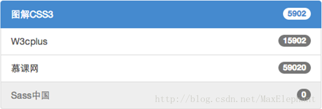
7、列表组–多彩列表组
列表组组件和警告组件一样,Bootstrap为不同的状态提供了不同的背景颜色和文本色,可以使用这几个类名定义不同背景色的列表项。
☑ list-group-item-success:成功,背景色绿色

☑ list-group-item-info:信息,背景色蓝色

☑ list-group-item-warning:警告,背景色为黄色

☑ list-group-item-danger:错误,背景色为红色
如果你想给列表项添加什么背景色,只需要在“list-group-item”基础上增加对应的类名:
<div class="list-group">

    <a href="##" class="list-group-item active"><span class="badge">5902</span>图解CSS3</a>

    <a href="##" class="list-group-item list-group-item-success"><span class="badge">15902</span>W3cplus</a>

    <a href="##" class="list-group-item list-group-item-info"><span class="badge">59020</span>慕课网</a>

    <a href="##" class="list-group-item list-group-item-warning"><span class="badge">0</span>Sass中国</a>

    <a href="##" class="list-group-item list-group-item-danger"><span class="badge">10</span>Mobile教程</a>

</div>
运行效果如下:

原理实现:
同样的,这几个类名仅修改了背景色和文本色,对应的源码为:boostrap.css文件第4899行~第4986行:
.list-group-item-success {

  color: #3c763d;

  background-color: #dff0d8;

}

a.list-group-item-success {

  color: #3c763d;

}

a.list-group-item-success .list-group-item-heading {

  color: inherit;

}

a.list-group-item-success:hover,

a.list-group-item-success:focus {

  color: #3c763d;

  background-color: #d0e9c6;

}

a.list-group-item-success.active,

a.list-group-item-success.active:hover,

a.list-group-item-success.active:focus {

  color: #fff;

  background-color: #3c763d;

  border-color: #3c763d;

}
深入理解BootStrap Item1-- 列表组(list-group)的更多相关文章
- Bootstrap(11)列表组面板和嵌入组件
一.列表组组件列表组组件用于显示一组列表的组件.//基本实例 <ul class="list-group"> <li class="list-group ...
- Bootstrap列表组
前面的话 列表组是Bootstrap框架新增的一个组件,可以用来制作列表清单.垂直导航等效果,也可以配合其他的组件制作出更漂亮的组件.本文将详细介绍Bootstrap列表组 基础列表组 基础列表组,看 ...
- Bootstrap <基础二十八>列表组
列表组.列表组件用于以列表形式呈现复杂的和自定义的内容.创建一个基本的列表组的步骤如下: 向元素 <ul> 添加 class .list-group. 向 <li> 添加 cl ...
- 详解Bootstrap列表组组件
列表组可以用来制作列表清单.垂直导航等效果,也可以配合其他的组件制作出更漂亮的组件,列表组在bootstrap框架中也是一个独立的组件,所以也对应有自己独立源码: LESS:list-group.le ...
- Bootstrap入门(二十二)组件16:列表组
Bootstrap入门(二十二)组件16:列表组 列表组是灵活又强大的组件,不仅能用于显示一组简单的元素,还能用于复杂的定制的内容. 1.默认样式列表组 2.加入徽章 3.链接 4.禁用的列表组 5. ...
- Bootstrap -- 缩略图、进度条、列表组、面板
Bootstrap -- 缩略图.进度条.列表组.面板 1. 缩略图 大多数站点都需要在网格中布局图像.视频.文本等.Bootstrap 通过缩略图为此提供了一种简便的方式.使用 Bootstrap ...
- BootStrap学习(5)_多媒体对象&列表组
一.多媒体对象 这些抽象的对象样式用于创建各种类型的组件(比如:博客评论),我们可以在组件中使用图文混排,图像可以左对齐或者右对齐.媒体对象可以用更少的代码来实现媒体对象与文字的混排. .media: ...
- 第二百四十二节,Bootstrap列表组面板和嵌入组件
Bootstrap列表组面板和嵌入组件 学习要点: 1.列表组组件 2.面板组件 3.响应式嵌入组件 本节课我们主要学习一下 Bootstrap 的三个组件功能:列表组组件.面板组件. 响应 式嵌入组 ...
- Bootstrap学习2--组件-列表组
备注:最新Bootstrap手册:http://www.jqhtml.com/bootstraps-syntaxhigh/index.html 1.列表组 列表组是Bootstrap框架新增的一个组件 ...
随机推荐
- python 线程 进程 协程 学习
转载自大神博客:http://www.cnblogs.com/aylin/p/5601969.html 仅供学习使用···· python 线程与进程简介 进程与线程的历史 我们都知道计算机是由硬件和 ...
- ArchLinux For Arm 树莓派开机自启动脚本rc.local
今天折腾了下树莓派的迅雷固件,迅雷的安装很顺利,解压直接运行portal 就搞定了, 但是自启动就有问题了,由于新版的ArchLinux切换到systemd,不但rc.conf省了,连rc.local ...
- python3+pyqt5 +eric5安装配置
一.大纲内容: 1.预备PC环境: 2.预备安装程序: 2.1.下载Python3.2 2.2.下载PyQt4 2.3.下载Eric5 3.安装配置步骤: 3.1.安装Pyhon3.2 3.2.安装P ...
- 在ubuntu下随意编译安装需要的python版本
一.环境 ubuntu14.04 二.准备 2.1更新软件库 sudo apt-get update 2.2安装编译器及相应工具 2.3安装相应的开发库 sudo apt-get install zl ...
- vim的加密和解密?
vim中出现的错误提示含义: 参考: http://blog.csdn.net/u014599371/article/details/43955169 E488: trailing character ...
- Trailing Zeroes (III) (二分)题解
You task is to find minimal natural number N, so that N! contains exactly Q zeroes on the trail in d ...
- 【基础知识】ActiveMQ基本原理
“来,根据你的了解说下 ActiveMQ 是什么.” “这个简单,ActiveMQ 是一个 MOM,具体来说是一个实现了 JMS 规范的系统间远程通信的消息代理.它……” “等等,先解释下什么是 MO ...
- 51Nod 1344 走格子(贪心
1344 走格子 有编号1-n的n个格子,机器人从1号格子顺序向后走,一直走到n号格子,并需要从n号格子走出去.机器人有一个初始能量,每个格子对应一个整数A[i],表示这个格子的能量值.如果A[i ...
- SQL 事务(Transaction)
1.概念 指访问并可能更新数据库中各种数据项的一个程序执行单元(unit)由多个sql语句组成,必须作为一个整体执行这些sql语句作为一个整体一起向系统提交,要么都执行.要么都不执行 语法步骤:开始事 ...
- apiCloud检出代码出现以下图示错误:
问题如下: Initialized empty Git repository in H:/simlpe/.git/ 已经在 H:\simlpe 完成必要的项目初始化工作正在尝试从代码服务器获取数据.. ...