flex常用布局
公共样式:
    <style>

        * {

            margin: 0;

            padding: 0;

        }

        .has-flex {

            display: flex;

        }

    </style>
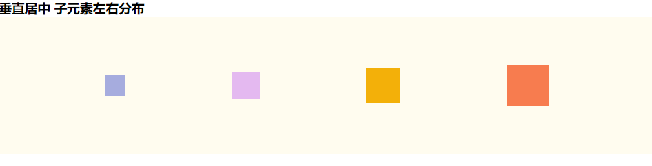
垂直居中 子元素左右分布
css
        .father-one {

            width: 100%;

            height: 200px;

            background-color: #fffcef;

            align-items: center; /*纵轴)方向上的对齐方式。*/

            justify-content: space-between; /* 均匀排列每个元素 首个元素放置于起点,末尾元素放置于终点,中间元素的中间间隔相等 */

            justify-content: space-around; /* 均匀排列每个元素 每个元素周围分配相同的空间 */

            justify-content: space-evenly; /* 均匀排列每个元素   每个元素之间的间隔相等 */

        }

        .fa-one-child1 {

            height: 30px;

            width: 30px;

            background-color: #a6acde;

        }

        .fa-one-child2 {

            height: 40px;

            width: 40px;

            background-color: #e4b9f0;

        }

        .fa-one-child3 {

            height: 50px;

            width: 50px;

            background-color: #f3b009;

        }

        .fa-one-child4 {

            height: 60px;

            width: 60px;

            background-color: #f77c4f;

        }
html
<!--垂直居中 子元素左右分布 star-->

<h3>垂直居中 子元素左右分布</h3>

<div class="father-one has-flex">

    <div class="fa-one-child1"></div>

    <div class="fa-one-child2"></div>

    <div class="fa-one-child3"></div>

    <div class="fa-one-child4"></div>

</div>

<!--垂直居中 子元素左右分布 end-->
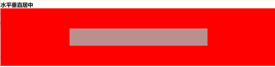
水平垂直居中
css
        .father-two {

            width: 100%;

            height: 200px;

            align-items: center; /*纵轴)方向上的对齐方式。*/

            justify-content: center; /*    横轴)方向上的对齐方式*/

            background-color: red;

        }

        .child {

            width: 50%;

            height: 60px;

            background-color: rosybrown;

        }
html
<!--水平垂直居中 star-->

<h3>水平垂直居中</h3>

<div class="father-two has-flex">

    <div class="child"></div>

</div>

<!--水平垂直居中 end-->
水平垂直居中 图标在上文字在下
css
        .father-three {

            height: 80px;

            background-color: #f77c4f;

            align-items: center;

            justify-content: center;

            flex-direction: column;

        }
html
<!--水平垂直居中 图标在上文字在下 star-->

<h3>水平垂直居中 图标在上文字在下</h3>

<div class="has-flex father-three">

    <i class="fa fa-file-text-o" aria-hidden="true"></i>

    <p>测试</p>

</div>

<!--水平垂直居中 图标在上文字在下 end-->

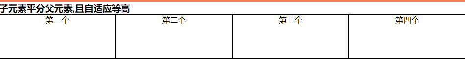
子元素平分父元素,且自适应等高
css
        .father-four {

            background-color: #ffd5eb;

        }

        .fa-four-child {

            flex: 1;

            text-align: center;

            background-color: #ffffff;

            border: 1px solid;

        }
html
<!--子元素平分父元素,且自适应等高   star-->

<h3>子元素平分父元素,且自适应等高 </h3>

<div class="has-flex father-four">

    <div class="fa-four-child">第一个</div>

    <div class="fa-four-child">第二个</div>

    <div class="fa-four-child">第三个</div>

    <div class="fa-four-child" style="height: 90px">第四个</div>

</div>

<!--子元素平分父元素,且自适应等高  end-->
子元素平分父元素,两边对齐中间自适应相同宽度间隔,且自动换行
css
        .father-five {

            height: 100px;

            background-color: #a6acde;

            justify-content: space-between;

            flex-wrap: wrap;

        }

        .fa-five-child {

            width: 21%;

            background-color: #f77c4f;

        }
html
<!--子元素平分父元素,两边对齐中间自适应相同宽度间隔,且自动换行   star-->

<h3>子元素平分父元素,两边对齐中间自适应相同宽度间隔,且自动换行 </h3>

<div class="has-flex father-five">

    <div class="fa-five-child">第一个</div>

    <div class="fa-five-child">第二个</div>

    <div class="fa-five-child">第三个</div>

    <div class="fa-five-child">第四个</div>

    <div class="fa-five-child">第五个</div>

    <div class="fa-five-child">第六个</div>

    <div class="fa-five-child">第七个</div>

    <div class="fa-five-child">第八个</div>

</div>

<!--子元素平分父元素,两边对齐中间自适应相同宽度间隔,且自动换行  end-->

三栏布局,两边固定宽中间自适应
css
        .father-six {

            height: 100px;

        }

        .one-child,

        .three-child {

            width: 300px;

            background-color: #a6acde;

        }

        .two-child {

            flex: 1;

            background-color: #eeeeee;

        }
html
<!--三栏布局,两边固定宽中间自适应   star-->

<h3>三栏布局,两边固定宽中间自适应 </h3>

<div class="has-flex father-six">

    <div class="fa-six-child one-child">第一个</div>

    <div class="fa-six-child two-child">第二个</div>

    <div class="fa-six-child three-child">第三个</div>

</div>

<!--三栏布局,两边固定宽中间自适应  end-->

对于Flex 布局更详细的讲解请移步:Flex 布局教程:语法篇
相关css面试题:两边宽度已知,如何让中间自适应
flex常用布局的更多相关文章
- Flex 常用布局
1.flex布局 1.1 容器指定为flex布局 .box{display: flex;} 1.2 行元素指定flex布局 .box{display:inline-flex} 2.容器的属性 2.1 ...
- CSS3动画属性和flex弹性布局各个属性
[CSS3动画的使用] 1.声明一个关键帧(动画): @keynames name{ from{} to{} } 每个阶段的写法: ①可以直接使用from-to的写法 ②可以设置0%-100%的写法, ...
- ExtJs常用布局--layout详解(含实例)
序言: 笔者用的ExtJs版本:ext-3.2.0 ExtJs常见的布局方式有:border.form.absolute.column.accordion.table.fit.card.anchor ...
- Flutter常用布局组件
Flutter控件本身通常由许多小型.单用途的控件组成,结合起来产生强大的效果,例如,Container是一种常用的控件,由负责布局.绘画.定位和大小调整的几个控件组成,具体来说,Container是 ...
- 2021年3月-第02阶段-前端基础-Flex 伸缩布局-移动WEB开发_流式布局
移动web开发流式布局 1.0 移动端基础 1.1 浏览器现状 PC端常见浏览器:360浏览器.谷歌浏览器.火狐浏览器.QQ浏览器.百度浏览器.搜狗浏览器.IE浏览器. 移动端常见浏览器:UC浏览器, ...
- CSS弹性盒模型flex在布局中的应用
× 目录 [1]元素居中 [2]两端对齐 [3]底端对齐[4]输入框按钮[5]等分布局[6]自适应布局[7]悬挂布局[8]全屏布局 前面的话 前面已经详细介绍过flex弹性盒模型的基本语法和兼容写法, ...
- python:页面布局 后台管理页面之常用布局
<!DOCTYPE HTML PUBLIC "-//W3C//DTD HTML 4.01 Transitional//EN" "http://www.w3.org/ ...
- 常用布局,div竖直居中
常用两列布局,多列布局和div竖直居中 body { margin:; padding:; } .w200 { width: 200px; } .mar-left200 { margin-left: ...
- 跟我学android-android常用布局介绍
在上一章我们曾经谈到,Android平台的界面 是使用XML的方式设计的,然后在上一章我们只做了一个简单的界面,在这章,我们将介绍如何使用常用的控件设计实用的界面. Android中的视图都是继承Vi ...
随机推荐
- JavaScript中async和await的使用以及队列问题
宏任务和微任务的队列入门知识,可以参考之前的文章: JavaScript的事件循环机制 宏任务和微任务在前端面试中,被经常提及到,包括口头和笔试题 async && await概念 a ...
- linux配置svn
1.安装 yum install subversion 2.测试安装是否成功: svnserve --version 3.创建目录并配置 建立版本库目录 mkdir -pv /data/svn/svn ...
- 关于 k 进制线性基
本质还是高斯消元,使其成为上三角矩阵.但是 \(k\) 不一定是质数. 但我们不需要保证已有数字不改变,只要维护的是一个上三角矩阵就行.所以我们可以利用更相减损让其中一个向量的最高位 \(= 0\) ...
- 测试人员假装自己会“devops”
目录 什么是DevOps DevOps岗位职责 DevOps的要求 如何增强DevOps能力 准备 服务器端安装jenkins Jenkins jenkins + maven 构建 jenkins下m ...
- Map集合概述和Map常用子类
概述java.util.Map接口 Map<K,V> 有两个泛型 类型参数:K - 此映射所维护的键的类型V - 映射值的类型 特点:1.Map集合是双列集合,一个元素包含两个值,一个是k ...
- dolphinscheduler添加hana支持
dolphinscheduler添加hana支持 转载请注明出处: https://www.cnblogs.com/funnyzpc/p/16395092.html 前面 上一节有讲datax对han ...
- SpringBoot接口 - 如何优雅的写Controller并统一异常处理?
SpringBoot接口如何对异常进行统一封装,并统一返回呢?以上文的参数校验为例,如何优雅的将参数校验的错误信息统一处理并封装返回呢?@pdai 为什么要优雅的处理异常 如果我们不统一的处理异常,经 ...
- SpringCloudAlibaba分布式事务解决方案Seata实战与源码分析-上
概述 定义 Spring Cloud Alibaba Seata 官网地址 https://seata.io/zh-cn/ 最新版本1.5.2 Spring Cloud Alibaba Seata 文 ...
- MySQL原理
MySQL基础: sql语句的执行过程: 连接器:登录连接sql数据库 分析器:分析解读sql语句,并检查是否符合SQL语法规则 优化器:对实现方式进行优化,比如在查询时决定使用哪个索引. 执行器:执 ...
- freeswitch的话单模块
概述 最近因为业务需要,在看freeswitch中话单相关的一些模块. 在voip的使用过程中,话单是重要的基础模块,涉及到计费和问题查找. 呼叫话单最重要的一点是稳定,不能有错误或遗漏. 本章对fs ...