Matplotlib之Bar Chart
Matplotlib之Bar Chart:
import numpy as np
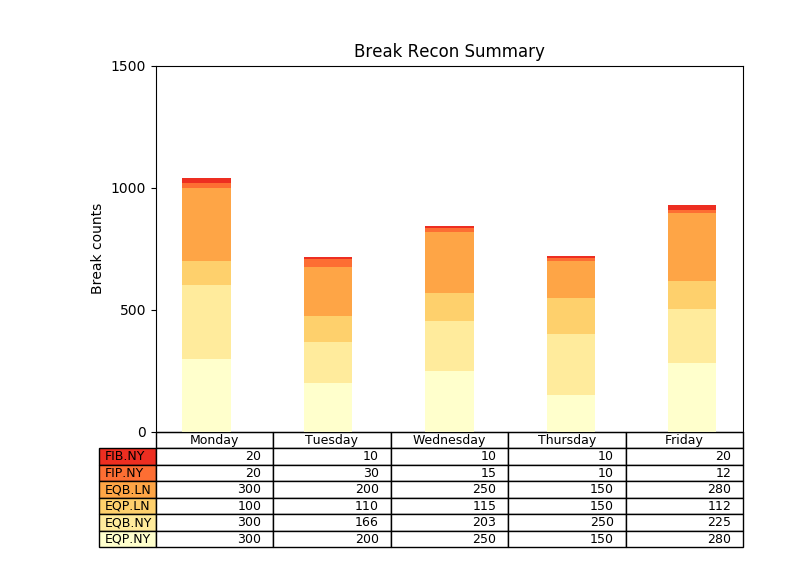
import matplotlib.pyplot as plt data = [[300, 200, 250, 150, 280],
[300, 166, 203, 250, 225],
[100, 110, 115, 150, 112],
[300, 200, 250, 150, 280],
[20, 30, 15, 10, 12],
[20, 10, 10, 10, 20]] columns = ('Monday', 'Tuesday', 'Wednesday', 'Thursday', 'Friday')
rows = [x for x in ("EQP.NY", "EQB.NY", "EQP.LN", "EQB.LN", "FIP.NY", "FIB.NY")] values = np.arange(0, 2000, 500) # Get some pastel shades for the colors
colors = plt.cm.YlOrRd(np.linspace(0, 0.7, len(rows))) n_rows = len(data) index = np.arange(len(columns)) + 0.3
bar_width = 0.4 # Initialize the vertical-offset for the stacked bar chart.
y_offset = np.zeros(len(columns)) # Plot bars and create text labels for the table
cell_text = []
for row in range(n_rows):
plt.bar(index, data[row], bar_width, bottom=y_offset, color=colors[row])
y_offset = y_offset + data[row]
cell_text.append(['%u' % x for x in data[row]])
# Reverse colors and text labels to display the last value at the top.
colors = colors[::-1]
cell_text.reverse()
# print(cell_text) # Add a table at the bottom of the axes
the_table = plt.table(cellText=cell_text,
rowLabels=rows[::-1],
rowColours=colors,
colLabels=columns,
loc='bottom') # Adjust layout to make room for the table:
plt.subplots_adjust(left=0.2, bottom=0.25) # plt.ylabel("Loss in ${0}'s".format(value_increment))
plt.ylabel('Break counts')
# print(values)
plt.yticks(values, ['%d' % val for val in values])
plt.xticks([])
plt.title('Break Recon Summary') plt.show()
效果:
Matplotlib之Bar Chart的更多相关文章
- matplotlib 柱状图 Bar Chart 样例及参数
def bar_chart_generator(): l = [1,2,3,4,5] h = [20, 14, 38, 27, 9] w = [0.1, 0.2, 0.3, 0 ...
- Bar Chart of Frequency of modals in different sections of the Brown Corpus
Natural Language Processing with Python Chapter 4.8 colors = 'rgbcmyk' # red, green, blue, cyan, mag ...
- Highcharts - Bar Chart & Column Chart
1. 条形图(Bar Chart)需要的数据格式类型如下: ["Luke Skywalker", "Darth Vader", "Yoda" ...
- Relative-Frequency|frequency|pie chart |bar chart
2.2Organizing Qualitative Data The number of times a particular distinct value occurs is called its ...
- bubble chart|Matrix Scatter|Overlay Scatter|Scatterplots|drop-line|box plot|Stem-and-leaf plot|Histogram|Bar chart|Pareto chart|Pie chart|doughnut chart|
应用统计学 对类别数据要分类处理: Bar chart复式条形图便于对比: Pareto chart:对类别变量依据频数高低排列: Pie chart:饼图用于一个样本,可以区分类别数据 doughn ...
- Matplotlib学习---用matplotlib画柱形图,堆积柱形图,横向柱形图(bar chart)
这里利用Nathan Yau所著的<鲜活的数据:数据可视化指南>一书中的数据,学习画图. 数据地址:http://datasets.flowingdata.com/hot-dog-cont ...
- 转 HighCharts笔记之: Bar Chart
最近需要做一些Web图标,研究了几个开源的第三方工具后,最后决定使用HighCharts开发: Highcharts 是一个用纯JavaScript编写的一个图表库, 能够很简单便捷的在web网站或是 ...
- plot bar chart using python
Example import matplotlib.pyplot as plt import plotly.plotly as py # Learn about API authentication ...
- Bar Chart _Study
---恢复内容开始--- 以“3D BarChart”为例. 1.Select a theme.(选择一个主题模板) 2.Set up categories and groups.(设置类型和组) 3 ...
随机推荐
- SpringBoot项目创建及入门基础
一:快速构建springboot项目 进入https://start.spring.io/,选择相应的springboot版本,包名,项目名,依赖 图中选择web,利用tomcat服务器进行开发 sp ...
- CodeForces 669 E Little Artem and Time Machine CDQ分治
题目传送门 题意:现在有3种操作, 1 t x 在t秒往multiset里面插入一个x 2 t x 在t秒从multiset里面删除一个x 3 t x 在t秒查询multiset里面有多少x 事情是按 ...
- codeforces 486 E. LIS of Sequence(dp)
题目链接:http://codeforces.com/contest/486/problem/E 题意:给出n个数,如果一个数满足不属于最长递增序列,那么输出1,如果属于最长递增序列但是不属于所有最长 ...
- Kafka源码分析及图解原理之Producer端
一.前言 任何消息队列都是万变不离其宗都是3部分,消息生产者(Producer).消息消费者(Consumer)和服务载体(在Kafka中用Broker指代).那么本篇主要讲解Producer端,会有 ...
- proveder:命名管道提供程序,error:40 - 无法打开到 SQL Server的连接
随着数据库数据量增加,对运维的压力也不断增加,为了以备不时之需,觉得弄个双机备份是很有必要的.于是乎捣鼓SQL Server的复制功能:网上对如何利用复制功能的介绍文章很多,这里不细说. 但是有一点就 ...
- (六十五)c#Winform自定义控件-图标字体
前提 入行已经7,8年了,一直想做一套漂亮点的自定义控件,于是就有了本系列文章. GitHub:https://github.com/kwwwvagaa/NetWinformControl 码云:ht ...
- Linux中新建用户用不了sudo命令问题:rootr is not in the sudoers file.This incident will be reported解决
参考:https://blog.csdn.net/lichangzai/article/details/39501025 如果执行sudo命令的用户没有执行sudo的权限,执行sudo命令时会报下面的 ...
- MySQL数据库(良心资料)
一.MySQL数据库 1.数据库简介 1.1.数据库的概念 数据库就是用来存储和管理数据的仓库.数据库存储数据的优点: l 可存储大量数据: l 方便检索: l 保持数据的一致性.完整性: l ...
- [淘宝客技术篇008](无需登录)淘宝天猫优惠券JSON接口1
今天,小星给大家分享的是一个非常重要,非常有意义的接口:获取淘宝天猫优惠券的JSON接口. 先上个链接: http://uland.taobao.com/cp/coupon_list?pid=mm_2 ...
- 20182324 实验一《Linux基础与Java开发环境》实验报告
20182324 2019-2020-1 <数据结构与面向对象程序设计>实验1报告 课程:<程序设计与数据结构> 班级: 1823 姓名: 殷宇豪 学号: 20182324 实 ...