THE R QGRAPH PACKAGE: USING R TO VISUALIZE COMPLEX RELATIONSHIPS AMONG VARIABLES IN A LARGE DATASET, PART ONE
The R qgraph Package: Using R to Visualize Complex Relationships Among Variables in a Large Dataset, Part One
A Tutorial by D. M. Wiig, Professor of Political Science, Grand View University
In my most recent tutorials I have discussed the use of the tabplot()package to visualize multivariate mixed data types in large datasets. This type of table display is a handy way to identify possible relationships among variables, but is limited in terms of interpretation and the number of variables that can be meaningfully displayed.
Social science research projects often start out with many potential independent predictor variables for a given dependant variable. If these variables are all measured at the interval or ratio level a correlation matrix often serves as a starting point to begin analyzing relationships among variables.
In this tutorial I will use the R packages SemiPar, qgraph and Hmisc in addition to the basic packages loaded when R is started. The code is as follows:
###################################################
#data from package SemiPar; dataset milan.mort
#dataset has 3652 cases and 9 vars
##################################################
install.packages(“SemiPar”)
install.packages(“Hmisc”)
install.packages(“qgraph”)
library(SemiPar)
####################################################
One of the datasets contained in the SemiPar packages is milan.mort. This dataset contains nine variables and data from 3652 consecutive days for the city of Milan, Italy. The nine variables in the dataset are as follows:
rel.humid (relative humidity)
tot.mort (total number of deaths)
resp.mort (total number of respiratory deaths)
SO2 (measure of sulphur dioxide level in ambient air)
TSP (total suspended particles in ambient air)
day.num (number of days since 31st December, 1979)
day.of.week (1=Monday; 2=Tuesday; 3=Wednesday; 4=Thursday; 5=Friday; 6=Saturday; 7=Sunday
holiday (indicator of public holiday: 1=public holiday, 0=otherwise
mean.temp (mean daily temperature in degrees celsius)
To look at the structure of the dataset use the following
#########################################
library(SemiPar)
data(milan.mort)
str(milan.mort)
###############################################
Resulting in the output:
> str(milan.mort)
‘data.frame’: 3652 obs. of 9 variables:
$ day.num : int 1 2 3 4 5 6 7 8 9 10 …
$ day.of.week: int 2 3 4 5 6 7 1 2 3 4 …
$ holiday : int 1 0 0 0 0 0 0 0 0 0 …
$ mean.temp : num 5.6 4.1 4.6 2.9 2.2 0.7 -0.6 -0.5 0.2 1.7 …
$ rel.humid : num 30 26 29.7 32.7 71.3 80.7 82 82.7 79.3 69.3 …
$ tot.mort : num 45 32 37 33 36 45 46 38 29 39 …
$ resp.mort : int 2 5 0 1 1 6 2 4 1 4 …
$ SO2 : num 267 375 276 440 354 …
$ TSP : num 110 153 162 198 235 …
As is seen above, the dataset contains 9 variables all measured at the ratio level and 3652 cases.
In doing exploratory research a correlation matrix is often generated as a first attempt to look at inter-relationships among the variables in the dataset. In this particular case a researcher might be interested in looking at factors that are related to total mortality as well as respiratory mortality rates.
A correlation matrix can be generated using the cor function which is contained in the stats package. There are a variety of functions for various types of correlation analysis. The cor function provides a fast method to calculate Pearson’s r with a large dataset such as the one used in this example.
To generate a zero order Pearson’s correlation matrix use the following:
###############################################
#round the corr output to 2 decimal places
#put output into variable cormatround
#coerce data to matrix
#########################################
library(Hmisc)
cormatround round(cormatround, 2)
#################################################
The output is:
> cormatround > round(cormatround, 2) |
|
|
The matrix can be examined to look at intercorrelations among the nine variables, but it is very difficult to detect patterns of correlations within the matrix. Also, when using the cor() function raw Pearson’s coefficients are reported, but significance levels are not.
A correlation matrix with significance can be generated by using thercorr() function, also found in the Hmisc package. The code is:
#############################################
library(Hmisc)
rcorr(as.matrix(milan.mort, type=”pearson”))
###################################################
The output is:
> rcorr(as.matrix(milan.mort, type="pearson")) |
|
|
In a future tutorial I will discuss using significance levels and correlation strengths as methods of reducing complexity in very large correlation network structures.
The recently released package qgraph () provides a number of interesting functions that are useful in visualizing complex inter-relationships among a large number of variables. To quote from the CRAN documentation file qraph() “Can be used to visualize data networks as well as provides an interface for visualizing weighted graphical models.” (see CRAN documentation for ‘qgraph” version 1.4.2. See also http://sachaepskamp.com/qgraph).
The qgraph() function has a variety of options that can be used to produce specific types of graphical representations. In this first tutorial segment I will use the milan.mort dataset and the most basicqgraph functions to produce a visual graphic network of intercorrelations among the 9 variables in the dataset.
The code is as follows:
###################################################
library(qgraph)
#use cor function to create a correlation matrix with milan.mort dataset
#and put into cormat variable
###################################################
cormat=cor(milan.mort) #correlation matrix generated
###################################################
###################################################
#now plot a graph of the correlation matrix
###################################################
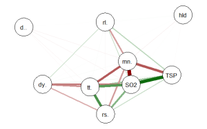
qgraph(cormat, shape=”circle”, posCol=”darkgreen”, negCol=”darkred”, layout=”groups”, vsize=10)
###################################################
This code produces the following correlation network:

The correlation network provides a very useful visual picture of the intercorrelations as well as positive and negative correlations. The relative thickness and color density of the bands indicates strength of Pearson’s r and the color of each band indicates a positive or negative correlation – red for negative and green for positive.
By changing the “layout=” option from “groups” to “spring” a slightly different perspective can be seen. The code is:
########################################################
#Code to produce alternative correlation network:
#######################################################
library(qgraph)
#use cor function to create a correlation matrix with milan.mort dataset
#and put into cormat variable
##############################################################
cormat=cor(milan.mort) #correlation matrix generated
##############################################################
###############################################################
#now plot a circle graph of the correlation matrix
##########################################################
qgraph(cormat, shape=”circle”, posCol=”darkgreen”, negCol=”darkred”, layout=”spring”, vsize=10)
###############################################################
The graph produced is below:
Once again the intercorrelations, strength of r and positive and negative correlations can be easily identified. There are many more options, types of graph and procedures for analysis that can be accomplished with the qgraph() package. In future tutorials I will discuss some of these.
转自:https://dmwiig.net/2017/03/10/the-r-qgraph-package-using-r-to-visualize-complex-relationships-among-variables-in-a-large-dataset-part-one/
THE R QGRAPH PACKAGE: USING R TO VISUALIZE COMPLEX RELATIONSHIPS AMONG VARIABLES IN A LARGE DATASET, PART ONE的更多相关文章
- R安装package报ERROR: a 'NAMESPACE' file is required
R安装package报错: [root@Hadoop-NN-01 mysofts]# R CMD INSTALL trimcluster_0.1-1.tar.gz * installing to li ...
- R(二): http与R脚本通讯环境安装
结合实际的工作环境,在开始R研究的时候,首先着手收集的就是能以Web方式发布R运行结果的基础框架,无耐的是,R一直以来常使用于个人电脑的客户端程序上,大家习惯性的下载R安装包,在自己的电脑上安装 -- ...
- 【R语言系列】R语言初识及安装
一.R是什么 R语言是由新西兰奥克兰大学的Ross Ihaka和Robert Gentleman两个人共同发明. 其词法和语法分别源自Schema和S语言. R定义:一个能够自由幼小的用于统计计算和绘 ...
- python中换行,'\r','\n'及'、'\r\n'
'\r'的本意是回到行首,'\n'的本意是换行. 所以回车相当于做的是'\r\n'或者'\n\r'.'\r'就是换行并回行首, '\n'就是换行并回行首,用'\r\n'表示换行并回行首. window ...
- 【R笔记】给R加个编译器——notepad++
R的日记-给R加个编译器 转载▼ R是一款强大免费且开源的统计分析软件,这是R的长处,可也是其“缺陷”的根源:不似商业软件那样user-friendly.记得初学R时,给我留下最深印象的不是其功能的强 ...
- 【R语言入门】R语言中的变量与基本数据类型
说明 在前一篇中,我们介绍了 R 语言和 R Studio 的安装,并简单的介绍了一个示例,接下来让我们由浅入深的学习 R 语言的相关知识. 本篇将主要介绍 R 语言的基本操作.变量和几种基本数据类型 ...
- R下载package的一些小问题
1.Error in install.packages : unable to create ‘C:/Users/???/Documents/R/win-library\3.5 采用管理员身份运行,先 ...
- R统计建模与R软件
教材目录 第一章 概率统计的基本知识 第二章 R软件的使用 第三章 数据描述性分析 第四章 参数估计 第五章 假设检验 第六章 回归分析 第七章 方差分析 第八章 应用多元分析(I) 第九章 应用多元 ...
- linux CentOS 权限问题修复(chmod 777 -R 或者chmod 755 -R问题修复)
我个人曾经有一次经历: 就是在修改文件夹权限的时候,本来该执行: #chmod 777 -R ./ 结果我漏掉了那个".";执行的命令是chmod 777 -R /. 这个命令一定 ...
随机推荐
- WebGL 高级技术
1.如何实现雾化 实现雾化的方式由多种,这里使用最简单的一种:线性雾化(linear fog).在线性雾化中,某一点的雾化程度取决于它与视点之间的距离,距离越远雾化程度越高.线性雾化有起点和终点,起点 ...
- 为已有表快速创建自动分区和Long类型like 的方法-Oracle 11G
对上一篇文章进行实际的运用.在工作中遇到有一张大表(五千万条数据),在开始的时候忘记了创建自动分区,导致现在使用非常不方便,查询的速度非常的满,所以就准备重新的分区表,最原始方法是先创建新的分区表,然 ...
- Elasticsearch搜索之cross_fields分析
cross_fields类型采用了一种以词条为中心(Term-centric)的方法,这种方法和best_fields及most_fields采用的以字段为中心(Field-centric)的方法有很 ...
- 数据可视化之MarkPoint
MarkPoint是什么效果?如上图,一闪一闪亮晶晶的效果,这是在Echarts中对应的效果.我最早看到的是腾讯的一个Flash的版本,显示当前QQ在线人数的全国分布效果,感觉效果很炫,当时也在想,怎 ...
- xmlplus 组件设计系列之五 - 选项卡
这一章将设计一个选项卡组件,选项卡组件在手持设备上用的比较多,下面是一个示意图: 选项卡组件的分解 在具体实现之前,想像一下目标组件是如何使用的,对于设计会有莫大的帮助.通过观察,可以将选项卡组件分为 ...
- 深入tornado中的ioLoop
本文所剖析的tornado源码版本为4.4.2 ioloop就是对I/O多路复用的封装,它实现了一个单例,将这个单例保存在IOLoop._instance中 ioloop实现了Reactor模型,将所 ...
- ELK菜鸟手记 (三) - X-Pack权限控制之给Kibana加上登录控制以及index_not_found_exception问题解决
0. 背景 我们在使用ELK进行日志记录的时候,通过网址在Kibana中查看我们的应用程序(eg: Java Web)记录的日志, 但是默认是任何客户端都可以访问Kibana的, 这样就会造成很不安全 ...
- DirectFB 之 动画播放初步
在基于linux的嵌入式仿真平台开发中,终端的美观和可定制是一个重要的问题.单调的"白纸黑字"型表现方式可谓大煞风景.改造linux控制台使之美观可定制地展示开机信息和logo成为 ...
- 用CSS实现响应式布局
响应式网页看起来高大上,但实际上,不用JS只用CSS也能实现响应式网站的布局 要用到的就是CSS中的媒体查询下面来简单介绍一下怎么运用 使用@media 的三种方式 第一: 直接在CSS文件中使用 @ ...
- 在Debian 8 上安装自动化工具Ansible
如果你是新手,就不要犹豫了,ansible是你最好的选择,本人菜鸟一个.废话少说,开始安装! 实验环境: 192.168.3.190 192.168.3.191 192.168.3.192 192.1 ...