
详解Bootstrap表单组件
表单常见的元素主要包括:文本输入框、下拉选择框、单选框、复选框、文本域、按钮等。下面是不同的bootstrap版本:
LESS: forms.less
SASS: _forms.scss
bootstrap仅对表单内的fieldset、legend、label标签进行了定制
fieldset {

min-width:;

padding:;

margin:;

border:;

}

legend {

display: block;

width: 100%;

padding:;

margin-bottom: 20px;

font-size: 21px;

line-height: inherit;

color: #333;

border:;

border-bottom: 1px solid #e5e5e5;

}

label {

display: inline-block;

margin-bottom: 5px;

font-weight: bold;

}
除了这个几个元素之外,还有input、select、textarea等元素,在bootstrap框架中,通过定制一个类名.form-control来实现效果
1、宽度变成了100%;
2、设置了一个浅灰色(#ccc)的边框
3、具有4px的圆角
4、设置阴影效果,并且元素得到焦点时,阴影和边框效果会有所变化
5、设置了palceholder的颜色为#999
内联表单
如果要在input之前添加一个了label标签,会导致input换行显示;如果又必须添加这样一个label标签,且不想让input换行,就需要将label标签也放在容器.form-group中,例如:
<div class="form-group ">

        <label class="sr-only">邮箱地址</label>

    </div>

    <div class="form-group">

        <input type="email" class="form-control" placeholder="请输入邮箱号">

    </div>
实现联表单效果只需在form元素中添加类名.form-inline即可,实现原理:
将表单控件设置成内联块元素(display:inline-block),让表单控件在一行显示。
例子:
<form class="form-inline">

        <div class="form-group">

            <label class="sr-only">邮箱</label>

            <input class="form-control" type="email" placeholder="请输入邮箱号">

        </div>

        <div class="form-group">

            <label class="sr-only">密码</label>

            <input type="password" class="form-control" placeholder="请输入密码">

        </div>

        <div class="checkbox">

            <label>

                <input type="checkbox" > 记住密码

            </label>

        </div>

        <div class="form-group">

            <button class="btn btn-default">进入邮箱</button>

        </div>

    </form>
效果如下:

看到上图效果你有没有发现代码里明明有label标签,且没放在容器.form-group中,input也不会换行,更奇怪的是label标签的内容居然没有显示出来!其实仔细一看label标签是添加了类名.sr-only,就是它将label给隐藏起来了,来看看它的源码:
.sr-only {

position: absolute;

width: 1px;

height: 1px;

padding:;

margin: -1px;

overflow: hidden;

clip: rect(0, 0, 0, 0);

border:;

}
既然添加了label标签,又添加.sr-only类名把label给隐藏起来,是不是多此一举???但这恰恰是bootstrap框架的一个优点,如果没有为输入控件设置label,屏幕阅读器将无法正确识别,同时也为残障人员进行了一定的考虑
水平表单
在bootstrap中实现水平表单效果需满足下面两个条件:
1、在form元素上使用类名.form-horizontal
2、配合bootstrap框架的网格系统(详细:详解Bootstrap网格系统)
在form元素使用类名.form-horizontal主要有以下几个作用:
1、设置表单控件padding和margin值
2、改变.from-group的表现形式,类似于网格系统的row
css源码:
.form-horizontal .control-label,

.form-horizontal .radio,

.form-horizontal .checkbox,

.form-horizontal .radio-inline,

.form-horizontal .checkbox-inline {

padding-top: 7px;

margin-top:;

margin-bottom:;

}

.form-horizontal .radio,

.form-horizontal .checkbox {

min-height: 27px;

}

.form-horizontal .form-group {

margin-right: -15px;

margin-left: -15px;

}

.form-horizontal .form-control-static {

padding-top: 7px;

}

@media (min-width: 768px) {

.form-horizontal .control-label {

text-align: right;

  }

}

.form-horizontal .has-feedback .form-control-feedback {

top:;

right: 15px;

}
例子:
<form class="form-horizontal">

        <div class="form-group">

            <label class="col-sm-2 control-label">邮箱</label>

            <div class="col-sm-10">

                <input type="email" class="form-control" placeholder="请输入邮箱">

            </div>

        </div>

        <div class="form-group">

            <label class="col-sm-2 control-label">密码</label>

            <div class="col-sm-10">

                <input type="password" class="form-control" placeholder="请输入密码">

            </div>

        </div>

        <div class="form-group">

            <div class="col-sm-10 col-sm-offset-2">

                <label>

                    <input type="checkbox">记住密码

                </label>

            </div>

        </div>

        <div class="form-group">

            <div class="col-sm-10 col-sm-offset-2">

                <button class="btn btn-default">进入邮箱</button>

            </div>

        </div>

    </form>
效果如下:

单行输入框
在bootstrap中使用input时也必须添加type类型,如果没有指定type类型,将无法得到正确的样式,因为bootstrap框架都是通过input[type=”?”]的形式来定义样式的,如:text类型,对应得是input[type=”text”]
为了让控件在各种表单风格中样式不错,需要添加类名.form-control
<form role="form">

    <div class="form-group">

        <input type="email" class="form-control" placeholder="enter email" >

    </div>

</form>
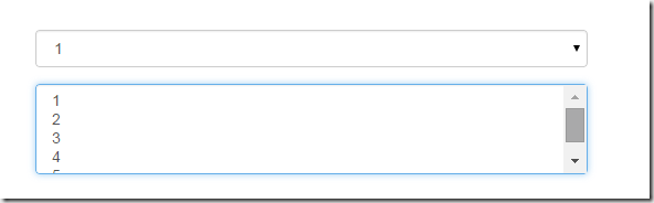
下拉选择框select
多行选择设置multiple属性的值为multiple
<form role="form">

<div class="form-group">

  <select class="form-control">

    <option>1</option>

    <option>2</option>

    <option>3</option>

    <option>4</option>

    <option>5</option>

  </select>

  </div>

  <div class="form-group">

  <select multiple class="form-control">

    <option>1</option>

    <option>2</option>

    <option>3</option>

    <option>4</option>

    <option>5</option>

  </select>

</div>

</form>
文本域textarea
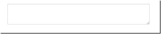
文本域和原始使用方法一样,设置rows可定义其高度,设置cols可以定义其宽度,如果textarea元素中添加了类名.form-control,则无需设置cols属性,因为bootstrap框架中.form-control样式的标的空间宽度为100%或auto
<form role="form">

        <div class="form-group">

            <textarea  class="form-control" rows="3"></textarea>

        </div>

    </form>
复选框checkbox和单选框radio
checkbox和radio与label标签配合使用会出现一些小问题(如对齐问题)
<form>

        <div class="checkbox">

            <label>

                <input type="checkbox"> 记住密码

            </label>

        </div>

        <div class="radio">

            <label>

                <input type="radio" name="optionsRadios" id="optionsRadios1" checked> 喜欢

            </label>

        </div>

        <div class="radio">

            <label>

                <input type="radio" name="optionsRadios" id="optionsRadios2">不喜欢

            </label>

        </div>

    </form>
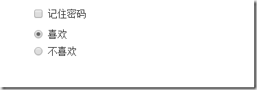
1、不管是checkbox还是radio都使用label包起来了
2、checkbox连同label标签放在一个名为.checkbox的容器内
3、radio连同label标签放在一个名为.radio的容器内,bootstrap主要借助.checkbox和.radio样式来处理复选框、单选按钮与标签的对齐方式
.radio,

.checkbox {

display: block;

min-height: 20px;

padding-left: 20px;

margin-top: 10px;

margin-bottom: 10px;

}

.radio label,

.checkbox label {

display: inline;

font-weight: normal;

cursor: pointer;

}

.radio input[type="radio"],

.radio-inline input[type="radio"],

.checkbox input[type="checkbox"],

.checkbox-inline input[type="checkbox"] {

float: left;

margin-left: -20px;

}

.radio + .radio,

.checkbox + .checkbox {

margin-top: -5px;

}
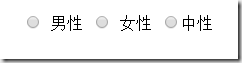
复选框和单选按钮水平排列
1、如果checkbox需要水平排列,只需要在label标签上添加类名.checkbox-inline
2、如果radio需要水平排列,只需在label标签上添加类名.radion-inline
下面是css源码:
.radio-inline,

.checkbox-inline {

display: inline-block;

padding-left: 20px;

margin-bottom:;

font-weight: normal;

vertical-align: middle;

cursor: pointer;

}

.radio-inline + .radio-inline,

.checkbox-inline + .checkbox-inline {

margin-top:;

margin-left: 10px;

}
<div class="form-group">

        <label class="radio-inline">

            <input type="radio" name="sex"value="option1"> 男性

        </label>

        <label class="radio-inline">

            <input type="radio"  name="sex" value="option2"> 女性

        </label>

        <label class="radio-inline">

            <input type="radio" name="sex" value="option3">中性

        </label>

    </div>
表单控件状态
1、焦点状态:
焦点状态是通过伪类:focus来实现的,bootstrap表单控件中的焦点状态删除了outline的默认样式,重新添加阴影效果,下面是css源码:
.form-control:focus {

border-color: #66afe9;

outline:;

  -webkit-box-shadow: inset 0 1px 1pxrgba(0,0,0,.075), 0 0 8px rgba(102, 175, 233, .6);

box-shadow: inset 0 1px 1pxrgba(0,0,0,.075), 0 0 8px rgba(102, 175, 233, .6);

}
从源码中可以看出,要让控件在焦点状态下有上面的样式效果需要给控件添加类名.form-control
<form class="form-horizontal">

        <div class="form-group ">

            <div class="col-xs-6">

                <input type="text" class=" input-lg" placeholder="不是在焦点状态下的效果">

            </div>

            <div class="col-xs-6">

                <input type="text" class="form-control input-lg" placeholder="在焦点状态下的效果">

            </div>

        </div>

 </form>

file、radio、checkbox控件在焦点状态下的效果也与普通的input控件不太一样,下面是源码
input[type="file"]:focus,

input[type="radio"]:focus,

input[type="checkbox"]:focus {

outline: thin dotted;

outline: 5px auto -webkit-focus-ring-color;

outline-offset: -2px;

}
2、禁用状态:
在相应得表单控件上添加属性disabled即可,下面是css源码:
.form-control[disabled],

.form-control[readonly],

fieldset[disabled] .form-control {

cursor: not-allowed;

background-color: #eee;

opacity:;

}
input[type="radio"][disabled],

input[type="checkbox"][disabled],

.radio[disabled],

.radio-inline[disabled],

.checkbox[disabled],

.checkbox-inline[disabled],

fieldset[disabled] input[type="radio"],

fieldset[disabled] input[type="checkbox"],

fieldset[disabled] .radio,

fieldset[disabled] .radio-inline,

fieldset[disabled] .checkbox,

fieldset[disabled] .checkbox-inline {

cursor: not-allowed;

}
例子:
<input type="text" class="form-control" placeholder="表单已禁用" disabled>

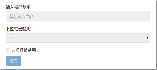
如果fieldset设置了disabled属性,整个域都会处于被禁用状态
例子:
<form role="form">

        <fieldset disabled>

            <div class="form-group">

                <label> 输入框已禁用</label>

                <input type="text" class="form-control" placeholder="禁止输入内容">

            </div>

            <div class="form-group">

                <label>下拉框已禁用</label>

                <select class="form-control">

                    <option>1</option>

                    <option>2</option>

                    <option>3</option>

                    <option>4</option>

                </select>

            </div>

            <div class="checkbox">

              <label >

                  <input type="checkbox">选项框被禁用了

              </label>

            </div>

            <button type="submit" class="btn btn-primary">提交</button>

        </fieldset>

</form>
效果如下:(鼠标移上去的时候出现禁用的图标,这里是直接截的图看不到这个效果)
3、验证状态
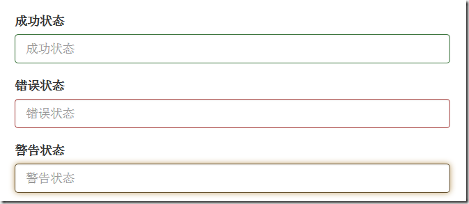
bootstrap提供下面这几种效果:
1、.has-warning:警告状态 黄色
2、 .has-error :错误状态 红色
3、 .has-success:成功状态 绿色
使用的时候只需在form-group容器上对应添加状态类名,三种状态下效果都是一样的,只是颜色不一样而已
例子:
<form>

        <div class="form-group has-success">

          <label>成功状态</label>

          <input type="text" class="form-control" placeholder="成功状态">

        </div>

        <div class="form-group has-error">

            <label>错误状态</label>

            <input type="text" class="form-control" placeholder="错误状态">

        </div>

        <div class="form-group has-warning">

            <label>警告状态</label>

            <input type="text" class="form-control" placeholder="警告状态">

        </div>

    </form>
效果如下:
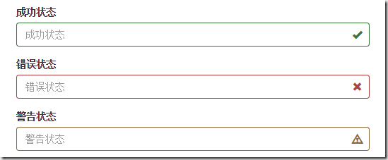
有时候,在表单验证的时不同的状态会提供不同的icon,如果要在对应的状态下显示icon出来,只需要在对应的状态下添加类名.has-feedback ,注意它要和.has-error,.has-success,.has-warning一起使用。
bootstrap的小图标都是使用@font-face来制作的。如:<span class=”glyphicon glyphicon-warning form-control-feedback”></span>
例子:
<form>

        <div class="form-group has-success has-feedback">

            <label> 成功状态</label>

            <input type="text" class="form-control" placeholder="成功状态">

            <span class="glyphicon glyphicon-ok form-control-feedback"></span>

        </div>

        <div class="form-group has-error has-feedback">

            <label>错误状态</label>

            <input type="text" class="form-control" placeholder="错误状态">

            <span class="glyphicon glyphicon-remove form-control-feedback"></span>

        </div>

        <div class="form-group has-warning has-feedback">

            <label>警告状态</label>

            <input type="text" class="form-control" placeholder="警告状态">

            <span class="glyphicon glyphicon-warning-sign form-control-feedback"></span>

        </div>

</form>
效果如下:
表单提示信息
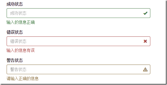
一般在制作表单验证时,需要提供不同的提示信息,在bootstrap框架中使用.help-block,将提示信息以块状显示,并且显示在控件底部
下面是css源码:
.help-block {

display: block;

margin-top: 5px;

margin-bottom: 10px;

color: #737373;

}
例子:
<form>

        <div class="form-group has-success has-feedback">

            <label>成功状态</label>

            <input type="text" class="form-control" placeholder="成功状态">

            <span class="help-block">输入的信息正确</span>

            <span class="glyphicon glyphicon-ok form-control-feedback"></span>

        </div>

        <div class="form-group has-error has-feedback">

            <label>错误状态</label>

            <input type="text" class="form-control" placeholder="错误状态">

            <span class="help-block">输入的信息有误</span>

            <span class="glyphicon glyphicon-remove form-control-feedback"></span>

        </div>

        <div class="form-group has-warning has-feedback">

            <label>警告状态</label>

            <input type="text" class="form-control" placeholder="警告状态">

            <span class="help-block">请输入正确的信息</span>

            <span class="glyphicon glyphicon-warning-sign form-control-feedback"></span>

        </div>

 </form>
效果如下:
如果不想为bootstrap.css增加自己的代码,而且设计又有这种需要,可以借助bootstrap的网格系统,例如:
<form role="form">

  <div class="form-group">

    <label class="control-label" for="inputSuccess1">成功状态</label>

    <div class="row">

      <div class="col-xs-6">

        <input type="text" class="form-control" id="inputSuccess1" placeholder="成功状态" >

      </div>

       <span class="col-xs-6 help-block">你输入的信息是正确的</span>

    </div>

  </div>

</form>
详解Bootstrap表单组件的更多相关文章
- 详解Bootstrap列表组组件
列表组可以用来制作列表清单.垂直导航等效果,也可以配合其他的组件制作出更漂亮的组件,列表组在bootstrap框架中也是一个独立的组件,所以也对应有自己独立源码: LESS:list-group.le ...
- 详解Bootstrap进度条组件
在网页中,进度条的效果并不少见,如:平分系统.加载状态等,进度条组件使用了css3的transition和animation属性来完成一些特效,这些特效在IE9及IE9以下版本.Firefox的老版本 ...
- bootstrapValidator.js,最好用的bootstrap表单验证插件
前言:做Web开发的我们,表单验证是再常见不过的需求了.友好的错误提示能增加用户体验.博主搜索bootstrap表单验证,搜到的结果大部分都是文中的主题:bootstrapvalidator.今天就来 ...
- Django form表单 组件
目录 Django form表单 组件 Form 组件介绍 普通方式手写注册功能 使用form组件实现注册功能 Form 常用字段与插件 常用字段(必备) 字段参数(必备) 内置验证(必备) 自定义效 ...
- 微信小程序-表单组件
button 按钮 注:button-hover 默认为{background-color: rgba(0, 0, 0, 0.1); opacity: 0.7;} 示例代码: /** wxss **/ ...
- Bootstrap表单
Bootstrap 提供了下列类型的表单布局: 垂直表单(默认) -> 这个不好看,都是手机版了,PC版占一排不好看: 内联表单 -> 我相信这个才是你想要的,PC版响应横排,手机版响应竖 ...
- Vue组件之自定义表单组件
今天又看了一遍vue的文档,记得之前学习的时候,官方文档中有提过,v-model指令是一个语法糖,做两件事,一个是给表单控件元素绑定value,第二个是当输入时更新绑定的值,不过后来在"表单 ...
- bootstrap表单带验证
<!DOCTYPE html> <html lang="zh-CN"> <head> <meta charset="utf-8& ...
- Form( 表单) 组件
本节课重点了解 EasyUI 中 Form(表单)组件的使用方法, 这个组件不依赖于任何组件.一. 加载方式表单组件只能在 JS 区域设置,首先定义一张表单.<form id="box ...
随机推荐
- 树形菜单的json字符串的拼接
最近在学习权限管理, 要用到树形按钮, 但是字符串的拼接是一个难理解的问题, 然后从网上找了一个从前台用js来遍历组成这个json字符串, 很好! 但是没看懂... var data = [ {&qu ...
- Log4j基本用法----日志级别
基本使用方法: Log4j由三个重要的组件构成:日志信息的优先级,日志信息的输出目的地,日志信息的输出格式.日志信息的优先级从高到低有ERROR.WARN.INFO.DEBUG,分别用来指定这条日志信 ...
- Errors occurred during the build. Errors running builder 'JavaScript Validator' on project 'XXX'.
Errors occurred during the build. Errors running builder 'JavaScript Validator' on project 'XXX'. ...
- Python网络爬虫Scrapy框架研究
看到一个爬虫比较完整的教程.保留一下. https://github.com/yidao620c/core-scrapy
- Java集合的运算之减法A-B
import com.sun.media.sound.SoftSynthesizer; import java.util.*; public class a123 { public static ...
- [f]动态判断js加载完成
在正常的加载过程中,js文件的加载是同步的,也就是说在js加载的过程中,浏览器会阻塞接下来的内容的解析.这时候,动态加载便显得尤为重要了,由于它是异步加载,因此,它可以在后台自动下载,并不会妨碍其它内 ...
- wav文件格式分析(二)
(三)格式分析 WAVE文件是由若干个Chunk组成的.按照在文件中的出现位置包括:RIFF WAVE Chunk, Format Chunk, Fact Chunk(可选), Data Chunk. ...
- Matlab神经网络函数newff()新旧用法差异
摘要 在Matlab R2010a版中,如果要创建一个具有两个隐含层.且神经元数分别为5.3的前向BP网络,使用旧的语法可以这样写: net1 = newff(minmax(P), [5 3 1]); ...
- (原创)即使最可怕的自然力量,也不失美丽——火山喷发(摄影,欣赏)
文中图片摘自腾讯文化:www.cal.qq.com 1.Abstract 最可怕的力量也潜含着最美丽的风景奇观,虽然不能亲眼目睹,但透过大师的视角,一样也能体会到自然力量撼动的美丽. 2.Co ...
- RHEL5.8设置OpenSSH的X11 Forwarding功能
X11的Forwarding功能需要在SSH中进行设置,RedHat Enterprise Linux5.8默认使用的而是OpenSSH,现将设置方法记录如下: OpenSSH配置文件路径: /etc ...