
CSS3学习笔记之loading动画
效果截图:
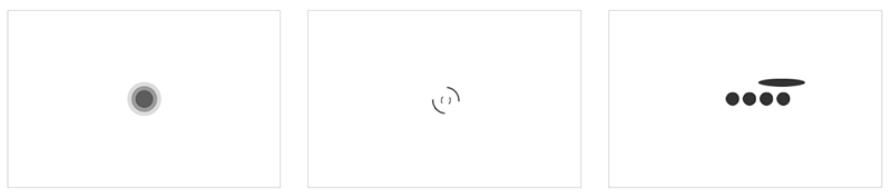
HTML代码:
<div class="divBox">

    <div class="loader">

        <div class="loading-1">

            <i></i>

            <i></i>

            <i></i>

        </div>

    </div>

    <div class="loader">

        <div class="loading-2">

            <i></i>

            <i></i>

        </div>

    </div>

    <div class="loader">

        <div class="loading-3">

            <i></i>

            <i></i>

            <i></i>

            <i></i>

            <i></i>

        </div>

    </div>

</div>
CSS代码:
.divBox{

    width: 100%; padding: 3%; box-sizing:border-box;

}

.loader{

    width: 30%; height: 260px; float: left; border:1px solid #ccc; margin-right: 3%;

}

/*第一个loading动画*/

.loading-1{

    position: relative; width: 60px; height: 60px; margin: 100px auto;

}

.loading-1 i{

    background-color: #333; width: 60px; height: 60px; border-radius: 50%; position: absolute; left:; top:; opacity:;

}

/*为第一个loading动画定义关键帧*/

@keyframes loading01{

    0%{ transform: scale(0); opacity:; }

    5%{ opacity:; }

    100%{ transform: scale(1); opacity:; }

}

.loading-1 i:nth-child(1){

    animation: loading01 1s linear 0s infinite;

}

.loading-1 i:nth-child(2){

    animation: loading01 1s linear 0.2s infinite;

}

.loading-1 i:nth-child(3){

    animation: loading01 1s linear 0.4s infinite;

}

/*第二个loading动画*/

.loading-2{

    width: 40px; height: 40px; margin: 110px auto; position: relative;

}

/*为第二个loading动画定义关键帧*/

@keyframes loading-2{

    0%{ transform: rotate(0deg) scale(1); }

    50%{ transform: rotate(180deg) scale(0.6); }

    100%{ transform: rotate(360deg) scale(1); }

}

.loading-2 i{

    position: absolute; border:2px solid #333; border-color: transparent #333; border-radius: 50%;

}

.loading-2 i:first-child{

    width: 40px; height: 40px; left:; top:; animation: loading-2 1s ease-in-out 0s infinite;

}

.loading-2 i:last-child{

    width: 20px; height: 20px; left: 10px; top: 10px; animation: loading-2 1s ease-in-out 0.4s infinite reverse

}

/*第三个loaing动画*/

.loading-3{

    width: 80px; height: 20px; position: relative; margin: 120px auto;

}

/*为第三个loading动画定义关键帧*/

@keyframes loading03{

    0%{ left:100px; top:; }

    80%{ left:; top:; }

    85%{ left:; top: -20px; width: 20px; height: 20px; }

    90%{ width: 80px; height: 10px; }

    95%{ left:100px; top: -20px; width: 20px; height: 20px; }

    100%{ left:100px; top:; }

}

.loading-3 i{

    width: 20px; height: 20px; position: absolute; border-radius: 50%; background-color: #333;

}

.loading-3 i:nth-child(1){

    animation: loading03 2s linear 0s infinite;

}

.loading-3 i:nth-child(2){

    animation: loading03 2s linear -0.4s infinite;

}

.loading-3 i:nth-child(3){

    animation: loading03 2s linear -0.8s infinite;

}

.loading-3 i:nth-child(4){

    animation: loading03 2s linear -1.2s infinite;

}

.loading-3 i:nth-child(5){

    animation: loading03 2s linear -1.6s infinite;

}
CSS3学习笔记之loading动画的更多相关文章
- CSS3学习笔记(3)-CSS3边框
p{ font-size: 15px; } .alexrootdiv>div{ background: #eeeeee; border: 1px solid #aaa; width: 99%; ...
- iOS学习笔记-自定义过渡动画
代码地址如下:http://www.demodashi.com/demo/11678.html 这篇笔记翻译自raywenderlick网站的过渡动画的一篇文章,原文用的swift,由于考虑到swif ...
- 十天精通CSS3学习笔记 part4
CSS3中的变形与动画(下) CSS3 Keyframes介绍 Keyframes 被称为关键帧,其类似于Flash中的关键帧.在CSS3中其主要以"@keyframes"开头,后 ...
- CSS3学习笔记之linear-gradient
我觉得CSS3很不错,自己也稍微看过,并且尝试过一些属性.对我自己而言,我没有勇气说我学过CSS3,我觉得任何自己看来很小的事情,也只是站在自己的角度来评判.就算的是"简单的"HT ...
- 十天精通CSS3学习笔记 part3
第8章 CSS3中的变形与动画(上) 变形--旋转 rotate() 旋转rotate()函数通过指定的角度参数使元素相对原点进行旋转.它主要在二维空间内进行操作,设置一个角度值,用来指定旋转的幅度. ...
- CSS3学习笔记(4)—上下滑动展开的按钮
最近写了一个动画,下面来看看我以前写的一个上下滑动展开的按钮效果: 这类的效果经常会在一些网站页面下载按钮处看到,当你鼠标悬浮在下载按钮时,会提醒你是否已注册,或者点击登录什么的小提示~~~~~ 一. ...
- [CSS3] 学习笔记-CSS动画特效
在CSS3中,出现了很多出彩的效果,例如2D.3D以及过度.动画和多列等.这些效果为页面设计添加了很多的可选设计. 1.2D.3D转换 转换,是使元素改变尺寸.形状.位置的一种效果:通过CSS3转换, ...
- CSS3 学习笔记(动画 多媒体查询)
动画 1.@keyframes规则用于创建动画.在@keyframes中规定某项CSS样式,就能创建由当前样式逐渐改为新样式的动画效果 2.使用animation进行动画捆绑.两个值:动画名称.时长 ...
- CSS3学习笔记之立体线框球形动画
效果截图: HTML代码: <div class="ball-box"> <div class="ball"> <div clas ...
随机推荐
- python中矢量化字符串方法
- 【EXCEL】SUMIFS(複数の条件を指定して数値を合計する)
分享:
- LARK BOARD开发板入门学习-第2篇
1. 本次主要研究下HDMI接口,使用芯片是CH7033,这个芯片可以接VGA和HDMI两种接口,和FPGA的接口是地址数据总线 2. 值得注意的地方,下图的D1,双二极管BAT54S在电路中一般用于 ...
- http报文和浏览器缓存机制
目录 1. 请求报文 1.1请求行 1.2 请求头 一些常用的请求头信息 2. 响应报文 2.1 状态行 1> 响应状态码 2> 常见的响应状态码 2.2 响应头 3. 浏览器缓存 3.1 ...
- ExtJs工具篇(2)——Aptana Studio 3 汉化
本身用的是中文版本的,但是输入一些中文后,竟然有乱码,所以就想把它汉化.在网上搜索了一下,把步骤记录如下: 首先到这个网站去 http://aptana.com/support 选择View Docu ...
- 存一些有用的CSS
reset ;} table{} fieldset,img{} address,caption,cite,code,dfn,em,strong,th,var{font-style:normal;fon ...
- spring mvc 返回xml格式数据
1.问题 : 因为业务需要,需要发送xml格式的数据,使用spring mvc 自己解析,就不用费心去自己搞这些东西. 2.解决: 新建一个实体类,直接在实体类中添加注解即可,如下: @XmlRoot ...
- hadoop 环境配置
HADOOP_HOME E:\tool\eclipse\hadoop-2.7.3 HADOOP_USER_NAME ambari-qa path: %HADOOP_HOME%/bin
- 1.16. BIP39协议:使用助记词生成确定性钱包
以太坊系统学习教程: https://www.netkiller.cn/blockchain/bip39.html 1.16. BIP39协议:使用助记词生成确定性钱包 BIP:39 层:应用层 标题 ...
- SPOJ 375 Query on a tree(树链剖分)(QTREE)
You are given a tree (an acyclic undirected connected graph) with N nodes, and edges numbered 1, 2, ...