CSS3之线性渐变(linear gradients)
线性渐变(linear gradients)沿着一根轴线改变颜色,从起点到终点颜色进行顺序渐变。
语法:
background:linear-gradient(direction,color-stop1,color-stop2,……);
1、线性渐变从上到下(默认)
语法
background:linear-gradient(color-stop1,color-stop2……);
实例
div {

    width: 800px;

    height: 500px;

    margin: 0 auto;

    background: -webkit-linear-gradient(red, blue);

    /* Safari 5.1 - 6.0*/

    background: -o-linear-gradient(red, blue);

    /* Opera 11.1 - 12.0 */

    background: -moz-linear-gradient(red, blue);

    /* Firefox 3.6 - 15 */

    background: linear-gradient(red, blue);

    /* 标准的语法 */

}
2、线性渐变从左到右
语法:
background: -webkit-linear-gradient(begin-level begin-vertical,color-stop1,color-stop2,……);
/* Safari 5.1 - 6.0 */
background: -o-linear-gradient(end-level end-vertical,color-stop1,color-stop2,……);
/* Opera 11.1 - 12.0 */
background: -moz-linear-gradient(end-level end-vertical,color-stop1,color-stop2,……);
/* Firefox 3.6 - 15 */
background: linear-gradient(to end-level end-vertical,color-stop1,color-stop2,……);
/*标准的语法*/
实例
div {

  width: 800px;

  height: 500px;

  margin: 0 auto;

  background: -webkit-linear-gradient(left, red, blue);

  /* Safari 5.1 - 6.0 */

  background: -o-linear-gradient(right, red, blue);

  /* Opera 11.1 - 12.0 */

  background: -moz-linear-gradient(right, red, blue);

  /* Firefox 3.6 - 15 */

  background: linear-gradient(to right, red, blue);

  /* 标准的语法 */

}
3、线性渐变对角
语法
background: -webkit-linear-gradient(begin-level begin-vertical,color-stop1,color-stop2,……);
/* Safari 5.1 - 6.0 */
background: -o-linear-gradient(end-level end-vertical,color-stop1,color-stop2,……);
/* Opera 11.1 - 12.0 */
background: -moz-linear-gradient(end-level end-vertical,color-stop1,color-stop2,……);
/* Firefox 3.6 - 15 */
background: linear-gradient(to end-level end-vertical,color-stop1,color-stop2,……);
/*标准的语法*/
小提示:线性渐变对角时关键字的顺序无关紧要,“to left bottom”与“to bottom left”相同。
实例
div {

  width: 800px;

  height: 500px;

  margin: 0 auto;

  background: -webkit-linear-gradient(left top, red , blue); /* Safari 5.1 - 6.0 */

  background: -o-linear-gradient(bottom right, red, blue); /* Opera 11.1 - 12.0 */

  background: -moz-linear-gradient(bottom right, red, blue); /* Firefox 3.6 - 15 */

  background: linear-gradient(to bottom right, red , blue); /* 标准的语法 */

}
3-3编程练习
小伙伴们,我们学习了怎样使用CSS3写颜色的渐变效果,那么根据效果图,写出代码,实现3中方式的渐变把!
效果图如下:
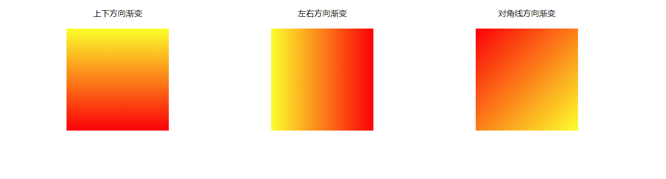
任务
第一步:写出html代码(3个div元素)
第二部:给div元素设置CSS样式(宽和高。三个元素在一行上)
第三部:给三个div元素设置相应的背景颜色
(1)第一个div元素是从上向下发生渐变,暗色由黄色变成红色
(2)第二个div元素是从左到右发生渐变,颜色由黄色变为红色
第三个div元素是从左上角到右下角发生渐变,颜色由红色变为黄色
参考代码:
<!DOCTYPE html>

<html lang="zh-CN">

<head>

  <meta charset="UTF-8">

  <title>background-clip</title>

  <meta name='description' content='background-clip'>

  <meta name='keywords' content='background-clip'>

  <style>

    /* 此处写代码 */

    html,

    body {

      margin: 0;

      padding: 0;

    }

    .container {

      width: 1000px;

      margin: 20px auto;

      display: flex;

      justify-content: space-between;

    }

    .font{

      display:flex;

      justify-content:center;

      width: 200px;

    }

    div.item{

      width: 200px;

      height: 200px;

      background: #ccc;

    }

    div.item:nth-child(1) {

      background: linear-gradient(yellow, red);

    }

    div.item:nth-child(2) {

      background: linear-gradient(to right,yellow, red);

    }

    div.item:nth-child(3) {

      background: linear-gradient(to bottom right, red,yellow);

    }

  </style>

</head>

<body>

  <!-- 此处写代码 -->

  <div class='container'>

    <div class='font'>上下方向渐变</div>

    <div class='font'>左右方向渐变</div>

    <div class='font'>对角线方向渐变</div>

  </div>

  <div class='container'>

    <div class='item'></div>

    <div class='item'></div>

    <div class='item'></div>

  </div>

</body>

</html>
4、线性渐变-使用角度
语法:
background:linear-gradient(angle,color-stop1,color-stop2,……);
角度说明
0deg创建一个从下到上的渐变,正角表示顺时针旋转,90deg创建一个从左到右的渐变。
实例
#grad {

  background: -webkit-linear-gradient(180deg, red, blue); /* Safari 5.1 - 6.0 */

  background: -o-linear-gradient(180deg, red, blue); /* Opera 11.1 - 12.0 */

  background: -moz-linear-gradient(180deg, red, blue); /* Firefox 3.6 - 15 */

  background: linear-gradient(180deg, red, blue); /* 标准的语法 */

}
编程练习
小伙伴们,根据效果图,补充代码,实现元素的背景颜色在水平方向上发生渐变,其中:
(1)0%-20%处,颜色是红色全透明
(2)20%-50%处,颜色是从白色渐变到红色
(3)50%-90%处,颜色从红色渐变到绿色,其中绿色的透明度是0.7
效果图如下:
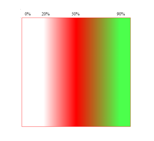
任务
给元素设置背景颜色渐变
(1)用角度表示法让颜色在水平方向发生渐变
(2)水平方向的0%-20%处,渐变的颜色是红色全透明
(3)水平方向的20%-50%处,渐变的颜色是红色,颜色没有透明度
(4)水平方向50%-90%处,渐变的颜色是绿色,透明度为0.7
参考代码:
<!DOCTYPE html>

<html lang="zh-CN">

<head>

  <meta charset="UTF-8">

  <title>em</title>

  <meta name='description' content='em'>

  <meta name='keywords' content='em'>

  <style>

    /* 此处写代码 */

    div {

      width: 400px;

      height: 400px;

      border:1px solid red;

      background:linear-gradient(90deg,rgba(255, 0, 0,0) 20%,rgba(255, 0, 0,1) 50%,rgba(0,255,0,0.7) 90%);

      margin:0 auto;

    }

  </style>

</head>

<body>

  <!-- 此处写代码 -->

  <div></div>

</body>

</html>
5、线性渐变-重复渐变
语法:
background:repeating-linear-gradient(color1 length|percentage,color2 length|percentage,……);
实例
div {
background:repeating-linear-gradient(red,blue 20%);
}
3-9编程练习
小伙伴们,我们学习了CSS3现象渐变中的重复渐变,接下来,根据效果图补充代码,实现元素中多个彩虹的重复。
提示:彩虹的颜色,用英语单词表达即可
效果图如下
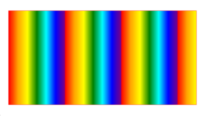
任务
给元素设置背景颜色重复渐变
(1)效果图中的完整彩虹重复了最少3次,占据了元素的90%的位置,所以一个彩虹占据元素的比例是30%
(2)将一个彩虹的7个颜色,均摊到30%中,每个颜色的比重是5%,比如红色占据的位置是0%,橙色占据的是5%,黄色占据的是10%,以此类推。
参考代码:
<!DOCTYPE html>

<html lang="zh-CN">

<head>

  <meta charset="UTF-8">

  <title>em</title>

  <meta name='description' content='em'>

  <meta name='keywords' content='em'>

  <style>

    /* 此处写代码 */

    div {

      width: 400px;

      height: 300px;

      border:1px solid red;

      background:repeating-linear-gradient(90deg,red 0%,orange 5%,yellow 10%,green 15%,blue 20%,indigo 25%,purple 30%);

      margin:0 auto;

    }

  </style>

</head>

<body>

  <!-- 此处写代码 -->

  <div></div>

</body>

</html>
CSS3之线性渐变(linear gradients)的更多相关文章
- CSS3 linear-gradient线性渐变实现虚线等简单实用图形
一.作为图片存在的CSS3 gradient渐变 我觉得CSS3 Backgrounds比较厉害的一个地方就是支持多背景,也就是背景图片个数可以无限累加,正好CSS3的gradient渐变性质是bac ...
- CSS3 Gradient线性渐变
废话小说,看代码 <!DOCTYPE html > <html > <head> <meta charset="utf-8"> &l ...
- CSS3的线性渐变(linear-gradient)
CSS3渐变(gradient)可分为线性渐变(linear-gradient)和径向渐变(radial-gradient).今天给大家说一说线性渐变. 以webkit内核浏览器为例, 语法: div ...
- CSS3———linear-gradient() 线性渐变
线性渐变linear-gradient() 遇到了这样的css样式 body { height: 100%; background-color: #ffffff; background-image: ...
- 【CSS3】 线性渐变
参考地址:http://www.w3cplus.com/css3/new-css3-linear-gradient.html background-image: linear-gradient(to ...
- CSS3渐变(Gradients)-线性渐变
CSS3渐变(Gradients)可以让你在两个或多个指定颜色之间显示平稳的过度,包括透明度. 以前,你必须使用图像来实现这些效果.但是,通过Css3渐变(Gradients),你可以减少下载的事件和 ...
- CSS3背景渐变属性 linear-gradient(线性渐变)和radial-gradient(径向渐变)
CSS3 Gradient分为linear-gradient(线性渐变)和radial-gradient(径向渐变). 为了更好的应用CSS3 Gradient,我们需要先了解一下目前的几种现代浏览器 ...
- 再说CSS3渐变——线性渐变
渐变背景一直以来在Web页面中都是一种常见的视觉元素.但一直以来,Web设计师都是通过图形软件设计这些渐变效果,然后以图片形式或者背景图片的形式运用到页面中.Web页面上实现的效果,仅从页面的视觉效果 ...
- CSS3线性渐变linear-gradient
转自 http://www.w3cplus.com/content/css3-gradient CSS3的线性渐变 一.线性渐变在Mozilla下的应用 -moz-linear-gradient( [ ...
随机推荐
- 多测师讲解selenium _下拉框的定位_高级讲师肖sir
from selenium import webdriver from selenium.webdriver.support.ui import Select#导入类from time import ...
- rs232转网络
rs232转网络 rs232转网络ZLAN5103可以实现RS232/485/422和TCP/IP之间进行透明数据转发.方便地使得串口设备连接到以太网和Internet,实现串口设备的网络化升级.支持 ...
- day30 Pyhton 复习模块
一.模块 什么是模块. 模块就是我们把装有特定功能的代码进行归类的结果. 从代码编写的单位来看我们的程序, 从小到大的顺序: 一条代码 < 语句句块 < 代码块(函数, 类) < 模 ...
- 界面酷炫,功能强大!这款 Linux 性能实时监控工具超好用!
对于维护.管理Linux系统来说,它的性能监控非常重要,特别是实时监控数据,这个数据有利于我们判断服务器的负载压力,及时调整资源调配,也有助于更好的服务于业务.所以,今天民工哥给大家安利一款 Linu ...
- C++分隔字符串split
split C++标准库中没有提供split分隔字符串的函数,哎. 实现一 下面的实现需要指定分隔符的集合delimiters,以及是否将连续的分隔符看作同一个分隔compress : enum cl ...
- filebeat7.5 日志
百度网盘 提取码: 6cvu 解压 tar -zxvf filebeat-7.5.0-linux-x86_64.tar.gz mv filebeat-7.5.0-linux-x86_64 /usr/l ...
- spring boot:用zxing生成二维码,支持logo(spring boot 2.3.2)
一,zxing是什么? 1,zxing的用途 如果我们做二维码的生成和扫描,通常会用到zxing这个库, ZXing是一个开源的,用Java实现的多种格式的1D/2D条码图像处理库. zxing还可以 ...
- deepin vue安装步骤
deepin安装node.js sudo wget https://nodejs.org/dist/v9.2.0/node-v9.2.0-linux-x64.tar.xz tar xJf node-v ...
- Windows(WSL2) Linux子系统搭建Docker环境
摘要:本文主要介绍了如何再Windows(WSL2)中启用Linux系统中,并搭建Docker环境. WSL是适用于 Linux 的 Windows 子系统可让开发人员按原样运行 GNU/Linux ...
- JS的各种数据类型
Number js与其他编程不一样,不管是整数还是浮点,都称为数字类型(Number) 例:123,1.11111,-960 当该类型结果不存在时,即表示为 NaN (Not a Number) In ...