position定位及实际应用
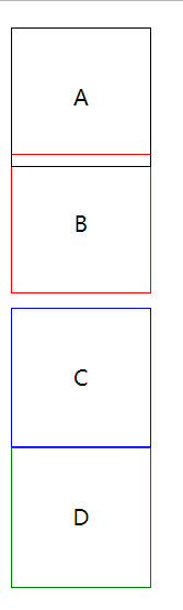
position: static; 静态定位 / 常规定位 / 自然定位
忽略top/right/bottom/left/z-index的影响,使元素回到自然流中
<!DOCTYPE html>

<html lang="en">

<head>

    <meta charset="UTF-8">

    <title>Document</title>

    <style>

        .block{

            width:100px;

            height:100px;

            line-height:100px;

            text-align:center;

            position: relative;

            top:10px;

        }

        .block:first-child{

            border:1px solid;

        }

        .block:nth-child(2){

            position: static;

            border:1px solid red;

        }

        .block:nth-child(3){

            border:1px solid blue;

        }

        .block:nth-child(4){

            border:1px solid green;

        }

    </style>

</head>

<body>

    <div class="block">A</div>

    <div class="block">B</div>

    <div class="block">C</div>

    <div class="block">D</div>

</body>

</html>
设置margin:auto为水平居中
<!DOCTYPE html>

<html lang="en">

<head>

    <meta charset="UTF-8">

    <title>Document</title>

    <style>

        .block{

            width:100px;

            height:100px;

            line-height:100px;

            text-align:center;

            position: static;

            margin:auto;

        }

        .block:first-child{

            border:1px solid;

        }

        .block:nth-child(2){

            border:1px solid red;

        }

        .block:nth-child(3){

            border:1px solid blue;

        }

        .block:nth-child(4){

            border:1px solid green;

        }

    </style>

</head>

<body>

    <div class="block">A</div>

    <div class="block">B</div>

    <div class="block">C</div>

    <div class="block">D</div>

</body>

</html>

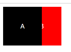
position:relative 相对定位
相对于自己在常规流中的位置,进行偏移
原来的空间依然预留
可以使浮动元素发生偏移,并控制堆叠顺序
<!DOCTYPE html>

<html lang="en">

<head>

    <meta charset="UTF-8">

    <title>Document</title>

    <style>

        .block{

            width:100px;

            height:100px;

            line-height:100px;

            text-align:center;

            color:white;

            float:left;

            position: relative;

        }

        .block:first-child{

            background:black;

            z-index:2;

        }

        .block:nth-child(2){

            background:red;

            left:-50px;

            z-index:1;

        }

    </style>

</head>

<body>

    <div class="block">A</div>

    <div class="block">B</div>

</body>

</html>
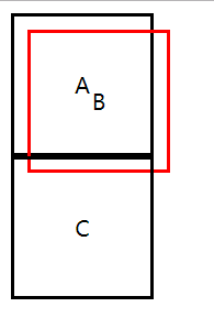
position:absolute;
参照物是最近定位的祖先元素
如果没有祖先元素被定位,则默认为body
<!DOCTYPE html>

<html lang="en">

<head>

    <meta charset="UTF-8">

    <title>Document</title>

    <style>

        .block{

            width:100px;

            height:100px;

            line-height:100px;

            text-align:center;

            border:2px solid;

            position: relative;

        }

        .block:nth-child(2){

            border-color:red;

            position: absolute;

            top:20px;

            left:20px;

        }

    </style>

</head>

<body>

    <div class="block">A</div>

    <div class="block">B</div>

    <div class="block">C</div>

</body>

</html>
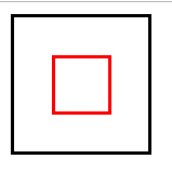
实现水平垂直居中定位:
1、给父元素设置:position: relative;
2、给子元素设置:
position: absolute;
top:0;
left:0;
right:0;
bottom:0;
margin:auto auto;
<!DOCTYPE html>

<html lang="en">

<head>

    <meta charset="UTF-8">

    <title>Document</title>

    <style>

        .parent{

            width:100px;

            height:100px;

            border:2px solid;

            position: relative;

        }

        .child{

            width:40px;

            height:40px;

            border:2px solid;

            border-color:red;

            position: absolute;

            top:0;

            left:0;

            right:0;

            bottom:0;

            margin:auto auto;

        }

    </style>

</head>

<body>

    <div class="parent">

        <div class="child"></div>

    </div>

</body>

</html>
position:fixed;
继承position:absolute;的所有特征,区别是以视口做参照来定位
position:sticky;
与top偏移量结合使用
如果最近祖先元素有定位,则参考最近祖先元素;否则参考视口
<!DOCTYPE html>

<html lang="en">

<head>

    <meta charset="UTF-8">

    <title>Document</title>

    <style>

        .banner{

            width:1200px;

            height:100px;

            background:#abcdef;

            margin:0 auto;

        }

        .nav{

            width:1200px;

            height:50px;

            background:orange;

            margin:0 auto;

            position: sticky;

            top:0;

        }

        .container{

            width:1200px;

            height:1000px;

            background:pink;

            margin:0 auto;

        }

    </style>

</head>

<body>

    <div class="banner">海报大图</div>

    <div class="nav">导航呀</div>

    <div class="container">内容。。。</div>

</body>

</html>
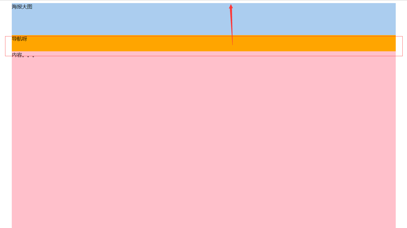
相对于最近定位的祖先元素做参考:
<!DOCTYPE html>

<html lang="en">

<head>

    <meta charset="UTF-8">

    <title>Document</title>

    <style>

        .banner{

            width:1200px;

            height:100px;

            background:#abcdef;

            margin:0 auto;

        }

        .nav{

            width:1200px;

            height:50px;

            background:orange;

            margin:0 auto;

            position: sticky;

            top:20px;

        }

        .container{

            width:1200px;

            height:200px;

            background:pink;

            margin:0 auto;

            position: relative;

            overflow-y: scroll;

            overflow-x: hidden;

        }

        p{

            height:1000px;

        }

    </style>

</head>

<body>

    <div class="banner">海报大图</div>

    <div class="container">

        <div class="nav">导航呀</div>

        <p>内容。。。</p>

    </div>

</body>

</html>
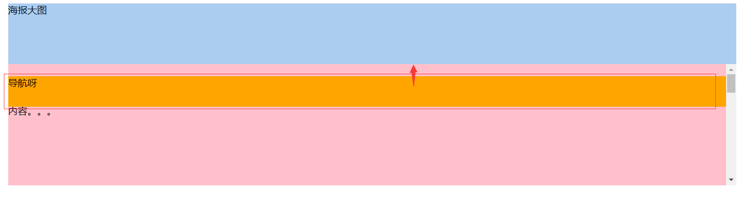
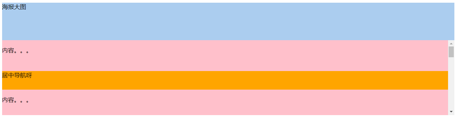
导航在居中位置
<!DOCTYPE html>

<html lang="en">

<head>

    <meta charset="UTF-8">

    <title>Document</title>

    <style>

        .banner{

            width:1200px;

            height:100px;

            background:#abcdef;

            margin:0 auto;

        }

        .nav{

            width:1200px;

            height:50px;

            background:orange;

            margin:0 auto;

            position: sticky;

            top:20px;

        }

        .container{

            width:1200px;

            height:200px;

            background:pink;

            margin:0 auto;

            position: relative;

            overflow-y: scroll;

            overflow-x: hidden;

        }

        p{

            height:1000px;

        }

        p:first-child{

            height:50px;

        }

    </style>

</head>

<body>

    <div class="banner">海报大图</div>

    <div class="container">

        <p>内容。。。</p>

        <div class="nav">居中导航呀</div>

        <p>内容。。。</p>

    </div>

</body>

</html>
www.caniuse.com 检测浏览器兼容性
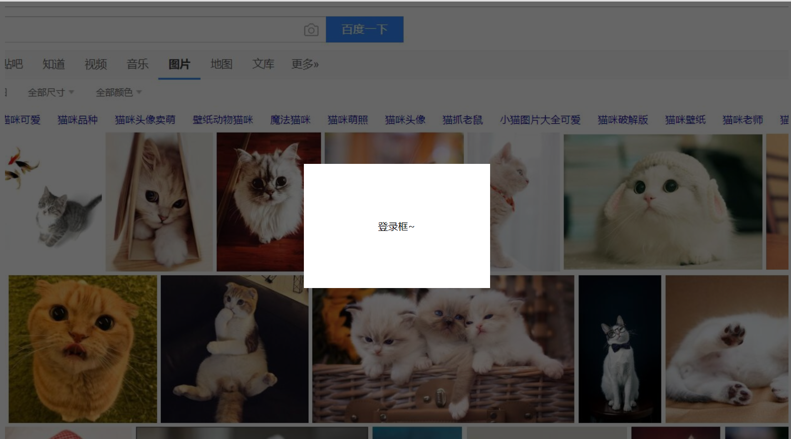
弹出层的简单实例
<!DOCTYPE html>

<html lang="en">

<head>

    <meta charset="UTF-8">

    <title>Document</title>

    <style>

        .content{

            width:100%;

            height:1000px;

            background:url(bg.jpg) top center no-repeat;

        }

        .opacity{

            width:100%;

            height:100%;

            background-color:rgba(0,0,0,.6);

            position: fixed;

            top:0;

            left:0;

        }

        .login{

            width:300px;

            height:200px;

            text-align:center;

            line-height:200px;

            position: fixed;

            background-color:#fff;

            top:50%;

            left:50%;

            margin-top:-100px;

            margin-left:-150px;

        }

    </style>

</head>

<body>

    <div class="content"></div>

    <div class="opacity"></div>

    <div class="login">登录框~</div>

</body>

</html>
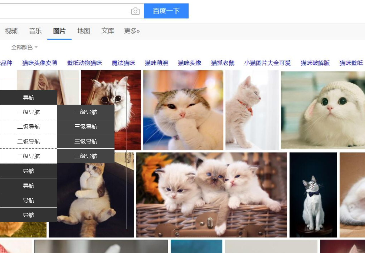
侧边栏导航实例
<!DOCTYPE html>

<html lang="en">

<head>

    <meta charset="UTF-8">

    <title>Document</title>

    <style>

        *{

            margin:0;

            padding:0;

        }

        ul{

            list-style:none;

        }

        .content{

            width:100%;

            height:1000px;

            background:url(bg.jpg) top center no-repeat;

        }

        .nav{

            width:160px;

            height:205px;

            position: fixed;

            left:0;

            top:50%;

            margin-top:-102px;

        }

        .nav-li{

            width:160px;

            height:auto;

            line-height:40px;

            border-bottom:1px solid #fff;

            color:#fff;

            background:#333;

            text-align: center;

            cursor:pointer;

        }

        .tit{

            width:160px;

            height:40px;

        }

        .nav-li ul{

            width:160px;

            height:auto;

            background:#fff;

            display: none;

        }

        .nav-li:hover ul{

            display: block

        }

        .nav-li ul li{

            width:160px;

            height:40px;

            color:#333;

            border-bottom:1px dashed #666;

            text-align: center;

            line-height:40px;

            position: relative;

        }

        .nav-li ul li:hover .subnav{

            display: block;

        }

        .subnav{

            position: absolute;

            width:160px;

            height:auto;

            top:0;

            left:160px;

            background:#444;

            display: none;

        }

        .subnav-item{

            width:160px;

            height:40px;

            border-bottom:1px solid #fff;

            color:#fff;

        }

    </style>

</head>

<body>

    <div class="content">

        <div class="nav">

            <div class="nav-li">

                <div class="tit">导航</div>

                <ul>

                    <li>

                        二级导航

                        <div class="subnav">

                            <div class="subnav-item">三级导航</div>

                            <div class="subnav-item">三级导航</div>

                            <div class="subnav-item">三级导航</div>

                            <div class="subnav-item">三级导航</div>

                        </div>

                    </li>

                    <li>二级导航</li>

                    <li>二级导航</li>

                    <li>二级导航</li>

                </ul>

            </div>

            <div class="nav-li">导航</div>

            <div class="nav-li">导航</div>

            <div class="nav-li">导航</div>

            <div class="nav-li">

                <div class="tit">导航</div>

                <ul>

                    <li>

                        二级导航

                        <div class="subnav">

                            <div class="subnav-item">三级导航</div>

                            <div class="subnav-item">三级导航</div>

                            <div class="subnav-item">三级导航</div>

                            <div class="subnav-item">三级导航</div>

                        </div>

                    </li>

                    <li>二级导航</li>

                    <li>二级导航</li>

                    <li>二级导航</li>

                </ul>

            </div>

        </div>

    </div>

</body>

</html>
position定位及实际应用的更多相关文章
- CSS Position 定位属性
本篇文章主要介绍元素的Position属性,此属性可以设置元素在页面的定位方式. 目录 1. 介绍 position:介绍position的值以及辅助属性. 2. position 定位方式:介绍po ...
- position定位
CSS盒模型和定位的类型 为了搞清楚定位首先你得了解CSS盒模型.在上一句中的链接是我写在InstantShift 中的一篇关于盒模型的文章.我在那篇文章做了详细的讲解并会在这篇文章中做一个快速的总结 ...
- 浅析CSS——元素重叠及position定位的z-index顺序
多次在项目中遇到html页面元素的非期待重叠错误,多数还是position定位情况下z-index的问题.其实每次解决类似问题思路大致都是一样的,说到底还是对z-index的理解比较模糊,可以解决问题 ...
- position定位的小问题
css中position定位有四个属性,分别是:static.fixed.relative.absolute. 其中,static是默认值,未脱离文档流,元素的位置即按照文档结构的顺序进行定位排序: ...
- (转)Position定位:relative | absolute
原文:http://hi.baidu.com/zxc0420/item/9ada5110845ba1e89c778a08 Position定位:relative | absolute 定位一直是WEB ...
- 元素重叠及position定位的z-index顺序
元素位置重叠的背景常识 (x)html文档中的元素默认处于普通流(normal flow)中,也就是说其顺序由元素在文档中的先后位置决定,此时一般不会产生重叠(但指定负边距可能产生重叠).当我们用cs ...
- 盒子模型&position定位
有时候深深的感觉语文这门课程其实很有用, 至少以前学的时候没有感觉到 直到现在阅读大量的别人的资料文章的时候或者是看一些题目....... 总之:认真阅读小心品味 当然,前面的孤言自语和本文无关,只是 ...
- CSS定位:几种类型的position定位的元素
当人们刚接触布局的时候都比较倾向于使用定位的方式.因为定位的概念看起来好像比较容易掌握.表面上你确切地指定了一个块元素所处的位置那么它就会坐落于那里.可是定位比你刚看到的时候要稍微复杂一点.对于定位来 ...
- 归纳篇(一)CSS的position定位和float浮动
近期会更新一系列博客,对基础知识再度做个巩固和梳理. 一.position定位 (一):position的属性 1.absolute:生成绝对定位的元素,相对于最近一级定位不是static的父元素来进 ...
- (转)浅析CSS——元素重叠及position定位的z-index顺序
多次在项目中遇到html页面元素的非期待重叠错误,多数还是position定位情况下z-index的问题.其实每次解决类似问题思路大致都是一样的,说到底还是对z-index的理解比较模糊,可以解决问题 ...
随机推荐
- 使用 web3D 技术的风力发电场展示
前言 风能是一种开发中的洁净能源,它取之不尽.用之不竭.当然,建风力发电场首先应考虑气象条件和社会自然条件.近年来,我国海上和陆上风电发展迅猛.海水.陆地为我们的风力发电提供了很好地质保障.正是 ...
- 如何获取 C# 类中发生数据变化的属性信息
一.前言 在平时的开发中,当用户修改数据时,一直没有很好的办法来记录具体修改了那些信息,只能暂时采用将类序列化成 json 字符串,然后全塞入到日志中的方式,此时如果我们想要知道用户具体改变了哪几个字 ...
- win10下Java12环境变量设置
jdk下载地址:https://www.oracle.com/technetwork/java/javase/downloads/index.html 变量设置: 右键"我的电脑" ...
- C++函数模板详解(一):概念和特性
函数模板是指这样的一类函数:可以用多种不同数据类型的参数进行调用,代表了一个函数家族.它的外表和普通的函数很相似,唯一的区别就是:函数中的有些元素是未确定的,这些元素将在使用的时候才被实例化.先来看一 ...
- Affinity Propagation
1. 调用方法: AffinityPropagation(damping=0.5, max_iter=200, convergence_iter=15, copy=True, preference=N ...
- PTA 7-9 集合相似度(STL之set初体验)
7-9 集合相似度(25 分) 给定两个整数集合,它们的相似度定义为:Nc/Nt×100%.其中Nc是两个集合都有的不相等整数的个数,Nt是两个集合一共有的不相等整数的个数.你 ...
- PC微信逆向--实现消息防撤回
自从聊天软件消息撤回功能问世后,对于撤回的消息,我们对它一直有种强烈的好奇感."Ta刚撤回了什么?是骂我的话?还是说喜欢我?还是把发给其他人的消息误发给了我?好气呀,都看不到了...&quo ...
- eclipse里新建work set,将项目分组放在不同文件夹
想必大家的Eclipse里也会有这么多得工程...... 每次工作使用到的项目肯定不会太多...... 每次从这么大数量的工程当中找到自己要使用的, 必须大规模的滚动滚动条......有点不和谐了. ...
- 《Head first设计模式》之适配器模式
适配器模式将一个类的接口,转换成客户期望的另一个接口.适配器让原本接口不兼容的类可以合作无间. 我们周围的适配器 如果你需要在欧洲国家使用美国制造的笔记本电脑,你可能需要使用一个交流电的适配器. 你知 ...
- sparc v8 汇编语言语法
1.3.1 Labeling Format Symbol names beginning with a dot (.) are assumed to be local symbols. Names b ...