纯CSS画的基本图形(圆形、三角形、多边形、爱心、八卦等)
1.圆形
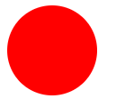
.circle {

 width: 100px;

 height: 100px;

 background: red;

 border-radius: 50px;

}
2.椭圆
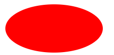
.oval {

  width: 200px;

  height: 100px;

  background: red;

  border-radius: 100px / 50px;

}
3.上三角
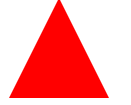
.triangle-up {

  width:;

  height:;

  border-left: 50px solid transparent;

  border-right: 50px solid transparent;

  border-bottom: 100px solid red;

}
4.左上三角

.triangle-topleft {

  width:;

  height:;

  border-top: 100px solid red;

  border-right: 100px solid transparent;

}
5.平行四边形
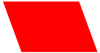
.parallelogram {

  width: 150px;

  height: 100px;

  margin-left:20px;

  transform: skew(20deg);

  background: red;

}
6.梯形
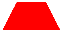
.trapezoid {

  border-bottom: 100px solid red;

  border-left: 50px solid transparent;

  border-right: 50px solid transparent;

  height:;

  width: 100px;

}
7.六角星

.star-six {

  position: relative;

  width:;

  height:;

  border-left: 50px solid transparent;

  border-right: 50px solid transparent;

  border-bottom: 100px solid red;

}

.star-six:after {

  content: "";

  position: absolute;

  top: 30px;

  left: -50px;

  width:;

  height:;

  border-left: 50px solid transparent;

  border-right: 50px solid transparent;

  border-top: 100px solid red;

}
8.五角星

.star-five {

  position: relative;

  margin: 50px 0;

  display: block;

  color: red;

  width: 0px;

  height: 0px;

  border-right: 100px solid transparent;

  border-bottom: 70px solid red;

  border-left: 100px solid transparent;

  transform: rotate(35deg);

}

.star-five:before {

  content: '';

  position: absolute;

  top: -45px;

  left: -65px;

  border-bottom: 80px solid red;

  border-left: 30px solid transparent;

  border-right: 30px solid transparent;

  height:;

  width:;

  display: block;

  transform: rotate(-35deg);

}

.star-five:after {

  content: '';

  position: absolute;

  display: block;

  color: red;

  top: 3px;

  left: -105px;

  width: 0px;

  height: 0px;

  border-right: 100px solid transparent;

  border-bottom: 70px solid red;

  border-left: 100px solid transparent;

  transform: rotate(-70deg);

}
9.五角大楼
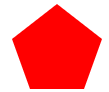
.pentagon {

  position: relative;

  width: 54px;

  border-width: 50px 18px 0;

  border-style: solid;

  border-color: red transparent;

}

.pentagon:before {

  content: "";

  position: absolute;

  height:;

  width:;

  top: -85px;

  left: -18px;

  border-width: 0 45px 35px;

  border-style: solid;

  border-color: transparent transparent red;

}
10.六边形
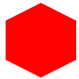
.hexagon {

  position: relative;

  width: 100px;

  height: 55px;

  background: red;

}

.hexagon:before {

  content: "";

  position: absolute;

  top: -25px;

  left:;

  width:;

  height:;

  border-left: 50px solid transparent;

  border-right: 50px solid transparent;

  border-bottom: 25px solid red;

}

.hexagon:after {

  content: "";

  position: absolute;

  bottom: -25px;

  left:;

  width:;

  height:;

  border-left: 50px solid transparent;

  border-right: 50px solid transparent;

  border-top: 25px solid red;

}
11.八角形
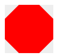
.octagon {

  position: relative;

  width: 100px;

  height: 100px;

  background: red;

}

.octagon:before {

  content: "";

  position: absolute;

  top:;

  left:;

  border-bottom: 29px solid red;

  border-left: 29px solid #eee;

  border-right: 29px solid #eee;

  width: 42px;

  height:;

}

.octagon:after {

  content: "";

  position: absolute;

  bottom:;

  left:;

  border-top: 29px solid red;

  border-left: 29px solid #eee;

  border-right: 29px solid #eee;

  width: 42px;

  height:;

}
12.爱心
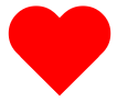
.heart {

  position: relative;

  width: 100px;

  height: 90px;

}

.heart:before, .heart:after {

  position: absolute;

  content: "";

  left: 50px;

  top:;

  width: 50px;

  height: 80px;

  background: red;

  border-radius: 50px 50px 0 0;

  transform: rotate(-45deg);

  transform-origin: 0 100%;

}

.heart:after {

  left:;

  transform: rotate(45deg);

  transform-origin :100% 100%;

}
13.无穷大符号

.infinity {

  position: relative;

  width: 212px;

  height: 100px;

}

.infinity:before, .infinity:after {

  content: "";

  position: absolute;

  top:;

  left:;

  width: 60px;

  height: 60px;

  border: 20px solid red;

  border-radius: 50px 50px 0 50px;

  transform: rotate(-45deg);

}

.infinity:after {

  left: auto;

  right:;

  border-radius: 50px 50px 50px 0;

  transform: rotate(45deg);

}
14.鸡蛋
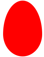
.egg {

  display:block;

  width: 126px;

  height: 180px;

  background-color: red;

  -webkit-border-radius: 63px 63px 63px 63px / 108px 108px 72px 72px;

  border-radius: 50% 50% 50% 50% / 60% 60% 40% 40%;

}
15.食逗人(Pac-Man)

.pacman {

  width: 0px;

  height: 0px;

  border-right: 60px solid transparent;

  border-top: 60px solid red;

  border-left: 60px solid red;

  border-bottom: 60px solid red;

  border-top-left-radius: 60px;

  border-top-right-radius: 60px;

  border-bottom-left-radius: 60px;

  border-bottom-right-radius: 60px;

}
16.提示对话框
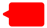
.talkbubble {

  position: relative;

  width: 120px;

  height: 80px;

  background: red;

  border-radius: 10px;

}

.talkbubble:before {

  content:"";

  position: absolute;

  right: 100%;

  top: 26px;

  width:;

  height:;

  border-top: 13px solid transparent;

  border-right: 26px solid red;

  border-bottom: 13px solid transparent;

}
17. 12角星

.burst-12 {

  background: red;

  width: 80px;

  height: 80px;

  position: relative;

  text-align: center;

}

.burst-12:before, .burst-12:after {

  content: "";

  position: absolute;

  top:;

  left:;

  height: 80px;

  width: 80px;

  background: red;

}

.burst-12:before {

  transform: rotate(30deg);

}

.burst-12:after {

  transform: rotate(60deg);

}
18.钻石
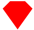
.cut-diamond {

  border-style: solid;

  border-color: transparent transparent red transparent;

  border-width: 0 25px 25px 25px;

  height:;

  width: 50px;

  position: relative;

  margin: 20px 0 50px 0;

}

.cut-diamond:after {

  content: "";

  position: absolute;

  top: 25px;

  left: -25px;

  width:;

  height:;

  border-style: solid;

  border-color: red transparent transparent transparent;

  border-width: 70px 50px 0 50px;

}
19. 阴阳八卦
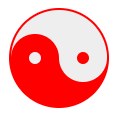
.yin-yang {

  position: relative;

  width: 96px;

  height: 48px;

  background: #eee;

  border-color: red;

  border-style: solid;

  border-width: 2px 2px 50px 2px;

  border-radius: 100%;

}

.yin-yang:before {

  content: "";

  position: absolute;

  top: 50%;

  left:;

  background: #eee;

  border: 18px solid red;

  border-radius: 100%;

  width: 12px;

  height: 12px;

}

.yin-yang:after {

  content: "";

  position: absolute;

  top: 50%;

  left: 50%;

  background: red;

  border: 18px solid #eee;

  border-radius:100%;

  width: 12px;

  height: 12px;

}
纯CSS画的基本图形(圆形、三角形、多边形、爱心、八卦等)的更多相关文章
- CSS之纯CSS画的基本图形(矩形、圆形、三角形、多边形、爱心、八卦等)
图形包括基本的矩形.圆形.椭圆.三角形.多边形,也包括稍微复杂一点的爱心.钻石.阴阳八卦等.当然有一些需要用到CSS3的属性,所以在你打开这篇文章的时候,我希望你用的是firefox或者chrome, ...
- 纯CSS画的基本图形
图形包括基本的矩形.圆形.椭圆.三角形.多边形,也包括稍微复杂一点的爱心.钻石.阴阳八卦等.当然有一些需要用到CSS3的属性,所以在你打开这篇文章的时候,我希望你用的是firefox或者chrome, ...
- 纯CSS画的基本图形(矩形、圆形、三角形、多边形、爱心、八卦
http://css-tricks.com/examples/ShapesOfCSS/
- 用纯css画个三角形
用纯css画个三角形以下是源代码: <!DOCTYPE html PUBLIC "-//W3C//DTD XHTML 1.0 Transitional//EN" " ...
- 纯css画三角形
纯css画三角形与border元素相关 设置border的属性 width: 100px; height: 100px; border-style: solid; border-width: 100p ...
- 用CSS画一个带阴影的三角形的示例代码
1. 思路 怎么用CSS3画一个带阴影的三角形呢 ? 有童鞋说, 这还不简单吗 网上有很多解决方案, 但其实大多都是实现不太完美的, 存在一些问题 假设我们做一个向下的三角形箭头 常见的方法大致有两种 ...
- 【原创】纯CSS画黄金梅丽号!
代码如下 <!DOCTYPE html> <!-- saved from url=(0055)http://jadyoap.bj.bcebos.com/ife%2FcssCatAni ...
- 用纯CSS画大白
纯CSS打造网页大白知识点: 首先要把大白分割,整体baymax中包含header(eye1,eye2,mouth),torso(heart),belly(cover),l-bigfinge ...
- 理解纯CSS画三角形
pure css draw a triangle code { display: inline-block; width: 300px; background-color: #E0E0E0 } .te ...
随机推荐
- 关于微信小程序使用canvas生成图片,内容图片跨域的问题
最近有个项目是保存为名片(图片),让用户发送给朋友或朋友圈,找了很多方案都不适用,绞尽脑汁之后还是选了使用canvas,但是用这玩意儿生成图片最大的缺点就是,如果你的内容中有图片,并且这个图片是通过外 ...
- oracle事务的四个特性(ACID)
事务产生的背景 当在PL/SQL中同时操作多个SQL语句,比如通过DML语句添加.修改或删除数据时,如何确保数据库数据不会因为意外而倒置错误数据是一个非常重要的问题. 以仓库发料系统为例,如果某一张领 ...
- 工作效率提升之Eclipse篇(1):干掉烦人的xml文件的validation
每次启动maven项目,都会有一堆烦人的xml文件的validation,一旦网络较慢,项目重新启动的时候,这些多余的验证纯属浪费时间. Eclipse上取消validation的方法: 1.菜单[W ...
- AssemblyScript的测试
详细文档介绍 export function f(x: i32): i32 { if (x === 1 || x === 2) { return 1; } return f(x - 1) + f(x ...
- Java多线程2:线程的使用及其生命周期
一.线程的使用方式 1.继承Thread类,重写父类的run()方法 优点:实现简单,只需实例化继承类的实例,即可使用线程 缺点:扩展性不足,Java是单继承的语言,如果一个类已经继承了其他类,就无法 ...
- Python图形用户界面
1.使用Tkinter创建图形用户界面的步骤 (1)导入Tkinter模块,使用import Tkinter或from Tkinter import * (2)创建顶层窗口对象容器,使用top = T ...
- dbexpress连接mysql提示Operation not allowed on a unidirectional dataset
最近刚接触delphi,在了解到dbExpress连接mysql的时候,出现了一些问题,特记录下 我遇到的问题有两个 1. TDBGrid --DataSet=TDataSource1 TDataSo ...
- 初识Xml。
/* * 一.Xml? * * 1.是什么? * Extensible markup Language 可拓展标记性语言 * 功能是 储存数据 * 1.配置文件 * 2.在网络中传输数据 * xml和 ...
- vue中组件绑定事件时是否加.native
组件绑定事件时 1. 普通组件绑定事件不能添加.native, 添加后事件失效 2. 自定义组件绑定事件需要添加.native, 否则事件无效 <template> <!-- < ...
- Jsoup的使用
http://caidongrong.blog.163.com/blog/static/21424025220139292525874/