WPF Input Validation Using MVVM
Data validation is a key part in WPF.
Validation is used to alert the user that the data he entered is illegal.
In this post we will see how to Validate user input using MVVM binding.
I have created 2 different templates for input validation :
Click WPFInputValidation Link To Download full source.
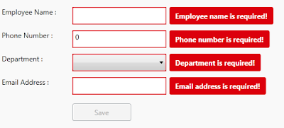
Example 1 :
To impelment validation we need to use IDataErrorInfo interface.
IDataErrorInfo interface provides the functionality to offer custom error information that a user interface can bind to.
It has 2 Properties :
- Error : Gets an error message indicating what is wrong with this object.
- string this[string columnName] Indexer : it will return the error message for the property. The default is an empty string ("")
Let's go through step by step to understand validation with mvvm binding and styling the validation template.
Step 1 : First change ErrorToolTip style by customizing the Template.
<ControlTemplate x:Key="ErrorToolTipTemplate_1">

 <ControlTemplate.Resources>

  <Style x:Key="textblockErrorTooltip" TargetType="TextBlock">

   <Setter Property="HorizontalAlignment" Value="Center" />

   <Setter Property="VerticalAlignment" Value="Center" />

   <Setter Property="FontWeight" Value="Bold" />

   <Setter Property="Foreground" Value="White" />

   <Setter Property="Margin" Value="10 0 10 0" />

  </Style>

 </ControlTemplate.Resources>

 <DockPanel LastChildFill="true">

  <Border Height="Auto"

   Margin="5,0,0,0"

   Background="#DC000C"

   CornerRadius="3"

   DockPanel.Dock="right">

    <TextBlock Style="{StaticResource textblockErrorTooltip}"

Text="{Binding ElementName=customAdorner, Path=AdornedElement.(Validation.Errors)[0].ErrorContent}" />

  </Border>

  <AdornedElementPlaceholder Name="customAdorner">

   <Border BorderBrush="#DC000C" BorderThickness="1.3" />

  </AdornedElementPlaceholder>

 </DockPanel>

</ControlTemplate>
As shown in above source, created ControlTemplate and changed the error tooltip style by AddingBorder control in DockPanel, within Border TextBlock placed with Text property binded to the error message set to the property from viewmodel.
changed Backgroud of the border to Red so it will display error message surround with border fill with red color. This will dispaly error on right side of the TextBox control. like :
ErrorTemplate uses adorner layer. which is drawing layer, using adorner layer you can add visual appearance to indicate an error without replacing controltemplate.
AdornedElementPlaceholder is part of the Validation feature of data binding. it specify where a decorated control is placed relative to other elements in the ControlTemplate.
Step 2 : Create TextBox style and set Validation ErrorTemplate.
<Style TargetType="TextBox">

 <Setter Property="HorizontalAlignment" Value="Left" />

 <Setter Property="VerticalAlignment" Value="Top" />

 <Setter Property="Width" Value="150" />

 <Setter Property="Height" Value="30" />

 <Setter Property="Validation.ErrorTemplate"

                 Value="{DynamicResource ErrorToolTipTemplate_1}" />

 <Style.Triggers>

  <Trigger Property="Validation.HasError" Value="true">

   <Setter Property="ToolTip"

Value="{Binding RelativeSource={RelativeSource Self}, Path=(Validation.Errors)[0].ErrorContent}" />

  </Trigger>

 </Style.Triggers>

</Style>
Created style of TargetType=TextBox, and Validation.ErrorTemplate is set to previously created template (DynamicResource ErrorToolTipTemplate)
you have to set Resource using DynamicResource, if your temaplate/style is available at global place (App.xaml)
if your control style and template is created in page itself then set resource using StaticResourcekeyword.
Step 3 : Create ViewModel class, that contains Properties to Bind into view.
public class InputValidationViewModel : ViewModelBase

{

 public InputValidationViewModel()

 {

 }

 private string employeeName;

 public string EmployeeName

 {

  get { return employeeName; }

  set { employeeName = value; RaisePropertyChanged("EmployeeName"); }

 }

 private string email;

 public string Email

 {

  get { return email; }

  set {email = value; RaisePropertyChanged("Email"); }

 }

 private long phoneNumber;

 public long PhoneNumber

 {

  get { return phoneNumber; }

  set { phoneNumber = value; RaisePropertyChanged("PhoneNumber"); }

 }

 private bool IsValidEmailAddress

 {

  get { return emailRegex.IsMatch(Email); }

 }

}
as shown in above code, ViewModel created and added some propeties that need to bind in UserControl.
Step 4 : Implement IDataErrorInfo Interface
public class InputValidationViewModel : ViewModelBase, IDataErrorInfo
{
private Regex emailRegex = new Regex(@"^([a-zA-Z0-9_\.\-])+\@(([a-zA-Z0-9\-])+\.)+([a-zA-Z0-9]{2,4})+$");
public InputValidationViewModel()
{
} private string error = string.Empty;
public string Error
{
get { return error; }
}
public string this[string columnName]
{
get
{
error = string.Empty;
if (columnName == "EmployeeName" && string.IsNullOrWhiteSpace(EmployeeName))
{
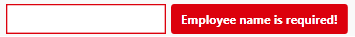
error = "Employee name is required!";
}
else if (columnName == "PhoneNumber" && PhoneNumber == 0)
{
error = "Phone number is required!";
}
else if (columnName == "PhoneNumber" && PhoneNumber.ToString().Length > 10)
{
error = "Phone number must have less than or equal to 10 digits!";
}
else if (columnName == "Email" && string.IsNullOrWhiteSpace(Email))
{
error = "Email address is required!";
}
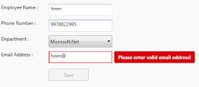
else if (columnName == "Email" && !IsValidEmailAddress)
{
error = "Please enter valid email address!";
}
return error; } }
}
IDataErrorInfo has Error property which returns the validation error that does not match the codition.
in above code, i set the error for each propeties by checking the codition, it coditiion is false then set the error for that property.
For valid email validation, created Regex expression to check entered email address is valid ro not.
This error appear on right side of the control that has property binded.
Step 5 : Last, Add TextBox cotrol in View
<TextBox Grid.Row="1"

 Grid.Column="1"

 Text="{Binding EmployeeName,

           Mode=TwoWay,

           UpdateSourceTrigger=PropertyChanged,

    ValidatesOnDataErrors=True}" />
Here EmployeeName proeprty is binded to TextBox control, you have to set ValidatesOnDataErrors=True to throw data error ( entered data is valida or not.)
Mode=TwoWay will allow user to change property from UI as well update UI from ViewModel property.
UpdateSourceTrigger=PropertyChanged will notify changes is updated as soon as the property changes.
If UpdateSourceTrigger is not set, then TextBox was not immediately sent back to the source. Instead, the source was updated only after focus was lost on the TextBox.
This behavior is controlled by a property on the binding called UpdateSourceTrigger.
Example 2 :
In this example, only ControlTemplate is chaned, other things like : ViewModels Property, Controls are same.
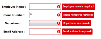
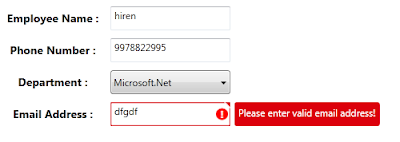
As shown in above image, tooltip style is changed, ! mark with red circle surrounded image is added on the errortemplate.
small triangle added on template, to show top right corner of the control if any data error exists.
below are the template change compare to previous example template :
<Border x:Name="ValidationErrorElement"

 BorderBrush="#FFDB000C"

 BorderThickness="1.2"

 CornerRadius="1"

 ToolTip="{Binding ElementName=customAdorner,

 Path=AdornedElement.(Validation.Errors)[0].ErrorContent}">

 <Grid Width="12"

  Height="12"

  Margin="1,-4,-4,0"

  HorizontalAlignment="Right"

  VerticalAlignment="Top"

  Background="Transparent">

  <Path Margin="1,3,0,0"

        Data="M 1,0 L6,0 A 2,2 90 0 1 8,2 L8,7 z"

        Fill="#FFDC000C" />

  <Path Margin="1,3,0,0"

        Data="M 0,0 L2,0 L 8,6 L8,8"

        Fill="#ffffff" />

 </Grid>

</Border>

<Border Grid.Column="0"

 Width="15"

 Height="15"

 Margin="0 0 3 0"

 HorizontalAlignment="Right"

 VerticalAlignment="Center"

 Background="Red"

 CornerRadius="10"

 ToolTip="{Binding ElementName=customAdorner,

 Path=AdornedElement.(Validation.Errors)[0].ErrorContent}">

 <TextBlock HorizontalAlignment="center"

  VerticalAlignment="center"

  FontWeight="Bold"

  Foreground="white"

  Text="!" />

</Border>
as shown in above code,
In First border, 2 shapes is created using path, this will create Triangle shape to disply on top right corner of the control.
To know more about how to draw shpaes using Path, Please refer Shapes & Drawing in WPF This Link
it will help you to create your custom shapes based on your requirement.
Second border will create red cirlce (by setting CornerRadius proeprty) with ! text wihin cirlce area.
it will display right side of the cotrol, if any data error is there for property.
Conclusion
This way you can create you custom error template for input controls.
Dwonload link
WPF Input Validation Using MVVM的更多相关文章
- 从PRISM开始学WPF(七)MVVM(三)事件聚合器EventAggregator-更新至Prism7.1
原文:从PRISM开始学WPF(七)MVVM(三)事件聚合器EventAggregator-更新至Prism7.1 事件聚合器EventAggregator [7.1updated]除了app部分,没 ...
- WPF学习08:MVVM 预备知识之COMMAND
WPF内建的COMMAND是GOF 提出的23种设计模式中,命令模式的实现. 本文是WPF学习07:MVVM 预备知识之数据绑定的后续,将说明实现COMMAND的三个重点:ICommand Comm ...
- 从PRISM开始学WPF(七)MVVM(三)事件聚合器EventAggregator?
原文:从PRISM开始学WPF(七)MVVM(三)事件聚合器EventAggregator? 从PRISM开始学WPF(一)WPF? 从PRISM开始学WPF(二)Prism? 从PRISM开始学WP ...
- 在 WPF 程序中使用 MVVM 模式
MVVM 模式是一个很久之前的技术了,最近因为一个项目的原因,需要使用 WPF 技术,所以,重新翻出来从前的一段程序,重温一下当年的技术. MVVM 模式 MVVM 实际上涉及三个部分,Model, ...
- (ZZ)WPF经典编程模式-MVVM示例讲解
http://www.cnblogs.com/xjxz/archive/2012/11/14/WPF.html 本篇从两个方面来讨论MVVM模式: MVVM理论知识 MVVM示例讲解 一,MVVM理论 ...
- 从PRISM开始学WPF(六)MVVM(二)Command?
从PRISM开始学WPF(一)WPF? 从PRISM开始学WPF(二)Prism? 从PRISM开始学WPF(三)Prism-Region? 从PRISM开始学WPF(四)Prism-Module? ...
- 从PRISM开始学WPF(六)MVVM(二)Command-更新至Prism7.1
命令绑定(Command) [7.1updated]这一节除了基础app部分,并没有什么变化 什么是Command? 先看下微软官方的说明: Commanding is an input mechan ...
- WPF 从属性赋值到MVVM模式详解
示例源码 这两天学习了一下MVVM模式,和大家分享一下,也作为自己的学习笔记.这里不定义MVVM的概念,不用苍白的文字说它的好处,而是从简单的赋值讲起,一步步建立一个MVVM模式的Simple.通过前 ...
- WPF学习笔记:MVVM模式下,ViewModel如何关闭View?
原文:http://blog.csdn.net/leftfist/article/details/32349731 矫枉过正,从一个极端走向另一个极端.MVVM模式,View只负责呈现,虽然也有后台代 ...
随机推荐
- 利用Solr服务建立的站内搜索雏形
最近看完nutch后总感觉像好好捯饬下solr,上次看到老大给我展现了下站内搜索我便久久不能忘怀.总觉着之前搭建的nutch配上solr还是有点呆板,在nutch爬取的时候就建立索引到solr服务下, ...
- NODESCHOOL
来源:https://nodeschool.io/zh-cn/ 核心基础课程(Core) javascripting 学习 JavaScript 语言的基础,无需任何编程经验 npm install ...
- Python3正则表达式(4)
正则表示式的子模式 使用()表示一个子模式,括号中的内容作为一个整体出现. (red)+ ==> redred, redredred, 等多个red重复的情况 子模式的扩展语法 案例1 tel ...
- SimpleDateFormat 格式化参数说明
字母 日期或时间元素 表示 示例 G Era 标志符 Text AD y 年 Year 1996; 96 M 年中的月份 Month July; Jul; 07 w 年中的周数 Number 27 W ...
- db2执行计划介绍
在数据库调优过程中,SQL语句往往是导致性能问题的主要原因,而执行计划则是解释SQL语句执行过程的语言,只有充分读懂执行计划才能在数据库性能优化中做到游刃有余. 常见的关系型数据库中,虽然执行计划的表 ...
- JDBC(2)—Statement
介绍: 获取到数据库连接之后,就可以对数据库进行一些增.删.改操作,但是却不能进行查询操作. 增删改操作是程序到数据库的一个操作过程,但是查询是程序到数据库--数据库返回到程序的一个过程. 步骤: 步 ...
- 体验jQuery和AngularJS的不同点以及AngularJS的迷人之处
本篇通过jQuery和Angular两种方式来实现同一个实例,从而体验两者的不同点以及AngularJS的迷人之处. 首先当然需要引用jquery.js和angular.js文件. ■ 使用jQuer ...
- android:Button控件
Button 是程序用于和用户进行交互的一个重要控件,相信你对这个控件已经是非常熟悉 了,因为我们在上一章用了太多次 Button.它可配置的属性和 TextView 是差不多的,我们 可以在 act ...
- 连接mysql 出现:java.sql.SQLException: Unable to load authentication plugin 'caching_sha2_password'.
数据测试的时候出现: 网上查资料说的是mysql5.x 版本和 8.x版本的区别: 5.7版本是:default_authentication_plugin=mysql_native_password ...
- windows下php7.1安装redis扩展以及redis测试使用全过程(转)
最近做项目,需要用到redis相关知识.在Linux下,redis扩展安装起来很容易,但windows下还是会出问题的.因此,特此记下自己实践安装的整个过程,以方便后来人. 一,php中redis扩展 ...