前端学习笔记--css案例
要实现的案例:
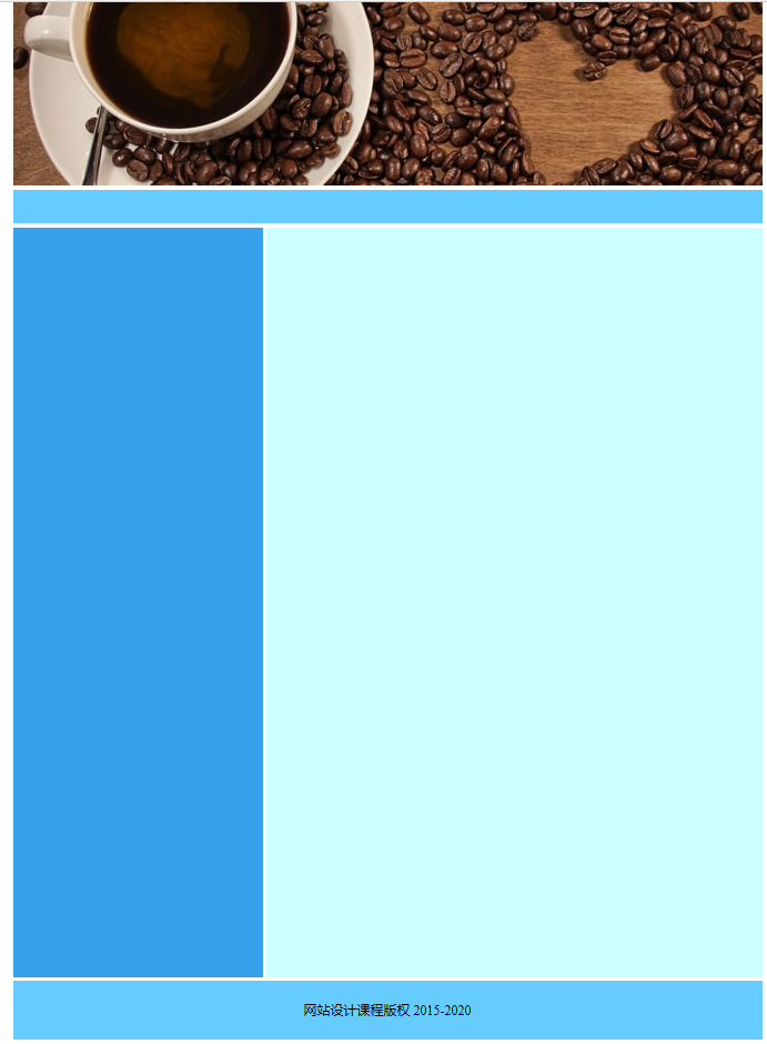
1.分析布局
2.划分文件结构:
3.编写css代码
* {

    padding: 0;

    margin: 0;

}

body {

    font-size: 16px;

    color: burlywood;

}

#container {

    width: 900px;

    margin: 0 auto;

}

#header {

    height: 220px;

    margin-bottom: 5px;

}

#nav {

    /*导航*/

    height: 40px;

    background-color: aqua;

    margin-bottom: 5px;

    font: 18px/30px;

    /*字体大小   行高*/

    color: black;

    letter-spacing: 2px;

    /*字符间距*/

    text-align: center;

}

#main {

    height: 900px;

    overflow: hidden;

    margin-bottom: 5px;

}

#aside {

    width: 300px;

    height: 900px;

    background-color: rgb(53, 162, 235);

    float: left;

    margin-right: 5px;

    text-align: center;

    font-size: 14px;

}

#content {

    height: 900px;

    width: 595px;

    float: left;

    background-color: #cff;

}

#footer {

    text-align: center;

    height: 70px;

    color: black;

    background-color: #6cf;

    clear: both;

    line-height: 70px;

}
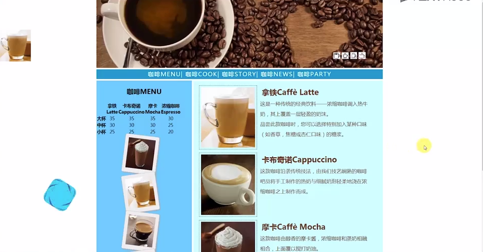
效果图:
4.代码:
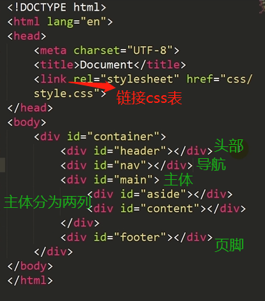
<!DOCTYPE html>

<html lang="en">

<head>

    <meta charset="UTF-8">

    <meta name="viewport" content="width=device-width, initial-scale=1.0">

    <meta http-equiv="X-UA-Compatible" content="ie=edge">

    <title>i coffee</title>

    <link rel="stylesheet" href="css/style.css">

</head>

<body>

    <div id="container">

        <div id="header">

            <img src="data:image/banner.jpg">

            <div id="icon-list">

                <img src="data:image/3.bmp" alt="">

                <img src="data:image/2.bmp" alt="">

                <img src="data:image/1.bmp" alt="">

                <img src="data:image/4.bmp" alt="">

            </div>

        </div>

        <div id="nav">

            <a href="#">咖啡MENU</a> |

            <a href="#">咖啡COOK</a> |

            <a href="#">咖啡STORY</a> |

            <a href="#">咖啡NEWS</a> |

            <a href="#">咖啡PARTY</a>

        </div>

        <div id="main">

            <div id="aside">

                <h2 class="h">咖啡MENU</h2>

                <table>

                    <tr>

                        <th></th>                             //表头

                        <th>拿铁<br />Latte</th>

                        <th>卡布奇诺<br />Cappuccino</th>

                        <th>摩卡<br />Mocha</th>

                        <th>浓缩咖啡<br />Espresso</th>

                    </tr>

                    <tr>

                        <th scope="row">大杯</th>

                        <td>35</td>

                        <td>35</td>

                        <td>35</td>

                        <td>30</td>

                    </tr>

                    <tr>

                        <th scope="row">中杯</th>    //行表头

                        <td>30</td>

                        <td>30</td>

                        <td>30</td>

                        <td>25</td>

                    </tr>

                    <tr>

                        <th scope="row">小杯</th>

                        <td>25</td>

                        <td>25</td>

                        <td>25</td>

                        <td>20</td>

                    </tr>

                </table>

                <div id="i-list">

                    <div class="ppl rote-left"><img src="data:image/Cappuccino.jpg"></div>

                    <div class="ppl rote-right"><img src="data:image/Espresso.jpg"></div>

                    <div class="ppl rote-left"><img src="data:image/Latte.jpg"></div>

                    <div class="ppl rote-right"><img src="data:image/Mocha.jpg"></div>

                </div>

            </div>

            <div id="content">

                <div class="subcon">

                    <img src="data:image/Latte.jpg" alt="">

                    <div class="subtext">

                        <h2>拿铁Caffè Latte</h2><br/>

                        <p>这是一种传统的经典饮料——浓缩咖啡调入热牛奶,其上覆盖一层轻盈的奶沫。 品尝此款咖啡时,您可以选择特别加入某种口味(如香草,焦糖或杏仁口味)的糖浆。

                        </p>

                    </div>

                </div>

                <div class="subcon">

                    <img src="data:image/Cappuccino.jpg" alt="">

                    <div class="subtext">

                        <h2>卡布奇诺Cappuccino</h2>

                        <br/>

                        <p>这款咖啡沿袭传统技法,由我们技艺娴熟的咖啡吧员 将手工制作的热奶与 细腻奶泡轻柔地浇在浓缩咖啡之上制作而成。

                        </p>

                    </div>

                </div>

                <div class="subcon">

                    <img src="data:image/Mocha.jpg" alt="">

                    <div class="subtext">

                        <h2>摩卡Caffè Mocha</h2><br/>

                        <p>这款咖啡由醇香的摩卡酱,浓缩咖啡和蒸奶相融相合,上面覆以搅打奶油。 寒冷的日子里,忧伤的时光中,任何人都无法抵抗她的诱惑。

                        </p>

                    </div>

                </div>

                <div class="subcon">

                    <img src="data:image/Espresso.jpg" alt="">

                    <div class="subtext">

                        <h2>浓缩咖啡Espresso</h2><br/>

                        <p>这是咖啡的精粹,以最浓缩的方式显现。浓缩咖啡带点焦糖味道,浓厚馥郁。</p>

                    </div>

                </div>

            </div>

        </div>

        <div id="footer">网站设计课程版权 2015-2020</div>

    </div>

    <div id="l-fix">

        <img src="data:image/cooker.jpg">

    </div>

</body>

</html>
* {

    padding: 0;

    margin: 0;      //清除浏览器样式

}

body {

    font-size: 16px;

    color: darksalmon;

}

#container {

    width: 900px;

    margin: 0 auto;    //居中

}

#header {

    height: 220px;

    margin-bottom: 5px;

    position: relative;    //相对定位

}

#icon-list {

    position: absolute;    //绝对定位

    width: 130px;

    height: 30px;

    top: 170px;

    right: 30px;

    /* font-size:0;  可以去掉图片间隔 */

}

#nav {

    /*导航*/

    height: 40px;

    background-color: #6cf;

    margin-bottom: 5px;

    font: 18px/30px;

    /*字体大小   行高*/

    color: black;

    letter-spacing: 2px;

    /*字符间距*/

    text-align: center;    //居中

    line-height: 40px;

}

#main {

    overflow: hidden;     //超出部分不显示

    margin-bottom: 5px;

}

.h {

    color: black;

}

#aside {

    width: 300px;

    background-color: rgb(53, 162, 235);

    float: left;     //左浮动

    margin-right: 5px;

    text-align: center;

    font-size: 14px;

}

.i-list {

    margin: 0 auto;

    width: 85px;

}

.i-list img:hover {      //针对i-list类的img做鼠标移上去的设定

    transform: scale(1.2);       //放大1.2倍

    -webkit-transform: scale(1.2);

    -moz-transform: scale(1.2);

    -ms-transform: scale(1.2);

    -o-transform: scale(1.2);

}

.ppl {        //图片墙的公共样式

    width: 85px;

    padding: 10px;

    margin: 0 auto;

    background-color: #eee;

    border: 2px solid gray;

    box-shadow: 2px 2px 4px #aaa;

    border-radius: 5px;    //圆角

    -webkit-border-radius: 5px;

    -moz-border-radius: 5px;

    -ms-border-radius: 5px;

    -o-border-radius: 5px;

}

#i-list img {     //图片公共样式

    height: 95px;

    width: 85px;

    margin: 0 auto;

}

.rote-left {

    transform: rotate(7deg);   //顺时针旋转7度

    -webkit-transform: rotate(7deg);

    -moz-transform: rotate(7deg);

    -ms-transform: rotate(7deg);

    -o-transform: rotate(7deg);

}

.rote-right {

    transform: rotate(-7deg);   //逆时针旋转7度

    -webkit-transform: rotate(-7deg);

    -moz-transform: rotate(-7deg);

    -ms-transform: rotate(-7deg);

    -o-transform: rotate(-7deg);

}

#content {

    width: 595px;

    float: left;     //左浮动

    background-color: #cff;

}

.subcon {

    width: 550px;

    height: 190px;

    margin: 10px auto;

    clear: both;

}

.subcon img {

    margin: 5px;

    padding: 5px;

    float: left;

    border: 1px dashed black;

}

.subcon .subtext {    //公共样式

    margin: 5px;

    float: right;

    width: 60%;

    letter-spacing: 2px;

}

.subcon h2 {

    margin: 5px;

}

.subcon p {

    font: 16px/2em;

    /* 字号大小  2倍行高 */

}

#footer {

    text-align: center;

    height: 70px;

    color: black;

    background-color: #6cf;

    clear: both;    //清除左右浮动

    line-height: 70px;  //行高

}

#nav a {

    /*特别声明这个样式是针对nav里面的a标签*/

    text-decoration: none;

}

a:link {

    color: white;

}

a:visited {

    color: white;

}

a:hover {

    color: yellow;

}

a:active {

    color: yellow;

}

h2 {

    margin-top: 20px;

}

table {

    margin-top: 20px;

    width: 300px;

    color: black;

}

th {

    height: 20px;

}

#l-fix {

    position: fixed;   //固定定位

    top: 100px;

    left: 5px;

}
前端学习笔记--css案例的更多相关文章
- 前端学习笔记--CSS布局--float定位
1.float属性 box1向右移动,box2顶替了box1的位置,box3顶替了box2的位置. 2.clear属性 案例: 一列三行布局: <!DOCTYPE html> <ht ...
- 前端学习笔记——CSS选择器
学习css选择器之前我们先了解下css规则: CSS 规则由两个主要的部分构成:选择器,以及一条或多条声明: 选择器通常是需要改变样式的 HTML 元素. 每条声明由一个属性和一个值组成. 1.id选 ...
- 前端学习笔记 - Css初级篇
有话先说:我是一只菜鸟,一只都是,从前是现在也是. CSS中的会计元素与行内元素 块级元素特性:占据一整行,总是重起一行并且后面的元素也必须另起一行显示.内联元素特性:和其他内联元素显示在同一行. 可 ...
- web前端学习笔记(CSS变化宽度布局)
一.“1-2-1”单列变宽布局: 对于变宽度的布局,首先要使内容的整体宽度随浏览器窗口宽度的变化而变化.因此中间的container容器中的左右两列的总宽度也会变化,这样就会产生不同的情况.这两列是按 ...
- web前端学习笔记(CSS固定宽度布局)
一.单列布局: 这是最简单的一种布局方式,之所以给出该示例,还是为了保证本篇博客的完整性. <html xmlns="http://www.w3.org/1999/xhtml" ...
- web前端学习笔记(CSS盒子的定位)
相对定位 使用相对定位的盒子的位置常以标准流的排版方式为基础,然后使盒子相对于它在原本的标准位置偏移指定的距离.相对定位的盒子仍在标准流中,它后面的盒子仍以标准流方式对待它. 使用relat ...
- web前端学习笔记(CSS盒子的浮动)
在标准流中,一个块级元素在水平方向会自动伸展,直到包含它的元素的边界:而在竖直方向和兄弟元素依次排列,不能并排.使用“浮动”方式后,块级元素的表现就会有所不同. CSS中有一个float属性 ...
- 前端学习笔记--CSS布局--层定位
1.层定位概述: z-index:前后叠加顺序 2.position属性: 3.fixed: 2.relative: 移动后: static没有往上移动占据box1的位置. 3.absolute: 移 ...
- 前端学习笔记--CSS布局--文件流定位
1.概述 2.文档流定位:从上到下,从左到右 代码: <!DOCTYPE html> <html lang="en"> <head> <m ...
随机推荐
- Mysql 学习整理
1 创建数据库 1.1数据库基本结构 数据库:数据库是表的集合,带有相关的数据. 表:一个表是多个字段的集合. 字段:一个字段是一列数据,由字段名和记录组成 1.2创建数据库 create datab ...
- 动态字节码技术Javassist
字节码技术可以动态改变某个类的结构(添加/删除/修改 新的属性/方法) 关于字节码的框架有javassist,asm,bcel等 引入依赖 <dependency> <groupI ...
- ContainsExtensions不分区大小写
public static class ContainsExtensions { public static bool Contains(this string source, string valu ...
- Word 中直引号和弯引号的相互替换
直引号替换成弯引号 弯引号替换成直引号 未完 ...... 点击访问原文(进入后根据右侧标签,快速定位到本文)
- 【C++札记】指针数组和数组指针
指针数组: 存储指针的数组,数组找那个的每个一元素都是指针 例: int* p1[4],p2[0]是一个指向int类型的指针 char* p2[4],p1[0]是一个指向char类型的指针 数组指针: ...
- Python各个岗位的开发流程
根据张大美女提供资料微修改,在这谢谢张大美女! 1.python软件开发工程师 1.1 项目启动会 说明项目目标.阶段划分.组织结构.管理流程等关键事项. 1.2 需求调研 由用户提出,描述产品的功 ...
- gdocrimg04从库无法重启问题
1.查看error.logVersion: '5.6.25-log' socket: '/tmp/mysqld.3324_gdocrimg04.sock' port: 3324 Source d ...
- Winform 快速开发框架,上位机开发,工控机程序开发,CS程序开发
1.当客户让你做个CS程序时,当你手上一穷二白,所有都要重复造轮,你是不是很烦. 2.但如果有一个通用的,快速开发框架,就可以把你从这些基础的工作解救出来,你专注做业务就好了. 3.本人其中一个项目的 ...
- as3鱼眼放大镜
package { //hi.baidu.com/inuko //bitmapdata fisheye magnifier //原创代码,如有雷同,纯属巧合 /* 本例是使用近似算法,只是最简单的鱼眼 ...
- springboot中常用的依赖
<?xml version="1.0" encoding="UTF-8"?> <project xmlns="http://mave ...