css3实现的4种动画特效按钮
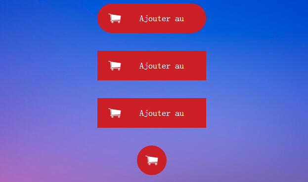
今天要给大家介绍的是css3按钮,里面包含四种特效的动画,如下图:
实现html代码:
<div align="center" class="fond">
<br />
<div class="bouton_1">
<a href="#123">
<img src="caddie.png" />
<span class="texteduboutton_1">Ajouter au panier</span></a>
</div>
<br />
<br />
<div class="bouton_2">
<a href="#123">
<img src="caddie.png" />
<span class="texteduboutton_2">Ajouter au panier</span></a>
</div>
<br />
<br />
<div class="bouton_3">
<a href="#123">
<img src="caddie.png" />
<span class="texteduboutton_3">Ajouter au panier</span></a>
</div>
<br />
<br />
<div class="bouton_4">
<a href="#123">
<img src="caddie.png" />
<span class="texteduboutton_4">Add to cart</span></a>
</div>
<br />
<br />
</div>
实现的css代码:
.fond{position:fixed;padding-top:px;top:;left:; right:;bottom:;

  background-image:url(fond_4.jpg);background-size:cover;overflow-y:auto;}

/*///////////////////////////////BOUTON _ 1///////////////////////////////////////*/

.bouton_1{

    width:200px;

    height:40px;

    padding:10px;

    border-radius:40px;

    background-color:#CB2025;

    overflow:hidden;

    -webkit-transition:all 0.2s ease-in;

    -moz-transition:all 0.2s ease-in;

    -ms-transition:all 0.2s ease-in;

    -o-transition:all 0.2s ease-in;

    transition:all 0.2s ease-in;

}

.bouton_1:hover{

    width:40px;

    height:40px;

    border-radius:40px;

    background-color:#60121C;

}

.texteduboutton_1

{

    width:70%;

    padding-right: 10px;

    float:right;

    line-height:40px;

    color:#ffffff;

    font-family:'Roboto';

    font-weight:;

    font-size:18px;

}

/*///////////////////////////////BOUTON _ 2///////////////////////////////////////*/

.bouton_2{

    width:200px;

    height:40px;

    padding:10px;

    background-color:#CB2025;

    overflow:hidden;

    -webkit-transition: all 0.5s ease-out;

    -moz-transition: all 0.5s ease-out;

    -ms-transition: all 0.5s ease-out;

    -o-transition: all 0.5s ease-out;

    transition: all 0.5s ease-out;

}

.bouton_2:hover{

    width:40px;

    height:40px;

    background-color:#60121C;

    -webkit-transform:rotateZ(360deg);

    -moz-transform:rotateZ(360deg);

    -ms-transform:rotateZ(360deg);

    -o-transform:rotateZ(360deg);

    transform:rotateZ(360deg);

}

.texteduboutton_2

{

    width:70%;

    padding-right: 10px;

    float:right;

    line-height:40px;

    color:#ffffff;

    font-family:'Roboto';

    font-weight:;

    font-size:18px;

}

/*///////////////////////////////BOUTON _ 3///////////////////////////////////////*/

.bouton_3{

    overflow:hidden;

    width:200px;

    height:40px;

    padding:10px;

    background-color:#CB2025;

}

.bouton_3:hover{

    width:40px;

    height:40px;

    background-color:#60121C;

    -webkit-animation: anim_trois 1.2s;

    -moz-animation: anim_trois 1.2s;

    -ms-animation: anim_trois 1.2s;

    -o-animation: anim_trois 1.2s;

    animation: anim_trois 1.2s;

}

.texteduboutton_3

{

    width:70%;

    padding-right: 10px;

    float:right;

    line-height:40px;

    color:#ffffff;

    font-family:'Roboto';

    font-weight:;

    font-size:18px;

}

@-webkit-keyframes anim_trois {

    0% {

        width:200px;

        -webkit-transform: perspective( 600px ) rotateY( 0deg );

    }

    50% {

        width:40px;

        height:40px;

        -webkit-transform: perspective( 600px ) rotateY( 0deg );

    }

    100% {

        width:40px;

        height:40px;

        background-color:#60121C;

        -webkit-transform: perspective( 600px ) rotateY( 180deg );

    }

}

@-moz-keyframes anim_trois {

    0% {

        width:200px;

        -moz-transform: perspective( 600px ) rotateY( 0deg );

    }

    50% {

        width:40px;

        height:40px;

        -moz-transform: perspective( 600px ) rotateY( 0deg );

    }

    100% {

        width:40px;

        height:40px;

        background-color:#60121C;

        -moz-transform: perspective( 600px ) rotateY( 180deg );

    }

}

@-ms-keyframes anim_trois {

    0% {

        width:200px;

        -ms-transform: perspective( 600px ) rotateY( 0deg );

    }

    50% {

        width:40px;

        height:40px;

        -ms-transform: perspective( 600px ) rotateY( 0deg );

    }

    100% {

        width:40px;

        height:40px;

        background-color:#60121C;

        -ms-transform: perspective( 600px ) rotateY( 180deg );

    }

}

@-o-keyframes anim_trois {

    0% {

        width:200px;

        -o-transform: perspective( 600px ) rotateY( 0deg );

    }

    50% {

        width:40px;

        height:40px;

        -o-transform: perspective( 600px ) rotateY( 0deg );

    }

    100% {

        width:40px;

        height:40px;

        background-color:#60121C;

        -o-transform: perspective( 600px ) rotateY( 180deg );

    }

}

@keyframes anim_trois {

    0% {

        width:200px;

        transform: perspective( 600px ) rotateY( 0deg );

    }

    50% {

        width:40px;

        height:40px;

        transform: perspective( 600px ) rotateY( 0deg );

    }

    100% {

        width:40px;

        height:40px;

        background-color:#60121C;

        transform: perspective( 600px ) rotateY( 180deg );

    }

}

/*///////////////////////////////BOUTON _ 4///////////////////////////////////////*/

.bouton_4{

    width:40px;

    height:40px;

    padding:10px;

    border-radius:40px;

    background-color:#CB2025;

    overflow:hidden;

    -webkit-transition:all 0.2s ease-in;

    -moz-transition:all 0.2s ease-in;

    -ms-transition:all 0.2s ease-in;

    -o-transition:all 0.2s ease-in;

    transition:all 0.2s ease-in;

}

.bouton_4:hover{

    width:200px;

    height:40px;

    border-radius:40px;

    background-color:#97bf0d;

}

.texteduboutton_4

{

    width:70%;

    padding-right: 10px;

    float:right;

    line-height:40px;

    color:#ffffff;

    font-family:'Roboto';

    font-weight:;

    font-size:18px;

}
注:本文爱编程原创文章,转载请注明原文地址:http://www.w2bc.com/Article/4762
css3实现的4种动画特效按钮的更多相关文章
- CSS3鼠标悬停8种动画特效
在线演示 本地下载
- 基于jQ+CSS3页面滚动内容元素动画特效
今天给大家分享一款基于jQ+CSS3页面滚动内容元素动画特效.这是一款基于jQuery+CSS3实现的页面滚动代码.该实例适用于适用浏览器:360.FireFox.Chrome.Safari.Oper ...
- 一款jquery和css3实现的卡通人物动画特效
之前为大家分享了很多jquery和css3的动画实例.今天给大家带来一款非常炫的jquery和css3实现的卡通人物动画特效.效果图如下: 在线预览 源码下载 实现的代码. html代码: < ...
- 分享十个CSS3鼠标滑过文字动画特效
介绍10组基于CSS3的鼠标滑过文字动画特效,有上凸.下凹等文字动画.这些炫酷的CSS3文字效果可以让网页变得更加绚丽.效果图如下: 在线预览 源码下载 实现的代码. html代码: <h2 ...
- iOS-各种动画特效
概述 广播跑马灯/弹幕/直播点赞/烟花/雪花等动画特效, 后续增加~ 详细 代码下载:http://www.demodashi.com/demo/10674.html 一.实现功能 1. 广播跑马灯 ...
- 利用CSS3实现div页面淡入动画特效
利用CSS3实现页面淡入动画特效 摘要 利用CSS3动画属性"@keyframes "可实现一些动态特效,具体语法和参数可以网上自行学习.这篇文章主要是实践应用一下这个动画属性 ...
- 纯css3 3D图片立方体旋转动画特效
纯css3 3D立方体模块,鼠标触碰,模块炸开,大立方体中套小立方体 效果展示 手机扫描二维码体验效果: 效果图如下: 源码下载:http://hovertree.com/h/bjaf/0qmul8g ...
- css3动画特效:纯css3制作win8加载动画特效
Windows 8 完整效果如上图:这个里面可能是css冲突,喜欢的可以自己去体征一下: css特效代码: <style type="text/css"> ...
- 10大炫酷的HTML5文字动画特效欣赏
文字是网页中最基本的元素,在CSS2.0时代,我们只能在网页上展示静态的文字,只能改变他的大小和颜色,显得枯燥无味.随着HTML5的发展,现在网页中的文字样式变得越来越丰富了,甚至出现了文字动画,HT ...
随机推荐
- openstack neutron 二/三层网络实现
引用声明:https://zhangchenchen.github.io/2017/02/12/neutron-layer2-3-realization-discovry/ 一.概述 Neutron是 ...
- android dialog加载中动画效果
//显示动画 dialog = new Dialog(context, R.style.loading); dialog.setContentView(R.layout.loadinglayout); ...
- 【C#】C#创建Windows Service服务
目录结构: contents structure [+] 创建Windows服务 配置 安装Windows服务 在Visual Studio中调试 常见问题 最近写了一个TCP连接的程序,由于这种通信 ...
- 【Spring】Spring之浅析Spring框架的搭建
Spring是什么 Spring是一个开源的容器框架,用于配置bean并且维护bean之间关系的.其主要的思想就是IOC(Inversion Of Control,控制反转)或者称作DI(Depend ...
- android 4.4 支持透明状态栏和透明导航栏
@Override protected void onCreate(Bundle savedInstanceState) { super.onCreate(savedInstanceSt ...
- 还没被玩坏的robobrowser(7)——表单操作
背景 有一些站点是需要登录之后才能抓取内容的,另外做web测试的时候登录是家常便饭. 这一节里我们就以登陆testerhome为例,讲解一下robobrowser中form的操作. 预备知识 get_ ...
- 还没被玩坏的robobrowser(6)——follow_link
背景 在做spider的时候,我们经常会有点击链接的需求. 考虑这样的一个简单spider:获取qq.com主页上的今日话题中的内容. 一般思路是先去qq.com首页上找到今日话题的链接,然后点击这个 ...
- WinForm DataGridView新增加行
1.不显示最下面的新行 通常 DataGridView 的最下面一行是用户新追加的行(行头显示 * ).如果不想让用户新追加行即不想显示该新行,可以将 DataGridView 对象的 Allow ...
- IRGAN:A Minimax Game for Unifying Generative and Discriminative Information Retrieval Models
https://arxiv.org/pdf/1705.10513.pdf 论文阅读笔记: https://www.cnblogs.com/liaohuiqiang/p/9694277.html htt ...
- springboot 中文文档
springboot 中文文档https://qbgbook.gitbooks.io/spring-boot-reference-guide-zh/content/