pure CSS3 实现三角形icon的方法
pure CSS3 实现三角形icon的方法
border: color+transparent
transform : rotate() /rotateZ()
? 使用 实体字符”◆“实现三角形效果
demo:
<!DOCTYPE html>
<html lang="en">
<head>
<meta charset="UTF-8">
<title>Document</title>
<style>
*{
-webkit-overflow-scrolling: touch;
}
.container{
margin-left: 300px;
margin-top: 200px;
}
.box{
width:60px;
height:60px;
/*border: 1px solid #0f0;*/
float: left;
position: relative;
}
.b1{
background: #e66161;
}
.b1 .circle{
width: 10px;
height: 10px;
background: #fff;
position: absolute;
border-radius: 5px;
top: 25px;
left: 60px;
z-index: 9999;
}
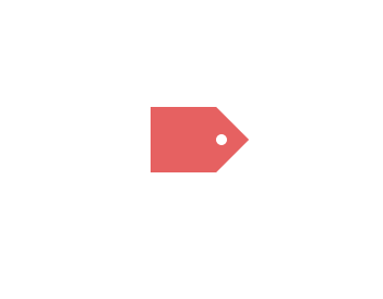
.triangle{
width:0px;
height:0px;
border-width:30px;
border-style:solid;
/*border-color:#e66161 #f3bb5b #94e24f #85bfda;*/
border-color:transparent transparent transparent #e66161;
/*can not using border-radius, head is not the real triangle*/
}
</style>
</head>
<body>
<div>
<h1>-webkit-overflow-scrolling: touch;</h1>
</div>
<div class="container">
<div class="box b1">
<div class="circle">
<!-- -->
</div>
</div>
<div class="box">
<div class="triangle">
<!-- -->
</div>
</div>
</div>
</body>
</html>
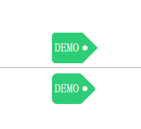
label Icon + font
1
demo-update:
1
<!DOCTYPE html>

<html lang="en">

<head>

    <meta charset="UTF-8">

    <title>Document</title>

    <style>

        *{

            -webkit-overflow-scrolling: touch;

        }

        .container{

             margin-left: 300px;

             margin-top: 200px;

             background-color: #000;

             width: auto;

             height: auto;

             overflow: hidden;

        }

        .box{

            width:60px;

            height:60px;

            /*border: 1px solid #0f0;*/

            float: left;

            position: relative;

            border-radius: 7px 0 0 7px;

        }

        .b1{

            background: #2CCD76;

        }

        .b1 .circle{

            width: 10px;

            height: 10px;

            background: #fff;

            position: absolute;

            border-radius: 5px;

            top: 25px;

            left: 60px;

            z-index: 9999;

        }

        .b1 span{

            color: #fff;

            font-size: 1.5em;

            display: inline-block;

            /*text-align: center;*/

            /*justify-content: center;*/

            /*border: 1px solid red;*/

            margin: 25% 8.3%;

        }

        .triangle{

            width:0px;

            height:0px;

            border-width:30px;

            border-style:solid;

            /*border-color:#e66161 #f3bb5b #94e24f #85bfda;*/

            border-color:transparent transparent transparent #2CCD76;

            /*can not using border-radius, head is not the real triangle*/

        }

    </style>

    <style>

        .r-container{

             margin-left: 300px;

             margin-top: 10px;

             background-color: #000;

             width: auto;

             height: auto;

             overflow: hidden;

        }

        .r-box{

            width:60px;

            height:60px;

            /*border: 1px solid #0f0;*/

            float: left;

            position: relative;

            border-radius: 10px 7px 7px 10px;

            background: #2CCD76;

            z-index: 9999;

        }

        .r-box span{

            color: #fff;

            font-size: 1.5em;

            display: inline-block;

            /*text-align: center;*/

            /*justify-content: center;*/

            /*border: 1px solid red;*/

            margin: 25% 8.3%;

        }

        .rr{

            width:42.5px;

            height:42.5px;

            /*border: 1px solid #0f0;*/

            float: left;

            left: 35px;

            top: 9px;

            position: absolute;

            background: #2CCD76;

            transform: rotateZ(45deg);

            /* rotate center ???*/

            z-index: -1;

            border-radius: 3px 5px;

        }

        .rr .rc{

            width: 10px;

            height: 10px;

            background: #fff;

            position: absolute;

            border-radius: 5px;

            top: 10px;

            left: 22px;

        }

    </style>

</head>

<body>

    <div>

        <h1>-webkit-overflow-scrolling: touch;</h1>

    </div>

    <div class="container">

        <div class="box b1">

            <span>DEMO</span>

            <div class="circle">

                <!--  -->

            </div>

        </div>

        <div class="box">

            <div class="triangle">

                <!--  -->

            </div>

        </div>

    </div>

    <hr>

    <div class="r-container">

        <div class="r-box">

            <span>DEMO</span>

            <div class="rr">

                <div class="rc">

                    <!--  -->

                </div>

            </div>

        </div>

    </div>

</body>

</html>
1
1
1
1
1
1
1
1
pure CSS3 实现三角形icon的方法的更多相关文章
- css3画三角形的原理
以前用过css3画过下拉菜单里文字后面的“下拉三角符号”,类似于下面这张图片文字后面三角符号的效果 下面是一个很简单的向上的三角形代码 #triangle-up { width: 0; height: ...
- CSS3中新颖的布局方法
本人已经很久没用 bootstrap 什么的了,而现阶段一点卑微的梦想就是自己做框架,毕竟也才入门不久. 所以在寻找布局的共通性/稳定性及拓展性时,会发觉 CSS3 的这三种方法比栅栏布局要有趣得多. ...
- css3 input placeholder颜色修改方法
css3 input placeholder颜色修改方法<pre> input::-webkit-input-placeholder { /* placeholder颜色 */ color ...
- css3自定义上传图片输入框的方法
css3自定义上传图片输入框的方法 代码如下<pre> <form class="form1"> <img src="/kelatoupia ...
- js 获取和设置css3 属性值的实现方法
众多周知 CSS3 增加了很多属性,在读写的时候就没有原先那么方便了. 如:<div style="left:100px"></div> 只考虑行间样式的话 ...
- RETINA显示屏下ICON优化方法
便于理解,先来了解几个名词: dpi(dots per inch),每英寸的点数,用来测量任何设备的硬件分辨率.一个21”的屏幕可以拥有1680 X 1050 的分辨率,27”的屏幕也可以拥有相同的分 ...
- xcode 5.0 以上去掉icon高亮方法&iOS5白图标问题
之前的建议方法是把在xxx.info.plist文件中把 icon already includes gloss and bevel effects 设置YES 在Xcode5下,反复实现不成功,今天 ...
- 让IE6IE7IE8支持CSS3属性的8种方法介绍
我们都知道,IE浏览器暂不支持CSS3的一些属性.国外的工程师们,不安于此现状,他们总是尽量使用一些手段使IE浏览器也能支持CSS3属性,我觉得这些都是很有意义,很有价值的工作,可以推动整个技术领域的 ...
- CSS3画三角形原理
1.首先看一下画出一个下三角形完整的代码及效果图 #trangle1-up{ width:; height:; border-left:50px solid transparent; border-r ...
随机推荐
- By default, the connection will be closed if the proxied server does not transmit any data within 60 seconds.
WebSocket proxying https://nginx.org/en/docs/http/websocket.html By default, the connection will be ...
- Springboot中PropertySource注解的使用
https://blog.csdn.net/qq_30739519/article/list/3 注解 https://blog.csdn.net/qq_30739519/article/detail ...
- [JSOI2019]节日庆典 做题心得
[JSOI2019]节日庆典 做题心得 一个性质有趣的字符串题 这要是在考场上我肯定做不出来吧 一开始还以为要 SAM 什么的暴力搞,没想到只用到了 \(Z\) 函数 -- 也是我生疏了罢 (学了啥忘 ...
- SQL操作数据——SQL组成,查询基础语法,where,Oracle常用函数等
SQL组成 DML数据操作语言 DCL数据控制语言 DQL数据查询语言 DDL数据定义语言 查询基础语法 记录筛选 where 子句 记录筛选 where 子句 实例练习 实例练习 Select语句中 ...
- KVM(虚拟机的迁移)
- python--基础2 (数据类型及应用)
资源池 链接:https://pan.baidu.com/s/1OGq0GaVcAuYEk4F71v0RWw 提取码:h2sd python数据类型 字符串 列表 字典 数字(整数) 数字(浮点数) ...
- 删除无用docker镜像
docker images | grep none | grep -v grep | awk '{print $3}' | xargs docker rmi -f
- 杂论-FTP
FTP 一 简单介绍 FTP 是File Transfer Protocol(文件传输协议)的英文简称,而中文简称为"文传协议".用于Internet上的控制文件的双向传输.同时, ...
- CCF-有趣的数(数位DP)
有趣的数 问题描述 我们把一个数称为有趣的,当且仅当: 1. 它的数字只包含0, 1, 2, 3,且这四个数字都出现过至少一次. 2. 所有的0都出现在所有的1之前,而所有的2都出现在所有的3之前 ...
- 面试官:请讲一下Redis主从复制的功能及实现原理
摘要:Redis在主从模式下会有许多问题需要考虑,这里写了一些关于redis在多服务器下的一些问题分析和总结. Redis单节点存在单点故障问题,为了解决单点问题,一般都需要对redis配置从节点,然 ...