pure CSS3 实现三角形icon的方法
pure CSS3 实现三角形icon的方法
border: color+transparent
transform : rotate() /rotateZ()
? 使用 实体字符”◆“实现三角形效果
demo:
<!DOCTYPE html>
<html lang="en">
<head>
<meta charset="UTF-8">
<title>Document</title>
<style>
*{
-webkit-overflow-scrolling: touch;
}
.container{
margin-left: 300px;
margin-top: 200px;
}
.box{
width:60px;
height:60px;
/*border: 1px solid #0f0;*/
float: left;
position: relative;
}
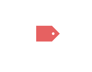
.b1{
background: #e66161;
}
.b1 .circle{
width: 10px;
height: 10px;
background: #fff;
position: absolute;
border-radius: 5px;
top: 25px;
left: 60px;
z-index: 9999;
}
.triangle{
width:0px;
height:0px;
border-width:30px;
border-style:solid;
/*border-color:#e66161 #f3bb5b #94e24f #85bfda;*/
border-color:transparent transparent transparent #e66161;
/*can not using border-radius, head is not the real triangle*/
}
</style>
</head>
<body>
<div>
<h1>-webkit-overflow-scrolling: touch;</h1>
</div>
<div class="container">
<div class="box b1">
<div class="circle">
<!-- -->
</div>
</div>
<div class="box">
<div class="triangle">
<!-- -->
</div>
</div>
</div>
</body>
</html>
label Icon + font
1
demo-update:
1
<!DOCTYPE html>
<html lang="en">
<head>
<meta charset="UTF-8">
<title>Document</title>
<style>
*{
-webkit-overflow-scrolling: touch;
}
.container{
margin-left: 300px;
margin-top: 200px;
background-color: #000;
width: auto;
height: auto;
overflow: hidden;
}
.box{
width:60px;
height:60px;
/*border: 1px solid #0f0;*/
float: left;
position: relative;
border-radius: 7px 0 0 7px;
}
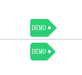
.b1{
background: #2CCD76;
}
.b1 .circle{
width: 10px;
height: 10px;
background: #fff;
position: absolute;
border-radius: 5px;
top: 25px;
left: 60px;
z-index: 9999;
}
.b1 span{
color: #fff;
font-size: 1.5em;
display: inline-block;
/*text-align: center;*/
/*justify-content: center;*/
/*border: 1px solid red;*/
margin: 25% 8.3%;
}
.triangle{
width:0px;
height:0px;
border-width:30px;
border-style:solid;
/*border-color:#e66161 #f3bb5b #94e24f #85bfda;*/
border-color:transparent transparent transparent #2CCD76;
/*can not using border-radius, head is not the real triangle*/
}
</style>
<style>
.r-container{
margin-left: 300px;
margin-top: 10px;
background-color: #000;
width: auto;
height: auto;
overflow: hidden;
}
.r-box{
width:60px;
height:60px;
/*border: 1px solid #0f0;*/
float: left;
position: relative;
border-radius: 10px 7px 7px 10px;
background: #2CCD76;
z-index: 9999;
}
.r-box span{
color: #fff;
font-size: 1.5em;
display: inline-block;
/*text-align: center;*/
/*justify-content: center;*/
/*border: 1px solid red;*/
margin: 25% 8.3%;
}
.rr{
width:42.5px;
height:42.5px;
/*border: 1px solid #0f0;*/
float: left;
left: 35px;
top: 9px;
position: absolute;
background: #2CCD76;
transform: rotateZ(45deg);
/* rotate center ???*/
z-index: -1;
border-radius: 3px 5px;
}
.rr .rc{
width: 10px;
height: 10px;
background: #fff;
position: absolute;
border-radius: 5px;
top: 10px;
left: 22px;
}
</style>
</head>
<body>
<div>
<h1>-webkit-overflow-scrolling: touch;</h1>
</div>
<div class="container">
<div class="box b1">
<span>DEMO</span>
<div class="circle">
<!-- -->
</div>
</div>
<div class="box">
<div class="triangle">
<!-- -->
</div>
</div>
</div>
<hr>
<div class="r-container">
<div class="r-box">
<span>DEMO</span>
<div class="rr">
<div class="rc">
<!-- -->
</div>
</div>
</div>
</div>
</body>
</html>
1
1
1
1
1
1
1
1
pure CSS3 实现三角形icon的方法的更多相关文章
- css3画三角形的原理
以前用过css3画过下拉菜单里文字后面的“下拉三角符号”,类似于下面这张图片文字后面三角符号的效果 下面是一个很简单的向上的三角形代码 #triangle-up { width: 0; height: ...
- CSS3中新颖的布局方法
本人已经很久没用 bootstrap 什么的了,而现阶段一点卑微的梦想就是自己做框架,毕竟也才入门不久. 所以在寻找布局的共通性/稳定性及拓展性时,会发觉 CSS3 的这三种方法比栅栏布局要有趣得多. ...
- css3 input placeholder颜色修改方法
css3 input placeholder颜色修改方法<pre> input::-webkit-input-placeholder { /* placeholder颜色 */ color ...
- css3自定义上传图片输入框的方法
css3自定义上传图片输入框的方法 代码如下<pre> <form class="form1"> <img src="/kelatoupia ...
- js 获取和设置css3 属性值的实现方法
众多周知 CSS3 增加了很多属性,在读写的时候就没有原先那么方便了. 如:<div style="left:100px"></div> 只考虑行间样式的话 ...
- RETINA显示屏下ICON优化方法
便于理解,先来了解几个名词: dpi(dots per inch),每英寸的点数,用来测量任何设备的硬件分辨率.一个21”的屏幕可以拥有1680 X 1050 的分辨率,27”的屏幕也可以拥有相同的分 ...
- xcode 5.0 以上去掉icon高亮方法&iOS5白图标问题
之前的建议方法是把在xxx.info.plist文件中把 icon already includes gloss and bevel effects 设置YES 在Xcode5下,反复实现不成功,今天 ...
- 让IE6IE7IE8支持CSS3属性的8种方法介绍
我们都知道,IE浏览器暂不支持CSS3的一些属性.国外的工程师们,不安于此现状,他们总是尽量使用一些手段使IE浏览器也能支持CSS3属性,我觉得这些都是很有意义,很有价值的工作,可以推动整个技术领域的 ...
- CSS3画三角形原理
1.首先看一下画出一个下三角形完整的代码及效果图 #trangle1-up{ width:; height:; border-left:50px solid transparent; border-r ...
随机推荐
- 基于源码分析Vue的nextTick
摘要:本文通过结合官方文档.源码和其他文章整理后,对Vue的nextTick做深入解析.理解本文最好有浏览器事件循环的基础,建议先阅读上文<事件循环Event loop到底是什么>. 一. ...
- Soul API 网关源码解析 03
目标 使用 soul 代理 dubbo 服务 dubbo 服务如何注册到网关的? dubbo 插件是如何工作的? 理清 http --> 网关--> dubbo provider 整条链路 ...
- (010)每日SQL学习:按字母顺序排列字符串
需求:一串字母'ADFGH',需要按照顺序来显示:A D F G H 第一步:先把字符串拆分 with test as( select 'ADFGH' as a from dual ) select ...
- Spring听课笔记(tg)
0. 地址:https://www.bilibili.com/video/av21335209 1.综述,Spring主要的复习要点集中在以下几点 -- Spring的整体结构,Maven依赖(环境搭 ...
- php开发扩展环境的搭建(Windows)
php开发扩展环境的搭建(Windows) 前期准备: (1) 下载php-5.3.10源码包(php-5.3.10.tar.bz2)并解压到C:\php-5.3.10:下载二进制包php-5.3.1 ...
- SSH 登录警告:WARNING: REMOTE HOST IDENTIFICATION HAS CHANGED!
1.使用Linux SSH登录其他Linux或者cisco交换机时有如下报错 WARNING: REMOTE HOST IDENTIFICATION HAS CHANGED! (远程主机标识已更改) ...
- 2020年10月ICPC & 天梯赛 选拔赛【ACFJ】
A. 表达式 题意 题解 将所有数字替换为A,运算符替换为O,然后不断合并(AOA),判断表达式最后是否为A即可. 注意将数字替换时判断有无前导零. 代码 #include <bits/stdc ...
- 矩阵树定理(Kirchhoff || Laplace)初探——Part 1(无向图计数)
必备知识: 高斯消元,图论基本知识(好像就这...(雾)) 这里是无向图部分,请不要走错场... 定义 我们将邻接矩阵定义为矩阵\(A(u,v)\),我想邻接矩阵就不用再多说了: 我们将每个点的度数矩 ...
- c语言实现--不带头结点的单链表操作
1,不带头结点的单链表操作中,除了InitList(),GetElem(),ListInsert(),ListDelete()操作与带头结点的单链表有差别外,其它的操作基本上一样. 2,不带头结点单链 ...
- Slim Span POJ 3522 (最小差值生成树)
题意: 最小生成树找出来最小的边权值总和使得n个顶点都连在一起.那么这找出来的边权值中的最大权值和最小权值之差就是本题的结果 但是题目要求让这个输出的结果最小,也就是差值最小.那么这就不是最小生成树了 ...