
CSS3实现几个常用的网页小效果
主题
由于最近比较忙,自己也没有很充裕的时间可以去做比较丰富的分享。今晚我挤出时间来制作这几个很常用的CSS3网页小效果。最近写JS的时间比例比较多,不过我还是比较钟情于CSS3。所以我还是坚持分享一些实用的CSS3小例子。这次由于时间有限,就做了几个相对比较简单的例子。看一下吧!
正文
第一种效果:
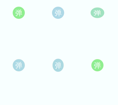
由于录制gif图片会掉帧,所以看起来不流畅,很卡,但其实实际效果还是不错的,有弹性一些。
html代码:
<span class="shake">弹</span>
css代码:
.shake{

    width:40px;

    height:40px;

    display:block;

    background:lightgreen;

    border-radius:50%;

    margin:5px;

    color:#fff;

    font-size:24px;

    text-align:center;

    line-height:40px;

    cursor:pointer;

    -webkit-transition:all 0.25s;

}

.shake:hover{

    -webkit-animation:shake 0.25s;

    background: lightblue;

}

@-webkit-keyframes shake{

    0%,10%,55%,90%,94%,98%,100%{

        -webkit-transform:scale(1,1);

    }

    30%{

        -webkit-transform:scale(1.14,0.86);

    }

    75%{

        -webkit-transform:scale(0.92,1.08);

    }

    92%{

        -webkit-transform:scale(1.04,0.96);

    }

    96%{

        -webkit-transform:scale(1.02,0.98);

    }

    99%{

        -webkit-transform:scale(1.01,0.99);

    }

}
昨晚看到某人的个人博客网站的回到顶部按钮悬浮效果就是这样子的,还是比较有趣的,不过人家的效果可能比我的好一些,大家不妨试一下。
第二种效果:
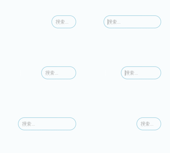
这种效果其实目前线上很多网站都在用了,不管是使用CSS3,还是jQuery,都是可以实现的。那这里我只是简单地使用CSS3来实现。
html代码:
<input class="search" type="text" placeholder="搜索...">
CSS代码:
.search{

    width:80px;

    height:40px;

    border-radius:40px;

    border:2px solid lightblue;

    position: absolute;

    right:200px;

    outline:none;

    text-indent:12px;

    color:#666;

    font-size:16px;

    padding:;

    -webkit-transition:width 0.5s;

}

.search:focus{

    width:200px;

}
一般旁边都会有一个按钮,这里我就不做了。
第三种效果:
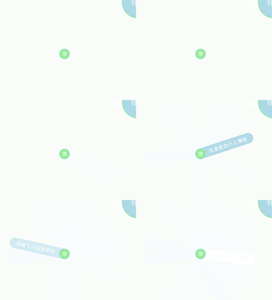
这种效果也是很常用,比较多还是个人网站偏多。
html代码:
<div class="banner">

    <a href="javascript:;">博</a>

    <span>这是我的个人博客</span>

</div>
css代码:
.banner{

    width:234px;

    height:34px;

    border-radius:34px;

    position:absolute;

    top:400px;

    left:200px;

}

.banner a{

    display:inline-block;

    width:30px;

    height:30px;

    line-height:30px;

    border-radius:50%;

    border:2px solid lightblue;

    position:absolute;

    left:0px;top:0px;

    background:lightgreen;

    color:#fff;

    text-align:center;

    text-decoration:none;

    cursor:pointer;

    z-index:;

}

.banner a:hover + span{

    -webkit-transform:rotate(360deg);

    opacity:;

}

.banner span{

    display:inline-block;

    width:auto;

    padding:0 20px;

    height:34px;

    line-height:34px;

    background:lightblue;

    border-radius:34px;

    text-align: center;

    position:absolute;

    color:#fff;

    text-indent:25px;

    opacity:;

    -webkit-transform-origin:8% center;

    -webkit-transition:all 1s;

}
第四种效果:
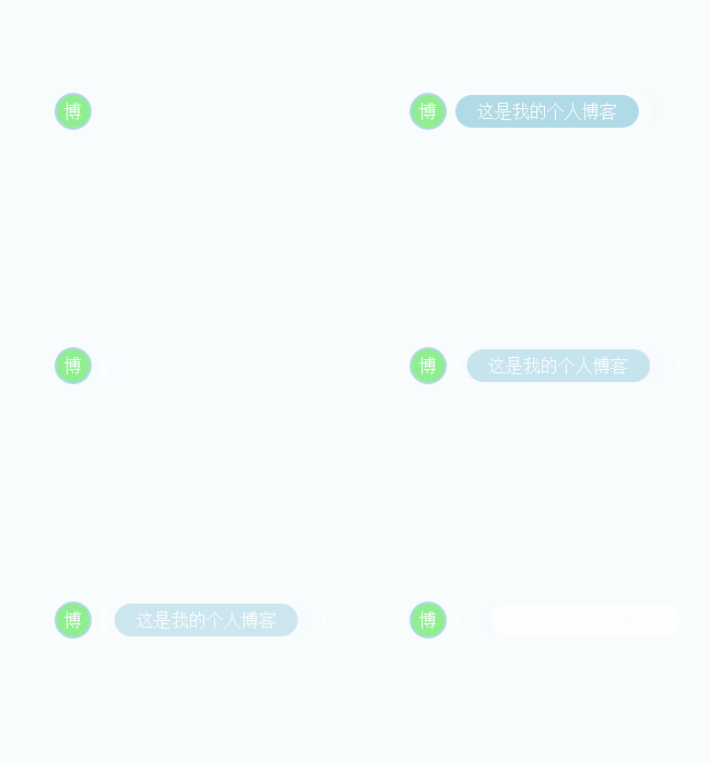
这种提示效果就更常用了,很多网站都用。
html代码:
<div class="banner1">

    <a href="javascript:;">博</a>

    <span>这是我的个人博客</span>

</div>
css代码:
.banner1{

    width:234px;

    height:34px;

    border-radius:40px;

    position:absolute;

    top:400px;

    left:600px;

}

.banner1 a{

    display:inline-block;

    width:30px;

    height:30px;

    line-height:30px;

    border-radius:50%;

    border:2px solid lightblue;

    position:absolute;

    left:0px;top:0px;

    background:lightgreen;

    color:#fff;

    text-align:center;

    text-decoration:none;

    cursor:pointer;

    z-index:;

}

.banner1 a:hover + span{

    -webkit-transform:translateX(40px);

    opacity:;

}

.banner1 span{

    display:inline-block;

    width:auto;

    padding:0 20px;

    height:30px;line-height:30px;

    background:lightblue;

    border-radius:30px;

    text-align: center;

    color:#fff;

    position:absolute;

    top:2px;

    opacity:;

    -webkit-transition:all 1s;

    -webkit-transform:translateX(80px);

}
最后一种效果
估计这种就是不常用了,自己做着玩,有兴趣看一下咯:
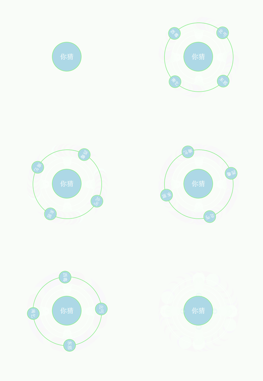
html结构:
<div class="wrapper">

    <div class="round">

        <span>东邪</span>

        <span>西毒</span>

        <span>南乞</span>

        <span>北丐</span>

    </div>

</div>
css代码:
.wrapper{

    width:100px;

    height:100px;

    background:lightblue;

    border-radius:50%;

    border:2px solid lightgreen;

    position: absolute;

    top:200px;

    left:400px;

    cursor:pointer;

}

.wrapper:after{

    content:'你猜';

    display:inline-block;

    width:100px;

    height:100px;

    line-height:100px;

    border-radius:50%;

    text-align:center;

    color:#fff;

    font-size:24px;

}

.wrapper:hover .round{

    -webkit-transform:scale(1);

    opacity:;

    -webkit-animation:rotating 6s 1.2s linear infinite alternate;

}

@-webkit-keyframes rotating{

    0%{

        -webkit-transform:rotate(0deg);

    }

    100%{

        -webkit-transform:rotate(180deg);

    }

}

.round{

    width:240px;

    height:240px;

    border:2px solid lightgreen;

    border-radius:50%;

    position: absolute;

    top:-70px;

    left:-70px;

    -webkit-transition:all 1s;

    -webkit-transform:scale(0.35);

    opacity:;

}

.round span{

    width:40px;

    height:40px;

    line-height:40px;

    display:inline-block;

    border-radius:50%;

    background:lightblue;

    border:2px solid lightgreen;

    color:#fff;

    text-align:center;

    position:absolute;

}

.round span:nth-child(1){

    right:-22px;

    top:50%;

    margin-top:-22px;

}

.round span:nth-child(2){

    left:-22px;

    top:50%;

    margin-top:-22px;

}

.round span:nth-child(3){

    left:50%;

    bottom:-22px;

    margin-left:-22px;

}

.round span:nth-child(4){

    left:50%;

    top:-22px;

    margin-left:-22px;

}
结语
那么这次就分享这么几个小玩意吧,以后有时间会分享一些比较好的。最后,祝大家七夕节快乐!
若需转载,请注明出处,谢谢合作!
CSS3实现几个常用的网页小效果的更多相关文章
- 【前端】javascript中10常用的个小技巧总结
javascript中10常用的个小技巧总结 本文转自:http://www.cnblogs.com/libin-1/p/6756393.html 1. new Set() 可能有人知道ES6中提供了 ...
- 网页3D效果库Three.js初窥
网页3D效果库Three.js初窥 背景 一直想研究下web页面的3D效果,最后选择了一个比较的成熟的框架Three.js下手 ThreeJs官网 ThreeJs-github; 接下来我会陆续翻译 ...
- HTML5 CSS3 专题 :诱人的实例 3D旋转木马效果相册
转载请标明出处:http://blog.csdn.net/lmj623565791/article/details/32964301 首先说明一下创意的出处:http://www.zhangxinxu ...
- CSS3 @font-face实现颜色大小可控的三角效果——张鑫旭
一.我之前介绍过的三角实现效果回顾 这里所说的三角效果之等腰直角三角形效果(等边三角形有现成字符实现,没什么好说的:还有图片实现三角众人皆知,不予以说明): 1. 字符实现三角效果关于字符实现三角我早 ...
- HTML5 CSS3 专题 :诱人的实例 3D旋转木马效果相冊
转载请标明出处:http://blog.csdn.net/lmj623565791/article/details/32964301 首先说明一下创意的出处:http://www.zhangxinxu ...
- 利用css3的text-shadow属性实现文字阴影乳白效果
现在CSS3+html5的网页应用的越来越广泛了.很多网页中的字体同样可以用CSS3来实现炫酷的效果. 下面就介绍一下利用css3的text-shadow属性实现文字阴影乳白效果.这是在设计达人上面看 ...
- Material Design Reveal effect(揭示效果) 你可能见过但是叫不出名字的小效果
Material Design Reveal effect(揭示效果) 你可能见过但是叫不出名字的小效果 前言: 每次写之前都会来一段(废)话.{心塞...} Google Play首页两个tab背景 ...
- weui 多网页切换效果分析
weui的文档写的不怎么详尽,简单的来讲WeUI 为微信 Web 服务量身设计的h5框架. WeUI是一套同微信原生视觉体验一致的基础样式库,由微信官方设计团队为微信 Web 开发量身设计,可以令用户 ...
- 使用chrome查看网页上效果的实现方式
使用chrome查看网页上效果的实现方式 chrome是一个极为强大的工具,很多时候,我们不知道一个效果怎么实现的,我们完全可以找到响应的网页,然后找到其html文件,和js文件,查看源码,获得其实现 ...
随机推荐
- Atitit.木马病毒的免杀原理---sikuli 的使用
Atitit.木马病毒的免杀原理---sikuli 的使用 1. 使用sikuli java api1 1.1. 3. Write code!1 2. 常用api2 2.1. wait 等待某个界面出 ...
- Snort - manual 笔记(三)
1.6 Reading pcap files Snort 不仅可以监听interface, 还可以读取和分析已经捕获的数据包. 1.6.1 Command line arguments 下面的命令都可 ...
- IOS程序开发中-跳转到 发送短信界面 实现发短信
前言:我发现我标题取的不好,谁帮我取个承接上下文的标题?评论一下,我改 项目需求:在程序开发中,我们需要在某个程序里面发送一些短信验证(不是接收短信验证,关于短信验证,传送门:http://www.c ...
- 分析实现Android自定义View之扇形图
继承View基类,画了这样的扇形图 直接来步骤吧 (参考了GcsSloop的教程) 1.分析 自定义View需要认真的分析下,里面还是会用到一些数学知识 首先是扇形该怎么表现 1. 扇形的外观是个圆弧 ...
- NSTimer定时器的使用
前言:这是关于NSTimer的学习笔记. 正文内容大纲: 1.关于计时器NSTimer的一个被添加进NSRunLoop的使用细节 2.关于NSTimer常用方法的使用 3.关于NSTimer的类别工具 ...
- python idle 清屏问题的解决
在学习和使用python的过程中,少不了要与python idle打交道.但使用python idle都会遇到一个常见而又懊恼的问题——要怎么清屏? 我在stackoverflow看到这样两种答案 ...
- 第k大的数,前k大的数
1.排序后去出前k个,o(n*log(n)) 如果k<log(n),可以考虑直接选择排序,因为只需要执行找到第k个就可以结束 o(n*k) 2.o(nlog(k))快排把数分为了两个部分, ...
- Linux Shell 01 脚本与变量
一 脚本的创建和执行 1. 创建文件*.sh,文件后缀为sh 2. 编辑脚本 首行必须为:#!/bin/bash #指定解释脚本的shell 3. 赋权 chmod u+x a.sh 4. 执行 ...
- Uploadify文件上传
一.简介 Uploadify 是一种基于html5 或 flash的多文件上传的jQuery插件.Uploadify可以支持多种定制.它是一种异步的文件上传插件.下载网站为http://www.upl ...
- JavaScript吸顶灯的实现
吸顶灯是各站点常用的一个功能,它有两个特性 向下滚动到div位置时,该div一直固定在页面的顶部 向上滚动到div原有位置时,div又恢复到文档中的原位置 div可能是一个“分类菜单”,也可能是一个“ ...