
css常见的各种布局上(两列布局)
常见的布局上(两列布局)
1.常见的两列布局
1.1左边固定,右边自适应,左边宽度已知,右边默认占满整行,使用left 左浮动,右边不浮动,设置margin-left:左侧宽度
<style>

        .box{

            overflow: hidden;

            height: 500px;

            background-color: bisque;

        }

        .box .box-left {

            margin-left: 10px;

            width: 200px;

            min-height: 100%;

            float: left;

            background-color: pink;

        }

        .box .box-right {

            margin-left: 220px;

            margin-right: 10px;

            height: 100%;

            background-color: green;

        }

        header,footer {

            height: 75px;

            background-color: aqua;

        }

    </style>

<div class="box">

        <div class="box-left">

            11

        </div>

        <div class="box-right">

            1shishsihsishsihi是不变的沙发电视柜很多水果和客户的感慨的沙发电视柜很多水果和客户的感慨大苏打撒郭德纲你只是  第三个大概了解斯大林经过拉丝几个垃圾

        </div>

    </div>
1.2右侧固定,宽度已知,左侧自适应,记住固定的区域一定要放自适应区域的右边,
.box{

            height: 500px;

            background-color: bisque;

            position: relative;

        }

        .box .box-right {

            float: right;

            width: 200px;

            min-height: 100%;

            margin-right: 10px;

            background-color: pink;

        }

        .box .box-left {

            margin-left: 10px;

            margin-right: 220px;

            height: 100%;

            background-color: green;

        }

        header,footer {

            height: 75px;

            background-color: aqua;

        }

<div class="box">

        <div class="box-right">

            11

        </div>

        <div class="box-left">

            1shishsihsishsihi是不变的沙发电视柜很多水果和客1111111111111111111111户的感慨的沙发电视柜很多水果和客户的感慨大苏打撒郭德纲你只是
        第三个大概了解斯大林经过拉丝几个垃圾

        </div>

    </div>
单列固定都是比较简单的还有嵌套一层div方式,还有弹性布局方式,还有grid布局,都能实现单侧固定
1.3 嵌套一层div ,左侧固定,右侧自适应布局,使用双浮动,右侧自适应先写入,左侧使用margin-left:-100%
不嵌套一层div,右侧直接使用margin-left:左侧宽度也是可以的(这个代码就不写了,和第一个差不多)
<style>

        .box{

            height: 500px;

            background-color: bisque;

            position: relative;

            overflow: hidden;

        }

        .box .box-right {

            float: left;

            margin-left: -100%;

            width: 200px;

            min-height: 100%;

            background-color: pink;

        }

        .box .box-left {

            float: left;

            width: 100%;

            height: 100%;

            background-color: green;

        }

        .box .box-left .son {

            margin-left: 210px;

        }

        header,footer {

            height: 75px;

            background-color: aqua;

        }

    </style>

<body>

    <header>

    </header>

    <div class="box">

        <div class="box-left">

            <div class="son">

                1shishsihsishsihi是不变的沙发电视柜很多水果和客1111111111111111111111户的感慨的沙发电视柜很多水果和客户的感慨大苏打撒郭德纲你只是
           第三个大概了解斯大林经过拉丝几个垃圾

            </div>

        </div>

        <div class="box-right">

            11

        </div>

    </div>

    <footer>

    </footer>

</body>
1.4 t弹性布局
<style>

        .box{

            height: 500px;

            background-color: bisque;

            position: relative;

            display: flex;

        }

        .box .box-left {

            margin-left: 10px;

            flex: 0 0 200px; /* 参数分别是 放大,缩小 初始大小 */

            background-color: pink;

        }

        .box .box-right {

            margin-left: 10px;

            margin-right: 10px;

            height: 100%;

            background-color: green;

        }

        header,footer {

            height: 75px;

            background-color: aqua;

        }

    </style>

<body>

    <header>

    </header>

    <div class="box">

        <div class="box-left">

            11

        </div>

        <div class="box-right">

            1shishsihsishsihi是不变的沙发电视柜很多水果和客1111111111111111111111户的感慨的沙发电视柜很多水果和客户的感慨
        大苏打撒郭德纲你只是  第三个大概了解斯大林经过拉丝几个垃圾

        </div>

    </div>

    <footer>

    </footer>

</body>
1.5 grid布局,grid相对于flex的话属于二维布局,可以定义行数,定义列数,定义行高列高,宽度也可以自适应,设置父容器的display:grid。grid 有很大的兼容性问题。慎用
使用grid 相当于设置行数为1,列数为2的grid布局,使用grid可以很容易实现九宫格布局
<style>

        .box{

            height: 500px;

            background-color: bisque;

            position: relative;

            display: grid;

            padding: 0 10px;

            grid-template-rows: 1fr;

            grid-template-columns: 200px auto;

            grid-gap: 10px;

        }

        .box .box-left {

            background-color: pink;

        }

        .box .box-right {

            background-color: green;

        }

        header,footer {

            height: 75px;

            background-color: aqua;

        }

    </style>

<body>

    <header>

    </header>

    <div class="box">

        <div class="box-left">

            11

        </div>

        <div class="box-right">

            1shishsihsishsihi是不变的沙发电视柜很多水果和客1111111111111111111111户的感慨的沙发电视柜很多水果和客户的感慨

        大苏打撒郭德纲你只是  第三个大概了解斯大林经过拉丝几个垃圾

        </div>

    </div>

    <footer>

    </footer>

</body>
使用grid实现9宫格布局
<style>

        .box{

            height: 500px;

            background-color: bisque;

            position: relative;

            display: grid;

            padding: 0 10px;

            grid-template-rows: 1fr 1fr 1fr;

            grid-template-columns: 1fr 1fr 1fr;

            grid-gap: 10px;

        }

        .box .box-left {

            background-color: pink;

        }

        .box .box-right {

            background-color: green;

        }

        header,footer {

            height: 75px;

            background-color: aqua;

        }

    </style>

<body>

    <header>

    </header>

    <div class="box">

        <div class="box-left">

            11

        </div>

        <div class="box-right">

            1shishsihsishsihi是不变的沙发电视柜很多水果和客1111111111111111111111户的感慨的沙发电视柜很多水果和客户的感慨

        大苏打撒郭德纲你只是  第三个大概了解斯大林经过拉丝几个垃圾

        </div>

        <div class="box-left">

            11

        </div>

        <div class="box-right">

            1shishsihsishsihi是不变的沙发电视柜很多水果和客1111111111111111111111户的感慨的沙发电视柜很多水果和客户的感慨

        大苏打撒郭德纲你只是  第三个大概了解斯大林经过拉丝几个垃圾

        </div>

        <div class="box-left">

            11

        </div>

        <div class="box-right">

            1shishsihsishsihi是不变的沙发电视柜很多水果和客1111111111111111111111户的感慨的沙发电视柜很多水果和客户的感慨

        大苏打撒郭德纲你只是  第三个大概了解斯大林经过拉丝几个垃圾

        </div>

        <div class="box-left">

            11

        </div>

        <div class="box-right">

            1shishsihsishsihi是不变的沙发电视柜很多水果和客1111111111111111111111户的感慨的沙发电视柜很多水果和客户的感慨

        大苏打撒郭德纲你只是  第三个大概了解斯大林经过拉丝几个垃圾

        </div>

        <div class="box-left">

            11

        </div>

    </div>

    <footer>

    </footer>

</body>
1.6 使用定位实现左侧固定右侧自适应布局,
1.6.1使用相对定位,该布局,左侧固定div 的高度已知,
<style>

        .box{

            height: 500px;

            background-color: bisque;

            position: relative;

        }

        .box .box-left {

            margin-left: 10px;

            width: 200px;

            height: 400px;

            background-color: pink;

        }

        .box .box-right {

            position: relative;

            top: -100%;

            margin-left: 220px;

            height: 100%;

            background-color: green;

            margin-right: 10px;

        }

        header,footer {

            height: 75px;

            background-color: aqua;

        }

    </style>

<body>

    <header>

    </header>

    <div class="box">

        <div class="box-left">

            11

        </div>

        <div class="box-right">

            1shishsihsishsihi是不变的沙发电视柜很多水果和客1111111111111111111111户的感慨的沙发电视柜很多水果和客户的感慨

            大苏打撒郭德纲你只是  第三个大概了解斯大林经过拉丝几个垃圾

        </div>

    </div>

    <footer>

    </footer>

</body>
1.6.2 使用相对定位实现左侧固定,右侧自适应,div高度未知,将自适应的模块放前面,固定宽度div设置top:-100%
<style>

        .box{

            height: 500px;

            background-color: bisque;

            position: relative;

        }

        .box .box-left {

            position: relative;

            top: -100%;

            margin-left: 10px;

            width: 200px;

            height: 400px;

            background-color: pink;

        }

        .box .box-right {

            margin-left: 220px;

            height: 100%;

            background-color: green;

            margin-right: 10px;

        }

        header,footer {

            height: 75px;

            background-color: aqua;

        }

    </style>

<body>

    <header>

    </header>

    <div class="box">

        <div class="box-right">

            1shishsihsishsihi是不变的沙发电视柜很多水果和客1111111111111111111111户的感慨的沙发电视柜很多水果和客户的感慨

            大苏打撒郭德纲你只是  第三个大概了解斯大林经过拉丝几个垃圾

        </div>

        <div class="box-left">

            11

        </div>

    </div>

    <footer>

    </footer>

</body>
1.6.3 使用绝对定位,两个模块都使用绝对定位,可以不使用浮动
<style>

        .box{

            height: 500px;

            background-color: bisque;

            position: relative;

        }

        .box .box-left {

            position: absolute;

            margin-left: 10px;

            width: 200px;

            height: 400px;

            background-color: pink;

        }

        .box .box-right {

            position: absolute;

            margin-left: 220px;

            height: 100%;

            background-color: green;

            margin-right: 10px;

        }

        header,footer {

            height: 75px;

            background-color: aqua;

        }

    </style>

<body>

    <header>

    </header>

    <div class="box">

        <div class="box-right">

            1shishsihsishsihi是不变的沙发电视柜很多水果和客1111111111111111111111户的感慨的沙发电视柜很多水果和客户的感慨

            大苏打撒郭德纲你只是  第三个大概了解斯大林经过拉丝几个垃圾

        </div>

        <div class="box-left">

            11

        </div>

    </div>

    <footer>

    </footer>

</body>
1.6.4 左侧先放入固定模块,设置定位为绝对定位,右侧模块无论使用什么定位,只要margin-left:左侧宽度,
都能实现这个布局
<style>

        .box{

            height: 500px;

            background-color: bisque;

            position: relative;

        }

        .box .box-left {

            position: absolute;

            margin-left: 10px;

            width: 200px;

            height: 400px;

            background-color: pink;

        }

        .box .box-right {

            margin-left: 220px;

            height: 100%;

            background-color: green;

            margin-right: 10px;

        }

        header,footer {

            height: 75px;

            background-color: aqua;

        }

    </style>

<body>

    <header>

    </header>

    <div class="box">

        <div class="box-left">

            11

        </div>

        <div class="box-right">

            1shishsihsishsihi是不变的沙发电视柜很多水果和客1111111111111111111111户的感慨的沙发电视柜很多水果和客户的感慨

            大苏打撒郭德纲你只是  第三个大概了解斯大林经过拉丝几个垃圾

        </div>

    </div>

    <footer>

    </footer>

</body>
上面所以布局的实现图
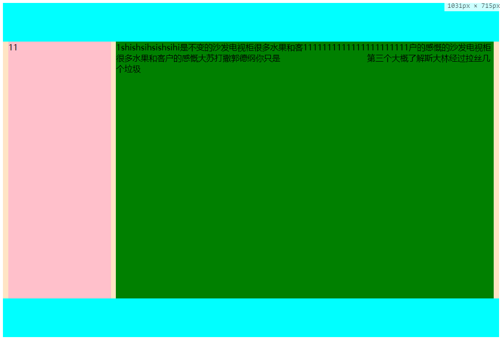
总结,左侧固定右侧自适应布局
1、不使用定位,左侧固定,浮动,右侧,设置margin-left:左侧宽度
2、不适用定位,左侧固定,浮动,右侧也浮动,,右侧模块一定要写在左侧模块之前,左侧使用margin-left:-100%
2.1右侧使用margin:左侧宽度,
2.2左侧设置宽度100%,嵌套一层div,设置margin:左侧宽度(这种方式有点多余,在两列布局上)
3、使用定位,父元素设置display:relative(为啥不使用absolute,子元素要是设置也是absolute,
那么都不知道跑什么地方去了)
3.1 左元素不设置定位,右侧元素设置相对定位display:relative;则,有点设置top:左侧高度,margin:左侧宽度
3.2 左侧宽度不定,则将左侧和右侧元素都设置为相对定位,右侧元素先放入页面,左侧设置top:-100%.右侧设置
margin-left:左侧宽度(3.1的左侧高度要已知,而这个左侧高度可以不已知)
3.2 左侧元素为绝对定义,则右侧元素直接设置margin-left:左侧宽度,(left,margin-left,对于自适应的
宽度,margin会使宽度变窄,而left 是不会的,如果要是用left:左侧宽度,那么一定要设置margin-right:左侧宽度)
4、使用flex布局,单列布局,设置父元素display:flex;左侧元素的flex为;:0 0 width;右侧元素不用设置
5、使用grid布局,grid布局是二维布局,设置为1行,1列,第一列宽度为定位宽度,第二列宽度为auto,子元素不用设置
上面基本上覆盖了所以的左侧固定,右侧自适吟的布局,第一种最简单, 4 5 有一定兼容性问题,flex常用语移动端。
如果您还有更好的方法,请给我留言。
css常见的各种布局上(两列布局)的更多相关文章
- CSS常用布局方式-两列布局、三列布局
CSS基础 2.几种布局方式1)table布局 当年主流的布局方式,第一种是通过table tr td布局 示例: <style type="text/css"> ta ...
- CSS布局——横向两列布局
1.固定两栏布局,使用float,注意对紧邻元素清除浮动影响.IE6在使用float布局同时设置横行margin的情况下会有双边距BUG,解决方案是加入_display:inline 代码如下: &l ...
- 慕课笔记利用css进行布局【两列布局】
<html> <head> <title>两列布局</title> <style type="text/css"> bo ...
- css布局之两列布局
我们见过两列布局的网站也很多,不过这种两列布局的分为两种:自适应和固定宽度 1.自适应两列布局 <!DOCTYPE html> <html lang="en"&g ...
- bootstrap的栅格布局与两列布局结合使用
在工作中我们常常需要实现响应式布局,这个可以使用bootstrap的栅格系统来实现,我们在列里也需要实现一部分的响应式.比如下面的效果图,需要实现左边图标固定,右边的自适应 : 左边固定宽度,右边自适 ...
- css布局--两列布局,左侧固定,右侧自适应(其中左侧要可以拖动,右侧水平滚动条)
(css布局所要实现的效果) 在前端面试中经常会被问到CSS布局,两列布局,左侧固定,右侧自适应.前几天去面试,遇到了这道题的升级版,要求左侧可拖动,右侧要有水平滚动条.拿到题目确实有些大脑短路,不知 ...
- 3种常见的CSS页面布局--双飞翼布局、粘连布局、左右两列布局
一.左右两列布局 1.代码如下,可先粘贴复制,自行运行 <!DOCTYPE html><html> <head> <meta charset="UT ...
- css两列布局之基于BFC规则实现
css要实现常见的自适应两列布局的方式方法挺多. 这里讲的是利用设置overflow不为visible时会形成新的BFC来实现.至于什么是BFC,可以搜搜看先,基本都讲的差不多了.等有更多空余时间,专 ...
- css 两列布局中单列定宽单列自适应布局的6种思路
前面的话 说起自适应布局方式,单列定宽单列自适应布局是最基本的布局形式.本文将从float.inline-block.table.absolute.flex和grid这六种思路来详细说明如何巧妙地实现 ...
随机推荐
- Linux 普通用户之间免密登陆
目的: 同台机器之间实现普通用户之间的免密登陆: NN01 的user1 免密登陆 user2 不同机器之间实现普通用户之间的免密登陆 :NN01 的user1 免密登陆 NN01 的user1 一. ...
- SSM-Spring-05:Spring的bean是单例还是多例,怎么改变?
------------吾亦无他,唯手熟尔,谦卑若愚,好学若饥------------- Spring的bean是单例的 它在Spring容器初始化的时候创建对象 可以修改为多例,在此bean节点中添 ...
- SAP系统三层架构
SAP系统三层架构:表示层,应用层,数据库层 表示层:也可以说个人用户client.由表示层提出数据请求,然后应用层对请求进行处理,再通过数据库层DBMS系统对数据进行处理. 从应用服务器的缓 ...
- Linux时间子系统之(三):用户空间接口函数
专题文档汇总目录 Notes:用户空间时间相关接口函数: 类型 API 精度 说明 时间 time stime time_t 精度为秒级 逐渐要被淘汰.需要定义__ARCH_WANT_SYS_TIME ...
- jmeter使用csv进行参数化(二)
上篇说的是csv的第一种方法进行参数化,这篇说第二种方法. 重新打开录制好的脚本. 1.提取函数变量 打开选项--函数助手对话框 设置对话框参数: 选择csvread,然后将变量文件的路径填写进来.添 ...
- spring MVC 管理HttpClient---实现在java中直接向Controller发送请求
在spring MVC中,大多数时候是由客户端的页面通过ajax等方式向controller发送请求,但有时候需要在java代码中直接向controller发送请求,这时可以使用HttpCilent实 ...
- Golang 嵌套map赋值办法
http://my.oschina.net/sol/blog/159060 m := map[string]map[string]string{} mm, ok := m["kkk" ...
- pip 安装mysqlclient报错OSError: mysql_config not found
执行 pip install mysqlclient 报错信息如下: [root@CentOS7-demo bin]# pip install mysqlclient Collecting mysql ...
- 在centos上面安装phantomjs
在opt目录下创建phantomjs文件夹 mkdir -p /opt/phantomjs 把phantomjs解压出来的的文件放到/opt/phantomjs下面 建立软链接 ln -s /opt/ ...
- util.go 源码阅读
} h := md5.New() baseString, _ := json.Marshal(obj) h.Write([]byte(baseString)) ...