响应式框架Bootstrap栅格系统
<!DOCTYPE html>
<html>
<head lang="en">
<meta charset="UTF-8">
<title></title>
<meta name="viewport" content="width=device-width, initial-scale=1">
<link rel="stylesheet" href="css/bootstrap.min.css"/>
<script language="JavaScript" src="js/jquery-3.js"></script>
<style type="text/css">
*{
top: 0px;
padding: 0px;
text-decoration: none;
list-style-type: none;
}
.top-styl{
height: 50px;
border: 1px solid red;
background-color: #000000;
}
.img-styl{
width: 174px;
height: 50px;
background: url("imges/logo.png")no-repeat 0px 3px;
background-size: contain;
float: left;
}
.sousuo-styl{
width: 187px;
float: left;
}
.top-search-input{
width: 150px;
padding: 0 5px;
height: 30px;
border: 0;
background: #363636;
float: left;
color: #ccc;
}
.top-search-submit{
width: 30px;
height: 30px;
border: 0;
background: green url("imges/zoom.gif")center center no-repeat;
float: left;
cursor: pointer; //光标指针
}
.dao-styll{
float: left;
font-size: 16px;
width: 329px;
margin-left: 33px;
margin-top: 11px;
}
.dao-styll li{
float: left;
position: relative; //相对定位
text-align: center;
padding: 0 7px;
}
.dao-styll >li:hover{
background-color: #999;
}
.dao-styll >li >a{
color: #FFF;
width: 100%;
height: 34px;
text-decoration: none; //取消下划线
}
.dz-styl{
float: right;
margin: -19px -9px 6px 21px;
}
.imgs-styl{
padding: 11px 0px 0px 114px;
float: right;
margin: 0px -98px -3px 8px;
}
.green-styl{
color: green;
}
.zc-styl{
color: white;
}
a{
text-decoration: none;
}
</style>
</head>
<body>
<div class="container-fluid"> //fluid表示用 百分比
<div class="row"> //row 行
<div class="top-styl col-md-12"> //col-md-12 每行桌面占12列
<div class="row">
<div class=" col-md-offset-1 col-md-9"> //col-md-offset-1 列偏移1列
<div class="row">
<div class="col-md-3 col-xs-4">
<div class="img-styl"></div>
</div>
<div class="col-md-3 ">
<div class="sousuo-styl" style="padding-left: 7px; margin: 8px auto;">
<input class="top-search-input" value="" type="text"><input
class="top-search-submit" type="submit" value="" />
</div>
</div>
<div class="col-md-4 hidden-xs" style="padding: 0px">
<ul class="dao-styll">
<li class=""><a href="#">风格</a>
</li>
<li class=""><a href="#">造型师</a></li>
<li class=""><a href="#">众分享</a>
</li>
<li class=""><a href="#">我的美丽衣橱</a></li>
</ul>
</div>
<div class="col-md-2">
<div class="imgs-styl">
<img src="imges/sina.gif">
</div>
<div class="dz-styl">
<span><a href="#" class="green-styl">登录</a> | </span><span>
<a href="#" class="zc-styl">注册</a></span>
</div>
</div>
</div>
</div>
</div>
</div>
</div>
<div class="row">
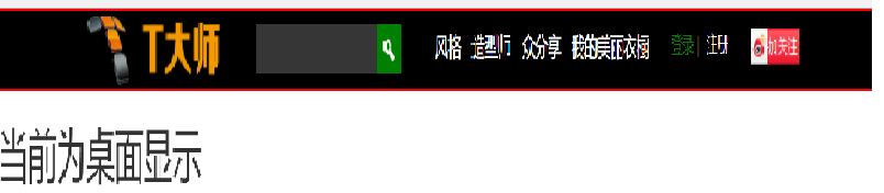
<div class="visible-md"><h1>当前为桌面显示</h1></div> //visible默认占满整行
<div class="visible-sm"><h1>当前为平面显示</h1></div>
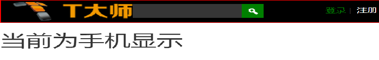
<div class="visible-xs"><h1>当前为手机显示</h1></div>
</div>
</div>
</body>
</html>
效果显示图:
响应式框架Bootstrap栅格系统的更多相关文章
- 最常用前端框架BootStrap——栅格系统
前 言 Bootstrap 提供了一套响应式.移动设备优先的流式栅格系统,随着屏幕或视口(viewport)尺寸的增加,系统会自动分为最多12列.它包含了易于使用的预定义类,还有强大的mix ...
- Bootstrap4响应式布局之栅格系统
前面说了Bootstrap4的下载和简单使用,现在我们接着往下学习,Bootstrap4的响应式布局主要依靠栅格系统来实现的.面老K先来讲解一下Bootstrap4的栅格系统,让你能够更快的了解Boo ...
- 响应式框架Bootstrap
概念:Bootstrap将会根据你的屏幕的大小来调整HTML元素的大小 -- 强调 响应式设计的概念. 通过响应式设计,你无需再为你的网站设计一个手机版的.它在任何尺寸的屏幕上看起来都会不错. Boo ...
- fcc 响应式框架Bootstrap 练习2
text-primary 属性值使标题直接变成了红色,text-center使标题直接居中 <h2 class="text-primary text-center"> ...
- bootstrap第一天,响应式布局,栅格系统运用
<!DOCTYPE html><html lang="zh-CN"> <head> <meta charset="utf-8&q ...
- fcc 响应式框架Bootstrap 练习1
需要通过添加下列代码到你的HTML开头来将Bootstrap添加到任意应用中: <link rel="stylesheet" href="//cdn.bootcss ...
- fcc 响应式框架Bootstrap 练习3
class="container-fluid"控制宽度100% <div class="container-fluid"> <h3 class ...
- 【响应式】foundation栅格布局的“尝鲜”与“填坑”
提到响应式,就不得不提两个响应式框架--bootstrap和foundation.在标题上我已经说明白啦,今天给大家介绍的是foundation框架. 何为"尝鲜"?就是带大伙 ...
- 巧用 BootStrap --- 栅格系统(布局)轻松搞定网页响应式布局!
摘要:Bootstrap 为我们提供了一套响应式.移动设备优先的流式栅格系统,合理的使用栅格系统将会使得网站页面布局变得更加简单,在设置了媒体查询之后,响应式网站也无需再单独写了.接下来我以Boots ...
随机推荐
- Leetcode题解(一)
1.Two Sum 题目 此题第一解题思路,就是最常见的方法,两个指针嵌套遍历数组,依次判断当前指针所指向的值是否满足条件.代码如下; class Solution { public: vector& ...
- java爬虫--jsoup简单的表单抓取案例
分析需求: 某农产品网站的农产品价格抓取 网站链接:点击打开链接 页面展示如上: 标签展示如上: 分析发现每日价格行情包括了蔬菜,水果,肉等所有的信息,所以直接抓每日行情的内容就可以实现抓取全部数据. ...
- linq 在查询表达式中处理 null 值
此示例显示如何在源集合中处理可能的 null 值. IEnumerable<T> 等对象集合可包含值为 null 的元素. 如果源集合为 null 或包含值为 null 的元素,并且查询不 ...
- AMD 和 CMD 的区别
AMD 规范在这里:https://github.com/amdjs/amdjs-api/wiki/AMD CMD 规范在这里:https://github.com/seajs/seajs/issue ...
- Chrome DevTools 开发者工具 技巧 调试
https://developers.google.com/chrome-developer-tools/docs/tips-and-tricks 1.console面板多行输入 Shift + ...
- JAVAscript学习笔记 js条件语句 第三节 (原创) 参考js使用表 (2017-09-14 15:55)
<!DOCTYPE html> <html lang="en"> <head> <meta charset="UTF-8&quo ...
- Sqlserver将数据从一个表插入到另一个表
.如果是整个表复制表达如下: insert into table1 select * from table2 .如果是有选择性的复制数据表达如下: insert into table1(column1 ...
- "use strict"详解
参考:http://www.ruanyifeng.com/blog/2013/01/javascript_strict_mode.html 目的: 消除JavaScript语法的一些不合理.不严谨之处 ...
- JavaScript面向对象(收集整理)
(1)封装 首先理解构造函数:所谓"构造函数",其实就是一个普通函数,但是内部使用了this变量.对构造函数使用new运算符,就能生成实例,并且this变量会绑定在实例对象上. f ...
- C#数据类型和SQL数据类型对照
C#操作SQL Float类型,数据会多很多小数,原来是C#的float和sql的float类型不一致 /// <summary> /// 数据库中与C#中的数 ...