CSS3画三角形原理
1、首先看一下画出一个下三角形完整的代码及效果图
#trangle1-up{

    width:0;

    height:0;

    border-left:50px solid transparent;

    border-right:50px solid transparent;

    border-bottom:100px solid blue;

    }
<div id="trangle1-up">

        </div>
chrome截图

2、接下来看一下原理
首先我们知道:
#test{

width: 100px;

height: 100px;

border:2px solid blue;

}
上面这段代码会产生如下的效果:

这个应该没什么疑问。
如果我们继续增大边框的宽度并且使边框各个边的颜色不一致:
#test{

width: 100px;

height: 100px;

border:20px solid;

border-color:blue black red yellow;

}
那么会产生如下效果:

那么,试想一下,如果我们把边框的宽度设置成50px呢?会产生什么效果?试验一下
#test{

width: 100px;

height: 100px;

border:50px solid;

border-color:blue black red yellow;

}

有人会问了为什么中间还有一块空白的区域呢?边框不是应该完全填充矩形区域了吗?
其实不然,这个设计到W3C的标准盒子模型的概念,可以参考一下http://www.jb51.net/css/12199.html
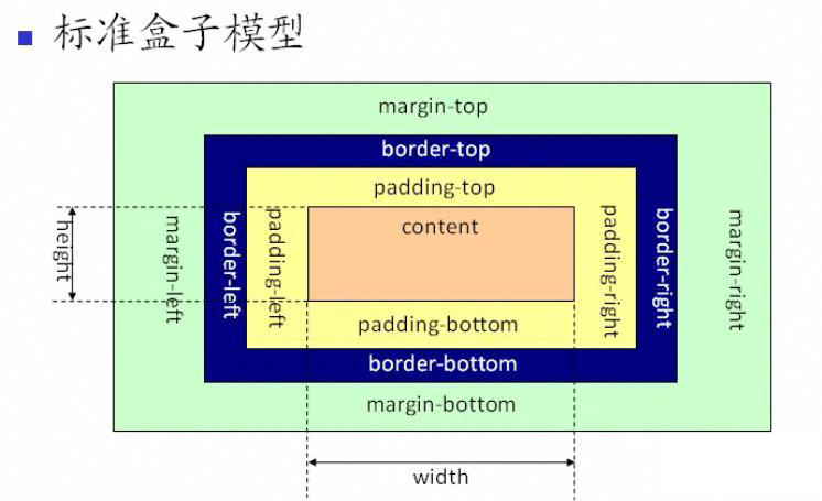
请仔细看图中,什么叫height?什么叫width?height和width包含边框border吗?当你明白了这些,我们再继续往下看。
。。。。。。。。。
现在我们把width和height设置为0:
#test{

width: 0px;

height: 0px;

border:50px solid;

border-color:blue black red yellow;

}

酱紫,中间就不再有空白的区域了,即content区域为0了;吃完饭回来再写。。。。
好了,到了这里,那么怎么画一个三角形呢?
#test{

width: 0px;

height: 0px;

border-left:50px solid transparent;

border-right:50px solid transparent;

border-bottom:100px solid blue;

}

酱紫咯,这不就是个三角形了吗?哈哈哈
其中,上边界是0px,所以下边界会向上延升100px,左右各50px。这是上三角,下三角也很好做:
#test{

width: 0px;

height: 0px;

border-left:50px solid transparent;

border-right:50px solid transparent;

border-top:100px solid blue;

}

左右三角就自己搞咯。。。。
最后来个合体的:
#test{

    width:100px;

    height:100px;

    margin-left:100px;

    position:absolute;

    background:#F63;}

#test-up{

width: 0px;

height: 0px;

margin-left:100px;

border-left:50px solid transparent;

border-right:50px solid transparent;

border-bottom:100px solid blue;

}

#test-right{

width: 0px;

height: 0px;

position:absolute;

margin-left:200px;

border-left:100px solid blue;

border-bottom:50px solid transparent;

border-top:50px solid transparent;

}

#test-bottom{

width: 0px;

height: 0px;

position:absolute;

margin-left:100px;

margin-top:100px;

border-left:50px solid transparent;

border-right:50px solid transparent;

border-top:100px solid blue;

}

#test-left{

width: 0px;

height: 0px;

border-bottom:50px solid transparent;

border-right:100px solid blue;

border-top:50px solid transparent;

}
<div id="test-up">

        </div>

        <div id="test">

        </div>

        <div id="test-right">

        </div>

        <div id="test-bottom">

        </div>

        <div id="test-left">

        </div>

接下来再上一个图形及其CSS代码:
图形长这样:

怎么实现?答案是需要借助伪类,使用方法是在一个黑色的右三角形上叠加一个全白的稍小一点的右三角形,叠加的顺序就得通过after和before伪类来控制,
注意代码中的after和before伪类中的颜色不可弄错,否则右三角形会是全黑的,代码如下:
#demo {

 width: 100px;

 height: 100px;

 border: 2px #000 solid;

 background-color: #fff;

 position: relative;

}

#demo:before {

 content: "";    /*这一行必须有,否则这个特效不会显示*/

 border-top: 12px transparent solid;

 border-bottom: 12px transparent solid;

 border-left: 12px #000 solid;    /*纯黑色*/

 position: absolute;

 /*right: -12px;*/

 margin-left:102px;

 margin-top: 18px;

}

#demo:after {

 content: "";

 border-top: 12px transparent solid;

 border-bottom: 12px transparent solid;

 border-left: 12px #fff solid;    /*纯白色*/

 position: absolute;

 /*right: -10px;*/

 margin-left:100px;

 margin-top:18px;

/* top: 20px;*/

}
<div id="demo">

        </div>
CSS3画三角形原理的更多相关文章
- css3画三角形的原理
以前用过css3画过下拉菜单里文字后面的“下拉三角符号”,类似于下面这张图片文字后面三角符号的效果 下面是一个很简单的向上的三角形代码 #triangle-up { width: 0; height: ...
- css画三角形原理解析
<div id="div1"></div><div id="div2"></div><div id=&qu ...
- css3 画三角形
/*箭头向上*/ .arrow-up { width:0; height:0; border-left:20px solid transparent; border-right:20px solid ...
- 纯CSS3画出小黄人并实现动画效果
前言 前两天我刚发布了一篇CSS3实现小黄人动画的博客,但是实现的CSS3动画是基于我在站酷网找到的一张小黄人的jpg格式图片,并自己用PS抠出需要实现动画的部分,最后才完成的动画效果.但是,其实我的 ...
- 菱形实现气泡Bubble,菱形画箭头,菱形画三角形
菱形实现气泡Bubble,菱形画箭头,菱形画三角形 >>>>>>>>>>>>>>>>>>&g ...
- CSS画三角形引发的一些思考
今天刷知乎时看到了一个问题,有谁能详细讲一下css如何画出一个三角形?怎么想都想不懂? - 知乎.很巧,刚入前端坑的我前不久也遇到过这个问题,今天再来谈一谈这个问题则是因为知乎的一些答案引发了我的 ...
- 使用CSS3画出一个叮当猫
刚学习了这个案例,然后觉得比较好玩,就练习了一下.然后发现其实也不难,如果你经常使用PS或者Flash的话,应该就会知道画个叮当猫是很容易的事,至少我是这么觉得.但是,用CSS3画出来确实是第一次接触 ...
- css伪元素before/after和画三角形的搭配应用
想要实现的效果如下: 第一步:如何用css画出三角形? /* css画三角形 */ .sanjiao{ ; border-top:40px solid red; border-bottom:40px ...
- 如何使用CSS3画出一个叮当猫
刚学习了这个案例,然后觉得比较好玩,就练习了一下.然后发现其实也不难,如果你经常使用PS或者Flash的话,应该就会知道画个叮当猫是很容易 的事,至少我是这么觉得.但是,用CSS3画出来确实是第一次接 ...
随机推荐
- oracle数据库创建用户,并且给用户授权
参考文档: http://www.blogjava.net/wolfman09/archive/2009/05/01/268536.html 一:创建用户 create user username i ...
- Mac下Sublime Text Vim模式 方向键无法长按
在Mac终端输入(不是sublime text里的console),分别对应ST2.ST3: defaults ApplePressAndHoldEnabled -bool false default ...
- hdf5 api
https://www.physics.ohio-state.edu/~wilkins/computing/HDF/hdf5tutorial/index.html
- Java队列实现
队列数组实现:队列长度有限,但是考虑到平时一般都使用有界队列,这应该也不算是个缺点 public class Queue { private Object[] objs; private int he ...
- JAVA8永久代
在Java虚拟机(以下简称JVM)中,类包含其对应的元数据,比如类的层级信息,方法数据和方法信息(如字节码,栈和变量大小),运行时常量池,已确定的符号引用和虚方法表. 在过去(当自定义类加载器使用不普 ...
- canvas实现“探照灯”共能
简单的样式: body{ margin: 0; padding: 0;}#canvas{ display: block; position: relative; margin: auto;} 创建绘图 ...
- 世界上最方便的SharePoint移动客户端--Rshare
Rshare我试用了一段时间,同时也测试了其他家产品,使用后的感觉是Rshare无愧于世界上最方面的SharePoint移动客户端. 1.界面设计很方便,设计中充分考虑到移动客户的使用习惯及喜好,设计 ...
- 理解Spark的RDD
RDD是个抽象类,定义了诸如map().reduce()等方法,但实际上继承RDD的派生类一般只要实现两个方法: def getPartitions: Array[Partition] def com ...
- notepad++中的python缩进问题
现在并没有遇到什么卵问题,但查到资料说会有问题,先记一笔,tab自动换4个空格 cmd /k "$(FULL_CURRENT_PATH)" & PAUSE & EX ...
- ios code style
注释 建议使用VVDocumenter插件 多行注释 格式: /** 注释内容 */ 单行注释 格式: ///在对文件.类.函数进行注释时推荐使用多行注释,在函数体内对代码块进行注释时,使用单行注释 ...