
Bootstrap3 入门实战
因为公司选择了使用BootStrap3作为项目的前台展示框架,所以花了半天时间来学习Bootstrap, 如果你是第一次听说,或者说以前听说过,但没有使用过这个框架的话,希望这篇入门实战能够让你快速掌握。
什么是BootStrap?
基于HTML,CSS,JAVASCRIPT的简洁灵活的流行前端框架及交互组件集,由Twitter的经验丰富的工程师和设计师奉献。说得更具体点就是基于12列的栅格布局的HTML,Javascript使用定制的jQuery插件,用LESS构建CSS等技术构建的响应式设计,跨设备,跨浏览器,而且最主要就是入门门槛非常低,既能用来开发简单的小东西,也能构造更为复杂的应用。完美支持HTML5/CSS 标签和语法,源码托管在GitHub。
如何入手?
1,下载bootstrap,官网下载到customize components. 使用到的jquery可以使用CDN,直接至官网http://jquery.com的最下面有一段cdn的链接,复制下来即可,至于是使用http还是https由你自己决定。我做的示例就是直接使用的http.
2,工具和将要使用的类库都准备好了,接下来,在notepad++中输入html代码,在我看来,手写html是一种好习惯,先建出框架出来,
<!DOCTYPE html>

<html>

    <head>

        <title>Bootstrap3</title>

        <meta name="viewport" content="width=device-width, initial-scale=1.0">

        <link href="css/bootstrap.min.css" rel="stylesheet">

    </head>

    <body>

        <div class="navbar navbar-inverse navbar-static-top">

            <div class="container">

                <a href="#" class="navbar-brand">BootStrap3 Study</a>

            </div>

        </div>

        <script src="http://ajax.googleapis.com/ajax/libs/jquery/1.10.2/jquery.min.js"></script>

        <script src="js/bootstrap.js"></script>

    </body>

</html>
navbar_only
3, 个人从这个简单的框架中得出的一个重要的结论就是div布局牢记,不管什么,先最好弄个div套住,然后再二层弄个div并冠以container class是最佳实践。例如要创建一个头部的导航菜单,先创建一个div,然后再弄个二级div叫container,第三层就是菜单内容,可以平行多个。如图示
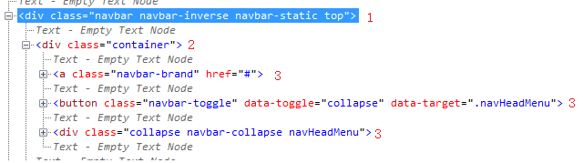
<!DOCTYPE html>

<html>

    <head>

        <title>Bootstrap3 Study</title>

        <meta name="viewport" content="width=device-width, initial-scale=1.0">

        <link href="css/bootstrap.min.css" rel="stylesheet">

        <link href="css/bootstrap_study.css" rel="stylesheet">

    </head>

    <body>

        <div class="navbar navbar-inverse navbar-static-top">

            <div class="container">

                <a  class ="navbar-brand" href="#">Bootstrap3</a>

                <button class="navbar-toggle" data-toggle="collapse" data-target=".navHeadMenu" >

                    <span class="icon-bar"/>

                    <span class="icon-bar"/>

                    <span class="icon-bar"/>

                </button>

                <div class="collapse navbar-collapse navHeadMenu">

                    <ul class="nav navbar-nav navbar-right">

                        <li class="active"><a href="#">Home</a></li>

                        <li><a href="#">Blog</a></li>

                        <li class="dropdown">

                            <a class="dropdown-toggle" data-toggle="dropdown">Technologies<b class="caret"></b></a>

                            <ul class="dropdown-menu">

                                <li><a href="#">Java</a></li>

                                <li><a href="#">C#</a></li>

                            </ul>

                        </li>

                        <li><a href="#">About</a></li>

                        <li><a href="#">Contact</a></li>

                    </ul>

                </div>

            </div>

        </div>

        <script src="http://ajax.googleapis.com/ajax/libs/jquery/1.10.2/jquery.min.js"></script>

        <script src="js/bootstrap.min.js"></script>

    </body>

</html>
点开查看全部源代码
bootstrap.css是很语义化的一个css. 真心建议阅读一下源代码。
4, 接下来就建一个底部的navigator, 按照我的体验,先弄个div与head navigator平级,然后里面再弄个container的div. 如下面这样子。
<div class="navbar navbar-default navbar-fixed-bottom">

            <div class="container">

                <p class="navbar-text pull-left">Create by BP</p>

                <a class="navbar-btn btn btn-danger pull-right" href="#">Subscribe on Tudou</a>

            </div>

        </div>
头部的navigator用的是navbar-static-top, 顶部嘛,当然是top,所以底部使用navbar-fixed-bottom, 靠左靠右使用的语义就是拉到左边,拉到右边。单词之间的空隙用的是-就可以了。
5, 其实,我上面说的有点绝对,并不能说是先弄个div,应该说弄一个有意义的div才合适,换句通俗点的话,就是弄个有class名称的div,然后再套个container的div. 举个例子就是我想在网页的上面显示一点大的字体块,用来说明一些简明扼要的信息,可以使用到jumbtron这个类。那么我的html就是在body的下一级加一个如下的div
        <div class="container">

            <div class="jumbotron">

                <center>

                    <h1>Hello, World!</h1>

                    <p>As a best practice, we highly recommend using the element whenever possible to ensure matching cross-browser rendering.</p>

                    <a class="btn btn-default" href="#">Watch Now!</a>

                    <a class="btn btn-info" href="#">Tweet it!</a>

                </center>

            </div>

        </div>
jumbotron是有圆角定义的,如果你将其移到container那个地方的话,圆角就没了,所以还是另套一个div 最为合适。
6,最后讲一个重量级的自适应的表格布局,在做这个布局之前,牢记一点,bootstrap的布局是一个基于12格的布局。作为表格,肯定是有行row和列col的。对于语义化很的bootstrap3自然也会考虑到这些,所以,在上面5点的基础上,可以很快得到一个代码编写流程:container的div下面建一个row的div,然后再在row的下面建一些col即可完成。
<div class="container">

    <div class="row">

        <div class="col-md-3">

    。。。。。

        </div>

    </div>

</div>
架构是这样子,因为col列里面是占3个格的,共12格,所以col列这个div应该重复4次。
        <div class="container">

            <div class="row">

                <div class="col-md-3">

                    <h3><a href = "#">$500 Gaming PC Build</a></h3>

                    <p>Lorem Ipsum is simply dummy text of the printing and typesetting industry. Lorem Ipsum has been the industry's standard dummy text ever since the 1500s, when an unknown printer took a galley of type and scrambled it to make a type specimen book. It has survived not only five centuries, but also the leap into electronic typesetting, remaining essentially unchanged. </p>

                    <a class="btn btn-default" href="#">Read More</a>

                </div>

                <div class="col-md-3">

                    <h3><a href = "#">$500 Gaming PC Build</a></h3>

                    <p>Lorem Ipsum is simply dummy text of the printing and typesetting industry. Lorem Ipsum has been the industry's standard dummy text ever since the 1500s, when an unknown printer took a galley of type and scrambled it to make a type specimen book. It has survived not only five centuries, but also the leap into electronic typesetting, remaining essentially unchanged. </p>

                    <a class="btn btn-default" href="#">Read More</a>

                </div>

                <div class="col-md-3">

                    <h3><a href = "#">$500 Gaming PC Build</a></h3>

                    <p>Lorem Ipsum is simply dummy text of the printing and typesetting industry. Lorem Ipsum has been the industry's standard dummy text ever since the 1500s, when an unknown printer took a galley of type and scrambled it to make a type specimen book. It has survived not only five centuries, but also the leap into electronic typesetting, remaining essentially unchanged. </p>

                    <a class="btn btn-default" href="#">Read More</a>

                </div>

                <div class="col-md-3">

                    <h3><a href = "#">$500 Gaming PC Build</a></h3>

                    <p>Lorem Ipsum is simply dummy text of the printing and typesetting industry. Lorem Ipsum has been the industry's standard dummy text ever since the 1500s, when an unknown printer took a galley of type and scrambled it to make a type specimen book. It has survived not only five centuries, but also the leap into electronic typesetting, remaining essentially unchanged. </p>

                    <a class="btn btn-default" href="#">Read More</a>

                </div>

            </div>

        </div>
点开查看全部的col-md-3
7, modal窗体的使用,在bootstrap3里面,实现一个模式窗体是不需要写任何js代码的。定义一个modal fade的div,然后千万千万记得设一个id, 至于modal窗体的结构就是:modal-dialog->modal-content->modal-header->modal-body->modal-footer. 如果你很好奇我为什么上一句说千万千万记得设一个id,那么你悟了,如果有id,那么你在类似于a 标签中就可以这样子用<a href="#id" data-toggle="modal">然后你点击这个链接时,就弹出了自定义的模式窗体了。
<div class="modal fade" id="contact">

            <div class="modal-dialog">

                <div class="modal-content">

                    <div class="modal-header">

                        <h4>Contact US</h4>

                    </div>

                    <div class="modal-body">

                        <p>Lorem Ipsum is simply dummy text of the printing and typesetting industry. Lorem Ipsum has been the industry's standard dummy text ever since the 1500s, when an unknown printer took a galley of type and scrambled it to make a type specimen book. It has survived not only five centuries, but also the leap into electronic typesetting, remaining essentially unchanged.</p>

                    </div>

                    <div class="modal-footer">

                        <a class="btn btn-default" data-dismiss="modal">Close</a>

                        <a class="btn btn-primary" data-dismiss="modal">OK</a>

                    </div>

                </div>

            </div>

        </div>

=============

invoke code like following:

 <li><a href="#contact" data-toggle="modal">Contact</a></li>
点出查看详细实现代码
8, 一般的,文章不可能是像6所说的几列显示,一篇文章就是一页是很符合人的阅读习惯的,bootstrap也考虑到了这些,就定义出了一个panel类出来。当然带图片的话,还可以带个featuredImg的class出来。可以定义一个结构:panel panel-default ->panel-body->page-header...
        <div class="container">

            <div class="row">

                <div class="col-lg-9">

                    <div class="panel panel-default">

                        <div class="panel-body">

                            <div class="page-header">

                                <h3>Whatever you want <small>Posted on Oct 26th</small></h3>

                            </div>

                            <img class="featuredImg" src="img/Lighthouse.jpg" width="100%"/>

                            <p>Lorem Ipsum is simply dummy text of the printing and typesetting industry. Lorem Ipsum has been the industry's standard dummy text ever since the 1500s, when an unknown printer took a galley of type and scrambled it to make a type specimen book. It has survived not only five centuries, but also the leap into electronic typesetting, remaining essentially unchanged.</p>

                            <h4> A heading</h4>

                            <p>Lorem Ipsum is simply dummy text of the printing and typesetting industry. Lorem Ipsum has been the industry's standard dummy text ever since the 1500s, when an unknown printer took a galley of type and scrambled it to make a type specimen book. It has survived not only five centuries, but also the leap into electronic typesetting, remaining essentially unchanged.</p>

                        </div>

                    </div>

                </div>

            </div>

        </div>
点击这里查看完整的panel结构
9, 由于8中使用的是col-lg-9,剩余3列的,我们用来做SideBar的效果,使用list-group。
                <div class="col-lg-3">

                    <div class="list-group">

                        <a href="#" class="list-group-item active">

                            <h4 class = "list-group-item-heading">Lorem ipsum</h4>

                            <p class = "list-group-item-text">Fusce consequat eu risus sit amet vehicula. Maecenas auctor odio ipsum. Phasellus convallis est eu cursus lacinia.</p>

                        </a>

                        <a href="#" class="list-group-item">

                            <h4 class = "list-group-item-heading">Lorem ipsum</h4>

                            <p class = "list-group-item-text">Fusce consequat eu risus sit amet vehicula. Maecenas auctor odio ipsum. Phasellus convallis est eu cursus lacinia.</p>

                        </a>

                        <a href="#" class="list-group-item">

                            <h4 class = "list-group-item-heading">Lorem ipsum</h4>

                            <p class = "list-group-item-text">Fusce consequat eu risus sit amet vehicula. Maecenas auctor odio ipsum. Phasellus convallis est eu cursus lacinia.</p>

                        </a>

                    </div>

                </div>
完整sidebar结构点击这里
10,对modal进行一些advance, 可以在modal-content里面加个form-horizontal也是可以的。也就是将modal-header/body/footer将在form里面。
                    <form class="form-horizontal">

                        <div class="modal-header">

                            <h4>Contact US</h4>

                        </div>

                        <div class="modal-body">

                            <div class ="form-group">

                                <label for = "contact-name" class = "col-lg-2 control-label">Name:</label>

                                <div class = "col-lg-10">

                                    <input type = "text" class = "form-control" id = "contact-name" placeholder = "Full Name">

                                </div>

                            </div>

                            <div class = "form-group">

                                <label for = "contact-email" class = "col-lg-2 control-label">Email:</label>

                                <div class = "col-lg-10">

                                    <input type = "email" class = "form-control" id = "contact-email" placeholder = "you@example.com">

                                </div>

                            </div>

                            <div class = "form-group">

                                 <label for = "contact-msg" class = "col-lg-2 control-label">Message:</label>

                                 <div class = "col-lg-10">

                                    <textarea class = "form-control" rows = "8"></textarea>

                                 </div>

                            </div>

                        </div>

                        <div class="modal-footer">

                            <a class="btn btn-default" data-dismiss="modal">Close</a>

                            <button class="btn btn-primary" type="submit">Send</button>

                        </div>

                    </form>
完整的form结构
如此上面这般,第一个自适应的网页就可以说是完成了,有头部菜单导航,有底部说明,有中间算是广告的醒目标题,也有自适应的grid表格布局。
Bootstrap3 入门实战的更多相关文章
- Spark入门实战系列--10.分布式内存文件系统Tachyon介绍及安装部署
[注]该系列文章以及使用到安装包/测试数据 可以在<倾情大奉送--Spark入门实战系列>获取 .Tachyon介绍 1.1 Tachyon简介 随着实时计算的需求日益增多,分布式内存计算 ...
- 003-Tuple、Array、Map与文件操作入门实战
003-Tuple.Array.Map与文件操作入门实战 Tuple 各个元素可以类型不同 注意索引的方式 下标从1开始 灵活 Array 注意for循环的until用法 数组的索引方式 上面的for ...
- Scala深入浅出实战经典-----002Scala函数定义、流程控制、异常处理入门实战
002-Scala函数定义.流程控制.异常处理入门实战 Scala函数定义 语句结束无分号 定义无参函数 def 函数名称(参数名称:参数类型)[:Unit=]{ 函数体 } 老师的代码 我的实际代码 ...
- Spark入门实战系列--1.Spark及其生态圈简介
[注]该系列文章以及使用到安装包/测试数据 可以在<倾情大奉送--Spark入门实战系列>获取 .简介 1.1 Spark简介 年6月进入Apache成为孵化项目,8个月后成为Apache ...
- Spark入门实战系列--2.Spark编译与部署(上)--基础环境搭建
[注] 1.该系列文章以及使用到安装包/测试数据 可以在<倾情大奉送--Spark入门实战系列>获取: 2.Spark编译与部署将以CentOS 64位操作系统为基础,主要是考虑到实际应用 ...
- Spark入门实战系列--2.Spark编译与部署(中)--Hadoop编译安装
[注]该系列文章以及使用到安装包/测试数据 可以在<倾情大奉送--Spark入门实战系列>获取 .编译Hadooop 1.1 搭建环境 1.1.1 安装并设置maven 1. 下载mave ...
- Spark入门实战系列--2.Spark编译与部署(下)--Spark编译安装
[注]该系列文章以及使用到安装包/测试数据 可以在<倾情大奉送--Spark入门实战系列>获取 .编译Spark .时间不一样,SBT是白天编译,Maven是深夜进行的,获取依赖包速度不同 ...
- Spark入门实战系列--3.Spark编程模型(上)--编程模型及SparkShell实战
[注]该系列文章以及使用到安装包/测试数据 可以在<倾情大奉送--Spark入门实战系列>获取 .Spark编程模型 1.1 术语定义 l应用程序(Application): 基于Spar ...
- Spark入门实战系列--3.Spark编程模型(下)--IDEA搭建及实战
[注]该系列文章以及使用到安装包/测试数据 可以在<倾情大奉送--Spark入门实战系列>获取 . 安装IntelliJ IDEA IDEA 全称 IntelliJ IDEA,是java语 ...
随机推荐
- 【学习笔记】【oc】类和对象及类的三大基本特征
1.类和对象 类是抽象化,对象是具体化. (1)定义类: 分为两个步骤,类的声明:定义类的成员变量和方法:@interface 用于声明定义类的接口部分,@end表面定义结束:. 成员变量的定义:{} ...
- Hibernate+JPA
参考链接:http://blog.163.com/hero_213/blog/static/398912142010312024809 近年来ORM(Object-Relational Mapping ...
- 『邪恶のWIFI』搭建假冒WIFI热点等女神来蹭网啊 - -。
pic by baidu 0x 00 ╮(╯▽╰)╭ 请喊我万恶的标题党 哈哈哈哈哈 0x 01 这里正题 虚拟机(Kali)不支持内置网卡,还好我有神器,插上我的RT8187L,开始搞起 参考资料 ...
- spark1.1.0源码阅读-executor
1. executor上执行launchTask def launchTask( context: ExecutorBackend, taskId: Long, taskName: String, s ...
- 装饰者模式 (decorator pattern)
参考 : Head First 设计模式(中文版) 这篇只作为个人温习! 用意 : 动态地给一个对象添加|扩展一些行为.Decorator 强调用对象组合而非继承来实现扩展,这显得较为灵活. 角色: ...
- win8 开启administrator 管理员帐户
进入命令提示符以后,输入命令:[net user administrator /active:yes]然后注销,就可以使用administrator登录.. 如果想要取消administrator激活 ...
- 转: Python 运算符与用法
+加两个对象相加 3 + 5得到8.'a' + 'b'得到'ab'. (注意:6+'a'这样是错误的,但在PHP里这样是可以运行的) -减得到负数或是一个数减去另一个数 -5.2得到一个负数.50 - ...
- HDU_2045——RPG问题,递推
Problem Description 人称“AC女之杀手”的超级偶像LELE最近忽然玩起了深沉,这可急坏了众多“Cole”(LELE的粉丝,即"可乐"),经过多方打探,某资深Co ...
- 我的eclipse插件推荐
1. ER图工具 ERMaster - http://ermaster.sourceforge.net/update-site/ 优点:可根据数据库生成ER图.支持生成转换成PNG,JavaDOC ...
- Objective-C priority queue
http://stackoverflow.com/questions/17684170/objective-c-priority-queue PriorityQueue.h // // Priorit ...