牛逼的bootcss之buttons
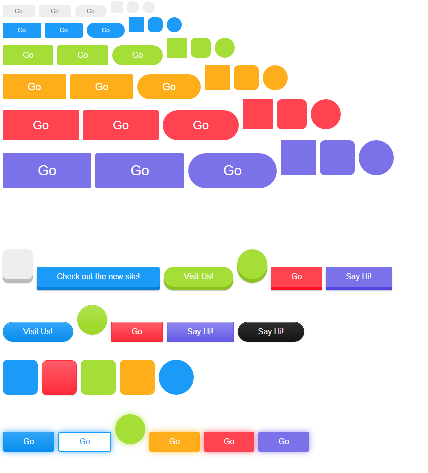
css源码
/*! @license
*
* Buttons
* Copyright 2012-2014 Alex Wolfe and Rob Levin
*
* Licensed under the Apache License, Version 2.0 (the "License");
* you may not use this file except in compliance with the License.
* You may obtain a copy of the License at
*
* http://www.apache.org/licenses/LICENSE-2.0
*
* Unless required by applicable law or agreed to in writing, software
* distributed under the License is distributed on an "AS IS" BASIS,
* WITHOUT WARRANTIES OR CONDITIONS OF ANY KIND, either express or implied.
* See the License for the specific language governing permissions and
* limitations under the License.
*/
/*
* Compass (optional)
*
* We recommend the use of autoprefixer instead of Compass
* when using buttons. However, buttons does support Compass.
* simply change $ubtn-use-compass to true and uncomment the
* @import 'compass' code below to use Compass.
*/
/*
* Required Files
*
* These files include the variables and options
* and base css styles that are required to generate buttons.
*/
/*
* $ubtn prefix (reserved)
*
* This prefix stands for Unicorn Button - ubtn
* We provide a prefix to the Sass Variables to
* prevent namespace collisions that could occur if
* you import buttons as part of your Sass build process.
* We kindly ask you not to use the prefix $ubtn in your project
* in order to avoid possilbe name conflicts. Thanks!
*/
/*
* Button Namespace (ex .button or .btn)
*
*/
/*
* Button Defaults
*
* Some default settings that are used throughout the button library.
* Changes to these settings will be picked up by all of the other modules.
* The colors used here are the default colors for the base button (gray).
* The font size and height are used to set the base size for the buttons.
* The size values will be used to calculate the larger and smaller button sizes.
*/
/*
* Button Colors
*
* $ubtn-colors is used to generate the different button colors.
* Edit or add colors to the list below and recompile.
* Each block contains the (name, background, color)
* The class is generated using the name: (ex .button-primary)
*/
/*
* Button Shapes
*
* $ubtn-shapes is used to generate the different button shapes.
* Edit or add shapes to the list below and recompile.
* Each block contains the (name, border-radius).
* The class is generated using the name: (ex .button-square).
*/
/*
* Button Sizes
*
* $ubtn-sizes is used to generate the different button sizes.
* Edit or add colors to the list below and recompile.
* Each block contains the (name, size multiplier).
* The class is generated using the name: (ex .button-giant).
*/
/*
* Color Mixin
*
* Iterates through the list of colors and creates
*
*/
/*
* No Animation
*
* Sets animation property to none
*/
/*
* Clearfix
*
* Clears floats inside the container
*/
/*
* Base Button Style
*
* The default values for the .button class
*/
.button {
color: #666;
background-color: #EEE;
border-color: #EEE;
font-weight: 300;
font-size: 16px;
font-family: "Helvetica Neue Light", "Helvetica Neue", Helvetica, Arial, "Lucida Grande", sans-serif;
text-decoration: none;
text-align: center;
line-height: 40px;
height: 40px;
padding: 0 40px;
margin: 0;
display: inline-block;
appearance: none;
cursor: pointer;
border: none;
-webkit-box-sizing: border-box;
-moz-box-sizing: border-box;
box-sizing: border-box;
-webkit-transition-property: all;
transition-property: all;
-webkit-transition-duration: .3s;
transition-duration: .3s;
/*
* Disabled State
*
* The disabled state uses the class .disabled, is-disabled,
* and the form attribute disabled="disabled".
* The use of !important is only added because this is a state
* that must be applied to all buttons when in a disabled state.
*/ }
.button:visited {
color: #666; }
.button:hover, .button:focus {
background-color: #f6f6f6;
text-decoration: none;
outline: none; }
.button:active, .button.active, .button.is-active {
text-shadow: 0 1px 0 rgba(255, 255, 255, 0.3);
text-decoration: none;
background-color: #eeeeee;
border-color: #cfcfcf;
color: #d4d4d4;
-webkit-transition-duration: 0s;
transition-duration: 0s;
-webkit-box-shadow: inset 0 1px 3px rgba(0, 0, 0, 0.2);
box-shadow: inset 0 1px 3px rgba(0, 0, 0, 0.2); }
.button.disabled, .button.is-disabled, .button:disabled {
top: 0 !important;
background: #EEE !important;
border: 1px solid #DDD !important;
text-shadow: 0 1px 1px white !important;
color: #CCC !important;
cursor: default !important;
appearance: none !important;
-webkit-box-shadow: none !important;
box-shadow: none !important;
opacity: .8 !important; }
/*
* Base Button Tyography
*
*/
.button-uppercase {
text-transform: uppercase; }
.button-lowercase {
text-transform: lowercase; }
.button-capitalize {
text-transform: capitalize; }
.button-small-caps {
font-variant: small-caps; }
.button-icon-txt-large {
font-size: 36px !important; }
/*
* Base padding
*
*/
.button-width-small {
padding: 0 10px !important; }
/*
* Base Colors
*
* Create colors for buttons
* (.button-primary, .button-secondary, etc.)
*/
.button-primary,
.button-primary-flat {
background-color: #1B9AF7;
border-color: #1B9AF7;
color: #FFF; }
.button-primary:visited,
.button-primary-flat:visited {
color: #FFF; }
.button-primary:hover, .button-primary:focus,
.button-primary-flat:hover,
.button-primary-flat:focus {
background-color: #4cb0f9;
border-color: #4cb0f9;
color: #FFF; }
.button-primary:active, .button-primary.active, .button-primary.is-active,
.button-primary-flat:active,
.button-primary-flat.active,
.button-primary-flat.is-active {
background-color: #2798eb;
border-color: #2798eb;
color: #0880d7; }
.button-plain,
.button-plain-flat {
background-color: #FFF;
border-color: #FFF;
color: #1B9AF7; }
.button-plain:visited,
.button-plain-flat:visited {
color: #1B9AF7; }
.button-plain:hover, .button-plain:focus,
.button-plain-flat:hover,
.button-plain-flat:focus {
background-color: white;
border-color: white;
color: #1B9AF7; }
.button-plain:active, .button-plain.active, .button-plain.is-active,
.button-plain-flat:active,
.button-plain-flat.active,
.button-plain-flat.is-active {
background-color: white;
border-color: white;
color: #e6e6e6; }
.button-inverse,
.button-inverse-flat {
background-color: #222;
border-color: #222;
color: #EEE; }
.button-inverse:visited,
.button-inverse-flat:visited {
color: #EEE; }
.button-inverse:hover, .button-inverse:focus,
.button-inverse-flat:hover,
.button-inverse-flat:focus {
background-color: #3c3c3c;
border-color: #3c3c3c;
color: #EEE; }
.button-inverse:active, .button-inverse.active, .button-inverse.is-active,
.button-inverse-flat:active,
.button-inverse-flat.active,
.button-inverse-flat.is-active {
background-color: #222222;
border-color: #222222;
color: #090909; }
.button-action,
.button-action-flat {
background-color: #A5DE37;
border-color: #A5DE37;
color: #FFF; }
.button-action:visited,
.button-action-flat:visited {
color: #FFF; }
.button-action:hover, .button-action:focus,
.button-action-flat:hover,
.button-action-flat:focus {
background-color: #b9e563;
border-color: #b9e563;
color: #FFF; }
.button-action:active, .button-action.active, .button-action.is-active,
.button-action-flat:active,
.button-action-flat.active,
.button-action-flat.is-active {
background-color: #a1d243;
border-color: #a1d243;
color: #8bc220; }
.button-highlight,
.button-highlight-flat {
background-color: #FEAE1B;
border-color: #FEAE1B;
color: #FFF; }
.button-highlight:visited,
.button-highlight-flat:visited {
color: #FFF; }
.button-highlight:hover, .button-highlight:focus,
.button-highlight-flat:hover,
.button-highlight-flat:focus {
background-color: #fec04e;
border-color: #fec04e;
color: #FFF; }
.button-highlight:active, .button-highlight.active, .button-highlight.is-active,
.button-highlight-flat:active,
.button-highlight-flat.active,
.button-highlight-flat.is-active {
background-color: #f3ab26;
border-color: #f3ab26;
color: #e59501; }
.button-caution,
.button-caution-flat {
background-color: #FF4351;
border-color: #FF4351;
color: #FFF; }
.button-caution:visited,
.button-caution-flat:visited {
color: #FFF; }
.button-caution:hover, .button-caution:focus,
.button-caution-flat:hover,
.button-caution-flat:focus {
background-color: #ff7680;
border-color: #ff7680;
color: #FFF; }
.button-caution:active, .button-caution.active, .button-caution.is-active,
.button-caution-flat:active,
.button-caution-flat.active,
.button-caution-flat.is-active {
background-color: #f64c59;
border-color: #f64c59;
color: #ff1022; }
.button-royal,
.button-royal-flat {
background-color: #7B72E9;
border-color: #7B72E9;
color: #FFF; }
.button-royal:visited,
.button-royal-flat:visited {
color: #FFF; }
.button-royal:hover, .button-royal:focus,
.button-royal-flat:hover,
.button-royal-flat:focus {
background-color: #a49ef0;
border-color: #a49ef0;
color: #FFF; }
.button-royal:active, .button-royal.active, .button-royal.is-active,
.button-royal-flat:active,
.button-royal-flat.active,
.button-royal-flat.is-active {
background-color: #827ae1;
border-color: #827ae1;
color: #5246e2; }
/*
* Base Layout Styles
*
* Very Miminal Layout Styles
*/
.button-block,
.button-stacked {
display: block; }
/*
* Button Types (optional)
*
* All of the files below represent the various button
* types (including shapes & sizes). None of these files
* are required. Simple remove the uneeded type below and
* the button type will be excluded from the final build
*/
/*
* Button Shapes
*
* This file creates the various button shapes
* (ex. Circle, Rounded, Pill)
*/
.button-square {
border-radius: 0; }
.button-box {
border-radius: 10px; }
.button-rounded {
border-radius: 4px; }
.button-pill {
border-radius: 200px; }
.button-circle {
border-radius: 100%; }
/*
* Size Adjustment for equal height & widht buttons
*
* Remove padding and set a fixed width.
*/
.button-circle,
.button-box,
.button-square {
padding: 0 !important;
width: 40px; }
.button-circle.button-giant,
.button-box.button-giant,
.button-square.button-giant {
width: 70px; }
.button-circle.button-jumbo,
.button-box.button-jumbo,
.button-square.button-jumbo {
width: 60px; }
.button-circle.button-large,
.button-box.button-large,
.button-square.button-large {
width: 50px; }
.button-circle.button-normal,
.button-box.button-normal,
.button-square.button-normal {
width: 40px; }
.button-circle.button-small,
.button-box.button-small,
.button-square.button-small {
width: 30px; }
.button-circle.button-tiny,
.button-box.button-tiny,
.button-square.button-tiny {
width: 24px; }
/*
* Border Buttons
*
* These buttons have no fill they only have a
* border to define their hit target.
*/
.button-border, .button-border-thin, .button-border-thick {
background: none;
border-width: 2px;
border-style: solid;
line-height: 36px; }
.button-border:hover, .button-border-thin:hover, .button-border-thick:hover {
background-color: rgba(255, 255, 255, 0.9); }
.button-border:active, .button-border-thin:active, .button-border-thick:active, .button-border.active, .active.button-border-thin, .active.button-border-thick, .button-border.is-active, .is-active.button-border-thin, .is-active.button-border-thick {
-webkit-box-shadow: none;
box-shadow: none;
text-shadow: none;
-webkit-transition-property: all;
transition-property: all;
-webkit-transition-duration: .3s;
transition-duration: .3s; }
/*
* Border Optional Sizes
*
* A slight variation in border thickness
*/
.button-border-thin {
border-width: 1px; }
.button-border-thick {
border-width: 3px; }
/*
* Border Button Colors
*
* Create colors for buttons
* (.button-primary, .button-secondary, etc.)
*/
.button-border, .button-border-thin, .button-border-thick,
.button-border-thin,
.button-border-thick {
/*
* Border Button Size Adjustment
*
* The line-height must be adjusted to compinsate for
* the width of the border.
*/ }
.button-border.button-primary, .button-primary.button-border-thin, .button-primary.button-border-thick,
.button-border-thin.button-primary,
.button-border-thick.button-primary {
color: #1B9AF7; }
.button-border.button-primary:hover, .button-primary.button-border-thin:hover, .button-primary.button-border-thick:hover, .button-border.button-primary:focus, .button-primary.button-border-thin:focus, .button-primary.button-border-thick:focus,
.button-border-thin.button-primary:hover,
.button-border-thin.button-primary:focus,
.button-border-thick.button-primary:hover,
.button-border-thick.button-primary:focus {
background-color: rgba(76, 176, 249, 0.9);
color: rgba(255, 255, 255, 0.9); }
.button-border.button-primary:active, .button-primary.button-border-thin:active, .button-primary.button-border-thick:active, .button-border.button-primary.active, .button-primary.active.button-border-thin, .button-primary.active.button-border-thick, .button-border.button-primary.is-active, .button-primary.is-active.button-border-thin, .button-primary.is-active.button-border-thick,
.button-border-thin.button-primary:active,
.button-border-thin.button-primary.active,
.button-border-thin.button-primary.is-active,
.button-border-thick.button-primary:active,
.button-border-thick.button-primary.active,
.button-border-thick.button-primary.is-active {
background-color: rgba(39, 152, 235, 0.7);
color: rgba(255, 255, 255, 0.5);
opacity: .3; }
.button-border.button-plain, .button-plain.button-border-thin, .button-plain.button-border-thick,
.button-border-thin.button-plain,
.button-border-thick.button-plain {
color: #FFF; }
.button-border.button-plain:hover, .button-plain.button-border-thin:hover, .button-plain.button-border-thick:hover, .button-border.button-plain:focus, .button-plain.button-border-thin:focus, .button-plain.button-border-thick:focus,
.button-border-thin.button-plain:hover,
.button-border-thin.button-plain:focus,
.button-border-thick.button-plain:hover,
.button-border-thick.button-plain:focus {
background-color: rgba(255, 255, 255, 0.9);
color: rgba(27, 154, 247, 0.9); }
.button-border.button-plain:active, .button-plain.button-border-thin:active, .button-plain.button-border-thick:active, .button-border.button-plain.active, .button-plain.active.button-border-thin, .button-plain.active.button-border-thick, .button-border.button-plain.is-active, .button-plain.is-active.button-border-thin, .button-plain.is-active.button-border-thick,
.button-border-thin.button-plain:active,
.button-border-thin.button-plain.active,
.button-border-thin.button-plain.is-active,
.button-border-thick.button-plain:active,
.button-border-thick.button-plain.active,
.button-border-thick.button-plain.is-active {
background-color: rgba(255, 255, 255, 0.7);
color: rgba(27, 154, 247, 0.5);
opacity: .3; }
.button-border.button-inverse, .button-inverse.button-border-thin, .button-inverse.button-border-thick,
.button-border-thin.button-inverse,
.button-border-thick.button-inverse {
color: #222; }
.button-border.button-inverse:hover, .button-inverse.button-border-thin:hover, .button-inverse.button-border-thick:hover, .button-border.button-inverse:focus, .button-inverse.button-border-thin:focus, .button-inverse.button-border-thick:focus,
.button-border-thin.button-inverse:hover,
.button-border-thin.button-inverse:focus,
.button-border-thick.button-inverse:hover,
.button-border-thick.button-inverse:focus {
background-color: rgba(60, 60, 60, 0.9);
color: rgba(238, 238, 238, 0.9); }
.button-border.button-inverse:active, .button-inverse.button-border-thin:active, .button-inverse.button-border-thick:active, .button-border.button-inverse.active, .button-inverse.active.button-border-thin, .button-inverse.active.button-border-thick, .button-border.button-inverse.is-active, .button-inverse.is-active.button-border-thin, .button-inverse.is-active.button-border-thick,
.button-border-thin.button-inverse:active,
.button-border-thin.button-inverse.active,
.button-border-thin.button-inverse.is-active,
.button-border-thick.button-inverse:active,
.button-border-thick.button-inverse.active,
.button-border-thick.button-inverse.is-active {
background-color: rgba(34, 34, 34, 0.7);
color: rgba(238, 238, 238, 0.5);
opacity: .3; }
.button-border.button-action, .button-action.button-border-thin, .button-action.button-border-thick,
.button-border-thin.button-action,
.button-border-thick.button-action {
color: #A5DE37; }
.button-border.button-action:hover, .button-action.button-border-thin:hover, .button-action.button-border-thick:hover, .button-border.button-action:focus, .button-action.button-border-thin:focus, .button-action.button-border-thick:focus,
.button-border-thin.button-action:hover,
.button-border-thin.button-action:focus,
.button-border-thick.button-action:hover,
.button-border-thick.button-action:focus {
background-color: rgba(185, 229, 99, 0.9);
color: rgba(255, 255, 255, 0.9); }
.button-border.button-action:active, .button-action.button-border-thin:active, .button-action.button-border-thick:active, .button-border.button-action.active, .button-action.active.button-border-thin, .button-action.active.button-border-thick, .button-border.button-action.is-active, .button-action.is-active.button-border-thin, .button-action.is-active.button-border-thick,
.button-border-thin.button-action:active,
.button-border-thin.button-action.active,
.button-border-thin.button-action.is-active,
.button-border-thick.button-action:active,
.button-border-thick.button-action.active,
.button-border-thick.button-action.is-active {
background-color: rgba(161, 210, 67, 0.7);
color: rgba(255, 255, 255, 0.5);
opacity: .3; }
.button-border.button-highlight, .button-highlight.button-border-thin, .button-highlight.button-border-thick,
.button-border-thin.button-highlight,
.button-border-thick.button-highlight {
color: #FEAE1B; }
.button-border.button-highlight:hover, .button-highlight.button-border-thin:hover, .button-highlight.button-border-thick:hover, .button-border.button-highlight:focus, .button-highlight.button-border-thin:focus, .button-highlight.button-border-thick:focus,
.button-border-thin.button-highlight:hover,
.button-border-thin.button-highlight:focus,
.button-border-thick.button-highlight:hover,
.button-border-thick.button-highlight:focus {
background-color: rgba(254, 192, 78, 0.9);
color: rgba(255, 255, 255, 0.9); }
.button-border.button-highlight:active, .button-highlight.button-border-thin:active, .button-highlight.button-border-thick:active, .button-border.button-highlight.active, .button-highlight.active.button-border-thin, .button-highlight.active.button-border-thick, .button-border.button-highlight.is-active, .button-highlight.is-active.button-border-thin, .button-highlight.is-active.button-border-thick,
.button-border-thin.button-highlight:active,
.button-border-thin.button-highlight.active,
.button-border-thin.button-highlight.is-active,
.button-border-thick.button-highlight:active,
.button-border-thick.button-highlight.active,
.button-border-thick.button-highlight.is-active {
background-color: rgba(243, 171, 38, 0.7);
color: rgba(255, 255, 255, 0.5);
opacity: .3; }
.button-border.button-caution, .button-caution.button-border-thin, .button-caution.button-border-thick,
.button-border-thin.button-caution,
.button-border-thick.button-caution {
color: #FF4351; }
.button-border.button-caution:hover, .button-caution.button-border-thin:hover, .button-caution.button-border-thick:hover, .button-border.button-caution:focus, .button-caution.button-border-thin:focus, .button-caution.button-border-thick:focus,
.button-border-thin.button-caution:hover,
.button-border-thin.button-caution:focus,
.button-border-thick.button-caution:hover,
.button-border-thick.button-caution:focus {
background-color: rgba(255, 118, 128, 0.9);
color: rgba(255, 255, 255, 0.9); }
.button-border.button-caution:active, .button-caution.button-border-thin:active, .button-caution.button-border-thick:active, .button-border.button-caution.active, .button-caution.active.button-border-thin, .button-caution.active.button-border-thick, .button-border.button-caution.is-active, .button-caution.is-active.button-border-thin, .button-caution.is-active.button-border-thick,
.button-border-thin.button-caution:active,
.button-border-thin.button-caution.active,
.button-border-thin.button-caution.is-active,
.button-border-thick.button-caution:active,
.button-border-thick.button-caution.active,
.button-border-thick.button-caution.is-active {
background-color: rgba(246, 76, 89, 0.7);
color: rgba(255, 255, 255, 0.5);
opacity: .3; }
.button-border.button-royal, .button-royal.button-border-thin, .button-royal.button-border-thick,
.button-border-thin.button-royal,
.button-border-thick.button-royal {
color: #7B72E9; }
.button-border.button-royal:hover, .button-royal.button-border-thin:hover, .button-royal.button-border-thick:hover, .button-border.button-royal:focus, .button-royal.button-border-thin:focus, .button-royal.button-border-thick:focus,
.button-border-thin.button-royal:hover,
.button-border-thin.button-royal:focus,
.button-border-thick.button-royal:hover,
.button-border-thick.button-royal:focus {
background-color: rgba(164, 158, 240, 0.9);
color: rgba(255, 255, 255, 0.9); }
.button-border.button-royal:active, .button-royal.button-border-thin:active, .button-royal.button-border-thick:active, .button-border.button-royal.active, .button-royal.active.button-border-thin, .button-royal.active.button-border-thick, .button-border.button-royal.is-active, .button-royal.is-active.button-border-thin, .button-royal.is-active.button-border-thick,
.button-border-thin.button-royal:active,
.button-border-thin.button-royal.active,
.button-border-thin.button-royal.is-active,
.button-border-thick.button-royal:active,
.button-border-thick.button-royal.active,
.button-border-thick.button-royal.is-active {
background-color: rgba(130, 122, 225, 0.7);
color: rgba(255, 255, 255, 0.5);
opacity: .3; }
.button-border.button-giant, .button-giant.button-border-thin, .button-giant.button-border-thick,
.button-border-thin.button-giant,
.button-border-thick.button-giant {
line-height: 66px; }
.button-border.button-jumbo, .button-jumbo.button-border-thin, .button-jumbo.button-border-thick,
.button-border-thin.button-jumbo,
.button-border-thick.button-jumbo {
line-height: 56px; }
.button-border.button-large, .button-large.button-border-thin, .button-large.button-border-thick,
.button-border-thin.button-large,
.button-border-thick.button-large {
line-height: 46px; }
.button-border.button-normal, .button-normal.button-border-thin, .button-normal.button-border-thick,
.button-border-thin.button-normal,
.button-border-thick.button-normal {
line-height: 36px; }
.button-border.button-small, .button-small.button-border-thin, .button-small.button-border-thick,
.button-border-thin.button-small,
.button-border-thick.button-small {
line-height: 26px; }
.button-border.button-tiny, .button-tiny.button-border-thin, .button-tiny.button-border-thick,
.button-border-thin.button-tiny,
.button-border-thick.button-tiny {
line-height: 20px; }
/*
* Border Buttons
*
* These buttons have no fill they only have a
* border to define their hit target.
*/
.button-borderless {
background: none;
border: none;
padding: 0 8px !important;
color: #EEE;
font-size: 20.8px;
font-weight: 200;
/*
* Borderless Button Colors
*
* Create colors for buttons
* (.button-primary, .button-secondary, etc.)
*/
/*
* Borderles Size Adjustment
*
* The font-size must be large to compinsate for
* the lack of a hit target.
*/ }
.button-borderless:hover, .button-borderless:focus {
background: none; }
.button-borderless:active, .button-borderless.active, .button-borderless.is-active {
-webkit-box-shadow: none;
box-shadow: none;
text-shadow: none;
-webkit-transition-property: all;
transition-property: all;
-webkit-transition-duration: .3s;
transition-duration: .3s;
opacity: .3; }
.button-borderless.button-primary {
color: #1B9AF7; }
.button-borderless.button-plain {
color: #FFF; }
.button-borderless.button-inverse {
color: #222; }
.button-borderless.button-action {
color: #A5DE37; }
.button-borderless.button-highlight {
color: #FEAE1B; }
.button-borderless.button-caution {
color: #FF4351; }
.button-borderless.button-royal {
color: #7B72E9; }
.button-borderless.button-giant {
font-size: 36.4px;
height: 52.4px;
line-height: 52.4px; }
.button-borderless.button-jumbo {
font-size: 31.2px;
height: 47.2px;
line-height: 47.2px; }
.button-borderless.button-large {
font-size: 26px;
height: 42px;
line-height: 42px; }
.button-borderless.button-normal {
font-size: 20.8px;
height: 36.8px;
line-height: 36.8px; }
.button-borderless.button-small {
font-size: 15.6px;
height: 31.6px;
line-height: 31.6px; }
.button-borderless.button-tiny {
font-size: 12.48px;
height: 28.48px;
line-height: 28.48px; }
/*
* Raised Buttons
*
* A classic looking button that offers
* great depth and affordance.
*/
.button-raised {
border-color: #e1e1e1;
border-style: solid;
border-width: 1px;
line-height: 38px;
background: -webkit-gradient(linear, left top, left bottom, from(#f6f6f6), to(#e1e1e1));
background: linear-gradient(#f6f6f6, #e1e1e1);
-webkit-box-shadow: inset 0px 1px 0px rgba(255, 255, 255, 0.3), 0 1px 2px rgba(0, 0, 0, 0.15);
box-shadow: inset 0px 1px 0px rgba(255, 255, 255, 0.3), 0 1px 2px rgba(0, 0, 0, 0.15); }
.button-raised:hover, .button-raised:focus {
background: -webkit-gradient(linear, left top, left bottom, from(white), to(gainsboro));
background: linear-gradient(top, white, gainsboro); }
.button-raised:active, .button-raised.active, .button-raised.is-active {
background: #eeeeee;
-webkit-box-shadow: inset 0px 1px 3px rgba(0, 0, 0, 0.2), 0px 1px 0px white;
box-shadow: inset 0px 1px 3px rgba(0, 0, 0, 0.2), 0px 1px 0px white; }
/*
* Raised Button Colors
*
* Create colors for raised buttons
*/
.button-raised.button-primary {
border-color: #088ef0;
background: -webkit-gradient(linear, left top, left bottom, from(#34a5f8), to(#088ef0));
background: linear-gradient(#34a5f8, #088ef0); }
.button-raised.button-primary:hover, .button-raised.button-primary:focus {
background: -webkit-gradient(linear, left top, left bottom, from(#42abf8), to(#0888e6));
background: linear-gradient(top, #42abf8, #0888e6); }
.button-raised.button-primary:active, .button-raised.button-primary.active, .button-raised.button-primary.is-active {
border-color: #0880d7;
background: #2798eb; }
.button-raised.button-plain {
border-color: #f2f2f2;
background: -webkit-gradient(linear, left top, left bottom, from(white), to(#f2f2f2));
background: linear-gradient(white, #f2f2f2); }
.button-raised.button-plain:hover, .button-raised.button-plain:focus {
background: -webkit-gradient(linear, left top, left bottom, from(white), to(#ededed));
background: linear-gradient(top, white, #ededed); }
.button-raised.button-plain:active, .button-raised.button-plain.active, .button-raised.button-plain.is-active {
border-color: #e6e6e6;
background: white; }
.button-raised.button-inverse {
border-color: #151515;
background: -webkit-gradient(linear, left top, left bottom, from(#2f2f2f), to(#151515));
background: linear-gradient(#2f2f2f, #151515); }
.button-raised.button-inverse:hover, .button-raised.button-inverse:focus {
background: -webkit-gradient(linear, left top, left bottom, from(#363636), to(#101010));
background: linear-gradient(top, #363636, #101010); }
.button-raised.button-inverse:active, .button-raised.button-inverse.active, .button-raised.button-inverse.is-active {
border-color: #090909;
background: #222222; }
.button-raised.button-action {
border-color: #9ad824;
background: -webkit-gradient(linear, left top, left bottom, from(#afe24d), to(#9ad824));
background: linear-gradient(#afe24d, #9ad824); }
.button-raised.button-action:hover, .button-raised.button-action:focus {
background: -webkit-gradient(linear, left top, left bottom, from(#b5e45a), to(#94cf22));
background: linear-gradient(top, #b5e45a, #94cf22); }
.button-raised.button-action:active, .button-raised.button-action.active, .button-raised.button-action.is-active {
border-color: #8bc220;
background: #a1d243; }
.button-raised.button-highlight {
border-color: #fea502;
background: -webkit-gradient(linear, left top, left bottom, from(#feb734), to(#fea502));
background: linear-gradient(#feb734, #fea502); }
.button-raised.button-highlight:hover, .button-raised.button-highlight:focus {
background: -webkit-gradient(linear, left top, left bottom, from(#febc44), to(#f49f01));
background: linear-gradient(top, #febc44, #f49f01); }
.button-raised.button-highlight:active, .button-raised.button-highlight.active, .button-raised.button-highlight.is-active {
border-color: #e59501;
background: #f3ab26; }
.button-raised.button-caution {
border-color: #ff2939;
background: -webkit-gradient(linear, left top, left bottom, from(#ff5c69), to(#ff2939));
background: linear-gradient(#ff5c69, #ff2939); }
.button-raised.button-caution:hover, .button-raised.button-caution:focus {
background: -webkit-gradient(linear, left top, left bottom, from(#ff6c77), to(#ff1f30));
background: linear-gradient(top, #ff6c77, #ff1f30); }
.button-raised.button-caution:active, .button-raised.button-caution.active, .button-raised.button-caution.is-active {
border-color: #ff1022;
background: #f64c59; }
.button-raised.button-royal {
border-color: #665ce6;
background: -webkit-gradient(linear, left top, left bottom, from(#9088ec), to(#665ce6));
background: linear-gradient(#9088ec, #665ce6); }
.button-raised.button-royal:hover, .button-raised.button-royal:focus {
background: -webkit-gradient(linear, left top, left bottom, from(#9c95ef), to(#5e53e4));
background: linear-gradient(top, #9c95ef, #5e53e4); }
.button-raised.button-royal:active, .button-raised.button-royal.active, .button-raised.button-royal.is-active {
border-color: #5246e2;
background: #827ae1; }
/*
* 3D Buttons
*
* These buttons have a heavy three dimensional
* style that mimics the visual appearance of a
* real life button.
*/
.button-3d {
position: relative;
top: 0;
-webkit-box-shadow: 0 7px 0 #bbbbbb, 0 8px 3px rgba(0, 0, 0, 0.2);
box-shadow: 0 7px 0 #bbbbbb, 0 8px 3px rgba(0, 0, 0, 0.2); }
.button-3d:hover, .button-3d:focus {
-webkit-box-shadow: 0 7px 0 #bbbbbb, 0 8px 3px rgba(0, 0, 0, 0.2);
box-shadow: 0 7px 0 #bbbbbb, 0 8px 3px rgba(0, 0, 0, 0.2); }
.button-3d:active, .button-3d.active, .button-3d.is-active {
top: 5px;
-webkit-transition-property: all;
transition-property: all;
-webkit-transition-duration: .15s;
transition-duration: .15s;
-webkit-box-shadow: 0 2px 0 #bbbbbb, 0 3px 3px rgba(0, 0, 0, 0.2);
box-shadow: 0 2px 0 #bbbbbb, 0 3px 3px rgba(0, 0, 0, 0.2); }
/*
* 3D Button Colors
*
* Create colors for buttons
* (.button-primary, .button-secondary, etc.)
*/
.button-3d.button-primary {
-webkit-box-shadow: 0 7px 0 #0880d7, 0 8px 3px rgba(0, 0, 0, 0.3);
box-shadow: 0 7px 0 #0880d7, 0 8px 3px rgba(0, 0, 0, 0.3); }
.button-3d.button-primary:hover, .button-3d.button-primary:focus {
-webkit-box-shadow: 0 7px 0 #077ace, 0 8px 3px rgba(0, 0, 0, 0.3);
box-shadow: 0 7px 0 #077ace, 0 8px 3px rgba(0, 0, 0, 0.3); }
.button-3d.button-primary:active, .button-3d.button-primary.active, .button-3d.button-primary.is-active {
-webkit-box-shadow: 0 2px 0 #0662a6, 0 3px 3px rgba(0, 0, 0, 0.2);
box-shadow: 0 2px 0 #0662a6, 0 3px 3px rgba(0, 0, 0, 0.2); }
.button-3d.button-plain {
-webkit-box-shadow: 0 7px 0 #e6e6e6, 0 8px 3px rgba(0, 0, 0, 0.3);
box-shadow: 0 7px 0 #e6e6e6, 0 8px 3px rgba(0, 0, 0, 0.3); }
.button-3d.button-plain:hover, .button-3d.button-plain:focus {
-webkit-box-shadow: 0 7px 0 #e0e0e0, 0 8px 3px rgba(0, 0, 0, 0.3);
box-shadow: 0 7px 0 #e0e0e0, 0 8px 3px rgba(0, 0, 0, 0.3); }
.button-3d.button-plain:active, .button-3d.button-plain.active, .button-3d.button-plain.is-active {
-webkit-box-shadow: 0 2px 0 #cccccc, 0 3px 3px rgba(0, 0, 0, 0.2);
box-shadow: 0 2px 0 #cccccc, 0 3px 3px rgba(0, 0, 0, 0.2); }
.button-3d.button-inverse {
-webkit-box-shadow: 0 7px 0 #090909, 0 8px 3px rgba(0, 0, 0, 0.3);
box-shadow: 0 7px 0 #090909, 0 8px 3px rgba(0, 0, 0, 0.3); }
.button-3d.button-inverse:hover, .button-3d.button-inverse:focus {
-webkit-box-shadow: 0 7px 0 #030303, 0 8px 3px rgba(0, 0, 0, 0.3);
box-shadow: 0 7px 0 #030303, 0 8px 3px rgba(0, 0, 0, 0.3); }
.button-3d.button-inverse:active, .button-3d.button-inverse.active, .button-3d.button-inverse.is-active {
-webkit-box-shadow: 0 2px 0 black, 0 3px 3px rgba(0, 0, 0, 0.2);
box-shadow: 0 2px 0 black, 0 3px 3px rgba(0, 0, 0, 0.2); }
.button-3d.button-action {
-webkit-box-shadow: 0 7px 0 #8bc220, 0 8px 3px rgba(0, 0, 0, 0.3);
box-shadow: 0 7px 0 #8bc220, 0 8px 3px rgba(0, 0, 0, 0.3); }
.button-3d.button-action:hover, .button-3d.button-action:focus {
-webkit-box-shadow: 0 7px 0 #84b91f, 0 8px 3px rgba(0, 0, 0, 0.3);
box-shadow: 0 7px 0 #84b91f, 0 8px 3px rgba(0, 0, 0, 0.3); }
.button-3d.button-action:active, .button-3d.button-action.active, .button-3d.button-action.is-active {
-webkit-box-shadow: 0 2px 0 #6b9619, 0 3px 3px rgba(0, 0, 0, 0.2);
box-shadow: 0 2px 0 #6b9619, 0 3px 3px rgba(0, 0, 0, 0.2); }
.button-3d.button-highlight {
-webkit-box-shadow: 0 7px 0 #e59501, 0 8px 3px rgba(0, 0, 0, 0.3);
box-shadow: 0 7px 0 #e59501, 0 8px 3px rgba(0, 0, 0, 0.3); }
.button-3d.button-highlight:hover, .button-3d.button-highlight:focus {
-webkit-box-shadow: 0 7px 0 #db8e01, 0 8px 3px rgba(0, 0, 0, 0.3);
box-shadow: 0 7px 0 #db8e01, 0 8px 3px rgba(0, 0, 0, 0.3); }
.button-3d.button-highlight:active, .button-3d.button-highlight.active, .button-3d.button-highlight.is-active {
-webkit-box-shadow: 0 2px 0 #b27401, 0 3px 3px rgba(0, 0, 0, 0.2);
box-shadow: 0 2px 0 #b27401, 0 3px 3px rgba(0, 0, 0, 0.2); }
.button-3d.button-caution {
-webkit-box-shadow: 0 7px 0 #ff1022, 0 8px 3px rgba(0, 0, 0, 0.3);
box-shadow: 0 7px 0 #ff1022, 0 8px 3px rgba(0, 0, 0, 0.3); }
.button-3d.button-caution:hover, .button-3d.button-caution:focus {
-webkit-box-shadow: 0 7px 0 #ff0618, 0 8px 3px rgba(0, 0, 0, 0.3);
box-shadow: 0 7px 0 #ff0618, 0 8px 3px rgba(0, 0, 0, 0.3); }
.button-3d.button-caution:active, .button-3d.button-caution.active, .button-3d.button-caution.is-active {
-webkit-box-shadow: 0 2px 0 #dc0010, 0 3px 3px rgba(0, 0, 0, 0.2);
box-shadow: 0 2px 0 #dc0010, 0 3px 3px rgba(0, 0, 0, 0.2); }
.button-3d.button-royal {
-webkit-box-shadow: 0 7px 0 #5246e2, 0 8px 3px rgba(0, 0, 0, 0.3);
box-shadow: 0 7px 0 #5246e2, 0 8px 3px rgba(0, 0, 0, 0.3); }
.button-3d.button-royal:hover, .button-3d.button-royal:focus {
-webkit-box-shadow: 0 7px 0 #493de1, 0 8px 3px rgba(0, 0, 0, 0.3);
box-shadow: 0 7px 0 #493de1, 0 8px 3px rgba(0, 0, 0, 0.3); }
.button-3d.button-royal:active, .button-3d.button-royal.active, .button-3d.button-royal.is-active {
-webkit-box-shadow: 0 2px 0 #2f21d4, 0 3px 3px rgba(0, 0, 0, 0.2);
box-shadow: 0 2px 0 #2f21d4, 0 3px 3px rgba(0, 0, 0, 0.2); }
/*
* Glowing Buttons
*
* A pulse like glow that appears
* rythmically around the edges of
* a button.
*/
/*
* Glow animation mixin for Compass users
*
*/
/*
* Glowing Keyframes
*
*/
@-webkit-keyframes glowing {
from {
-webkit-box-shadow: 0 0 0 rgba(44, 154, 219, 0.3);
box-shadow: 0 0 0 rgba(44, 154, 219, 0.3); }
50% {
-webkit-box-shadow: 0 0 20px rgba(44, 154, 219, 0.8);
box-shadow: 0 0 20px rgba(44, 154, 219, 0.8); }
to {
-webkit-box-shadow: 0 0 0 rgba(44, 154, 219, 0.3);
box-shadow: 0 0 0 rgba(44, 154, 219, 0.3); } }
@keyframes glowing {
from {
-webkit-box-shadow: 0 0 0 rgba(44, 154, 219, 0.3);
box-shadow: 0 0 0 rgba(44, 154, 219, 0.3); }
50% {
-webkit-box-shadow: 0 0 20px rgba(44, 154, 219, 0.8);
box-shadow: 0 0 20px rgba(44, 154, 219, 0.8); }
to {
-webkit-box-shadow: 0 0 0 rgba(44, 154, 219, 0.3);
box-shadow: 0 0 0 rgba(44, 154, 219, 0.3); } }
/*
* Glowing Keyframes for various colors
*
*/
@-webkit-keyframes glowing-primary {
from {
-webkit-box-shadow: 0 0 0 rgba(27, 154, 247, 0.3);
box-shadow: 0 0 0 rgba(27, 154, 247, 0.3); }
50% {
-webkit-box-shadow: 0 0 20px rgba(27, 154, 247, 0.8);
box-shadow: 0 0 20px rgba(27, 154, 247, 0.8); }
to {
-webkit-box-shadow: 0 0 0 rgba(27, 154, 247, 0.3);
box-shadow: 0 0 0 rgba(27, 154, 247, 0.3); } }
@keyframes glowing-primary {
from {
-webkit-box-shadow: 0 0 0 rgba(27, 154, 247, 0.3);
box-shadow: 0 0 0 rgba(27, 154, 247, 0.3); }
50% {
-webkit-box-shadow: 0 0 20px rgba(27, 154, 247, 0.8);
box-shadow: 0 0 20px rgba(27, 154, 247, 0.8); }
to {
-webkit-box-shadow: 0 0 0 rgba(27, 154, 247, 0.3);
box-shadow: 0 0 0 rgba(27, 154, 247, 0.3); } }
@-webkit-keyframes glowing-plain {
from {
-webkit-box-shadow: 0 0 0 rgba(255, 255, 255, 0.3);
box-shadow: 0 0 0 rgba(255, 255, 255, 0.3); }
50% {
-webkit-box-shadow: 0 0 20px rgba(255, 255, 255, 0.8);
box-shadow: 0 0 20px rgba(255, 255, 255, 0.8); }
to {
-webkit-box-shadow: 0 0 0 rgba(255, 255, 255, 0.3);
box-shadow: 0 0 0 rgba(255, 255, 255, 0.3); } }
@keyframes glowing-plain {
from {
-webkit-box-shadow: 0 0 0 rgba(255, 255, 255, 0.3);
box-shadow: 0 0 0 rgba(255, 255, 255, 0.3); }
50% {
-webkit-box-shadow: 0 0 20px rgba(255, 255, 255, 0.8);
box-shadow: 0 0 20px rgba(255, 255, 255, 0.8); }
to {
-webkit-box-shadow: 0 0 0 rgba(255, 255, 255, 0.3);
box-shadow: 0 0 0 rgba(255, 255, 255, 0.3); } }
@-webkit-keyframes glowing-inverse {
from {
-webkit-box-shadow: 0 0 0 rgba(34, 34, 34, 0.3);
box-shadow: 0 0 0 rgba(34, 34, 34, 0.3); }
50% {
-webkit-box-shadow: 0 0 20px rgba(34, 34, 34, 0.8);
box-shadow: 0 0 20px rgba(34, 34, 34, 0.8); }
to {
-webkit-box-shadow: 0 0 0 rgba(34, 34, 34, 0.3);
box-shadow: 0 0 0 rgba(34, 34, 34, 0.3); } }
@keyframes glowing-inverse {
from {
-webkit-box-shadow: 0 0 0 rgba(34, 34, 34, 0.3);
box-shadow: 0 0 0 rgba(34, 34, 34, 0.3); }
50% {
-webkit-box-shadow: 0 0 20px rgba(34, 34, 34, 0.8);
box-shadow: 0 0 20px rgba(34, 34, 34, 0.8); }
to {
-webkit-box-shadow: 0 0 0 rgba(34, 34, 34, 0.3);
box-shadow: 0 0 0 rgba(34, 34, 34, 0.3); } }
@-webkit-keyframes glowing-action {
from {
-webkit-box-shadow: 0 0 0 rgba(165, 222, 55, 0.3);
box-shadow: 0 0 0 rgba(165, 222, 55, 0.3); }
50% {
-webkit-box-shadow: 0 0 20px rgba(165, 222, 55, 0.8);
box-shadow: 0 0 20px rgba(165, 222, 55, 0.8); }
to {
-webkit-box-shadow: 0 0 0 rgba(165, 222, 55, 0.3);
box-shadow: 0 0 0 rgba(165, 222, 55, 0.3); } }
@keyframes glowing-action {
from {
-webkit-box-shadow: 0 0 0 rgba(165, 222, 55, 0.3);
box-shadow: 0 0 0 rgba(165, 222, 55, 0.3); }
50% {
-webkit-box-shadow: 0 0 20px rgba(165, 222, 55, 0.8);
box-shadow: 0 0 20px rgba(165, 222, 55, 0.8); }
to {
-webkit-box-shadow: 0 0 0 rgba(165, 222, 55, 0.3);
box-shadow: 0 0 0 rgba(165, 222, 55, 0.3); } }
@-webkit-keyframes glowing-highlight {
from {
-webkit-box-shadow: 0 0 0 rgba(254, 174, 27, 0.3);
box-shadow: 0 0 0 rgba(254, 174, 27, 0.3); }
50% {
-webkit-box-shadow: 0 0 20px rgba(254, 174, 27, 0.8);
box-shadow: 0 0 20px rgba(254, 174, 27, 0.8); }
to {
-webkit-box-shadow: 0 0 0 rgba(254, 174, 27, 0.3);
box-shadow: 0 0 0 rgba(254, 174, 27, 0.3); } }
@keyframes glowing-highlight {
from {
-webkit-box-shadow: 0 0 0 rgba(254, 174, 27, 0.3);
box-shadow: 0 0 0 rgba(254, 174, 27, 0.3); }
50% {
-webkit-box-shadow: 0 0 20px rgba(254, 174, 27, 0.8);
box-shadow: 0 0 20px rgba(254, 174, 27, 0.8); }
to {
-webkit-box-shadow: 0 0 0 rgba(254, 174, 27, 0.3);
box-shadow: 0 0 0 rgba(254, 174, 27, 0.3); } }
@-webkit-keyframes glowing-caution {
from {
-webkit-box-shadow: 0 0 0 rgba(255, 67, 81, 0.3);
box-shadow: 0 0 0 rgba(255, 67, 81, 0.3); }
50% {
-webkit-box-shadow: 0 0 20px rgba(255, 67, 81, 0.8);
box-shadow: 0 0 20px rgba(255, 67, 81, 0.8); }
to {
-webkit-box-shadow: 0 0 0 rgba(255, 67, 81, 0.3);
box-shadow: 0 0 0 rgba(255, 67, 81, 0.3); } }
@keyframes glowing-caution {
from {
-webkit-box-shadow: 0 0 0 rgba(255, 67, 81, 0.3);
box-shadow: 0 0 0 rgba(255, 67, 81, 0.3); }
50% {
-webkit-box-shadow: 0 0 20px rgba(255, 67, 81, 0.8);
box-shadow: 0 0 20px rgba(255, 67, 81, 0.8); }
to {
-webkit-box-shadow: 0 0 0 rgba(255, 67, 81, 0.3);
box-shadow: 0 0 0 rgba(255, 67, 81, 0.3); } }
@-webkit-keyframes glowing-royal {
from {
-webkit-box-shadow: 0 0 0 rgba(123, 114, 233, 0.3);
box-shadow: 0 0 0 rgba(123, 114, 233, 0.3); }
50% {
-webkit-box-shadow: 0 0 20px rgba(123, 114, 233, 0.8);
box-shadow: 0 0 20px rgba(123, 114, 233, 0.8); }
to {
-webkit-box-shadow: 0 0 0 rgba(123, 114, 233, 0.3);
box-shadow: 0 0 0 rgba(123, 114, 233, 0.3); } }
@keyframes glowing-royal {
from {
-webkit-box-shadow: 0 0 0 rgba(123, 114, 233, 0.3);
box-shadow: 0 0 0 rgba(123, 114, 233, 0.3); }
50% {
-webkit-box-shadow: 0 0 20px rgba(123, 114, 233, 0.8);
box-shadow: 0 0 20px rgba(123, 114, 233, 0.8); }
to {
-webkit-box-shadow: 0 0 0 rgba(123, 114, 233, 0.3);
box-shadow: 0 0 0 rgba(123, 114, 233, 0.3); } }
/*
* Glowing Buttons Base Styes
*
* A pulse like glow that appears
* rythmically around the edges of
* a button.
*/
.button-glow {
-webkit-animation-duration: 3s;
animation-duration: 3s;
-webkit-animation-iteration-count: infinite;
animation-iteration-count: infinite;
-webkit-animation-name: glowing;
animation-name: glowing; }
.button-glow:active, .button-glow.active, .button-glow.is-active {
-webkit-animation-name: none;
animation-name: none; }
/*
* Glowing Button Colors
*
* Create colors for glowing buttons
*/
.button-glow.button-primary {
-webkit-animation-name: glowing-primary;
animation-name: glowing-primary; }
.button-glow.button-plain {
-webkit-animation-name: glowing-plain;
animation-name: glowing-plain; }
.button-glow.button-inverse {
-webkit-animation-name: glowing-inverse;
animation-name: glowing-inverse; }
.button-glow.button-action {
-webkit-animation-name: glowing-action;
animation-name: glowing-action; }
.button-glow.button-highlight {
-webkit-animation-name: glowing-highlight;
animation-name: glowing-highlight; }
.button-glow.button-caution {
-webkit-animation-name: glowing-caution;
animation-name: glowing-caution; }
.button-glow.button-royal {
-webkit-animation-name: glowing-royal;
animation-name: glowing-royal; }
/*
* Dropdown menu buttons
*
* A dropdown menu appears
* when a button is pressed
*/
/*
* Dropdown Container
*
*/
.button-dropdown {
position: relative;
overflow: visible;
display: inline-block; }
/*
* Dropdown List Style
*
*/
.button-dropdown-list {
display: none;
position: absolute;
padding: 0;
margin: 0;
top: 0;
left: 0;
z-index: 1000;
min-width: 100%;
list-style-type: none;
background: rgba(255, 255, 255, 0.95);
border-style: solid;
border-width: 1px;
border-color: #d4d4d4;
font-family: "Helvetica Neue Light", "Helvetica Neue", Helvetica, Arial, "Lucida Grande", sans-serif;
-webkit-box-shadow: 0 2px 7px rgba(0, 0, 0, 0.2);
box-shadow: 0 2px 7px rgba(0, 0, 0, 0.2);
border-radius: 3px;
-webkit-box-sizing: border-box;
-moz-box-sizing: border-box;
box-sizing: border-box;
/*
* Dropdown Below
*
*/
/*
* Dropdown Above
*
*/ }
.button-dropdown-list.is-below {
top: 100%;
border-top: none;
border-radius: 0 0 3px 3px; }
.button-dropdown-list.is-above {
bottom: 100%;
top: auto;
border-bottom: none;
border-radius: 3px 3px 0 0;
-webkit-box-shadow: 0 -2px 7px rgba(0, 0, 0, 0.2);
box-shadow: 0 -2px 7px rgba(0, 0, 0, 0.2); }
/*
* Dropdown Buttons
*
*/
.button-dropdown-list > li {
padding: 0;
margin: 0;
display: block; }
.button-dropdown-list > li > a {
display: block;
line-height: 40px;
font-size: 12.8px;
padding: 5px 10px;
float: none;
color: #666;
text-decoration: none; }
.button-dropdown-list > li > a:hover {
color: #5e5e5e;
background: #f6f6f6;
text-decoration: none; }
.button-dropdown-divider {
border-top: 1px solid #e6e6e6; }
/*
* Dropdown Colors
*
* Create colors for buttons
* (.button-primary, .button-secondary, etc.)
*/
.button-dropdown.button-dropdown-primary .button-dropdown-list {
background: rgba(27, 154, 247, 0.95);
border-color: #0880d7; }
.button-dropdown.button-dropdown-primary .button-dropdown-list .button-dropdown-divider {
border-color: #0888e6; }
.button-dropdown.button-dropdown-primary .button-dropdown-list > li > a {
color: #FFF; }
.button-dropdown.button-dropdown-primary .button-dropdown-list > li > a:hover {
color: #f2f2f2;
background: #088ef0; }
.button-dropdown.button-dropdown-plain .button-dropdown-list {
background: rgba(255, 255, 255, 0.95);
border-color: #e6e6e6; }
.button-dropdown.button-dropdown-plain .button-dropdown-list .button-dropdown-divider {
border-color: #ededed; }
.button-dropdown.button-dropdown-plain .button-dropdown-list > li > a {
color: #1B9AF7; }
.button-dropdown.button-dropdown-plain .button-dropdown-list > li > a:hover {
color: #088ef0;
background: #f2f2f2; }
.button-dropdown.button-dropdown-inverse .button-dropdown-list {
background: rgba(34, 34, 34, 0.95);
border-color: #090909; }
.button-dropdown.button-dropdown-inverse .button-dropdown-list .button-dropdown-divider {
border-color: #101010; }
.button-dropdown.button-dropdown-inverse .button-dropdown-list > li > a {
color: #EEE; }
.button-dropdown.button-dropdown-inverse .button-dropdown-list > li > a:hover {
color: #e1e1e1;
background: #151515; }
.button-dropdown.button-dropdown-action .button-dropdown-list {
background: rgba(165, 222, 55, 0.95);
border-color: #8bc220; }
.button-dropdown.button-dropdown-action .button-dropdown-list .button-dropdown-divider {
border-color: #94cf22; }
.button-dropdown.button-dropdown-action .button-dropdown-list > li > a {
color: #FFF; }
.button-dropdown.button-dropdown-action .button-dropdown-list > li > a:hover {
color: #f2f2f2;
background: #9ad824; }
.button-dropdown.button-dropdown-highlight .button-dropdown-list {
background: rgba(254, 174, 27, 0.95);
border-color: #e59501; }
.button-dropdown.button-dropdown-highlight .button-dropdown-list .button-dropdown-divider {
border-color: #f49f01; }
.button-dropdown.button-dropdown-highlight .button-dropdown-list > li > a {
color: #FFF; }
.button-dropdown.button-dropdown-highlight .button-dropdown-list > li > a:hover {
color: #f2f2f2;
background: #fea502; }
.button-dropdown.button-dropdown-caution .button-dropdown-list {
background: rgba(255, 67, 81, 0.95);
border-color: #ff1022; }
.button-dropdown.button-dropdown-caution .button-dropdown-list .button-dropdown-divider {
border-color: #ff1f30; }
.button-dropdown.button-dropdown-caution .button-dropdown-list > li > a {
color: #FFF; }
.button-dropdown.button-dropdown-caution .button-dropdown-list > li > a:hover {
color: #f2f2f2;
background: #ff2939; }
.button-dropdown.button-dropdown-royal .button-dropdown-list {
background: rgba(123, 114, 233, 0.95);
border-color: #5246e2; }
.button-dropdown.button-dropdown-royal .button-dropdown-list .button-dropdown-divider {
border-color: #5e53e4; }
.button-dropdown.button-dropdown-royal .button-dropdown-list > li > a {
color: #FFF; }
.button-dropdown.button-dropdown-royal .button-dropdown-list > li > a:hover {
color: #f2f2f2;
background: #665ce6; }
/*
* Buton Groups
*
* A group of related buttons
* displayed edge to edge
*/
.button-group {
position: relative;
display: inline-block; }
.button-group:after {
content: " ";
display: block;
clear: both; }
.button-group .button,
.button-group .button-dropdown {
float: left; }
.button-group .button:not(:first-child):not(:last-child),
.button-group .button-dropdown:not(:first-child):not(:last-child) {
border-radius: 0;
border-right: none; }
.button-group .button:first-child,
.button-group .button-dropdown:first-child {
border-top-right-radius: 0;
border-bottom-right-radius: 0;
border-right: none; }
.button-group .button:last-child,
.button-group .button-dropdown:last-child {
border-top-left-radius: 0;
border-bottom-left-radius: 0; }
/*
* Button Wrapper
*
* A wrap around effect to highlight
* the shape of the button and offer
* a subtle visual effect.
*/
.button-wrap {
border: 1px solid #e3e3e3;
display: inline-block;
padding: 9px;
background: -webkit-gradient(linear, left top, left bottom, from(#f2f2f2), to(#FFF));
background: linear-gradient(#f2f2f2, #FFF);
border-radius: 200px;
-webkit-box-shadow: inset 0 1px 3px rgba(0, 0, 0, 0.04);
box-shadow: inset 0 1px 3px rgba(0, 0, 0, 0.04); }
/*
* Long Shadow Buttons
*
* A visual effect adding a flat shadow to the text of a button
*/
/*
* Long Shadow Function
*
* Loops $length times building a long shadow. Defaults downward right
*/
/*
* LONG SHADOW MIXIN
*
*/
/*
* Shadow Right
*
*/
.button-longshadow,
.button-longshadow-right {
overflow: hidden; }
.button-longshadow.button-primary,
.button-longshadow-right.button-primary {
text-shadow: 0px 0px #0880d7, 1px 1px #0880d7, 2px 2px #0880d7, 3px 3px #0880d7, 4px 4px #0880d7, 5px 5px #0880d7, 6px 6px #0880d7, 7px 7px #0880d7, 8px 8px #0880d7, 9px 9px #0880d7, 10px 10px #0880d7, 11px 11px #0880d7, 12px 12px #0880d7, 13px 13px #0880d7, 14px 14px #0880d7, 15px 15px #0880d7, 16px 16px #0880d7, 17px 17px #0880d7, 18px 18px #0880d7, 19px 19px #0880d7, 20px 20px #0880d7, 21px 21px #0880d7, 22px 22px #0880d7, 23px 23px #0880d7, 24px 24px #0880d7, 25px 25px #0880d7, 26px 26px #0880d7, 27px 27px #0880d7, 28px 28px #0880d7, 29px 29px #0880d7, 30px 30px #0880d7, 31px 31px #0880d7, 32px 32px #0880d7, 33px 33px #0880d7, 34px 34px #0880d7, 35px 35px #0880d7, 36px 36px #0880d7, 37px 37px #0880d7, 38px 38px #0880d7, 39px 39px #0880d7, 40px 40px #0880d7, 41px 41px #0880d7, 42px 42px #0880d7, 43px 43px #0880d7, 44px 44px #0880d7, 45px 45px #0880d7, 46px 46px #0880d7, 47px 47px #0880d7, 48px 48px #0880d7, 49px 49px #0880d7, 50px 50px #0880d7, 51px 51px #0880d7, 52px 52px #0880d7, 53px 53px #0880d7, 54px 54px #0880d7, 55px 55px #0880d7, 56px 56px #0880d7, 57px 57px #0880d7, 58px 58px #0880d7, 59px 59px #0880d7, 60px 60px #0880d7, 61px 61px #0880d7, 62px 62px #0880d7, 63px 63px #0880d7, 64px 64px #0880d7, 65px 65px #0880d7, 66px 66px #0880d7, 67px 67px #0880d7, 68px 68px #0880d7, 69px 69px #0880d7, 70px 70px #0880d7, 71px 71px #0880d7, 72px 72px #0880d7, 73px 73px #0880d7, 74px 74px #0880d7, 75px 75px #0880d7, 76px 76px #0880d7, 77px 77px #0880d7, 78px 78px #0880d7, 79px 79px #0880d7, 80px 80px #0880d7, 81px 81px #0880d7, 82px 82px #0880d7, 83px 83px #0880d7, 84px 84px #0880d7, 85px 85px #0880d7; }
.button-longshadow.button-primary:active, .button-longshadow.button-primary.active, .button-longshadow.button-primary.is-active,
.button-longshadow-right.button-primary:active,
.button-longshadow-right.button-primary.active,
.button-longshadow-right.button-primary.is-active {
text-shadow: 0 1px 0 rgba(255, 255, 255, 0.4); }
.button-longshadow.button-plain,
.button-longshadow-right.button-plain {
text-shadow: 0px 0px #e6e6e6, 1px 1px #e6e6e6, 2px 2px #e6e6e6, 3px 3px #e6e6e6, 4px 4px #e6e6e6, 5px 5px #e6e6e6, 6px 6px #e6e6e6, 7px 7px #e6e6e6, 8px 8px #e6e6e6, 9px 9px #e6e6e6, 10px 10px #e6e6e6, 11px 11px #e6e6e6, 12px 12px #e6e6e6, 13px 13px #e6e6e6, 14px 14px #e6e6e6, 15px 15px #e6e6e6, 16px 16px #e6e6e6, 17px 17px #e6e6e6, 18px 18px #e6e6e6, 19px 19px #e6e6e6, 20px 20px #e6e6e6, 21px 21px #e6e6e6, 22px 22px #e6e6e6, 23px 23px #e6e6e6, 24px 24px #e6e6e6, 25px 25px #e6e6e6, 26px 26px #e6e6e6, 27px 27px #e6e6e6, 28px 28px #e6e6e6, 29px 29px #e6e6e6, 30px 30px #e6e6e6, 31px 31px #e6e6e6, 32px 32px #e6e6e6, 33px 33px #e6e6e6, 34px 34px #e6e6e6, 35px 35px #e6e6e6, 36px 36px #e6e6e6, 37px 37px #e6e6e6, 38px 38px #e6e6e6, 39px 39px #e6e6e6, 40px 40px #e6e6e6, 41px 41px #e6e6e6, 42px 42px #e6e6e6, 43px 43px #e6e6e6, 44px 44px #e6e6e6, 45px 45px #e6e6e6, 46px 46px #e6e6e6, 47px 47px #e6e6e6, 48px 48px #e6e6e6, 49px 49px #e6e6e6, 50px 50px #e6e6e6, 51px 51px #e6e6e6, 52px 52px #e6e6e6, 53px 53px #e6e6e6, 54px 54px #e6e6e6, 55px 55px #e6e6e6, 56px 56px #e6e6e6, 57px 57px #e6e6e6, 58px 58px #e6e6e6, 59px 59px #e6e6e6, 60px 60px #e6e6e6, 61px 61px #e6e6e6, 62px 62px #e6e6e6, 63px 63px #e6e6e6, 64px 64px #e6e6e6, 65px 65px #e6e6e6, 66px 66px #e6e6e6, 67px 67px #e6e6e6, 68px 68px #e6e6e6, 69px 69px #e6e6e6, 70px 70px #e6e6e6, 71px 71px #e6e6e6, 72px 72px #e6e6e6, 73px 73px #e6e6e6, 74px 74px #e6e6e6, 75px 75px #e6e6e6, 76px 76px #e6e6e6, 77px 77px #e6e6e6, 78px 78px #e6e6e6, 79px 79px #e6e6e6, 80px 80px #e6e6e6, 81px 81px #e6e6e6, 82px 82px #e6e6e6, 83px 83px #e6e6e6, 84px 84px #e6e6e6, 85px 85px #e6e6e6; }
.button-longshadow.button-plain:active, .button-longshadow.button-plain.active, .button-longshadow.button-plain.is-active,
.button-longshadow-right.button-plain:active,
.button-longshadow-right.button-plain.active,
.button-longshadow-right.button-plain.is-active {
text-shadow: 0 1px 0 rgba(255, 255, 255, 0.4); }
.button-longshadow.button-inverse,
.button-longshadow-right.button-inverse {
text-shadow: 0px 0px #090909, 1px 1px #090909, 2px 2px #090909, 3px 3px #090909, 4px 4px #090909, 5px 5px #090909, 6px 6px #090909, 7px 7px #090909, 8px 8px #090909, 9px 9px #090909, 10px 10px #090909, 11px 11px #090909, 12px 12px #090909, 13px 13px #090909, 14px 14px #090909, 15px 15px #090909, 16px 16px #090909, 17px 17px #090909, 18px 18px #090909, 19px 19px #090909, 20px 20px #090909, 21px 21px #090909, 22px 22px #090909, 23px 23px #090909, 24px 24px #090909, 25px 25px #090909, 26px 26px #090909, 27px 27px #090909, 28px 28px #090909, 29px 29px #090909, 30px 30px #090909, 31px 31px #090909, 32px 32px #090909, 33px 33px #090909, 34px 34px #090909, 35px 35px #090909, 36px 36px #090909, 37px 37px #090909, 38px 38px #090909, 39px 39px #090909, 40px 40px #090909, 41px 41px #090909, 42px 42px #090909, 43px 43px #090909, 44px 44px #090909, 45px 45px #090909, 46px 46px #090909, 47px 47px #090909, 48px 48px #090909, 49px 49px #090909, 50px 50px #090909, 51px 51px #090909, 52px 52px #090909, 53px 53px #090909, 54px 54px #090909, 55px 55px #090909, 56px 56px #090909, 57px 57px #090909, 58px 58px #090909, 59px 59px #090909, 60px 60px #090909, 61px 61px #090909, 62px 62px #090909, 63px 63px #090909, 64px 64px #090909, 65px 65px #090909, 66px 66px #090909, 67px 67px #090909, 68px 68px #090909, 69px 69px #090909, 70px 70px #090909, 71px 71px #090909, 72px 72px #090909, 73px 73px #090909, 74px 74px #090909, 75px 75px #090909, 76px 76px #090909, 77px 77px #090909, 78px 78px #090909, 79px 79px #090909, 80px 80px #090909, 81px 81px #090909, 82px 82px #090909, 83px 83px #090909, 84px 84px #090909, 85px 85px #090909; }
.button-longshadow.button-inverse:active, .button-longshadow.button-inverse.active, .button-longshadow.button-inverse.is-active,
.button-longshadow-right.button-inverse:active,
.button-longshadow-right.button-inverse.active,
.button-longshadow-right.button-inverse.is-active {
text-shadow: 0 1px 0 rgba(255, 255, 255, 0.4); }
.button-longshadow.button-action,
.button-longshadow-right.button-action {
text-shadow: 0px 0px #8bc220, 1px 1px #8bc220, 2px 2px #8bc220, 3px 3px #8bc220, 4px 4px #8bc220, 5px 5px #8bc220, 6px 6px #8bc220, 7px 7px #8bc220, 8px 8px #8bc220, 9px 9px #8bc220, 10px 10px #8bc220, 11px 11px #8bc220, 12px 12px #8bc220, 13px 13px #8bc220, 14px 14px #8bc220, 15px 15px #8bc220, 16px 16px #8bc220, 17px 17px #8bc220, 18px 18px #8bc220, 19px 19px #8bc220, 20px 20px #8bc220, 21px 21px #8bc220, 22px 22px #8bc220, 23px 23px #8bc220, 24px 24px #8bc220, 25px 25px #8bc220, 26px 26px #8bc220, 27px 27px #8bc220, 28px 28px #8bc220, 29px 29px #8bc220, 30px 30px #8bc220, 31px 31px #8bc220, 32px 32px #8bc220, 33px 33px #8bc220, 34px 34px #8bc220, 35px 35px #8bc220, 36px 36px #8bc220, 37px 37px #8bc220, 38px 38px #8bc220, 39px 39px #8bc220, 40px 40px #8bc220, 41px 41px #8bc220, 42px 42px #8bc220, 43px 43px #8bc220, 44px 44px #8bc220, 45px 45px #8bc220, 46px 46px #8bc220, 47px 47px #8bc220, 48px 48px #8bc220, 49px 49px #8bc220, 50px 50px #8bc220, 51px 51px #8bc220, 52px 52px #8bc220, 53px 53px #8bc220, 54px 54px #8bc220, 55px 55px #8bc220, 56px 56px #8bc220, 57px 57px #8bc220, 58px 58px #8bc220, 59px 59px #8bc220, 60px 60px #8bc220, 61px 61px #8bc220, 62px 62px #8bc220, 63px 63px #8bc220, 64px 64px #8bc220, 65px 65px #8bc220, 66px 66px #8bc220, 67px 67px #8bc220, 68px 68px #8bc220, 69px 69px #8bc220, 70px 70px #8bc220, 71px 71px #8bc220, 72px 72px #8bc220, 73px 73px #8bc220, 74px 74px #8bc220, 75px 75px #8bc220, 76px 76px #8bc220, 77px 77px #8bc220, 78px 78px #8bc220, 79px 79px #8bc220, 80px 80px #8bc220, 81px 81px #8bc220, 82px 82px #8bc220, 83px 83px #8bc220, 84px 84px #8bc220, 85px 85px #8bc220; }
.button-longshadow.button-action:active, .button-longshadow.button-action.active, .button-longshadow.button-action.is-active,
.button-longshadow-right.button-action:active,
.button-longshadow-right.button-action.active,
.button-longshadow-right.button-action.is-active {
text-shadow: 0 1px 0 rgba(255, 255, 255, 0.4); }
.button-longshadow.button-highlight,
.button-longshadow-right.button-highlight {
text-shadow: 0px 0px #e59501, 1px 1px #e59501, 2px 2px #e59501, 3px 3px #e59501, 4px 4px #e59501, 5px 5px #e59501, 6px 6px #e59501, 7px 7px #e59501, 8px 8px #e59501, 9px 9px #e59501, 10px 10px #e59501, 11px 11px #e59501, 12px 12px #e59501, 13px 13px #e59501, 14px 14px #e59501, 15px 15px #e59501, 16px 16px #e59501, 17px 17px #e59501, 18px 18px #e59501, 19px 19px #e59501, 20px 20px #e59501, 21px 21px #e59501, 22px 22px #e59501, 23px 23px #e59501, 24px 24px #e59501, 25px 25px #e59501, 26px 26px #e59501, 27px 27px #e59501, 28px 28px #e59501, 29px 29px #e59501, 30px 30px #e59501, 31px 31px #e59501, 32px 32px #e59501, 33px 33px #e59501, 34px 34px #e59501, 35px 35px #e59501, 36px 36px #e59501, 37px 37px #e59501, 38px 38px #e59501, 39px 39px #e59501, 40px 40px #e59501, 41px 41px #e59501, 42px 42px #e59501, 43px 43px #e59501, 44px 44px #e59501, 45px 45px #e59501, 46px 46px #e59501, 47px 47px #e59501, 48px 48px #e59501, 49px 49px #e59501, 50px 50px #e59501, 51px 51px #e59501, 52px 52px #e59501, 53px 53px #e59501, 54px 54px #e59501, 55px 55px #e59501, 56px 56px #e59501, 57px 57px #e59501, 58px 58px #e59501, 59px 59px #e59501, 60px 60px #e59501, 61px 61px #e59501, 62px 62px #e59501, 63px 63px #e59501, 64px 64px #e59501, 65px 65px #e59501, 66px 66px #e59501, 67px 67px #e59501, 68px 68px #e59501, 69px 69px #e59501, 70px 70px #e59501, 71px 71px #e59501, 72px 72px #e59501, 73px 73px #e59501, 74px 74px #e59501, 75px 75px #e59501, 76px 76px #e59501, 77px 77px #e59501, 78px 78px #e59501, 79px 79px #e59501, 80px 80px #e59501, 81px 81px #e59501, 82px 82px #e59501, 83px 83px #e59501, 84px 84px #e59501, 85px 85px #e59501; }
.button-longshadow.button-highlight:active, .button-longshadow.button-highlight.active, .button-longshadow.button-highlight.is-active,
.button-longshadow-right.button-highlight:active,
.button-longshadow-right.button-highlight.active,
.button-longshadow-right.button-highlight.is-active {
text-shadow: 0 1px 0 rgba(255, 255, 255, 0.4); }
.button-longshadow.button-caution,
.button-longshadow-right.button-caution {
text-shadow: 0px 0px #ff1022, 1px 1px #ff1022, 2px 2px #ff1022, 3px 3px #ff1022, 4px 4px #ff1022, 5px 5px #ff1022, 6px 6px #ff1022, 7px 7px #ff1022, 8px 8px #ff1022, 9px 9px #ff1022, 10px 10px #ff1022, 11px 11px #ff1022, 12px 12px #ff1022, 13px 13px #ff1022, 14px 14px #ff1022, 15px 15px #ff1022, 16px 16px #ff1022, 17px 17px #ff1022, 18px 18px #ff1022, 19px 19px #ff1022, 20px 20px #ff1022, 21px 21px #ff1022, 22px 22px #ff1022, 23px 23px #ff1022, 24px 24px #ff1022, 25px 25px #ff1022, 26px 26px #ff1022, 27px 27px #ff1022, 28px 28px #ff1022, 29px 29px #ff1022, 30px 30px #ff1022, 31px 31px #ff1022, 32px 32px #ff1022, 33px 33px #ff1022, 34px 34px #ff1022, 35px 35px #ff1022, 36px 36px #ff1022, 37px 37px #ff1022, 38px 38px #ff1022, 39px 39px #ff1022, 40px 40px #ff1022, 41px 41px #ff1022, 42px 42px #ff1022, 43px 43px #ff1022, 44px 44px #ff1022, 45px 45px #ff1022, 46px 46px #ff1022, 47px 47px #ff1022, 48px 48px #ff1022, 49px 49px #ff1022, 50px 50px #ff1022, 51px 51px #ff1022, 52px 52px #ff1022, 53px 53px #ff1022, 54px 54px #ff1022, 55px 55px #ff1022, 56px 56px #ff1022, 57px 57px #ff1022, 58px 58px #ff1022, 59px 59px #ff1022, 60px 60px #ff1022, 61px 61px #ff1022, 62px 62px #ff1022, 63px 63px #ff1022, 64px 64px #ff1022, 65px 65px #ff1022, 66px 66px #ff1022, 67px 67px #ff1022, 68px 68px #ff1022, 69px 69px #ff1022, 70px 70px #ff1022, 71px 71px #ff1022, 72px 72px #ff1022, 73px 73px #ff1022, 74px 74px #ff1022, 75px 75px #ff1022, 76px 76px #ff1022, 77px 77px #ff1022, 78px 78px #ff1022, 79px 79px #ff1022, 80px 80px #ff1022, 81px 81px #ff1022, 82px 82px #ff1022, 83px 83px #ff1022, 84px 84px #ff1022, 85px 85px #ff1022; }
.button-longshadow.button-caution:active, .button-longshadow.button-caution.active, .button-longshadow.button-caution.is-active,
.button-longshadow-right.button-caution:active,
.button-longshadow-right.button-caution.active,
.button-longshadow-right.button-caution.is-active {
text-shadow: 0 1px 0 rgba(255, 255, 255, 0.4); }
.button-longshadow.button-royal,
.button-longshadow-right.button-royal {
text-shadow: 0px 0px #5246e2, 1px 1px #5246e2, 2px 2px #5246e2, 3px 3px #5246e2, 4px 4px #5246e2, 5px 5px #5246e2, 6px 6px #5246e2, 7px 7px #5246e2, 8px 8px #5246e2, 9px 9px #5246e2, 10px 10px #5246e2, 11px 11px #5246e2, 12px 12px #5246e2, 13px 13px #5246e2, 14px 14px #5246e2, 15px 15px #5246e2, 16px 16px #5246e2, 17px 17px #5246e2, 18px 18px #5246e2, 19px 19px #5246e2, 20px 20px #5246e2, 21px 21px #5246e2, 22px 22px #5246e2, 23px 23px #5246e2, 24px 24px #5246e2, 25px 25px #5246e2, 26px 26px #5246e2, 27px 27px #5246e2, 28px 28px #5246e2, 29px 29px #5246e2, 30px 30px #5246e2, 31px 31px #5246e2, 32px 32px #5246e2, 33px 33px #5246e2, 34px 34px #5246e2, 35px 35px #5246e2, 36px 36px #5246e2, 37px 37px #5246e2, 38px 38px #5246e2, 39px 39px #5246e2, 40px 40px #5246e2, 41px 41px #5246e2, 42px 42px #5246e2, 43px 43px #5246e2, 44px 44px #5246e2, 45px 45px #5246e2, 46px 46px #5246e2, 47px 47px #5246e2, 48px 48px #5246e2, 49px 49px #5246e2, 50px 50px #5246e2, 51px 51px #5246e2, 52px 52px #5246e2, 53px 53px #5246e2, 54px 54px #5246e2, 55px 55px #5246e2, 56px 56px #5246e2, 57px 57px #5246e2, 58px 58px #5246e2, 59px 59px #5246e2, 60px 60px #5246e2, 61px 61px #5246e2, 62px 62px #5246e2, 63px 63px #5246e2, 64px 64px #5246e2, 65px 65px #5246e2, 66px 66px #5246e2, 67px 67px #5246e2, 68px 68px #5246e2, 69px 69px #5246e2, 70px 70px #5246e2, 71px 71px #5246e2, 72px 72px #5246e2, 73px 73px #5246e2, 74px 74px #5246e2, 75px 75px #5246e2, 76px 76px #5246e2, 77px 77px #5246e2, 78px 78px #5246e2, 79px 79px #5246e2, 80px 80px #5246e2, 81px 81px #5246e2, 82px 82px #5246e2, 83px 83px #5246e2, 84px 84px #5246e2, 85px 85px #5246e2; }
.button-longshadow.button-royal:active, .button-longshadow.button-royal.active, .button-longshadow.button-royal.is-active,
.button-longshadow-right.button-royal:active,
.button-longshadow-right.button-royal.active,
.button-longshadow-right.button-royal.is-active {
text-shadow: 0 1px 0 rgba(255, 255, 255, 0.4); }
/*
* Shadow Left
*
*/
.button-longshadow-left {
overflow: hidden; }
.button-longshadow-left.button-primary {
text-shadow: 0px 0px #0880d7, -1px 1px #0880d7, -2px 2px #0880d7, -3px 3px #0880d7, -4px 4px #0880d7, -5px 5px #0880d7, -6px 6px #0880d7, -7px 7px #0880d7, -8px 8px #0880d7, -9px 9px #0880d7, -10px 10px #0880d7, -11px 11px #0880d7, -12px 12px #0880d7, -13px 13px #0880d7, -14px 14px #0880d7, -15px 15px #0880d7, -16px 16px #0880d7, -17px 17px #0880d7, -18px 18px #0880d7, -19px 19px #0880d7, -20px 20px #0880d7, -21px 21px #0880d7, -22px 22px #0880d7, -23px 23px #0880d7, -24px 24px #0880d7, -25px 25px #0880d7, -26px 26px #0880d7, -27px 27px #0880d7, -28px 28px #0880d7, -29px 29px #0880d7, -30px 30px #0880d7, -31px 31px #0880d7, -32px 32px #0880d7, -33px 33px #0880d7, -34px 34px #0880d7, -35px 35px #0880d7, -36px 36px #0880d7, -37px 37px #0880d7, -38px 38px #0880d7, -39px 39px #0880d7, -40px 40px #0880d7, -41px 41px #0880d7, -42px 42px #0880d7, -43px 43px #0880d7, -44px 44px #0880d7, -45px 45px #0880d7, -46px 46px #0880d7, -47px 47px #0880d7, -48px 48px #0880d7, -49px 49px #0880d7, -50px 50px #0880d7, -51px 51px #0880d7, -52px 52px #0880d7, -53px 53px #0880d7, -54px 54px #0880d7, -55px 55px #0880d7, -56px 56px #0880d7, -57px 57px #0880d7, -58px 58px #0880d7, -59px 59px #0880d7, -60px 60px #0880d7, -61px 61px #0880d7, -62px 62px #0880d7, -63px 63px #0880d7, -64px 64px #0880d7, -65px 65px #0880d7, -66px 66px #0880d7, -67px 67px #0880d7, -68px 68px #0880d7, -69px 69px #0880d7, -70px 70px #0880d7, -71px 71px #0880d7, -72px 72px #0880d7, -73px 73px #0880d7, -74px 74px #0880d7, -75px 75px #0880d7, -76px 76px #0880d7, -77px 77px #0880d7, -78px 78px #0880d7, -79px 79px #0880d7, -80px 80px #0880d7, -81px 81px #0880d7, -82px 82px #0880d7, -83px 83px #0880d7, -84px 84px #0880d7, -85px 85px #0880d7; }
.button-longshadow-left.button-primary:active, .button-longshadow-left.button-primary.active, .button-longshadow-left.button-primary.is-active {
text-shadow: 0 1px 0 rgba(255, 255, 255, 0.4); }
.button-longshadow-left.button-plain {
text-shadow: 0px 0px #e6e6e6, -1px 1px #e6e6e6, -2px 2px #e6e6e6, -3px 3px #e6e6e6, -4px 4px #e6e6e6, -5px 5px #e6e6e6, -6px 6px #e6e6e6, -7px 7px #e6e6e6, -8px 8px #e6e6e6, -9px 9px #e6e6e6, -10px 10px #e6e6e6, -11px 11px #e6e6e6, -12px 12px #e6e6e6, -13px 13px #e6e6e6, -14px 14px #e6e6e6, -15px 15px #e6e6e6, -16px 16px #e6e6e6, -17px 17px #e6e6e6, -18px 18px #e6e6e6, -19px 19px #e6e6e6, -20px 20px #e6e6e6, -21px 21px #e6e6e6, -22px 22px #e6e6e6, -23px 23px #e6e6e6, -24px 24px #e6e6e6, -25px 25px #e6e6e6, -26px 26px #e6e6e6, -27px 27px #e6e6e6, -28px 28px #e6e6e6, -29px 29px #e6e6e6, -30px 30px #e6e6e6, -31px 31px #e6e6e6, -32px 32px #e6e6e6, -33px 33px #e6e6e6, -34px 34px #e6e6e6, -35px 35px #e6e6e6, -36px 36px #e6e6e6, -37px 37px #e6e6e6, -38px 38px #e6e6e6, -39px 39px #e6e6e6, -40px 40px #e6e6e6, -41px 41px #e6e6e6, -42px 42px #e6e6e6, -43px 43px #e6e6e6, -44px 44px #e6e6e6, -45px 45px #e6e6e6, -46px 46px #e6e6e6, -47px 47px #e6e6e6, -48px 48px #e6e6e6, -49px 49px #e6e6e6, -50px 50px #e6e6e6, -51px 51px #e6e6e6, -52px 52px #e6e6e6, -53px 53px #e6e6e6, -54px 54px #e6e6e6, -55px 55px #e6e6e6, -56px 56px #e6e6e6, -57px 57px #e6e6e6, -58px 58px #e6e6e6, -59px 59px #e6e6e6, -60px 60px #e6e6e6, -61px 61px #e6e6e6, -62px 62px #e6e6e6, -63px 63px #e6e6e6, -64px 64px #e6e6e6, -65px 65px #e6e6e6, -66px 66px #e6e6e6, -67px 67px #e6e6e6, -68px 68px #e6e6e6, -69px 69px #e6e6e6, -70px 70px #e6e6e6, -71px 71px #e6e6e6, -72px 72px #e6e6e6, -73px 73px #e6e6e6, -74px 74px #e6e6e6, -75px 75px #e6e6e6, -76px 76px #e6e6e6, -77px 77px #e6e6e6, -78px 78px #e6e6e6, -79px 79px #e6e6e6, -80px 80px #e6e6e6, -81px 81px #e6e6e6, -82px 82px #e6e6e6, -83px 83px #e6e6e6, -84px 84px #e6e6e6, -85px 85px #e6e6e6; }
.button-longshadow-left.button-plain:active, .button-longshadow-left.button-plain.active, .button-longshadow-left.button-plain.is-active {
text-shadow: 0 1px 0 rgba(255, 255, 255, 0.4); }
.button-longshadow-left.button-inverse {
text-shadow: 0px 0px #090909, -1px 1px #090909, -2px 2px #090909, -3px 3px #090909, -4px 4px #090909, -5px 5px #090909, -6px 6px #090909, -7px 7px #090909, -8px 8px #090909, -9px 9px #090909, -10px 10px #090909, -11px 11px #090909, -12px 12px #090909, -13px 13px #090909, -14px 14px #090909, -15px 15px #090909, -16px 16px #090909, -17px 17px #090909, -18px 18px #090909, -19px 19px #090909, -20px 20px #090909, -21px 21px #090909, -22px 22px #090909, -23px 23px #090909, -24px 24px #090909, -25px 25px #090909, -26px 26px #090909, -27px 27px #090909, -28px 28px #090909, -29px 29px #090909, -30px 30px #090909, -31px 31px #090909, -32px 32px #090909, -33px 33px #090909, -34px 34px #090909, -35px 35px #090909, -36px 36px #090909, -37px 37px #090909, -38px 38px #090909, -39px 39px #090909, -40px 40px #090909, -41px 41px #090909, -42px 42px #090909, -43px 43px #090909, -44px 44px #090909, -45px 45px #090909, -46px 46px #090909, -47px 47px #090909, -48px 48px #090909, -49px 49px #090909, -50px 50px #090909, -51px 51px #090909, -52px 52px #090909, -53px 53px #090909, -54px 54px #090909, -55px 55px #090909, -56px 56px #090909, -57px 57px #090909, -58px 58px #090909, -59px 59px #090909, -60px 60px #090909, -61px 61px #090909, -62px 62px #090909, -63px 63px #090909, -64px 64px #090909, -65px 65px #090909, -66px 66px #090909, -67px 67px #090909, -68px 68px #090909, -69px 69px #090909, -70px 70px #090909, -71px 71px #090909, -72px 72px #090909, -73px 73px #090909, -74px 74px #090909, -75px 75px #090909, -76px 76px #090909, -77px 77px #090909, -78px 78px #090909, -79px 79px #090909, -80px 80px #090909, -81px 81px #090909, -82px 82px #090909, -83px 83px #090909, -84px 84px #090909, -85px 85px #090909; }
.button-longshadow-left.button-inverse:active, .button-longshadow-left.button-inverse.active, .button-longshadow-left.button-inverse.is-active {
text-shadow: 0 1px 0 rgba(255, 255, 255, 0.4); }
.button-longshadow-left.button-action {
text-shadow: 0px 0px #8bc220, -1px 1px #8bc220, -2px 2px #8bc220, -3px 3px #8bc220, -4px 4px #8bc220, -5px 5px #8bc220, -6px 6px #8bc220, -7px 7px #8bc220, -8px 8px #8bc220, -9px 9px #8bc220, -10px 10px #8bc220, -11px 11px #8bc220, -12px 12px #8bc220, -13px 13px #8bc220, -14px 14px #8bc220, -15px 15px #8bc220, -16px 16px #8bc220, -17px 17px #8bc220, -18px 18px #8bc220, -19px 19px #8bc220, -20px 20px #8bc220, -21px 21px #8bc220, -22px 22px #8bc220, -23px 23px #8bc220, -24px 24px #8bc220, -25px 25px #8bc220, -26px 26px #8bc220, -27px 27px #8bc220, -28px 28px #8bc220, -29px 29px #8bc220, -30px 30px #8bc220, -31px 31px #8bc220, -32px 32px #8bc220, -33px 33px #8bc220, -34px 34px #8bc220, -35px 35px #8bc220, -36px 36px #8bc220, -37px 37px #8bc220, -38px 38px #8bc220, -39px 39px #8bc220, -40px 40px #8bc220, -41px 41px #8bc220, -42px 42px #8bc220, -43px 43px #8bc220, -44px 44px #8bc220, -45px 45px #8bc220, -46px 46px #8bc220, -47px 47px #8bc220, -48px 48px #8bc220, -49px 49px #8bc220, -50px 50px #8bc220, -51px 51px #8bc220, -52px 52px #8bc220, -53px 53px #8bc220, -54px 54px #8bc220, -55px 55px #8bc220, -56px 56px #8bc220, -57px 57px #8bc220, -58px 58px #8bc220, -59px 59px #8bc220, -60px 60px #8bc220, -61px 61px #8bc220, -62px 62px #8bc220, -63px 63px #8bc220, -64px 64px #8bc220, -65px 65px #8bc220, -66px 66px #8bc220, -67px 67px #8bc220, -68px 68px #8bc220, -69px 69px #8bc220, -70px 70px #8bc220, -71px 71px #8bc220, -72px 72px #8bc220, -73px 73px #8bc220, -74px 74px #8bc220, -75px 75px #8bc220, -76px 76px #8bc220, -77px 77px #8bc220, -78px 78px #8bc220, -79px 79px #8bc220, -80px 80px #8bc220, -81px 81px #8bc220, -82px 82px #8bc220, -83px 83px #8bc220, -84px 84px #8bc220, -85px 85px #8bc220; }
.button-longshadow-left.button-action:active, .button-longshadow-left.button-action.active, .button-longshadow-left.button-action.is-active {
text-shadow: 0 1px 0 rgba(255, 255, 255, 0.4); }
.button-longshadow-left.button-highlight {
text-shadow: 0px 0px #e59501, -1px 1px #e59501, -2px 2px #e59501, -3px 3px #e59501, -4px 4px #e59501, -5px 5px #e59501, -6px 6px #e59501, -7px 7px #e59501, -8px 8px #e59501, -9px 9px #e59501, -10px 10px #e59501, -11px 11px #e59501, -12px 12px #e59501, -13px 13px #e59501, -14px 14px #e59501, -15px 15px #e59501, -16px 16px #e59501, -17px 17px #e59501, -18px 18px #e59501, -19px 19px #e59501, -20px 20px #e59501, -21px 21px #e59501, -22px 22px #e59501, -23px 23px #e59501, -24px 24px #e59501, -25px 25px #e59501, -26px 26px #e59501, -27px 27px #e59501, -28px 28px #e59501, -29px 29px #e59501, -30px 30px #e59501, -31px 31px #e59501, -32px 32px #e59501, -33px 33px #e59501, -34px 34px #e59501, -35px 35px #e59501, -36px 36px #e59501, -37px 37px #e59501, -38px 38px #e59501, -39px 39px #e59501, -40px 40px #e59501, -41px 41px #e59501, -42px 42px #e59501, -43px 43px #e59501, -44px 44px #e59501, -45px 45px #e59501, -46px 46px #e59501, -47px 47px #e59501, -48px 48px #e59501, -49px 49px #e59501, -50px 50px #e59501, -51px 51px #e59501, -52px 52px #e59501, -53px 53px #e59501, -54px 54px #e59501, -55px 55px #e59501, -56px 56px #e59501, -57px 57px #e59501, -58px 58px #e59501, -59px 59px #e59501, -60px 60px #e59501, -61px 61px #e59501, -62px 62px #e59501, -63px 63px #e59501, -64px 64px #e59501, -65px 65px #e59501, -66px 66px #e59501, -67px 67px #e59501, -68px 68px #e59501, -69px 69px #e59501, -70px 70px #e59501, -71px 71px #e59501, -72px 72px #e59501, -73px 73px #e59501, -74px 74px #e59501, -75px 75px #e59501, -76px 76px #e59501, -77px 77px #e59501, -78px 78px #e59501, -79px 79px #e59501, -80px 80px #e59501, -81px 81px #e59501, -82px 82px #e59501, -83px 83px #e59501, -84px 84px #e59501, -85px 85px #e59501; }
.button-longshadow-left.button-highlight:active, .button-longshadow-left.button-highlight.active, .button-longshadow-left.button-highlight.is-active {
text-shadow: 0 1px 0 rgba(255, 255, 255, 0.4); }
.button-longshadow-left.button-caution {
text-shadow: 0px 0px #ff1022, -1px 1px #ff1022, -2px 2px #ff1022, -3px 3px #ff1022, -4px 4px #ff1022, -5px 5px #ff1022, -6px 6px #ff1022, -7px 7px #ff1022, -8px 8px #ff1022, -9px 9px #ff1022, -10px 10px #ff1022, -11px 11px #ff1022, -12px 12px #ff1022, -13px 13px #ff1022, -14px 14px #ff1022, -15px 15px #ff1022, -16px 16px #ff1022, -17px 17px #ff1022, -18px 18px #ff1022, -19px 19px #ff1022, -20px 20px #ff1022, -21px 21px #ff1022, -22px 22px #ff1022, -23px 23px #ff1022, -24px 24px #ff1022, -25px 25px #ff1022, -26px 26px #ff1022, -27px 27px #ff1022, -28px 28px #ff1022, -29px 29px #ff1022, -30px 30px #ff1022, -31px 31px #ff1022, -32px 32px #ff1022, -33px 33px #ff1022, -34px 34px #ff1022, -35px 35px #ff1022, -36px 36px #ff1022, -37px 37px #ff1022, -38px 38px #ff1022, -39px 39px #ff1022, -40px 40px #ff1022, -41px 41px #ff1022, -42px 42px #ff1022, -43px 43px #ff1022, -44px 44px #ff1022, -45px 45px #ff1022, -46px 46px #ff1022, -47px 47px #ff1022, -48px 48px #ff1022, -49px 49px #ff1022, -50px 50px #ff1022, -51px 51px #ff1022, -52px 52px #ff1022, -53px 53px #ff1022, -54px 54px #ff1022, -55px 55px #ff1022, -56px 56px #ff1022, -57px 57px #ff1022, -58px 58px #ff1022, -59px 59px #ff1022, -60px 60px #ff1022, -61px 61px #ff1022, -62px 62px #ff1022, -63px 63px #ff1022, -64px 64px #ff1022, -65px 65px #ff1022, -66px 66px #ff1022, -67px 67px #ff1022, -68px 68px #ff1022, -69px 69px #ff1022, -70px 70px #ff1022, -71px 71px #ff1022, -72px 72px #ff1022, -73px 73px #ff1022, -74px 74px #ff1022, -75px 75px #ff1022, -76px 76px #ff1022, -77px 77px #ff1022, -78px 78px #ff1022, -79px 79px #ff1022, -80px 80px #ff1022, -81px 81px #ff1022, -82px 82px #ff1022, -83px 83px #ff1022, -84px 84px #ff1022, -85px 85px #ff1022; }
.button-longshadow-left.button-caution:active, .button-longshadow-left.button-caution.active, .button-longshadow-left.button-caution.is-active {
text-shadow: 0 1px 0 rgba(255, 255, 255, 0.4); }
.button-longshadow-left.button-royal {
text-shadow: 0px 0px #5246e2, -1px 1px #5246e2, -2px 2px #5246e2, -3px 3px #5246e2, -4px 4px #5246e2, -5px 5px #5246e2, -6px 6px #5246e2, -7px 7px #5246e2, -8px 8px #5246e2, -9px 9px #5246e2, -10px 10px #5246e2, -11px 11px #5246e2, -12px 12px #5246e2, -13px 13px #5246e2, -14px 14px #5246e2, -15px 15px #5246e2, -16px 16px #5246e2, -17px 17px #5246e2, -18px 18px #5246e2, -19px 19px #5246e2, -20px 20px #5246e2, -21px 21px #5246e2, -22px 22px #5246e2, -23px 23px #5246e2, -24px 24px #5246e2, -25px 25px #5246e2, -26px 26px #5246e2, -27px 27px #5246e2, -28px 28px #5246e2, -29px 29px #5246e2, -30px 30px #5246e2, -31px 31px #5246e2, -32px 32px #5246e2, -33px 33px #5246e2, -34px 34px #5246e2, -35px 35px #5246e2, -36px 36px #5246e2, -37px 37px #5246e2, -38px 38px #5246e2, -39px 39px #5246e2, -40px 40px #5246e2, -41px 41px #5246e2, -42px 42px #5246e2, -43px 43px #5246e2, -44px 44px #5246e2, -45px 45px #5246e2, -46px 46px #5246e2, -47px 47px #5246e2, -48px 48px #5246e2, -49px 49px #5246e2, -50px 50px #5246e2, -51px 51px #5246e2, -52px 52px #5246e2, -53px 53px #5246e2, -54px 54px #5246e2, -55px 55px #5246e2, -56px 56px #5246e2, -57px 57px #5246e2, -58px 58px #5246e2, -59px 59px #5246e2, -60px 60px #5246e2, -61px 61px #5246e2, -62px 62px #5246e2, -63px 63px #5246e2, -64px 64px #5246e2, -65px 65px #5246e2, -66px 66px #5246e2, -67px 67px #5246e2, -68px 68px #5246e2, -69px 69px #5246e2, -70px 70px #5246e2, -71px 71px #5246e2, -72px 72px #5246e2, -73px 73px #5246e2, -74px 74px #5246e2, -75px 75px #5246e2, -76px 76px #5246e2, -77px 77px #5246e2, -78px 78px #5246e2, -79px 79px #5246e2, -80px 80px #5246e2, -81px 81px #5246e2, -82px 82px #5246e2, -83px 83px #5246e2, -84px 84px #5246e2, -85px 85px #5246e2; }
.button-longshadow-left.button-royal:active, .button-longshadow-left.button-royal.active, .button-longshadow-left.button-royal.is-active {
text-shadow: 0 1px 0 rgba(255, 255, 255, 0.4); }
/*
* Button Sizes
*
* This file creates the various button sizes
* (ex. .button-large, .button-small, etc.)
*/
.button-giant {
font-size: 28px;
height: 70px;
line-height: 70px;
padding: 0 70px; }
.button-jumbo {
font-size: 24px;
height: 60px;
line-height: 60px;
padding: 0 60px; }
.button-large {
font-size: 20px;
height: 50px;
line-height: 50px;
padding: 0 50px; }
.button-normal {
font-size: 16px;
height: 40px;
line-height: 40px;
padding: 0 40px; }
.button-small {
font-size: 12px;
height: 30px;
line-height: 30px;
padding: 0 30px; }
.button-tiny {
font-size: 9.6px;
height: 24px;
line-height: 24px;
padding: 0 24px; }
更多帮助请参考 http://www.bootcss.com/p/buttons/
牛逼的bootcss之buttons的更多相关文章
- 我喜欢ASP.NET的MVC因为它牛逼的9大理由(转载)
我很早就关注ASP.NET的mvc的,因为最开始是学了Java的MVC,由于工作的原因一直在做.Net开发,最近的几个新项目我采用了MVC做了,我个一直都非常喜欢.Net的MVC.我们为什么使用MVC ...
- 为什么我会认为SAP是世界上最好用最牛逼的ERP系统,没有之一?
为什么我认为SAP是世界上最好用最牛逼的ERP系统,没有之一?玩过QAD.Tiptop.用友等产品,深深觉得SAP是贵的有道理! 一套好的ERP系统,不仅能够最大程度承接适配企业的管理和业务流程,在技 ...
- 最牛逼android上的图表库MpChart(三) 条形图
最牛逼android上的图表库MpChart三 条形图 BarChart条形图介绍 BarChart条形图实例 BarChart效果 最牛逼android上的图表库MpChart(三) 条形图 最近工 ...
- 最牛逼android上的图表库MpChart(二) 折线图
最牛逼android上的图表库MpChart二 折线图 MpChart折线图介绍 MpChart折线图实例 MpChart效果 最牛逼android上的图表库MpChart(二) 折线图 最近工作中, ...
- 最牛逼android上的图表库MpChart(一) 介绍篇
最牛逼android上的图表库MpChart一 介绍篇 MpChart优点 MpChart是什么 MpChart支持哪些图表 MpChart效果如何 最牛逼android上的图表库MpChart(一) ...
- .Net免费公开课视频+资料+源码+经典牛逼 汇总篇【持续更新】
博主推荐一:WP8.1最经典培训教程 博主点评:经典Windows Phone8.1 Runtime API培训最经典教程,此教程由传智播客蒋坤老师录制的一整套WP8.1入门级视频教程,讲授内容非常广 ...
- 科学家有了钱以后,真是挺吓人的——D.E.Shaw的牛逼人生
科学家有了钱以后,真是挺吓人的——D.E.Shaw的牛逼人生 黑科技,还是要提D.E.Shaw Research这个奇异的存在. 要讲这个黑科技,我们可能要扯远一点,先讲讲D.E. Shaw这个人是怎 ...
- cssViewer牛逼的chrome插件
很牛逼,功能很强大.
- NBU是最牛逼的备份软件
NBU是最牛逼的备份软件 TSM是IBM的备份 好好看看几个厂商 VERITAS 公司下的NBU入门级备份有BEHP的备份软件有DPIBM的是TSMCommvault也非常牛逼这都是做到了小机AI ...
随机推荐
- php代码优化技巧
搬运: 1. 尽量采用大量的PHP内置函数. 2. echo 比print 快. 3. 不要把方法细分得过多,仔细想想你真正打算重用的是哪些代码? 4. 在执行for循环之前确定最大循环数,不要每循环 ...
- 10.23 noip模拟试题
尼玛蛋pdf好难粘 直接写了 T1 /*开始写wa了 我真弱2333 关于p的排序规则不只是差值 为了字典序最小 还要拍别的*/ #include<cstdio> #include< ...
- js 的post提交的写法
function AddEditDevice(data){ var form = $("#deviceEditform"); if (form.length == 0) { for ...
- 在Weex中定制自定义组件
1.配置自定义组件 public class MyViewComponent extends WXComponent{ public MyViewComponent(WXSDKInstance ins ...
- idea+maven
使用IntelliJ IDEA开发SpringMVC网站(一)开发环境 http://my.oschina.net/gaussik/blog/385697 使用IntelliJ IDEA开发Sprin ...
- mysql locktables
SELECT r.trx_id waiting_trx_id, r.trx_mysql_thread_id waiting_thread, TIMESTAMPDIFF( ...
- innerHTML/outerHTML; innerText/outerText; textContent
innerHTML v.s. outerHTML Element.innerHTML Reference: https://developer.mozilla.org/en-US/docs/Web/A ...
- 【转】ASP.NET MVC 入门教程列表
ASP.NET MVC小论 2008-12-04 11:11 by T2噬菌体, 8052 visits, 网摘, 收藏, 编辑 摘要:ASP.NET MVC作为微软官方的.NET平台下MVC解决方案 ...
- Qt Quick 与 QML语言(初学笔记1)
Qt Quick Qt Quick是一些新的UI技术的集合,用来帮助开发者创建一种现在越来越多用于手机.多媒体播放器.机顶盒以及其他便携式设备上的直观的.现代的.流畅的用户界面.简单来说,Qt Qui ...
- SGU 121.Bridges painting
原题地址 题意: 新百慕大由N个岛屿组成,在岛屿之间有一些连接它们的桥.在任意两个岛屿之间,最多只有一座桥连接它们.总统先生下达命令,要求给所有桥上色. 每一座桥能被染成 白色 或者 黑色. 每一个岛 ...