flex布局中flex-grow与flex-shrink的计算方式
CSS 中的 Flex(弹性布局) 可以很灵活的控制网页的布局,其中决定 Flex 布局内项目宽度/高度的是三个属性:
flex-basis, flex-grow, flex-shrink.
flex-basis
flex-basis 决定了项目占据主轴的空间,除非使用 box-sizing 进行设置,否则它将设置内容框的大小,因此当你指定一个flex项的大小时需要额外小心,因为它很肯能包含内边距与边框。
你可以为其指定一个具体的CSS尺寸值,也可以指定其占据父元素的百分比,它的默认值为 auto(根据内容自动调整大小)
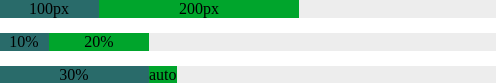
  <!-- demo-1 -->

  <div class="parent">

    <div class="child1">100px</div>

    <div class="child2">200px</div>

  </div>

  <div class="parent">

    <div class="child1">10%</div>

    <div class="child2">20%</div>

  </div>

  <div class="parent">

    <div class="child1">30%</div>

    <div class="child2">auto</div>

  </div>

  <style>

    .parent {

      width: 500px;

      display: flex;

      margin-bottom: 15px;

      text-align: center;

      background-color: #eeeeee;

    }

    /** 像素值*/

    .parent:nth-child(1) .child1 {

      flex-basis: 100px;

      background-color: #356969

    }

    .parent:nth-child(1) .child2 {

      flex-basis: 200px;

      background-color: #369925;

    }

    /** 百分比 */

    .parent:nth-child(2) .child1 {

      flex-basis: 10%;

      background-color: #356969

    }

    .parent:nth-child(2) .child2 {

      flex-basis: 20%;

      background-color: #369925;

    }

    /** 自动 */

    .parent:nth-child(3) .child1 {

      flex-basis: 30%;

      background-color: #356969

    }

    .parent:nth-child(3) .child2 {

      flex-basis: auto;

      background-color: #369925;

    }

  </style>
flex-grow
flex-grow 设置当 flex 容器存在剩余空间(flex容器的大小减去所有flex项的大小之和)时项目的放大比例,它的默认值为 0 (即使存在剩余空间也不放大)。如果所有项目的 flex-grow 属性值都是相同的,则它们将等分剩余空间,否则,将根据不同的属性值所定义的比率进行分配。
例如,主轴长度为600px, 项目1占据50px, 项目2占据100px, 项目3占据150px, 则剩余空间为:600px - (50px + 100px + 150px) = 300px
假如每个项目的 flex-grow 属性值都相同(例如都为1),则所有项目分配到相同的剩余空间:
- 项目1: 300px * (1 / (1 + 1 + 1)) = 100px;
- 项目2: 300px * (1 / (1 + 1 + 1)) = 100px;
- 项目3: 300px * (1 / (1 + 1 + 1)) = 100px;
  <!-- demo-2 -->

  <div class="parent">

    <div class="child1">50px + 100px</div>

    <div class="child2">100px + 100px</div>

    <div class="child3">150px + 100px</div>

  </div>

  <style>

    .parent {

      width: 600px;

      display: flex;

      text-align: center;

      color: #eee;

    }

    .child1 {

      flex-basis: 50px;

      flex-grow: 1;

      background-color: #0066CC;

    }

    .child2 {

      flex-basis: 100px;

      flex-grow: 1;

      background-color: #009900;

    }

    .child3 {

      flex-basis: 150px;

      flex-grow: 1;

      background-color: #CC3300;

    }

  </style>

假设每个项目的 flex-grow 属性的值并不都是相同的,例如项目1为 1, 项目2为 2, 项目3为 3, 则它们分配到的剩余空间分别为:
- 项目1: 300px * (1 / (1 + 2 + 3)) = 50px;
- 项目2: 300px * (2 / (1 + 2 + 3)) = 100px;
- 项目3: 300px * (3 / (1 + 2 + 3)) = 150px;
  <!-- demo-3 -->

  <div class="parent">

    <div class="child1">50px + 50px</div>

    <div class="child2">100px + 100px</div>

    <div class="child3">150px + 150px</div>

  </div>

  <style>

    .parent {

      width: 600px;

      display: flex;

      text-align: center;

      color: #eee;

    }

    .child1 {

      flex-basis: 50px;

      flex-grow: 1;

      background-color: #0066CC;

    }

    .child2 {

      flex-basis: 100px;

      flex-grow: 2;

      background-color: #009900;

    }

    .child3 {

      flex-basis: 150px;

      flex-grow: 3;

      background-color: #CC3300;

    }

  </style>

要是属性值为小数怎么办呢?这里分两种情况:
1. 所有flex项的 flex-gorw 属性值之和大于1,仍然按照上述方式进行计算;
2. 所有flex项的 flex-gorw 属性值之和小于1,基值按照1来进行计算,例如项目1为 0.2, 项目2为 0.3, 项目3为 0.4, 则它们分配到的剩余空间分别为:
- 项目1: 300px * (0.2 / 1) = 60px;
- 项目2: 300px * (0.3 / 1) = 90px;
- 项目3: 300px * (0.4 / 1) = 120px;
  <!-- demo-4 -->

  <div class="parent">

    <div class="child1">50px + 60px</div>

    <div class="child2">100px + 90px</div>

    <div class="child3">150px + 120px</div>

  </div>

  <style>

    .parent {

      width: 600px;

      display: flex;

      text-align: center;

      color: #eee;

    }

    .child1 {

      flex-basis: 50px;

      flex-grow: 0.2;

      background-color: #0066CC;

    }

    .child2 {

      flex-basis: 100px;

      flex-grow: 0.3;

      background-color: #009900;

    }

    .child3 {

      flex-basis: 150px;

      flex-grow: 0.4;

      background-color: #CC3300;

    }

flex-shrink
flex-shrink 设置当 flex 容器空间不足时项目的放大比例,它的默认值为 1 (空间不足时该项目将缩小)。
flex-shrink 的计算方式与 flex-grow 略有不同,有两个因素影响 flex 项该缩小多少,一个是 flex-shrink 的属性值,另一个是 flex 项本身的大小,它们按各自的权重进行缩小,举例来说:
主轴长度为600px, 项目1占据100px, 项目2占据300px, 项目3占据500px, 每个项目的 flex-shrink 属性值分别为1,3,2, 则总权重为 100px * 1 + 300px * 3 + 500px *2 = 2000px, 每个项目的权重分别为为:
- 项目1: (100px * 1) / 2000px = 0.05;
- 项目2: (300px * 3) / 2000px = 0.45;
- 项目3: (500px * 2) / 2000px = 0.50;
溢出的空间长度为:100px + 300px + 500px - 600px = 300px;
那么每个项目分别缩小:
- 项目1: 300px * 0.05 = 15px;
- 项目2: 300px * 0.45 = 135px;
- 项目3: 300px * 0.50 = 150px;
  <!-- demo-5 -->

  <div class="parent">

    <div class="child1">100px - 15px</div>

    <div class="child2">300px - 135px</div>

    <div class="child3">500px - 150px</div>

  </div>

  <style>

    .parent {

      width: 600px;

      display: flex;

      text-align: center;

      color: #eee;

    }

    .child1 {

      flex-basis: 100px;

      flex-shrink: 1;

      background-color: #0066CC;

    }

    .child2 {

      flex-basis: 300px;

      flex-shrink: 3;

      background-color: #009900;

    }

    .child3 {

      flex-basis: 500px;

      flex-shrink: 2;

      background-color: #CC3300;

    }

  </style>

同样的,当 flex-shrink 的值为小数时,也分两种情况:
1. 所有flex项的 flex-shrink 属性值之和大于1,仍然按照上述方式进行计算;
2. 所有flex项的 flex-shrink 属性值之和小于1,只收缩溢出空间的一部分,例如项目1为 0.1, 项目2为 0.3, 项目3为 0.2, 则总的收缩空间为:
300px * (0.1 + 0.3 + 0.2) = 180px
每个项的权重计算方式是不变的,每个项目分别缩小:
- 项目1: 180px * 0.05 = 9px;
- 项目2: 180px * 0.45 = 81px;
- 项目3: 180px * 0.50 = 90px;
  <!-- demo-6 -->

  <div class="parent">

    <div class="child1">100px - 9px</div>

    <div class="child2">300px - 135px</div>

    <div class="child3">500px - 90px</div>

  </div>

    <style>

    .parent {

      width: 600px;

      display: flex;

      text-align: center;

      color: #eee;

    }

    .child1 {

      flex-basis: 100px;

      flex-shrink: 0.1;

      background-color: #0066CC;

    }

    .child2 {

      flex-basis: 300px;

      flex-shrink: 0.3;

      background-color: #009900;

    }

    .child3 {

      flex-basis: 500px;

      flex-shrink: 0.2;

      background-color: #CC3300;

    }

  </style>

由于只收缩了溢出空间的一部分,div 内的元素总宽度实际上是超出 div 的宽度的。
以上就是关于使用flex布局中 flex-grow 与 flex-shrink 计算方式的简单介绍。
该篇博客内的代码已同步到Github
参考资料:
[1]. MDN文档 https://developer.mozilla.org/zh-CN/docs/Web/CSS/flex-basis
[2]. MDN文档 https://developer.mozilla.org/zh-CN/docs/Web/CSS/flex-grow
[3]. MDN文档 https://developer.mozilla.org/zh-CN/docs/Web/CSS/flex-shrink
flex布局中flex-grow与flex-shrink的计算方式的更多相关文章
- flex布局中flex-basis|flex-grow|flex-shrink
flex布局中flex-basis|flex-grow|flex-shrink 整个才是正确的算法 flex-basis(基准值) 可以设置flex布局中容器的宽度,如果同时存在width属性,将把它 ...
- svg矢量图在flex布局中样式扭曲的问题
问题机型 小米5 华为nova 其他未知的可能机型 问题描述 利用flex 布局的一行中, 左一样式: -webkit-box-flex: 0; flex: 0 1 auto; 左二样式: -webk ...
- flex布局中transform出错
在flex布局下,若应用transform 的动画的子元素没有使用进行定位,则动画过程中,子元素将相对display:flex的元素进行static定位 动画结束后位置正常: 修复代码只需要posit ...
- 关于flex布局中的兼容性问题
这几天在做项目中用到了flex布局,但是在测试的过程中发现他的兼容性实在是太差了,仅仅用到水平和垂直居中的样式,没想到兼容性代码就写了好几行. display:flex; display:-webki ...
- flex布局中flex属性运用在随机发红包的算法上
flex布局是现在前端基本上都会运用的一种布局,基本上用到比较多的是父元素设置display:flex,两个子元素,一个设置固定宽度,另一个设置为flex:1(这里都指flex-direction为r ...
- flex布局中父容器属性部分演示效果
如图可见flex的属性分为父容器和子容器的属性共12个.关于这些属性具体代表什么意思,网上有很多教程的文章,自觉不能写得比别人更好,所以这里主要写了一些例子关于父容器属性效果的演示,希望可以帮助大家理 ...
- 微信小程序-flex布局中align-items和align-self区别
首先看看菜鸟教程中关于align-items和align-self的定义 align-items:align-items 属性定义flex子项在flex容器的当前行的侧轴(纵轴)方向上的对齐方式.(对 ...
- flex布局中flex-shrink的计算规则
下面代码来自MDN html部分: <p>the width of content is 500px, flex-basic of flex item is 120px.</p> ...
- flex布局中的主轴和侧轴的确定
1.主轴和侧轴是通过flex-direction确定的 如果flex-direction是row或者row-reverse,那么主轴就是justify-contain 如果flex-direction ...
随机推荐
- google在nature上发表的关于量子计算机的论文(Quantum supremacy using a programmable superconducting processor 译)— 附论文
Google 2019年10月23号发表在Nature(<自然><科学>及<细胞>杂志都是国际顶级期刊,貌似在上面发文两篇,就可以评院士了)上,关于量子计算(基于 ...
- 解决WordPress不能发邮件,WordPress 无法发送邮件
解决WordPress不能发邮件,WordPress 无法发送邮件,不得不说WordPress这个问题真的很烦人,研究了一下午发现不能发邮件的问题无非以下几种! 1.系统本身问题,这个直接装个插件即可 ...
- nyoj 67-三角形面积 (海伦公式, 叉积)
67-三角形面积 内存限制:64MB 时间限制:3000ms 特判: No 通过数:8 提交数:13 难度:2 题目描述: 给你三个点,表示一个三角形的三个顶点,现你的任务是求出该三角形的面积 输入描 ...
- Github相关知识
github的提交流程 mkdir 目录名 :创建一个空文件夹 mkdir webs webs代表创建的新文件名称 cd 目录名 :切换到文件夹 cd webs 切换到当前新建的目录下 ...
- 领扣(LeetCode)二叉树的所有路径 个人题解
给定一个二叉树,返回所有从根节点到叶子节点的路径. 说明: 叶子节点是指没有子节点的节点. 示例: 输入: 1 / \ 2 3 \ 5 输出: ["1->2->5", ...
- Robot Framework自动化测试环境搭建
robotFramework是一个通用的自动化测试框架来进行验收测试和验收测试驱动开发模式,它具有易于使用的表格的测试数据和关键字测试驱动方法,其测试功能可通过实现与python或java的测试库进行 ...
- Linux基础命令复习01
一.Linux中的基本查看.查找命令: 1.ls 查看目录信息: -l #查看属性,以长格式显示 -d #查看本身属性 -A #显示包括以.开头的隐藏文档 -h #提供易读的单位 -R #表示递 ...
- [ML机器学习 - Stanford University] - Week1 - 01 Introduction
What is Machine Learning? Two definitions of Machine Learning are offered. Arthur Samuel described i ...
- String类的详细
String str = new String("abc")创建过程 (1) 先定义一个名为str的对String类的对象引用变量放入栈中. (2) 然后在堆中(不是常量池)创建一 ...
- 正则表达式 第六篇:调用CLR函数执行正则查询
在SQL Server数据库中可以执行模糊查询,像like子句,和全文查询(Fulltext search),但是无法直接执行正则查找,SQL Server没有执行正则表达式的内置函数,但是我们可以创 ...