
div 居中进行总结
1.margin:auto ;让元素居中,需要确定元素的宽度,并且需要是块元素
eg: div {
width:200px;
height:200px;
background:#222;
margin:0 auto;
}
2. div > p 两者都是块元素
div {
width:200px;
height:200px;
background:#eee;
margin:auto;
}
div>p {
width:60%;
margin:auto;
font-size:14px/1.5 Arial,sans-serif;
}

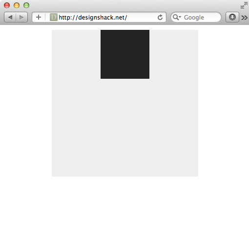
3.
.container {

  height: 300px;

  width: 300px;

  background: #eee;

  margin: 10px auto;

  position: relative;

}

.box {

  height: 100px;

  width: 100px;

  background: #222;

  position: absolute;

  left: 100px; 100 = (300 - 100)/2

}
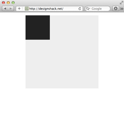
4.
.container {

  height: 300px;

  width: 300px;

  background: #eee;

  margin: 10px auto;

  position: relative;

}

.box {

  height: 100px;

  width: 100px;

  background: #222;

  position: absolute;

}
5.
.container {

  height: 300px;

  width: 70%;

  background: #eee;

  margin: 10px auto;

  position: relative;

}

.box {

  height: 100px;

  width: 100px;

  background: #222;

  position: absolute;

  /*Centering Method 2*/

  margin: 0px 0 0 -50px;

  left: 50%;

}

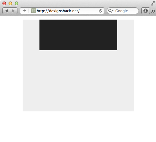
6.
.container {

  height: 300px;

  width: 70%;

  background: #eee;

  margin: 10px auto;

  position: relative;

}

.box {

  height: 100px;

  width: 70%;

  background: #222;

  position: absolute;

  /*Centering Method 2*/

  margin: 0px 0 0 -35%; /* Half of 70% /*

  left: 50%;

}
7.
.container {

  height: 300px;

  width: 300px;

  background: #eee;

  position: absolute;

  margin: -150px 0 0 -150px;

  left: 50%;

  top: 50%;

}

.box {

  height: 100px;

  width: 100px;

  background: #222;

  position: absolute;

  /*Centering Method 2*/

  margin: -50px 0 0 -50px;

  left: 50%;

  top: 50%;

}

8.
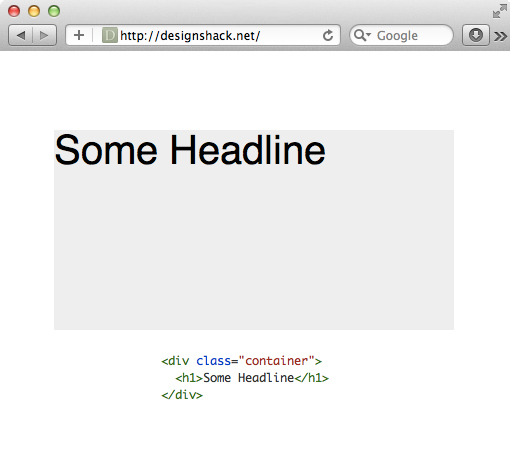
9.
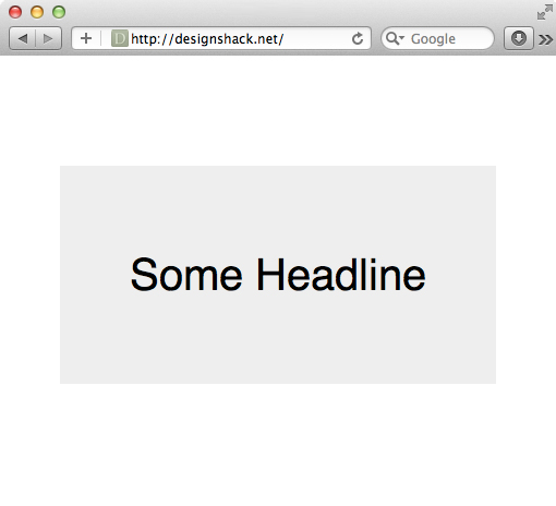
.container {

  height: 400px;

  width: 400px;

  background: #eee;

  margin: 50px auto;

}

h1 {

  font: 40px/1 Helvetica, sans-serif;

  text-align: center;

}
10.
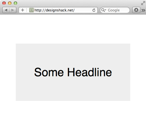
.container {

  height: 200px; /*Set line-height to this value*/

  width: 400px;

  background: #eee;

  margin: 150px auto;

}
h1 {

  font: 40px/200px Helvetica, sans-serif;

  text-align: center;

}
11.
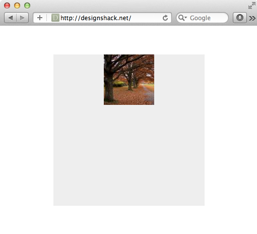
.container {
  height: 300px;

  width: 300px;

  margin: 150px auto;

  background: #eee url(http://lorempixum.com/100/100/nature/4) no-repeat;

  background-position: top center;

}
12.
.container {

  height: 300px;

  width: 300px;

  margin: 150px auto;

  background: #eee url(http://lorempixum.com/100/100/nature/4) no-repeat center;

}

1. 重要: 先对元素 设置高度
2. 运用以下规则
    position: absolute;

    margin: auto;

    top: 0; left: 0; right: 0; bottom: 0;

    overflow: auto;
考虑多浏览器兼容性的话 display: table or display: inline-block;
3.宽度高度不固定DIV水平居中
html部分
     <div class="container">

     <div class="center"><a href="#">1</a><a href="#">2</a><a href="#">3</a>

     <div style="clear:both"></div></div>
css部分
     .container{width:500px;height:80px;background:#C2300B;margin-left:50px;padding-top:10px;text-align:center;}

     .center{display:inline-block;border:2px solid #fff;}

     .center{_display:inline;} /*针对ie6 hack*/

     .center a{float:left;border:1px solid #fff;padding:5px 10px;margin:10px;color:#fff;text-decoration:none;}
代码要点:
- 父容器container加css属性 text-align:center;
- 子容器center加css属性display:inline-block;
- .center{_display:inline;} 为针对ie6的hack
3.宽度高度不固定DIV垂直居中
html部分
     <div id="vc"><div id="vci"><div id="content">

     我们垂直居中了,我们水平居中了

     </div></div></div>
css部分
     #vc { display:table; background-color:#C2300B; width:500px; height:200px; overflow:hidden; margin-left:50px; _position:relative; }

     #vci { vertical-align:middle; display:table-cell; text-align:center; _position:absolute; _top:50%; _left:50%; }

     #content { color:#fff; border:1px solid #fff; display:inline-block; _position:relative; _top:-50%; _left:-50%; }
代码要点:
- 父容器vc的css属性 display:table;overflow:hidden;
- 子容器vci的css属性 vertical-align:middle;display:table-cell;
- 针对ie6的hack,vci容器的 _position:absolute;_top:50%; 和content容器的 _position:relative; _top:-50%;
- 如果不需要水平居中的话,需要注释掉vci容器的text-align:center;_left:50%;以及content的display:inline-block;_left:-50%;
4.宽度高度固定水平垂直居中
html部分
<div class="guding"><div class="gd">居中了</div></div>
css部分
    .guding{width:500px;height:200px;background:#c2300b;margin-left:50px;position:relative;}

    .gd{width:50px;height:20px;background:#fff;position:absolute;top:50%;left:50%;margin-top:-10px;margin-left:-25px;}
代码要点:
- 父容器要用相对定位position:relative;否则的话子元素会相对于浏览器窗口进行绝对定位。
- 子容器绝对定位,top:50%;left:50%;margin-top,margin-left的值取该容器高度,宽度的一半的负值。
5. 然后CSS3来了,使用flexbox布局
抛开兼容性,我想这是一个完美的居中,不需要考虑宽度和高度值。
<div id="parent">

    <div id="item">test</div>

</div>
#parent {

    display: flex;

    width: 400px; /* 宽度值,随便啦 */

    height: 400px;  /* 高度值,随便啦 */

    background-color: yellow;

}

#item {

    width: 100px;/* 宽度值,随便啦 */

    height: 20px;/* 高度值,随便啦 */

    margin: auto;

    background-color: red; /* Magic! */

}
div 居中进行总结的更多相关文章
- bootstrap之div居中
bootstrap之div居中 偏移列 偏移是一个用于更专业的布局的有用功能.它们可用来给列腾出更多的空间.例如,.col-xs=* 类不支持偏移,但是它们可以简单地通过使用一个空的单元格来实现该效果 ...
- 移动页面div居中效果代码
在线查看效果:http://hovertree.com/texiao/mobile/4.htm 可用手机浏览器查看 以下为HTML文件: <!DOCTYPE html> <html& ...
- 【转】div居中代码 DIV水平居中显示CSS代码
原文地址:http://www.divcss5.com/rumen/r622.shtml 如何使用CSS让DIV居中显示,让div水平居中有哪些CSS样式呢? 需要的主要css代码有两个,一个为tex ...
- 【转】CSS中怎么让DIV居中
来源:http://www.cnblogs.com/DebugLZQ/archive/2011/08/09/2132381.html CSS 如何使DIV层水平居中 今天用CSS碰到个很棘手的 ...
- 关于div居中
margin : 100px; margin-left: auto; margin-right: auto; 这样子设置css样式就可以实现一个div居中
- CSS实现div居中
<!DOCTYPE html> <html> <head> <meta charset="utf-8" /> <title&g ...
- HTML4如何让一个DIV居中对齐?float输入日志标题
float:left,right clear:both 如何让一个DIV居中对齐? 第一步:设置外层的DIV的text-align:center; 第二步:设置里层的DIV的margin:auto 以 ...
- CSS中怎么让DIV居中(转载)
CSS 如何使DIV层水平居中 今天用CSS碰到个很棘手的问题,DIV本身没有定义自己居中的属性, 网上很多的方法都是介绍用上级的text-align: center然后嵌套一层DIV来解决问题. 可 ...
- CSS中怎么让DIV居中
CSS 如何使DIV层水平居中 今天用CSS碰到个很棘手的问题,DIV本身没有定义自己居中的属性, 网上很多的方法都是介绍用上级的text-align: center然后嵌套一层DIV来解决问题. 可 ...
- DIV居中的经典方法
1. 实现DIV水平居中 设置DIV的宽高,使用margin设置边距0 auto,CSS自动算出左右边距,使得DIV居中. 1 div{ 2 width: 100px; 3 height: 100px ...
随机推荐
- 读、写SD上的文件请按如下步骤进行
1.调用Environment的getExternalStorageState()方法判断手机上是否插入了SD卡,并且应用程序具有读写SD卡的权限.例如使用如下代码//Environment.getE ...
- fatal error C1083: Cannot open include file: 'qttreepropertybrowser.moc': No such file or directory
编译QtPropertyBrowser的时候出错.要用moc来生成.moc文件.我好奇的是与之前的通过.h生成moc_xxx.cpp不一样. 要用以下命令.一般来说是处理带Q_OBJECT宏的.h文件 ...
- 8.2.1.13 Multi-Range Read Optimization 多个range 读优化
8.2.1.13 Multi-Range Read Optimization 多个range 读优化 读记录使用一个range scan 在一个secondary index 可以导致很多的随机磁盘访 ...
- cocos2d-x 找不到资源文件问题
问题描述: 在项目中引用到了图片,但是运行时报错: Unhandled exception at 0x001049DE in hello.exe: 0xC0000005: Access violati ...
- EA强大的画图工具---设计数据库表格
http://blog.csdn.net/senior_lee/article/details/30272169?utm_source=tuicool 关于EA这个优秀的软件是从师哥哪里听来的,自己瞎 ...
- HDU4452 Running Rabbits
涉及知识点: 1. direction数组. 2. 一一映射(哈希). Running Rabbits Time Limit: 2000/1000 MS (Java/Others) Memory ...
- Contest - 第10届“新秀杯”ACM程序设计大赛网络资格赛 赛后信息(晋级名单·正式版)
2014_acm_fresh_0057 刘畅 20131620 2014_acm_fresh_0099 汪哲 20132185 2014_acm_fresh_0086 陈顺 2014111776 20 ...
- hadoop2.2.0的ha分布式集群搭建
hadoop2.2.0 ha集群搭建 使用的文件如下: jdk-6u45-linux-x64.bin hadoop-2.2.0.x86_64.tar zookeeper-3.4.5. ...
- 并发队列之:BlockingQueue和ConcurrentLinkedQueue
一.并行和并发区别: 并行:是指两者同时执行一件事.比如赛跑,两个人都在不停的往前跑: 并发:是指资源有限的情况下,两者交替轮流使用资源.比如一段路(单核CPU资源)同时只能过一个人,A走一段后,让给 ...
- css入门之css选择器
CSS选择器 css的选择器最常用的是class选择器,定义方式如下. <!DOCTYPE html> <html lang="en"> <head& ...