[转]Build beautiful, responsive sites with Bootstrap and ASP.NET Core
本文转自:https://docs.microsoft.com/en-us/aspnet/core/client-side/bootstrap?view=aspnetcore-2.1
Bootstrap is currently the most popular web framework for developing responsive web applications. It offers a number of features and benefits that can improve your users' experience with your web site, whether you're a novice at front-end design and development or an expert. Bootstrap is deployed as a set of CSS and JavaScript files, and is designed to help your website or application scale efficiently from phones to tablets to desktops.
Get started
There are several ways to get started with Bootstrap. If you're starting a new web application in Visual Studio, you can choose the default starter template for ASP.NET Core, in which case Bootstrap will come pre-installed:

Adding Bootstrap to an ASP.NET Core project is simply a matter of adding it to bower.json as a dependency:
{

  "name": "asp.net",

  "private": true,

  "dependencies": {

    "bootstrap": "3.3.6",

    "jquery": "2.2.0",

    "jquery-validation": "1.14.0",

    "jquery-validation-unobtrusive": "3.2.6"

  }

}
This is the recommended way to add Bootstrap to an ASP.NET Core project.
You can also install bootstrap using one of several package managers, such as Bower, npm, or NuGet. In each case, the process is essentially the same:
Bower
bower install bootstrap
npm
npm install bootstrap
NuGet
Install-Package bootstrap
Note
The recommended way to install client-side dependencies like Bootstrap in ASP.NET Core is via Bower (using bower.json, as shown above). The use of npm/NuGet are shown to demonstrate how easily Bootstrap can be added to other kinds of web applications, including earlier versions of ASP.NET.
If you're referencing your own local versions of Bootstrap, you'll need to reference them in any pages that will use it. In production you should reference bootstrap using a CDN. In the default ASP.NET site template, the _Layout.cshtml file does so like this:
<!DOCTYPE html>
<html>
<head>
<meta charset="utf-8" />
<meta name="viewport" content="width=device-width, initial-scale=1.0" />
<title>@ViewData["Title"] - WebApplication1</title>
<environment names="Development">
<link rel="stylesheet" href="~/lib/bootstrap/dist/css/bootstrap.css" />
<link rel="stylesheet" href="~/css/site.css" />
</environment>
<environment names="Staging,Production">
<link rel="stylesheet" href="https://ajax.aspnetcdn.com/ajax/bootstrap/3.3.6/css/bootstrap.min.css"
asp-fallback-href="~/lib/bootstrap/dist/css/bootstrap.min.css"
asp-fallback-test-class="sr-only" asp-fallback-test-property="position" asp-fallback-test-value="absolute" />
<link rel="stylesheet" href="~/css/site.min.css" asp-append-version="true" />
</environment>
</head>
<body>
<div class="navbar navbar-inverse navbar-fixed-top">
<div class="container">
<div class="navbar-header">
<button type="button" class="navbar-toggle" data-toggle="collapse" data-target=".navbar-collapse">
<span class="sr-only">Toggle navigation</span>
<span class="icon-bar"></span>
<span class="icon-bar"></span>
<span class="icon-bar"></span>
</button>
<a asp-area="" asp-controller="Home" asp-action="Index" class="navbar-brand">WebApplication1</a>
</div>
<div class="navbar-collapse collapse">
<ul class="nav navbar-nav">
<li><a asp-area="" asp-controller="Home" asp-action="Index">Home</a></li>
<li><a asp-area="" asp-controller="Home" asp-action="About">About</a></li>
<li><a asp-area="" asp-controller="Home" asp-action="Contact">Contact</a></li>
</ul>
@await Html.PartialAsync("_LoginPartial")
</div>
</div>
</div>
<div class="container body-content">
@RenderBody()
<hr />
<footer>
<p>© 2016 - WebApplication1</p>
</footer>
</div>
<environment names="Development">
<script src="~/lib/jquery/dist/jquery.js"></script>
<script src="~/lib/bootstrap/dist/js/bootstrap.js"></script>
<script src="~/js/site.js" asp-append-version="true"></script>
</environment>
<environment names="Staging,Production">
<script src="https://ajax.aspnetcdn.com/ajax/jquery/jquery-2.2.0.min.js"
asp-fallback-src="~/lib/jquery/dist/jquery.min.js"
asp-fallback-test="window.jQuery">
</script>
<script src="https://ajax.aspnetcdn.com/ajax/bootstrap/3.3.6/bootstrap.min.js"
asp-fallback-src="~/lib/bootstrap/dist/js/bootstrap.min.js"
asp-fallback-test="window.jQuery && window.jQuery.fn && window.jQuery.fn.modal">
</script>
<script src="~/js/site.min.js" asp-append-version="true"></script>
</environment>
@RenderSection("scripts", required: false)
</body>
</html>
Note
If you're going to be using any of Bootstrap's jQuery plugins, you will also need to reference jQuery.
Basic templates and features
The most basic Bootstrap template looks very much like the _Layout.cshtml file shown above, and simply includes a basic menu for navigation and a place to render the rest of the page.
Basic navigation
The default template uses a set of <div> elements to render a top navbar and the main body of the page. If you're using HTML5, you can replace the first <div> tag with a <nav> tag to get the same effect, but with more precise semantics. Within this first <div> you can see there are several others. First, a <div> with a class of "container", and then within that, two more <div> elements: "navbar-header" and "navbar-collapse". The navbar-header div includes a button that will appear when the screen is below a certain minimum width, showing 3 horizontal lines (a so-called "hamburger icon"). The icon is rendered using pure HTML and CSS; no image is required. This is the code that displays the icon, with each of the tags rendering one of the white bars:
<button type="button" class="navbar-toggle" data-toggle="collapse" data-target=".navbar-collapse">

    <span class="icon-bar"></span>

    <span class="icon-bar"></span>

    <span class="icon-bar"></span>

</button>
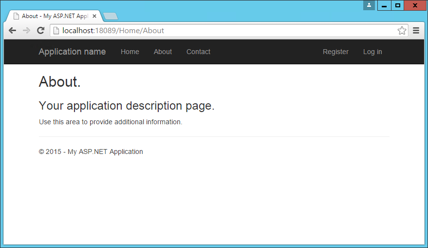
It also includes the application name, which appears in the top left. The main navigation menu is rendered by the <ul> element within the second div, and includes links to Home, About, and Contact. Below the navigation, the main body of each page is rendered in another <div>, marked with the "container" and "body-content" classes. In the simple default _Layout file shown here, the contents of the page are rendered by the specific View associated with the page, and then a simple <footer> is added to the end of the <div> element. You can see how the built-in About page appears using this template:
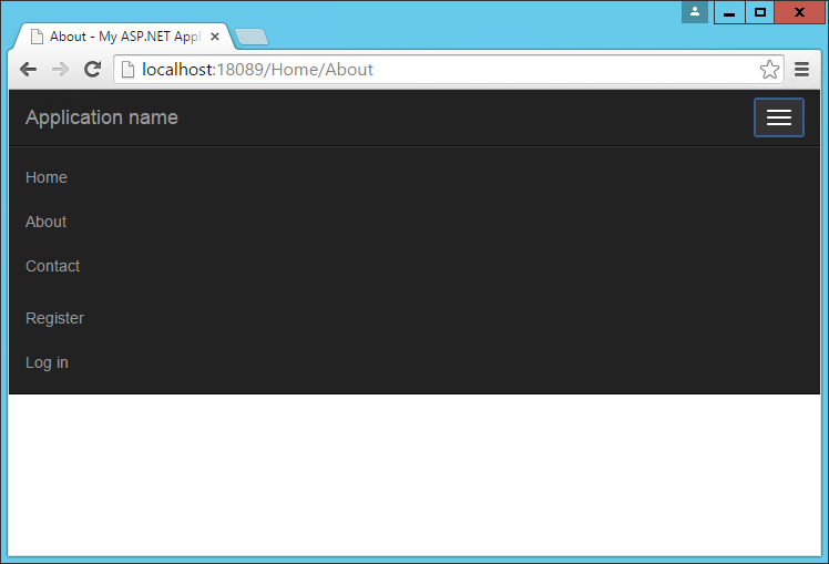
The collapsed navbar, with "hamburger" button in the top right, appears when the window drops below a certain width:

Clicking the icon reveals the menu items in a vertical drawer that slides down from the top of the page:
Typography and links
Bootstrap sets up the site's basic typography, colors, and link formatting in its CSS file. This CSS file includes default styles for tables, buttons, form elements, images, and more (learn more). One particularly useful feature is the grid layout system, covered next.
Grids
One of the most popular features of Bootstrap is its grid layout system. Modern web applications should avoid using the <table> tag for layout, instead restricting the use of this element to actual tabular data. Instead, columns and rows can be laid out using a series of <div> elements and the appropriate CSS classes. There are several advantages to this approach, including the ability to adjust the layout of grids to display vertically on narrow screens, such as on phones.
Bootstrap's grid layout system is based on twelve columns. This number was chosen because it can be divided evenly into 1, 2, 3, or 4 columns, and column widths can vary to within 1/12th of the vertical width of the screen. To start using the grid layout system, you should begin with a container <div> and then add a row <div>, as shown here:
<div class="container">

    <div class="row">

        ...

    </div>

</div>
Next, add additional <div> elements for each column, and specify the number of columns that <div> should occupy (out of 12) as part of a CSS class starting with "col-md-". For instance, if you want to simply have two columns of equal size, you would use a class of "col-md-6" for each one. In this case "md" is short for "medium" and refers to standard-sized desktop computer display sizes. There are four different options you can choose from, and each will be used for higher widths unless overridden (so if you want the layout to be fixed regardless of screen width, you can just specify xs classes).
| CSS Class Prefix | Device Tier | Width |
|---|---|---|
| col-xs- | Phones | < 768px |
| col-sm- | Tablets | >= 768px |
| col-md- | Desktops | >= 992px |
| col-lg- | Larger Desktop Displays | >= 1200px |
When specifying two columns both with "col-md-6" the resulting layout will be two columns at desktop resolutions, but these two columns will stack vertically when rendered on smaller devices (or a narrower browser window on a desktop), allowing users to easily view content without the need to scroll horizontally.
Bootstrap will always default to a single-column layout, so you only need to specify columns when you want more than one column. The only time you would want to explicitly specify that a <div> take up all 12 columns would be to override the behavior of a larger device tier. When specifying multiple device tier classes, you may need to reset the column rendering at certain points. Adding a clearfix div that's only visible within a certain viewport can achieve this, as shown here:
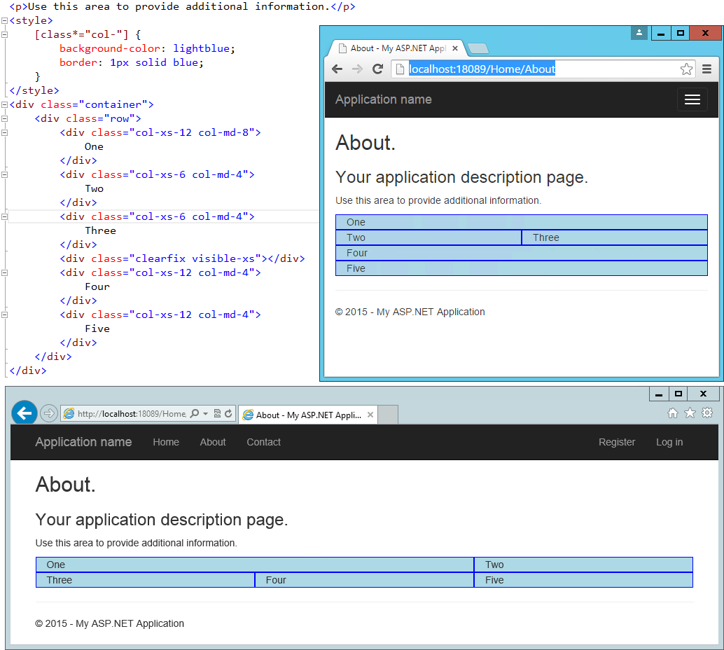
In the above example, One and Two share a row in the "md" layout, while Two and Three share a row in the "xs" layout. Without the clearfix <div>, Two and Three are not shown correctly in the "xs" view (note that only One, Four, and Five are shown):
In this example, only a single row <div> was used, and Bootstrap still mostly did the right thing with regard to the layout and stacking of the columns. Typically, you should specify a row <div> for each horizontal row your layout requires, and of course you can nest Bootstrap grids within one another. When you do, each nested grid will occupy 100% of the width of the element in which it's placed, which can then be subdivided using column classes.
Jumbotron
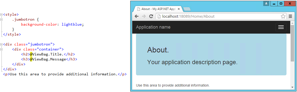
If you've used the default ASP.NET MVC templates in Visual Studio 2012 or 2013, you've probably seen the Jumbotron in action. It refers to a large full-width section of a page that can be used to display a large background image, a call to action, a rotator, or similar elements. To add a jumbotron to a page, simply add a <div> and give it a class of "jumbotron", then place a container <div> inside and add your content. We can easily adjust the standard About page to use a jumbotron for the main headings it displays:
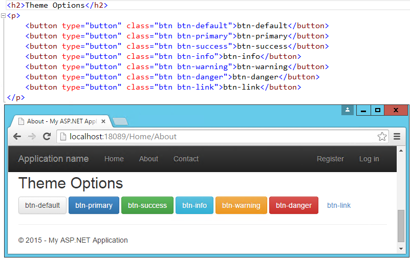
Buttons
The default button classes and their colors are shown in the figure below.
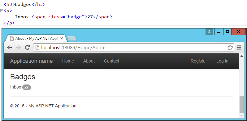
Badges
Badges refer to small, usually numeric callouts next to a navigation item. They can indicate a number of messages or notifications waiting, or the presence of updates. Specifying such badges is as simple as adding a <span> containing the text, with a class of "badge":
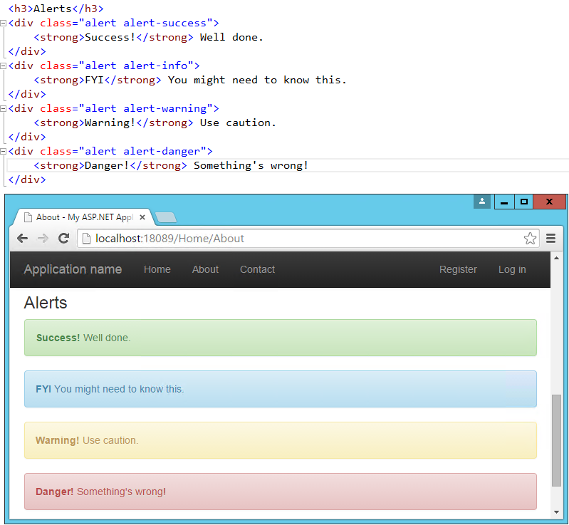
Alerts
You may need to display some kind of notification, alert, or error message to your application's users. That's where the standard alert classes are useful. There are four different severity levels with associated color schemes:
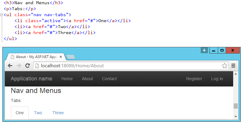
Navbars and menus
Our layout already includes a standard navbar, but the Bootstrap theme supports additional styling options. We can also easily opt to display the navbar vertically rather than horizontally if that's preferred, as well as adding sub-navigation items in flyout menus. Simple navigation menus, like tab strips, are built on top of <ul> elements. These can be created very simply by just providing them with the CSS classes "nav" and "nav-tabs":
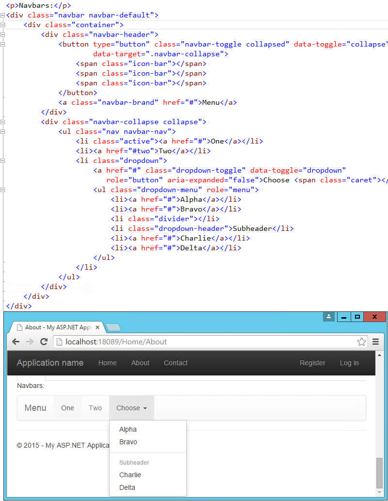
Navbars are built similarly, but are a bit more complex. They start with a <nav> or <div> with a class of "navbar", within which a container div holds the rest of the elements. Our page includes a navbar in its header already – the one shown below simply expands on this, adding support for a dropdown menu:
Additional elements
The default theme can also be used to present HTML tables in a nicely formatted style, including support for striped views. There are labels with styles that are similar to those of the buttons. You can create custom Dropdown menus that support additional styling options beyond the standard HTML <select> element, along with Navbars like the one our default starter site is already using. If you need a progress bar, there are several styles to choose from, as well as List Groups and panels that include a title and content. Explore additional options within the standard Bootstrap Theme here:
http://getbootstrap.com/examples/theme/
More themes
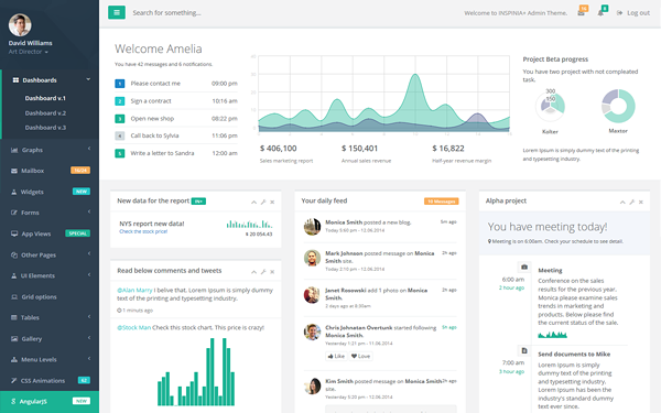
You can extend the standard Bootstrap theme by overriding some or all of its CSS, adjusting the colors and styles to suit your own application's needs. If you'd like to start from a ready-made theme, there are several theme galleries available online that specialize in Bootstrap themes, such as WrapBootstrap.com (which has a variety of commercial themes) and Bootswatch.com (which offers free themes). Some of the paid templates available provide a great deal of functionality on top of the basic Bootstrap theme, such as rich support for administrative menus, and dashboards with rich charts and gauges. An example of a popular paid template is Inspinia, currently for sale for $18, which includes an ASP.NET MVC5 template in addition to AngularJS and static HTML versions. A sample screenshot is shown below.
If you want to change your Bootstrap theme, put the bootstrap.css file for the theme you want in the wwwroot/css folder and change the references in _Layout.cshtml to point it. Change the links for all environments:
<environment names="Development">

    <link rel="stylesheet" href="~/css/bootstrap.css" />
<environment names="Staging,Production">

    <link rel="stylesheet" href="~/css/bootstrap.min.css" />
If you want to build your own dashboard, you can start from the free example available here: http://getbootstrap.com/examples/dashboard/.
Components
In addition to those elements already discussed, Bootstrap includes support for a variety of built-in UI components.
Glyphicons
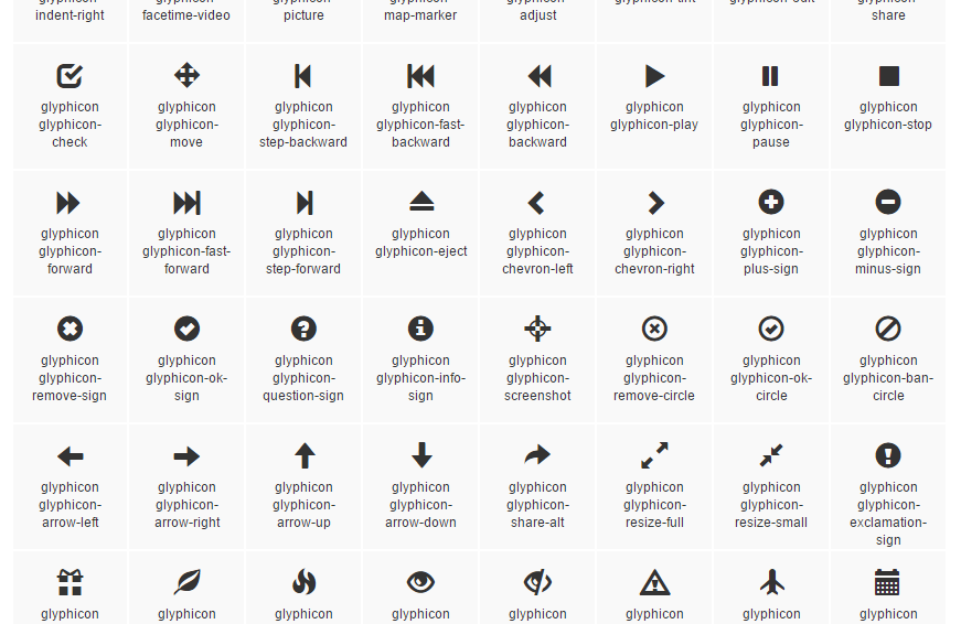
Bootstrap includes icon sets from Glyphicons (http://glyphicons.com), with over 200 icons freely available for use within your Bootstrap-enabled web application. Here's just a small sample:
Input groups
Input groups allow bundling of additional text or buttons with an input element, providing the user with a more intuitive experience:

Breadcrumbs
Breadcrumbs are a common UI component used to show a user their recent history or depth within a site's navigation hierarchy. Add them easily by applying the "breadcrumb" class to any <ol> list element. Include built-in support for pagination by using the "pagination" class on a <ul>element within a <nav>. Add responsive embedded slideshows and video by using <iframe>, <embed>, <video>, or <object> elements, which Bootstrap will style automatically. Specify a particular aspect ratio by using specific classes like "embed-responsive-16by9".
JavaScript support
Bootstrap's JavaScript library includes API support for the included components, allowing you to control their behavior programmatically within your application. In addition, bootstrap.js includes over a dozen custom jQuery plugins, providing additional features like transitions, modal dialogs, scroll detection (updating styles based on where the user has scrolled in the document), collapse behavior, carousels, and affixing menus to the window so they don't scroll off the screen. There's not sufficient room to cover all of the JavaScript add-ons built into Bootstrap – to learn more please visit http://getbootstrap.com/javascript/.
Summary
Bootstrap provides a web framework that can be used to quickly and productively lay out and style a wide variety of websites and applications. Its basic typography and styles provide a pleasant look and feel that can easily be manipulated through custom theme support, which can be hand-crafted or purchased commercially. It supports a host of web components that in the past would've required expensive third-party controls to accomplish, while supporting modern and open web standards.
[转]Build beautiful, responsive sites with Bootstrap and ASP.NET Core的更多相关文章
- 基于Bootstrap的Asp.net Mvc 分页
基于Bootstrap的Asp.net Mvc 分页的实现 最近写了一个mvc 的 分页,样式是基于 bootstrap 的 ,提供查询条件,不过可以自己写样式根据个人的喜好,以此分享一下.首先新建一 ...
- 使用Angular 4、Bootstrap 4、TypeScript和ASP.NET Core开发的Apworks框架案例应用:Task List
最近我为我自己的应用开发框架Apworks设计了一套案例应用程序,并以Apache 2.0开源,开源地址是:https://github.com/daxnet/apworks-examples,目的是 ...
- ASP.NET Core Web App应用第三方Bootstrap模板
引言 作为后端开发来说,前端表示玩不转,我们一般会选择套用一些开源的Bootstrap 模板主题来进行前端设计.那如何套用呢?今天就简单创建一个ASP.NET Core Web MVC 模板项目为例, ...
- ASP.NET Core 2.1以上 Bootstrap 4前端模板文件,开发环境与发布环境前端模板 environment的使用
笔者的前端文件如下 笔者增加Bootstrap 4 和 FontAwersome(字体图标),因为Bootsrap 4已经不再包含图标了. ASp.Net Core 中,通常在 _Layout.csh ...
- Asp.net Core + EF Core + Bootstrap搭建的MVC后台通用管理系统模板(跨平台版本)
Asp.net Core + EF Core + Bootstrap搭建的MVC后台通用管理系统模板(跨平台版本) 原创 2016年07月22日 10:33:51 23125 6月随着.NET COR ...
- [Node.js] Take Screenshots of Multiple Dimensions for Responsive Sites using Nightmare
When developing responsive websites, you will constantly be resizing your browser to make sure your ...
- Bootstrap 与 ASP.NET MVC 4 不使用 NuGet Package 笔记
转自 http://www.mytecbits.com/microsoft/dot-net/bootstrap-with-asp-net-mvc-4-step-by-step 单位最近做了一个Boot ...
- Bootstrap in ASP.NET MVC 5
一,新建ASP.NET MVC 5 项目 Bootstrap 文件分布 引入到页面 1.定义.注意:不要包含有.min.的文件名称,会被忽略,因为在发布的时候编译器会加载min版的文件 2.在母版页中 ...
- 基于Bootstrap的Asp.net Mvc 分页的实现
最近写了一个mvc 的 分页,样式是基于 bootstrap 的 ,提供查询条件,不过可以自己写样式根据个人的喜好,以此分享一下.首先新建一个Mvc 项目,既然是分页就需要一些数据,我这边是模拟了一些 ...
随机推荐
- phpize增加php模块
phpize增加php模块 张映 发表于 2010-02-09 分类目录: php 一,phpize的好处 什么时候我们要用phpize呢?我们在安装php时: './configure' '--pr ...
- 使用docker部署WordPress博客系统(win10企业版)
docker介绍: docker 是一个开源的应用容器引擎,让开发者可以打包他们的应用以及依赖包到一个可移植的容器中,然后发布到任何流行的Linux机器上,也可以实现虚拟化,容器是完全使用沙箱机制,相 ...
- asp.net core mvc 中间件之WebpackDevMiddleware
asp.net core mvc 中间件之WebpackDevMiddleware WebpackDevMiddleware中间件主要用于开发SPA应用,启用Webpack,增强网页开发体验.好吧,你 ...
- 利用GDI+处理图像的色彩
首先先介绍一下ColorMatrix结构体:表示颜色的变换关系,定义如下: typedef struct { REAL m[][]; } ColorMatrix; ColorMatrix结构体一般和I ...
- ASP.NET MVC5 高级编程-学习日记-第三章 视图
开发人员之所以花费大量时间来重点设计控制器和模型对象,是因为在这些领域中,精心编写的整洁代码是开发一个可维护Web应用程序的基础. 3.1 视图的作用 视图的职责是向用户提供用户界面.当控制器针对被请 ...
- 获取webpart方法以及连接字符串记录
在页面地址后面添加?contents=1就可以显示所有页面的webpart部件了 server=wtcsps05;database=Testing_DB;uid=sqluser;password=wt ...
- 背水一战 Windows 10 (49) - 控件(集合类): Pivot, Hub
[源码下载] 背水一战 Windows 10 (49) - 控件(集合类): Pivot, Hub 作者:webabcd 介绍背水一战 Windows 10 之 控件(集合类) Pivot Hub 示 ...
- Ubuntu18.04 - 安装深度桌面(Deepin Linux Desktop)
深度Linux官网:https://www.deepin.org 深度桌面感觉确实不错,所以打算安装上来,以后体验一下,下面是安装的命令: 1, sudo add-apt-repository ppa ...
- cnetos6上实现nfs共享
利用空余时间,做个nfs共享实验,岂不美滋滋!!! 系统测试环境: 主机ip 系统 主机名(服务) 192.168.241.130 centos6.5 hadoop1(nfs-sr ...
- linux安装使用7zip
7z,全称7-Zip, 是一款开源软件.是目前公认的压缩比例最大的压缩解压软件. 源码编译安装 官网下载地址:http://www.7-zip.org/download.html 源文件项目地址:ht ...