CSS-背景渐变的兼容写法
background-image: -moz-linear-gradient(top, rgba(0,0,0,0), rgba(0,0,0,0.5) 75%);

    background-image: -webkit-linear-gradient(top, rgba(0,0,0,0), rgba(0,0,0,0.5) 75%);

    background-image: -o-linear-gradient(top, rgba(0,0,0,0), rgba(0,0,0,0.5) 75%);

    background-image: -ms-linear-gradient(top, rgba(0,0,0,0), rgba(0,0,0,0.5) 75%);

    background-image: linear-gradient(to bottom, rgba(0,0,0,0), rgba(0,0,0,0.5) 75%);
linear-gradient:to 方位词
-前缀-linear-gradient:方位词

最近在做的项目中用到的实例(2016-12-13 13:53:11)
background: -webkit-linear-gradient(bottom, #fba555, #ffed6c 75%);

background: -moz-linear-gradient(bottom, #fba555, #ffed6c 75%);

background: -ms-linear-gradient(bottom, #fba555, #ffed6c 75%);

background: -o-linear-gradient(bottom, #fba555, #ffed6c 75%);

background: linear-gradient(to top, #fba555, #ffed6c 75%);
20180307 补充代码:
qq浏览器效果如下:

ie8浏览器效果如下:
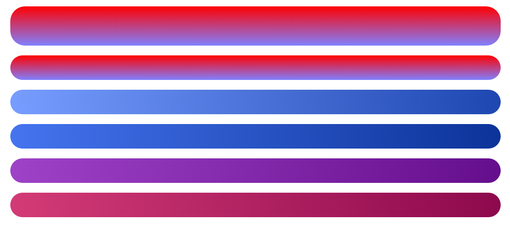
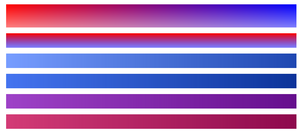
html
<div class="zhang1"></div>

<div class="zhang2"></div>

<div class="myself1"></div>

<div class="myself2"></div>

<div class="myself3"></div>

<div class="myself4"></div>
css
div{

            height: 50px;

            width: 1000px;

            margin: 20px auto;

            border-radius: 30px;

        }

        .zhang1{

            height: 80px;

        background:red; /* 一些不支持背景渐变的浏览器 */

            filter:alpha(opacity=100 finishopacity=50 style=1 startx=0,starty=0,finishx=0,finishy=150) progid:DXImageTransform.Microsoft.gradient(startcolorstr=red,endcolorstr=blue,gradientType=1);

        -ms-filter:alpha(opacity=100 finishopacity=50 style=1 startx=0,starty=0,finishx=0,finishy=150) progid:DXImageTransform.Microsoft.gradient(startcolorstr=red,endcolorstr=blue,gradientType=1);/*IE8 gradientType=1代表横向渐变,gradientType=0代表纵向淅变。*/

        background:-moz-linear-gradient(top, red, rgba(0, 0, 255, 0.5));

        background:-webkit-gradient(linear, 0 0, 0 bottom, from(#ff0000), to(rgba(0, 0, 255, 0.5)));

        background:-o-linear-gradient(top, red, rgba(0, 0, 255, 0.5));

        }

        .zhang2{

            filter:alpha(opacity=100 finishopacity=50 style=1 startx=0,starty=0,finishx=0,finishy=150) progid:DXImageTransform.Microsoft.gradient(startcolorstr=red,endcolorstr=blue,gradientType=0);

        -ms-filter:alpha(opacity=100 finishopacity=50 style=1 startx=0,starty=0,finishx=0,finishy=150) progid:DXImageTransform.Microsoft.gradient(startcolorstr=red,endcolorstr=blue,gradientType=0);/*IE8*/

        background:red; /* 一些不支持背景渐变的浏览器 */

        background:-moz-linear-gradient(top, red, rgba(0, 0, 255, 0.5));

        background:-webkit-gradient(linear, 0 0, 0 bottom, from(#ff0000), to(rgba(0, 0, 255, 0.5)));

        background:-o-linear-gradient(top, red, rgba(0, 0, 255, 0.5));

        }

        .myself1{

            background: #779DFF;

            filter:alpha(opacity=100) progid:DXImageTransform.Microsoft.gradient(startcolorstr=#779DFF,endcolorstr=#1E47B1,gradientType=1);/*IE8*/

        -ms-filter:alpha(opacity=100) progid:DXImageTransform.Microsoft.gradient(startcolorstr=#779DFF,endcolorstr=#1E47B1,gradientType=1);/*IE8*/

            background: -webkit-linear-gradient(left, #779DFF, #1E47B1 100%);

            background: -moz-linear-gradient(left, #779DFF, #1E47B1 100%);

            background: -ms-linear-gradient(left, #779DFF, #1E47B1 100%);

            background: -o-linear-gradient(left, #779DFF, #1E47B1 100%);

            background: linear-gradient(to right, #779DFF, #1E47B1 100%);

        }

        .myself2{

            background: #4574EF;

            filter:alpha(opacity=100) progid:DXImageTransform.Microsoft.gradient(startcolorstr=#4574EF,endcolorstr=#0C3399,gradientType=1);/*IE8*/

        -ms-filter:alpha(opacity=100) progid:DXImageTransform.Microsoft.gradient(startcolorstr=#4574EF,endcolorstr=#0C3399,gradientType=1);/*IE8*/

            background: -webkit-linear-gradient(left, #4574EF, #0C3399 100%);

            background: -moz-linear-gradient(left, #4574EF, #0C3399 100%);

            background: -ms-linear-gradient(left, #4574EF, #0C3399 100%);

            background: -o-linear-gradient(left, #4574EF, #0C3399 100%);

            background: linear-gradient(to right, #4574EF, #0C3399 100%);

        }

        .myself3{

            background: #9E42C7;

            filter:alpha(opacity=100) progid:DXImageTransform.Microsoft.gradient(startcolorstr=#9E42C7,endcolorstr=#650E8D,gradientType=1);

        -ms-filter:alpha(opacity=100) progid:DXImageTransform.Microsoft.gradient(startcolorstr=#9E42C7,endcolorstr=#650E8D,gradientType=1);IE8

            background: -webkit-linear-gradient(left, #9E42C7, #650E8D 100%);

            background: -moz-linear-gradient(left, #9E42C7, #650E8D 100%);

            background: -ms-linear-gradient(left, #9E42C7, #650E8D 100%);

            background: -o-linear-gradient(left, #9E42C7, #650E8D 100%);

            background: linear-gradient(to right, #9E42C7, #650E8D 100%);

        }

        .myself4{

            background: #D33B76;

            filter:alpha(opacity=100) progid:DXImageTransform.Microsoft.gradient(startcolorstr=#D33B76,endcolorstr=#8D094D,gradientType=1);

        -ms-filter:alpha(opacity=100) progid:DXImageTransform.Microsoft.gradient(startcolorstr=#D33B76,endcolorstr=#8D094D,gradientType=1);/*IE8 */

            background: -webkit-linear-gradient(left, #D33B76, #8D094D 100%);

          background: -moz-linear-gradient(left, #D33B76, #8D094D 100%);

            background: -ms-linear-gradient(left, #D33B76, #8D094D 100%);

            background: -o-linear-gradient(left, #D33B76, #8D094D 100%);

            background: linear-gradient(to right, #D33B76, #8D094D 100%);

        }
张鑫旭教程
CSS-背景渐变的兼容写法的更多相关文章
- CSS——背景渐变
在线性渐变过程中,颜色沿着一条直线过渡:从左侧到右侧.从右侧到左侧.从顶部到底部.从底部到顶部或着沿任何任意轴.如果你曾使用过制作图件,比如说Photoshop,你对线性渐变并不会陌生. 兼容性问题很 ...
- css背景渐变兼容(兼容所有ie)
css3里面一行可以搞定的事,换到ie里,要用滤镜,在网上找了很多,不知道什么原因都没用,终于找到个有用的,放在这里,方便大家用,自己也找得到~ 完整型代码,兼容所有浏览器: background: ...
- CSS背景渐变支持transition过渡效果
background-image 是不支持 CSS3 的transition过渡效果的,而CSS3 gradient 渐变作为背景图片存在的时候, 下面的CSS不会有过渡效果 <div clas ...
- Css背景渐变
语法: background:linear-gradient( 渐变方向,起点颜色,终点颜色 ) 参数说明: 渐变方向:可以使用top,left,或者指定具体的角度(deg为单位),比如top是自上而 ...
- CSS 中的字体兼容写法:用CSS为英文和中文字体分别设置不同的字体
font-family的调用方法: font-family:Arial,'Times New Roman','Microsoft YaHei',SimHei; font:bold 12px/.75em ...
- css 弹性盒子--“垂直居中”--兼容写法
使用弹性盒子兼容低端适配有时需要: display:flex 和 display:-webkit-box display: -webkit-box; -webkit-box-align: cent ...
- css 背景色渐变兼容写法
最近在项目中,有很多地方都用到了线性渐变,比如:表单提交按钮的背景,数据展示的标题背景等等,按照以前的做法是切 1px 图片然后 repeat-x.下面我将介绍如何用 css 来完成该效果. css3 ...
- 【css】css 背景色渐变兼容写法
最近在项目中,有很多地方都用到了线性渐变,比如:表单提交按钮的背景,数据展示的标题背景等等,按照以前的做法是切 1px 图片然后 repeat-x.下面我将介绍如何用 css 来完成该效果. css3 ...
- (转)css 背景色渐变兼容写法
css3:linear-gradient 比如:黑色渐变到白色,代码如下: .gradient{ background: -moz-linear-gradient(top, #000000 0%, # ...
随机推荐
- ORA-27125: unable to create shared memory segment
平台环境 : Oracle Linux Server release 5.7 x86_64 数据库版本 : Oracle Database 10g Enterprise Edition Rel ...
- JDBC Driver Types
JDBC Driver Types Type1: JDBC-ODBC Bridge Driver Type2: JDBC-Native API Type3: JDBC-Net Pure Java Ty ...
- .NET框架设计(常被忽视的C#设计技巧)
阅读目录: 1.开篇介绍 2.尽量使用Lambda匿名函数调用代替反射调用(走进声明式设计) 3.被忽视的特性(Attribute)设计方式 4.扩展方法让你的对象如虎添翼(要学会使用扩展方法的设计思 ...
- 【Linux学习】Linux操作技巧
linux 删除已输入的命令 ctl + u 删除光标以前的字符 ctl + k 删除光标以后的字符 ctl + a 移动光标至的字符头 ctl + e 移动光标至的字符尾 ctrl + w 往回删除 ...
- 服务器文件上传下载(XShell+Xftp)
1.下载XShell安装包+Xftp安装包.百度网盘(XShell):https://pan.baidu.com/s/1eR4PFpS 百度网盘(Xftp):https://pan.baidu.com ...
- Linux FHS
学习linux有必要了解FHS的知识,FHS英文全称是Filesystem Hierarchy Standard.中文翻译就是文件系统层次结构标准.关于这个详细的介绍参考官方的文档和鸟哥linux书. ...
- 去掉windows8.1鸡肋的开始按钮
无开始按钮了,win8.1的 开始按钮反而非常鸡肋.. 可以使用我分享的链接下载startisgone: http://download.csdn.net/detail/wangallan/89728 ...
- vb上位机模拟电压监测系统
vb作为一种古老的语言,在工作中已经用不到了,但这门语言也是我在校期间研究比较多的一种,基本的通讯,数据库,界面等模块已经比较了解,马上要进单位实习了,研究的是电机的变频器,软件这块,希望在以后的工作 ...
- UVA11525 Permutation[康托展开 树状数组求第k小值]
UVA - 11525 Permutation 题意:输出1~n的所有排列,字典序大小第∑k1Si∗(K−i)!个 学了好多知识 1.康托展开 X=a[n]*(n-1)!+a[n-1]*(n-2)!+ ...
- POJ1236Network of Schools[强连通分量|缩点]
Network of Schools Time Limit: 1000MS Memory Limit: 10000K Total Submissions: 16571 Accepted: 65 ...