【转载】 机器学习的高维数据可视化技术(t-SNE 介绍) 外文博客原文:How t-SNE works and Dimensionality Reduction
原文地址:
https://www.displayr.com/using-t-sne-to-visualize-data-before-prediction/
该文是网上传的比较多的一个 t-SNE 技术介绍的博客,原文是英文,国内的很多博客将其翻译成中文,这里直接将原文转过来了,以备以后学习使用时查找。
========================================
t-SNE is a machine learning technique for dimensionality reduction that helps you to identify relevant patterns. The main advantage of t-SNE is the ability to preserve local structure. This means, roughly, that points which are close to one another in the high-dimensional data set will tend to be close to one another in the chart. t-SNE also produces beautiful looking visualizations.
When setting up a predictive model, the first step should always be to understand the data. Although scanning raw data and calculating basic statistics can lead to some insights, nothing beats a chart. However, fitting multiple dimensions of data into a simple chart is always a challenge (dimensionality reduction). This is where t-SNE (or, t-distributed stochastic neighbor embedding for long) comes in.
In this blog post, I explain how t-SNE works, and how to conduct and interpret your own t-SNE.
The t-SNE algorithm explained
This post is about how to use t-SNE so I'll be brief with the details here. You can easily skip this section and still produce beautiful visualizations.
The t-SNE algorithm models the probability distribution of neighbors around each point. Here, the term neighbors refers to the set of points which are closest to each point. In the original, high-dimensional space this is modeled as a Gaussian distribution. In the 2-dimensional output space this is modeled as a t-distribution. The goal of the procedure is to find a mapping onto the 2-dimensional space that minimizes the differences between these two distributions over all points. The fatter tails of a t-distribution compared to a Gaussian help to spread the points more evenly in the 2-dimensional space.
The main parameter controlling the fitting is called perplexity. Perplexity is roughly equivalent to the number of nearest neighbors considered when matching the original and fitted distributions for each point. A low perplexity means we care about local scale and focus on the closest other points. High perplexity takes more of a "big picture" approach.
Because the distributions are distance based, all the data must be numeric. You should convert categorical variables to numeric ones by binary encoding or a similar method. It is also often useful to normalize the data, so each variable is on the same scale. This avoids variables with a larger numeric range dominating the analysis.
Note that t-SNE only works with the data it is given. It does not produce a model that you can then apply to new data.
t-SNE visualizations
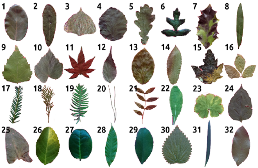
The first data set I am going to use contains the classification of 10 different types of leaf based on their physical characteristics. In this case t-SNE takes as input 14 numeric variables. These include the elongation and aspect ratio of the leaves. The following chart shows the 2-dimensional output. The species of the plant determines the labels (and colors) of the points.
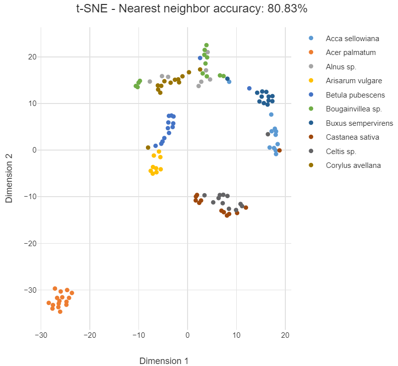
The data points for the species Acer palmatum form a cluster of orange points in the lower left. This indicates that those leaves are quite distinct from the leaves of the other species. The categories in this example are generally well grouped. Points from the same species (same color) tend to be grouped close to one another. However, in the middle points from Castanea sativa and Celtis sp. overlap, implying that they are similar.
The nearest neighbor accuracy gives the probability that a random point has the same species as its closest neighbor. This would be close to 100% if the points were perfectly grouped according to their species. A high nearest neighbor accuracy implies that the data can be cleanly separated into groups.
Perplexity
Next, I perform a similar analysis with cola brand data. In this example, the data corresponds to whether or not people in a survey associated 30 or so attributes with the different cola brands. To demonstrate the impact of perplexity, I start by setting it to a low value of 2. The mapping of each point considers only its very closest neighbors. We tend to see many small groups of a few points.

Now I'll rerun the t-SNE with a high perplexity of 100. Below we see the points are more evenly spread out, as though they are less-strongly attracted to each other.
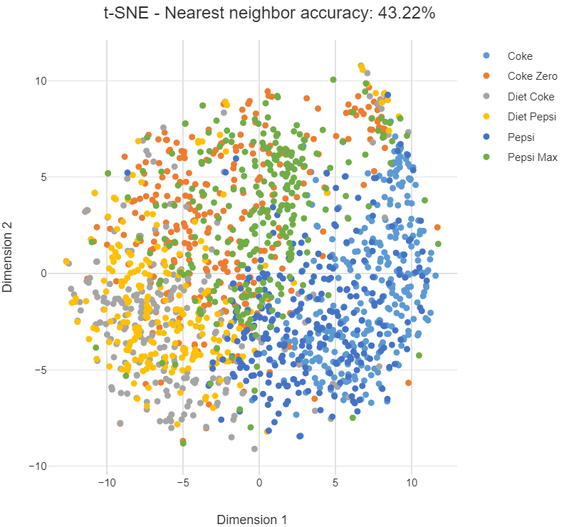
In either case, the cola data is less separable than the leaves. Although there are regions where one brand is more concentrated, there are no clear boundaries.
Note that there is no "correct" value for perplexity, although numbers in the range from 5 to 50 often produce the most appealing output. Within this range of perplexity, t-SNE is known for being relatively robust.
Insights into prediction
Measuring the distances or angles between points in these charts do not allow us to deduce anything specific and quantitative about the data. So is there more to this than pretty visualizations? Absolutely yes.
Discovering patterns at an early stage helps to guide the next steps of data science. If categories are well-separated by t-SNE, machine learning is likely to be able to find a mapping from an unseen new data point to its category. Given the right prediction algorithm, we can then expect to achieve high accuracy.
In the Acer palmatum example above one category is isolated. This can mean that if all we want to do is distinguish this category from the remainder, a simple model will suffice.
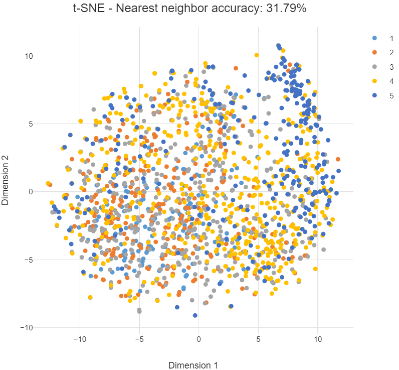
In contrast, if the categories are overlapping, machine learning may not be so successful. At the very least you can expect to have to work harder and be more creative to make decent predictions. This is the case below, which is the same as the previous plot except that now we are grouping by the strength of preference for a brand (on a scale from 1 to 5). The fact that the categories are more diffuse suggests that strength of preference will be harder to predict than cola brand. The nearest neighbor accuracy is also lower.
Comparison to PCA
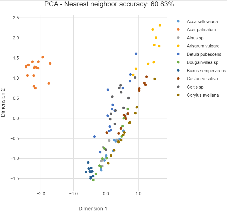
It's natural to ask how t-SNE compares to other dimension reduction techniques. The most popular of these is principal components analysis (PCA). PCA finds new dimensions that explain most of the variance in the data. It is best at positioning those points that are far apart from each other because they are the drivers of the variance.
The chart below plots the first 2 dimensions of PCA for the leaf data. We see that Acer palmatum is also isolated but the other categories are more diffuse. This is because PCA cares relatively little about local neighbors. It is also a linear method, meaning that if the relationship between the variables is nonlinear it performs poorly. Such an example is where the data are on the surface of a sphere in 3 dimensions. All is not lost, however, as PCA is more useful than t-SNE for compressing data to create a smaller number of features for input to predictive algorithms.
Summary
t-SNE is a user-friendly method for visualizing high dimensional space. It often produces more insightful charts than the alternatives. Next time you have new data to analyze, try t-SNE first and see where it leads you!
=======================================
【转载】 机器学习的高维数据可视化技术(t-SNE 介绍) 外文博客原文:How t-SNE works and Dimensionality Reduction的更多相关文章
- 前端er必须掌握的数据可视化技术
又是一月结束,打工人准时准点的汇报工作如期和大家见面啦.提到汇报,必不可少的一部分就是数据的汇总.分析. 作为一名合格的社会人,我们每天都在工作.生活.学习中和数字打交道.小到量化的工作内容,大到具体 ...
- 新鲜:阿里云的DataV数据可视化技术可以用起来
直接通过拖拽+关联的方式就可以比较方便的做出下面这种大屏展示数据的界面 只要阿里云上购买DataV数据可视化套件(https://data.aliyun.com/experience/case8? ...
- 用Python的Plotly画出炫酷的数据可视化(含各类图介绍,附代码)
前言 本文的文字及图片来源于网络,仅供学习.交流使用,不具有任何商业用途,版权归原作者所有,如有问题请及时联系我们以作处理. 作者: 我被狗咬了 在谈及数据可视化的时候,我们通常都会使用到matplo ...
- 数据可视化 gojs 简单使用介绍
目录 1. gojs 简介 2. gojs 应用场景 3. 为什么选用 gojs: 4. gojs 上手指南 5. 小技巧(非常实用哦) 6. 实践:实现节点分组关系可视化交互图 最后 本文是关于如何 ...
- iOS开发数据持久化技术02——plist介绍
有疑问的请加qq交流群:390438081 我的QQ:604886384(注明来意) 微信:niuting823 1. 简单介绍:属性列表是一种xml格式的文件.扩展名.plist: 2. 特性:pl ...
- 自动驾驶汽车数据不再封闭,Uber 开源新的数据可视化系统
日前,Uber 开源了基于 web 的自动驾驶可视化系统(AVS),称该系统为自动驾驶行业带来理解和共享数据的新方式.AVS 由Uber旗下负责自动驾驶汽车研发的技术事业群(ATG)开发,目前该系统已 ...
- 地理数据可视化:Simple,Not Easy
如果要给2015年的地理信息行业打一个标签,地理大数据一定是其中之一.在信息技术飞速发展的今天,“大数据”作为一种潮流铺天盖地的席卷了各行各业,从央视的春运迁徙图到旅游热点预测,从大数据工程师奇货可居 ...
- Android实现数据存储技术
转载:Android实现数据存储技术 本文介绍Android中的5种数据存储方式. 数据存储在开发中是使用最频繁的,在这里主要介绍Android平台中实现数据存储的5种方式,分别是: 1 使用Shar ...
- Python调用matplotlib实现交互式数据可视化图表案例
交互式的数据可视化图表是 New IT 新技术的一个应用方向,在过去,用户要在网页上查看数据,基本的实现方式就是在页面上显示一个表格出来,的而且确,用表格的方式来展示数据,显示的数据量会比较大,但是, ...
- PoPo数据可视化周刊第4期
PoPo数据可视化 聚焦于Web数据可视化与可视化交互领域,发现可视化领域有意思的内容.不想错过可视化领域的精彩内容, 就快快关注我们吧 :) 微信号:popodv_com 由于国庆节的原因,累计 ...
随机推荐
- 开源高性能结构化日志模块NanoLog
最近在写数据库程序,需要一个高性能的结构化日志记录组件,简单研究了一下Microsoft.Extensions.Logging和Serilog,还是决定重造一个轮子. 一.使用方法 直接参考以 ...
- Angular 集成 StreamSaver
应用场景: 实现目标: 在网页端实现大文件(文件大小 >= 2 G) 断点续传 实际方案: 发送多次请求, 每次请求一部分文件数据, 然后通过续写将文件数据全部写入. 难点: 无法实现文件续写, ...
- 探索Semantic Kernel内置插件:深入了解HttpPlugin的应用
前言 上一章我们熟悉了Semantic Kernel中的内置插件和对ConversationSummaryPlugin插件进行了实战,本章我们讲解一下另一个常用的内置插件HttpPlugin的应用. ...
- Linux 内核:设备驱动模型(6)设备资源管理
Linux 内核:设备驱动模型(6)设备资源管理 背景 不要总是用Linux 2.6的风格来写驱动代码了,也该与时俱进一下. 参考:http://www.wowotech.net/device_mod ...
- RabbitMQ 3.7.9版本中,Create Channel超时的常见原因及排查方法
在RabbitMQ 3.7.9版本中,Create Channel超时的常见原因及排查方法如下: 常见原因 网络问题: 网络延迟或不稳定可能导致通信超时. 网络分区(network partition ...
- 逆向通达信 x 逆向微信 x 逆向Qt
本篇在博客园地址https://www.cnblogs.com/bbqzsl/p/18252961 本篇内容包括: win32窗口嵌入Qt UI.反斗玩转signal-slot.最后 通达信 x 微信 ...
- matlab常用语法简介
目录 一.输入函数 1.disp函数 二.合并字符串 1.strcat函数 (1)strcat函数可用于合并字符串,用法如图: 2.利用向量,用法如图: 3.利用"num2str" ...
- 分享一个国内可用的ChatGPT网站,免费无限制,支持AI绘画
背景 ChatGPT作为一种基于人工智能技术的自然语言处理工具,近期的热度直接沸腾. 作为一个AI爱好者,翻遍了各大基于ChatGPT的网站,终于找到一个免费!免登陆!手机电脑通用!国内可直接对话的C ...
- redis雪崩
每个key(即数据)如果设置了失效时间的话,如果大量key同时过期的时候,或者说因为某种原因redis中的数据突然大批量丢失,这些key又大量地去请求这些key时,因为redis里面没有这些数据,就会 ...
- [oeasy]python0053_ 续行符_line_continuation_python行尾续行
续行符与三引号 回忆上次内容 上次还是转义序列 类型 英文 符号 \a bell 响铃 \b backspace 退格 \t tab 水平制表符 \v vertical tab 垂直制表符换行不回车 ...