svg制作风车旋转
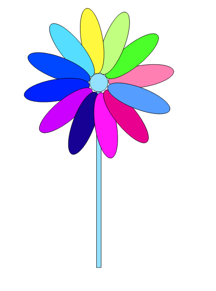
首先用ai画一个简单的风车
例如:
svg代码:
<animateTransform

	attributeName="transform"

	begin="0s"

	dur="2s"

	type="rotate"

	from="0 305 225.5"

	to="360 305 225.5"

	repeatCount="indefinite"

	/>
接下来看完整的代码:
<!DOCTYPE html>

<html>

<head>

	<meta charset="utf-8">

	<title></title>

	<style>

		svg{

			width: 500px;

			height: 800px;

			border: 1px solid #ccc;

			display: block;

			margin: 0 auto;

		}

	</style>

</head>

<body>

	<?xml version="1.0" encoding="utf-8"?>

<!-- Generator: Adobe Illustrator 19.0.0, SVG Export Plug-In . SVG Version: 6.00 Build 0)  -->

<svg version="1.1" id="图层_1" xmlns="http://www.w3.org/2000/svg" xmlns:xlink="http://www.w3.org/1999/xlink" x="0px" y="0px"

	 viewBox="0 0 640 782.8" style="enable-background:new 0 0 640 782.8;" xml:space="preserve">

<style type="text/css">

	.st0{fill:#94E1FF;stroke:#000000;stroke-miterlimit:10;}

	.st1{fill:#FF7FB3;stroke:#000000;stroke-miterlimit:10;}

	.st2{fill:#4BFF2A;stroke:#000000;stroke-miterlimit:10;}

	.st3{fill:#C0FF7F;stroke:#000000;stroke-miterlimit:10;}

	.st4{fill:#FFF83F;stroke:#000000;stroke-miterlimit:10;}

	.st5{fill:#55DEFF;stroke:#000000;stroke-miterlimit:10;}

	.st6{fill:#0048FF;stroke:#000000;stroke-miterlimit:10;}

	.st7{fill:#0022FF;stroke:#000000;stroke-miterlimit:10;}

	.st8{fill:#CB00FF;stroke:#000000;stroke-miterlimit:10;}

	.st9{fill:#170094;stroke:#000000;stroke-miterlimit:10;}

	.st10{fill:#FF15F7;stroke:#000000;stroke-miterlimit:10;}

	.st11{fill:#E9008F;stroke:#000000;stroke-miterlimit:10;}

	.st12{fill:#559DFF;stroke:#000000;stroke-miterlimit:10;}

</style>

<rect id="XMLID_27_" x="300.2" y="247.9" class="st0" width="11.6" height="440.5"/>

<g>

	<ellipse id="XMLID_1_" class="st1" cx="306" cy="117.2" rx="27.2" ry="83.2"/>

	<ellipse id="XMLID_3_" transform="matrix(0.866 -0.5 0.5 0.866 -31.9659 143.826)" class="st2" cx="252.4" cy="131.6" rx="27.2" ry="83.2"/>

	<ellipse id="XMLID_4_" transform="matrix(0.5 -0.866 0.866 0.5 -41.3361 270.0038)" class="st3" cx="213.2" cy="170.8" rx="27.2" ry="83.2"/>

	<ellipse id="XMLID_5_" class="st4" cx="198.8" cy="224.4" rx="83.2" ry="27.2"/>

	<ellipse id="XMLID_6_" transform="matrix(-0.5 -0.866 0.866 -0.5 78.9881 601.6038)" class="st5" cx="213.2" cy="278" rx="27.2" ry="83.2"/>

	<ellipse id="XMLID_7_" transform="matrix(-0.866 -0.5 0.5 -0.866 312.3658 718.174)" class="st6" cx="252.4" cy="317.2" rx="27.2" ry="83.2"/>

	<ellipse id="XMLID_8_" class="st7" cx="306" cy="331.6" rx="27.2" ry="83.2"/>

	<ellipse id="XMLID_9_" transform="matrix(-0.866 0.5 -0.5 -0.866 829.6417 412.174)" class="st8" cx="359.6" cy="317.2" rx="27.2" ry="83.2"/>

	<ellipse id="XMLID_10_" transform="matrix(-0.5 0.866 -0.866 -0.5 839.012 71.5962)" class="st9" cx="398.8" cy="278" rx="27.2" ry="83.2"/>

	<ellipse id="XMLID_11_" class="st10" cx="413.2" cy="224.4" rx="83.2" ry="27.2"/>

	<ellipse id="XMLID_12_" transform="matrix(0.5 0.866 -0.866 0.5 347.3361 -260.0038)" class="st11" cx="398.8" cy="170.8" rx="27.2" ry="83.2"/>

	<ellipse id="XMLID_13_" transform="matrix(0.866 0.5 -0.5 0.866 113.9583 -162.174)" class="st12" cx="359.6" cy="131.6" rx="27.2" ry="83.2"/>

	<animateTransform

			attributeName="transform"

			begin="0s"

			dur="2s"

			type="rotate"

			from="0 305 225.5"

			to="360 305 225.5"

			repeatCount="indefinite"

			/>

</g>

<circle id="XMLID_2_" class="st0" cx="306" cy="224.9" r="23"/>

</svg>

</body>

</html>
效果图:
svg制作风车旋转的更多相关文章
- CSS3特效----制作3D旋转导航
大致思路:首先给 three-d-box 设置一个 transition是不可少的 然后每个 a 标签里面有两个 span 一个叫 font 一个叫 back,默认状态下 font 旋转0度,也就是没 ...
- 使用 SVG 制作单选和多选框动画【附源码】
通过 JavaScript 实现 SVG 路径动画,我们可以做很多花哨的东西.今天我们要为您介绍一些复选框和单选按钮效果.实现的主要思路是隐藏原生的输入框,使用伪元素创造更具吸引力的样式,输入框被选中 ...
- 太可爱了!CSS3 & SVG 制作的米老鼠钟表
米老鼠是大家非常熟悉的迪斯尼动画形象.这是一个可爱的效果,结合 CSS & SVG 图形实现的米老鼠钟表效果.Web 技术让很多生活中的事物都能搬到网上去,后面的推荐阅读也有很多的效果,感兴趣 ...
- 用CSS3制作的旋转六面体动画
这是用CSS3制作的旋转的六面体 请用火狐或谷歌浏览器预览,有些旋转角度做的不够好,请大神指教 top bottom left right front back
- css3+jquery制作3d旋转相册
首先来看一下今天的炫酷效果: 首先分析一下这张图片: 1.每张图片都有倒影 2.这11张图片呈圆形均匀排列 3.可旋转,上下移动(当然这是效果做出来以后,图片是分析不出来的) 那下面就开始吧. 一.准 ...
- Snap.svg中transform旋转值的“r+数组”表现形式
Snap.svg中transform的值还可以写为类似以下这种形式: transform:'r'+[100,[50,50]]; 这种写法的意思是,让元素以(50,50)为旋转中心点,然后旋转100度. ...
- toolTip(用svg制作出富有动态的对话框)
昨晚看了用svg如何制作富有动态的tooltip,于是今天就心血来潮学着做一下,于是也成功做出来,也明白其中的原理,收获颇多阿!接下来要多去学习svg,这是个好东西. 这其中也注意了一些平时纠结的细节 ...
- 用svg制作loading动画
首先说明:由于各浏览器对svg动画事件支持不统一,此loading动画在Firefox,Opera,Chrome中均没有问题,IE和Safari中有问题,可能是不支持SIML写动画的语法, 但是用Ca ...
- css3制作3d旋转相册
此处只是记录,解析可见原文:http://www.cnblogs.com/skyblue-li/p/6092799.html <!DOCTYPE html> <html xmlns= ...
随机推荐
- vue视频学习笔记01
video 1 vue:读音: v-u-eview vue到底是什么?一个mvvm框架(库).和angular类似比较容易上手.小巧mvc:mvpmvvmmv*mvx官网:http://cn.vuej ...
- 将sublimeText添加到鼠标右键菜单栏
将sublimeText添加到鼠标右键菜单栏主要是写一个注册表的文件,将这个注进去,首先你需要清楚你的sublimeText软件的安装路径,然后改一下下面这段代码就可以了 Windows Regist ...
- Oracle 12C 新特性之 sqlplus查看History命令
12c里,Oracle推出了 History 命令,这很像 Shell 中的 history ,减少了重敲 SQL ,带来了很多便利. 1. 查看history帮助SQL> help histo ...
- Jmeter结构体系及运行原理
Jmeter结构体系 把Jmeter的结构体系拆分为三维空间,如图: X1~X5:是负载模拟的一个过程,使用这些组件来完成负载的模拟: X1:选择协议,模拟用户请求,检查服务器响应是否正确,然后收集结 ...
- web socket教程
web socket是一种网络通信协议,很多网页应用中都会使用到它,比如聊天室,选票等等. 一.为什么需要WebSocket? HTTP是无连接(无连接的含义是限制每次连接只处理一个请求.服务器处理完 ...
- HeadFirst SQL 读书摘要
数据库都是用 圆柱形表示的. 数据库中包含表 表中包含行和列 行又叫记录record, 列又叫 字段field 创建数据库 create database mypipe_l; 选择数据库 use m ...
- v$session & v$session_wait
(1)v$session v$session视图记录了当前连接到数据库的session信息 Column Description SADDR session address SID Session i ...
- VR全景智慧城市——商家的需求才是全景市场的核心竞争力
消费者视角痛点:比如酒店消费行业,很多消费者在预订酒店过程中,都遇到过这样的场景:网上照片里酒店房间看着宽敞明亮,格调不凡,感觉非常喜欢,等真正推开房门插上房卡一看,却大失所望.在酒店行业,网上照片和 ...
- 以太坊的crypto模块--以太坊源码学习
以太坊的crypto模块 该模块分为两个部分一个是实现sha3,一个是实现secp256k1(这也是比特币中使用的签名算法). 需要说明的是secp256k1有两种实现方式,一种是依赖libsecp2 ...
- python 获取utc时间转化为本地时间
import datetime timenow = (datetime.datetime.utcnow() + datetime.timedelta(hours=8)) timetext = time ...