echarts仪表盘如何设置图例(legend)
echarts 图表中经常需要对不同的颜色设置图例标识不同的意义,而仪表盘的指针只存在一个值,如何表示不同颜色的意义,官网配置项并未给出该功能;
不同段的颜色是通过axisLine->lineStyle->color来设置的;
搜索了很多的资料都没有找到用来标识各颜色段的图例;
反复琢磨,可不可以使用有图例的图来强制加上这个图例呢?
这里熟悉echarts的童鞋可能想到解决方法了;
那我们就来使用一招“移花接木”大法;
主要思想:使用柱状图的legend图例,然后设置柱状图和仪表图的层级,然后再隐藏柱状图,禁用legend的点击事件;
注意点:
1.series中既有type为‘gauge’的配置项,也有type为‘bar’的配置项,而'bar'类型的配置项只要关注其legend的颜色即可;
2.对于柱状图要隐藏的项较多,必须全部设置成不显示,其中包括轴线和分割线等;
3.防止奇怪的体验最好将legend的点击事件禁用掉;
var option = {
legend: { //配置legend,这里的data,要对应type为‘bar’的series数据项的‘name’名称,作为图例的说明
data:['预热期','导入期','成长期','成熟期','衰退期'],
selectedMode:false, //图例禁止点击
top:20,
itemWidth:23,
itemHeight:6,
textStyle: {
color: '#707070',
fontStyle: 'normal',
fontWeight: 'normal',
fontFamily: 'sans-serif',
fontSize: 11,
},
},
grid: {
z:1, //grid作为柱状图的坐标系,其层级要和仪表图层级不同,同时隐藏
show:false,
left: '-30%',
right: '4%',
bottom: '3%',
containLabel: true,
splitLine:{
show: false //隐藏分割线
},
},
xAxis : [ //这里有很多的show,必须都设置成不显示
{
type : 'category',
data : [],
axisLine: {
show: false
},
splitLine:{
show: false
},
splitArea: {
interval: 'auto',
show: false
}
}
],
yAxis : [ //这里有很多的show,必须都设置成不显示
{
type : 'value',
axisLine: {
show: false
},
splitLine:{
show: false
},
}
],
toolbox: {
show: false,
},
series : [
{
name:'刻度盘',
type: 'gauge',
startAngle: 180,
endAngle: 0,
"center": ["50%", "80%"], //整体的位置设置
z: 3,
min: min,
max: max+min,
splitNumber: max,
radius: '110%',
axisLine: { // 坐标轴线
lineStyle: { // 属性lineStyle控制线条样式
width: 10,
color:optionUsedColors
}
},
axisTick: { // 坐标轴小标记
length: 19, // 属性length控制线长
splitNumber: 2,
lineStyle: { // 属性lineStyle控制线条样式
color: '#cdcdcd'
}
},
splitLine: { // 分隔线
length: 20, // 属性length控制线长
lineStyle: { // 属性lineStyle(详见lineStyle)控制线条样式
color: 'auto'
}
},
axisLabel: {
textStyle: {
color:'#454A57'
}
},
pointer: {
show: true,
length: '70%',
width: 5,
},
itemStyle:{
normal:{
color:'#454A57',
borderWidth:0
}
},
title: { //仪表盘标题
show: true,
offsetCenter: ['0', '20'],
textStyle: {
color: '#444A56',
fontSize: 12,
fontFamily: 'Microsoft YaHei'
}
},
detail: {
textStyle: {
fontSize: 12,
color: '#707070'
},
offsetCenter: offsetConfig,
formatter: function(){
return '上市时间\n'+time;
}
},
data:[{value: (status/100*max || 0), name: '当前阶段'}]
},
{
name: '灰色内圈',
type: 'gauge',
z:2,
radius: '110%',
startAngle: 180,
endAngle: 0,
"center": ["50%", "80%"], //整体的位置设置
splitNumber: 4,
axisLine: { // 坐标轴线
lineStyle: { // 属性lineStyle控制线条样式
color: [
[1, '#F2F4F8']
],
width: 24,
opacity: 1,
}
},
splitLine: { //分隔线样式
show: false,
},
axisLabel: { //刻度标签
show: false,
},
axisTick: { //刻度样式
show: false,
},
detail : {
show:false,
textStyle: { // 其余属性默认使用全局文本样式,详见TEXTSTYLE
fontWeight: 'bolder',
fontSize:12
}
},
},
{
name:'预热期',
type:'bar',
barWidth: '60%', //不显示,可以随便设置
data:[0],
itemStyle: {
normal: {
color: '#41C468', //这里的图例要注意,颜色设置和仪表盘的颜色对应起来
}
}
},
{
name:'导入期',
type:'bar',
barWidth: '60%',
data:[0],
itemStyle: {
normal: {
color: '#70C1B3',
}
}
},
{
name:'成长期',
type:'bar',
barWidth: '60%',
data:[0],
itemStyle: {
normal: {
color: '#00A1E9',
}
}
},
{
name:'成熟期',
type:'bar',
barWidth: '60%',
data:[0],
itemStyle: {
normal: {
color: '#EE4444',
}
}
},
{
name:'衰退期',
type:'bar',
barWidth: '60%',
data:[0],
itemStyle: {
normal: {
color: '#DCF2C4',
}
}
}
]
}
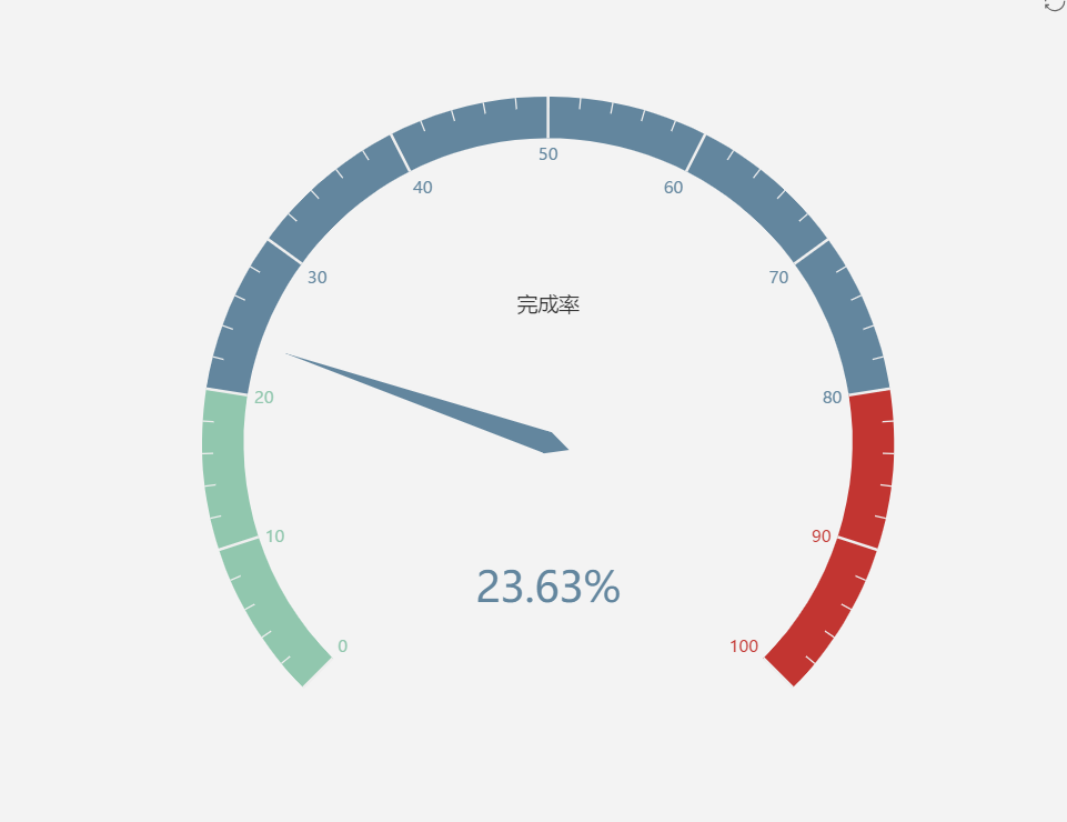
最终的效果图如下,是不是很简单呢。

echarts仪表盘如何设置图例(legend)的更多相关文章
- gnuplot图例legend设置
//将图例放在右下角 set key bottom //将图例放在中间 set key center //将图例放在左边 set key left //将图例放在指定位置右下角的坐标为(10,0.7) ...
- echarts基础 handleIcon 设置
1.自己引入echarts库 2.找到代码中dataZoom中的handleIcon ,看见对应的是"M0,0 v9.7h5 v-9.7h-5 Z",这是由svg画出来的图形,其中 ...
- echarts相关属性设置(1)折线图篇
option = { tooltip: { trigger: 'axis', // axisPointer: { // type: 'cross', // label: { // background ...
- highcharts图表的图例legend怎么改变显示位置
一.将图例Legend放于图表右侧1.设置chart的marginRight属性值:chart: { marginRight: 120}2.设置legend图例属性值如下 legend: { alig ...
- echarts图表属性设置
原地址:http://blog.csdn.net/she_lover/article/details/51448967theme = { // 全图默认背景 // backgroundColor: ‘ ...
- echarts属性的设置(完整大全)
// 全图默认背景 // backgroundColor: ‘rgba(0,0,0,0)’, // 默认色板 color: ['#ff7f50','#87cefa','#da70d6','#32cd ...
- highcharts图表的图例legend
一.将图例Legend放于图表右侧1.设置chart的marginRight属性值:chart: { marginRight: 120}2.设置legend图例属性值如下 legend: { alig ...
- echarts相关属性设置(3)环状图
option = { grid: { left: '3%', top: '0%', // height: 500, right: '30%', containLabel: true, }, legen ...
- echarts属性的设置
// 全图默认背景 // backgroundColor: ‘rgba(0,0,0,0)’, // 默认色板 color: ['#ff7f50','#87cefa','#da70d6','#32cd ...
随机推荐
- 学习MVC之租房网站(六)-用户登录和权限控制
在上一篇<学习MVC之租房网站(五)-权限.角色.用户管理>完成了权限.角色.用户的增删改查,现在将基于前面完成的内容,进行后台用户登录和权限控制功能的开发. 一.用户登录 用户登录涉及到 ...
- Python全栈之路-Day32
1 类的__slots__ #!/usr/bin/env python # __Author__: "wanyongzhen" # Date: 2017/4/25 # 只能定义__ ...
- 做一个常规的banner图——负边距的使用、banner图的拼法
在这之前,首先要了解如何设置块级元素在块级元素水平居中 方法: 设置子容器为定位元素 水平居中 left:50%:margin-left:-width/2: 垂直居中 top:50%:margin-t ...
- Vue 项目实战系列 (一)
最近一直在学习Vue,基本的文档看完后就需要进行具体的项目进行练手了,本系列文章主要是将我学习过程记录下来,和大家一起学习交流. 我在git上找到了一个淘票票的Vue项目,项目地址: https:// ...
- poj3067树状数组求逆序数
Japan plans to welcome the ACM ICPC World Finals and a lot of roads must be built for the venue. Jap ...
- Maven的pom.xml配置文件详解
Maven简述 Maven项目对象模型(POM),可以通过一小段描述信息来管理项目的构建,报告和文档的软件项目管理工具. Maven 除了以程序构建能力为特色之外,还提供高级项目管理工具.由于 Mav ...
- Excel 数据导入(OleDb)
@using (Html.BeginForm("Student", "Excel", FormMethod.Post, new { enctype = &quo ...
- Lamp环境搭建Linux CentOS6.5编译安装mysql5.6
经典web开发组合Lamp环境搭建之mysql安装详解 安装前准备 通过rpm命令检查centos上是否已经安装mysql,然后卸载已经存在的mysql版本 [root@localhost src]# ...
- 蚂蚁金服新一代数据可视化引擎 G2
新公司已经呆了一个多月,目前着手一个数据可视化的项目,数据可视化肯定要用到图形库如D3.Highcharts.ECharts.Chart等,经决定我的这个项目用阿里旗下蚂蚁金服所开发的G2图表库. 官 ...
- 状态(State)模式
状态模式,又称状态对象模式(Pattern of Objects for States),状态模式是对象的行为模式.状态模式允许一个对象在其内部状态改变的时候改变其行为.这个对象看上去就像是改变了它的 ...