CSS3移动动画
transition: .3s all ease;
.tmall .tmall-tabbodys {

    width: 100%;

    position: absolute;

    left: 0px;

    transition: .7s all ease;

}
动果切换带有运营商校验
<!DOCTYPE html>
<html lang="en">
<head>
<meta charset="UTF-8">
<meta name="viewport" content="width=device-width, initial-scale=1.0">
<meta http-equiv="X-UA-Compatible" content="ie=edge">
<title>Document</title>
<style>
*{padding:0;margin:0;box-sizing:border-box}
.row{display:flex;flex-direction:row}
.tmall{width:290px;padding:10px 20px 0px;background:#ffffff;position:relative;border:1px solid #ccc}
.tmall{width:290px;padding:10px 20px 0px;background:#ffffff;position:relative}
.tmall .tmall-tabs .tab{padding:3px 10px;font-size:14px;color:#666}
.tmall .tmall-tabs .tab.current{color:#FF4300}
.tmall-tabbody-container{width:100%;height:300px;overflow:hidden;position:relative;margin-top:15px}
.tmall .tmall-tabbodys .tabbody{min-width:250px;width:250px;padding-top:4px}
.tmall .tmall-tabbodys .tabbody .input-group{width:188px}
.space-between{justify-content:space-between}
.tmall .tmall-tabbodys{width:100%;position:absolute;left:0px;transition:.3s all ease;margin-top:20px}
.input{height:26px;border:1px solid #cccccc;position:relative}
.input input.hasricon{padding:4px 20px 4px 6px}
.input .tip{height:24px;font-size:12px;color:#cccccc;position:absolute;top:0;right:26px}
.center{display:flex;justify-content:center;align-items:center}
.iconfont{font-family:"iconfont" !important;font-size:16px;font-style:normal;-webkit-font-smoothing:antialiased;-webkit-text-stroke-width:0.2px;-moz-osx-font-smoothing:grayscale}
.input .ricon{width:26px;height:24px;color:#cccccc;position:absolute;top:0;right:0}
.input input.hasricon{padding:4px 20px 4px 6px}
.input input{padding:4px 6px}
.input input{color:#000000;font-size:12px}
.fill{width:100%;height:100%}
input{border:none;outline:none;display:block}
.input .select-option{position:absolute;top:24px;left:-1px;color:#000000;background:#fafafa;width:-webkit-calc(100% + 2px);border:1px solid #cccccc;border-bottom:none}
.input .select-option li:nth-child(odd){border-right:1px solid #a9a9a9}
.input .select-option li{width:50%;height:30px;font-size:14px;float:left;border-bottom:1px solid #a9a9a9}
.input .select-option li span{font-weight:bold}
.input .select-option li:hover{background:#a9a9a9;color:#ffffff}
.input:hover{border:1px solid #a9a9a9;color:#000000;z-index:999}
.pointer{cursor:pointer}
.input-group .button{border:none;border-radius:2px;padding:0;height:27px;width:68px;line-height:27px;background:#ff4200;font-size:12px;font-weight:700;color:#fff}
.input-group .price span{color:#f60;font-weight:700;font-family:verdana,arial}
.input-group .price{font-size:14px;padding:5px 0;color:#666666}
</style>
</head>
<body>
<!-- 知识点:动画,@click赋值, -->
<div id="app">
<div id="tmall" class="tmall">
<div class="tmall-tabs row space-between">
<div class="tab pointer" v-for = 'value,index in tabs' :class="{'current':index == cur}" @click = 'cur = index'
>{{value}}</div>
</div>
<div class="tmall-tabbody-container">
<div class="input">
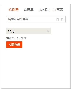
<input type="text" placeholder="请输入手机号码" class="fill hasricon" v-model="mobile">
<div class="tip center"><i class="iconfont"></i>{{getSP(mobile)}}</div>
<div class="ricon center"><i class="iconfont"></i></div>
</div>
<div class="tmall-tabbodys row space-between" :style = "{left:-250*cur+'px'}">
<div class="tabbody">
<div class="input-group">
<div class="input mg-1 pointer" @click="listShow=true">
<input type="text" disabled="disabled" class="fill hasricon pointer" :value="curAmount+'元'">
<div class="ricon pointer center"><i class="iconfont">^</i></div> <div class="select-option" v-show ="listShow">
<ul>
<li class="center" v-for ="amount in amountList"
@click.stop = 'curAmount = amount;listShow=false;'><span>{{amount}}</span>元</li>
</ul>
</div>
</div>
<div class="price">售价:¥<span v-if = "curAmount"> {{curAmount!=0?curAmount-0.1:curAmount}} 元</span></div>
<div class="button pointer center">立即充值</div>
</div>
</div>
<div class="tabbody"><div class="input-group">222</div></div>
<div class="tabbody"><div class="input-group">333</div></div>
<div class="tabbody"><div class="input-group">444</div></div>
</div>
</div>
</div>
</div>
</body>
<script src="vue2.js"></script>
<script type="text/javascript">
var vm = new Vue({
el:'#app',
data:{
tabs:['充话费','充流量','充固话','充宽带'],
amountList: [10, 20, 30, 50, 100, 200, 300, 500, 1000, 2000],
cur:0,
mobile:'',
curAmount:0,
listShow:false,
},
methods:{
getSP(str){
if(str.length!=11){
return '';
}else{
if(/^((13[5-9])|(15[01289]))/.test(str)){
return '中国移动';
}else if(/^(13[0-2])/.test(str)){
return '中国联通';
}else if(/^(18[01])/.test(str)){
return '中国电信';
}else if(/^170/.test(str)){
return '虚拟运营商';
}else{
return '未知';
}
}
},
}
})
</script>
</html>
注意:当@click嵌套时,最里边的@click点击是无效的,解决里边@click.stop阻止冒泡
<div @click="listShow=true">

    <div @click.stop = 'curAmount = amount;'></div>

</div>
运营商规则:
移动:

134X(0-8)、135、136、137、138、139、150、151、152、157X(0-7\9)(TD)、158、159、182 、183、184、187(3G\4G)、188(3G)147(数据卡)、178(4G)

联通:

130、131、132、155、156、185(3G)、186(3G) 、145(数据卡)、176(4G)

电信:

180(3G)、181(3G)、189(3G)、133、153、(1349卫通) 、177(4G)

虚拟运营商:

170
CSS3移动动画的更多相关文章
- CSS3 @keyframes 动画
CSS3的@keyframes,它可以取代许多网页动画图像,Flash动画,和JAVAScripts. CSS3的动画属性 下面的表格列出了 @keyframes 规则和所有动画属性: 浏览器支持 表 ...
- 使用css3的动画模拟太阳系行星公转
本文介绍使用css3的animation画一个太阳系行星公转的动画,再加以改进,讨论如何画椭圆的运行轨迹.然后分析京东和人人网使用animation的实际案例,最后结合css3的clip-path做一 ...
- css3中动画(transition)和过渡(animation)详析
css3中动画(transition)和过渡(animation)详析
- css3 animation动画特效插件的巧用
这一个是css3 animation动画特效在线演示的网站 https://daneden.github.io/animate.css/ 下载 animate.css文件,文件的代码很多,不过要明白 ...
- CSS3简单动画
css3的动画确实非常绚丽!浏览器兼容性很重要!. 分享两个小动画 <!doctype html> <html lang="en"> <head> ...
- css3常用动画+动画库
一.animates.css animate.css是来自dropbox的工程师Daniel Eden开发的一款CSS3的动画效果小类库.包含了60多款不同类型的CSS3动画,包括:晃动,闪动,各种淡 ...
- css3 animation动画技巧
一,css3 animation动画前言 随着现在浏览器对css3的兼容性越来越好,使用css3动画来制作动画的例子也越来越广泛,也随着而来带来了许多的问题值得我们能思考.css3动画如何让物体运动更 ...
- 8款超酷而实用的CSS3按钮动画
1.CSS3分享按钮动画特效 这是一款基于CSS3的社会化分享按钮,按钮非常简单,提供了分享到twitter.facebook.youtube等大型社交网站.每一个分享按钮都有个大社交网站的Logo图 ...
- 9种jQuery和css3图片动画特效代码演示
1.自由旋转的jQuery图片 演示和下载地址 2.css3阴影动画效果 演示和下载地址 3.拉窗帘特效图片 演示和下载地址 4.css3文字特效动画 演示和下载地址 5.css3时钟代码 演示和下载 ...
- CSS3展现精彩的动画效果 css3的动画属性
热火朝天的css3无疑吸引了很多前端开发者的眼球,然而在css3中的动画属性则是新功能中的主打招牌,说到css3的动画属性不得不让人想起这三个属性:Transform﹑Transition﹑Anima ...
随机推荐
- Django框架:2、静态文件配置、form表单、request对象、pycharm链接数据库、django链接数据库、ORM框架
Django框架 目录 Django框架 一.静态文件配置 1.静态文件 2.配置方法 二.form表单 1.action属性 2.method属性 三.request对象 1.基本用法 四.pych ...
- ES6——模块化
模块化 模块化是指将一个大的程序文件,拆分成许多小的文件,然后将小文件组合起来. 一.浏览器使用ES6模块化方式一 使用script标签,将type属性设置为module,然后在script中书写代码 ...
- 现代 CSS 高阶技巧,完美的波浪进度条效果!
本文是 CSS Houdini 之 CSS Painting API 系列第三篇. 现代 CSS 之高阶图片渐隐消失术 现代 CSS 高阶技巧,像 Canvas 一样自由绘图构建样式! 在上两篇中,我 ...
- get请求拼接数组转字符串
get请求拼接数组转换成字符串
- 彻底弄懂Javascript模块导入导出
笔者开始学习Javascript的时候,对模块不太懂,不知道怎么导入模块,导出模块,就胡乱一通试 比如 import xx from 'test.js' 不起作用,就加个括号 import {xx} ...
- Javaweb后端学习笔记
C/S结构与B/S结构: 1.C/S(Client/Server)结构:适用于个人娱乐市场[QQ等] (1).优点:安全性高.且有效降低服务器压力: (2).不足:增加服务成本.更新较繁琐: 2.B/ ...
- Mapper的动态代理
可以自动生产接口的实现类 ,所以就不需要再写daoImpl这个实现类了, 直接使用sqlSession.getMapper自动生成实现类 @Before 此注解的目的是为了将@Befoe 作为首先执行 ...
- NSOperation的简单使用
1.默认情况下,NSOperation并不具备封装操作的能力,必须使用它的子类,使用NSOperation子类的方式有3种: 1> NSInvocationOperation 2> NSB ...
- VBA中的(升降序)排名问题
1 Sub 升序() 2 3 all_rows = Sheets(1).Range("a65536").End(xlUp).Row 4 5 With ActiveWorkbook. ...
- 【Redis场景3】缓存穿透、击穿问题
场景问题及原因 缓存穿透: 原因:客户端请求的数据在缓存和数据库中不存在,这样缓存永远不会生效,请求全部打入数据库,造成数据库连接异常. 解决思路: 缓存空对象 对于不存在的数据也在Redis建立缓存 ...