
魔幻般冒泡背景的CSS3按钮动画
这是一款非常有特点的CSS3按钮,按钮的背景不是北京图片,也不是单纯的颜色,而是一组魔幻般的冒泡背景动画。当我们将鼠标滑过按钮时,按钮的冒泡背景动画就可以展示出来。可以说这款CSS3按钮的设计风格相当有创意,而且令人惊叹的是,这些动画都是用CSS3实现的,并没有使用JavaScript,非常强大。
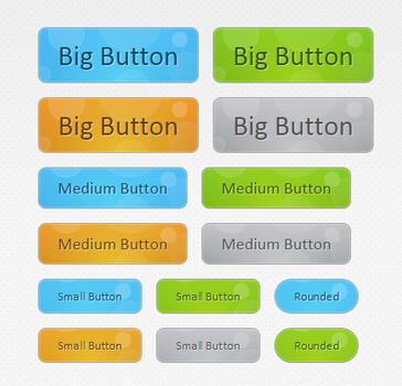
HTML代码:
- <div id="buttonContainer">
- <a href="#" class="button big blue">Big Button</a>
- <a href="#" class="button big green">Big Button</a>
- <a href="#" class="button big orange">Big Button</a>
- <a href="#" class="button big gray">Big Button</a>
- <a href="#" class="button blue medium">Medium Button</a>
- <a href="#" class="button green medium">Medium Button</a>
- <a href="#" class="button orange medium">Medium Button</a>
- <a href="#" class="button gray medium">Medium Button</a>
- <a href="#" class="button small blue">Small Button</a>
- <a href="#" class="button small green">Small Button</a>
- <a href="#" class="button small blue rounded">Rounded</a>
- <a href="#" class="button small orange">Small Button</a>
- <a href="#" class="button small gray">Small Button</a>
- <a href="#" class="button small green rounded">Rounded</a>
- </div>
- .button{
- font:15px Calibri, Arial, sans-serif;
- /* A semi-transparent text shadow */
- text-shadow:1px 1px 0 rgba(255,255,255,0.4);
- /* Overriding the default underline styling of the links */
- text-decoration:none !important;
- whitewhite-space:nowrap;
- display:inline-block;
- vertical-align:baselinebaseline;
- position:relative;
- cursor:pointer;
- padding:10px 20px;
- background-repeat:no-repeat;
- /* The following two rules are fallbacks, in case
- the browser does not support multiple backgrounds. */
- background-position:bottombottom left;
- background-image:url('button_bg.png');
- /* Multiple backgrounds version. The background images
- are defined individually in color classes */
- background-position:bottombottom left, top rightright, 0 0, 0 0;
- background-clip:border-box;
- /* Applying a default border raidus of 8px */
- -moz-border-radius:8px;
- -webkit-border-radius:8px;
- border-radius:8px;
- /* A 1px highlight inside of the button */
- -moz-box-shadow:0 0 1px #fff inset;
- -webkit-box-shadow:0 0 1px #fff inset;
- box-shadow:0 0 1px #fff inset;
- /* Animating the background positions with CSS3 */
- /* Currently works only in Safari/Chrome */
- -webkit-transition:background-position 1s;
- -moz-transition:background-position 1s;
- transition:background-position 1s;
- }
- .button:hover{
- /* The first rule is a fallback, in case the browser
- does not support multiple backgrounds
- */
- background-position:top left;
- background-position:top left, bottombottom rightright, 0 0, 0 0;
- }
- .button:active{
- /* Moving the button 1px to the bottom when clicked */
- bottombottom:-1px;
- }
- /* The three buttons sizes */
- .button.big { font-size:30px;}
- .button.medium { font-size:18px;}
- .button.small { font-size:13px;}
- /* A more rounded button */
- .button.rounded{
- -moz-border-radius:4em;
- -webkit-border-radius:4em;
- border-radius:4em;
- }
- /* Defining four button colors */
- /* BlueButton */
- .blue.button{
- color:#0f4b6d !important;
- border:1px solid #84acc3 !important;
- /* A fallback background color */
- background-color: #48b5f2;
- /* Specifying a version with gradients according to */
- background-image: url('button_bg.png'), url('button_bg.png'),
- -moz-radial-gradient( center bottombottom, circle,
- rgba(89,208,244,1) 0,rgba(89,208,244,0) 100px),
- -moz-linear-gradient(#4fbbf7, #3faeeb);
- background-image: url('button_bg.png'), url('button_bg.png'),
- -webkit-gradient( radial, 50% 100%, 0, 50% 100%, 100,
- from(rgba(89,208,244,1)), to(rgba(89,208,244,0))),
- -webkit-gradient(linear, 0% 0%, 0% 100%, from(#4fbbf7), to(#3faeeb));
- }
- .blue.button:hover{
- background-color:#63c7fe;
- background-image: url('button_bg.png'), url('button_bg.png'),
- -moz-radial-gradient( center bottombottom, circle,
- rgba(109,217,250,1) 0,rgba(109,217,250,0) 100px),
- -moz-linear-gradient(#63c7fe, #58bef7);
- background-image: url('button_bg.png'), url('button_bg.png'),
- -webkit-gradient( radial, 50% 100%, 0, 50% 100%, 100,
- from(rgba(109,217,250,1)), to(rgba(109,217,250,0))),
- -webkit-gradient(linear, 0% 0%, 0% 100%, from(#63c7fe), to(#58bef7));
- }
- /* Green Button */
- .green.button{
- color:#345903 !important;
- border:1px solid #96a37b !important;
- background-color: #79be1e;
- background-image:url('button_bg.png'), url('button_bg.png'), -moz-radial-gradient(center bottombottom, circle, rgba(162,211,30,1) 0,rgba(162,211,30,0) 100px),-moz-linear-gradient(#82cc27, #74b317);
- background-image:url('button_bg.png'), url('button_bg.png'), -webkit-gradient(radial, 50% 100%, 0, 50% 100%, 100, from(rgba(162,211,30,1)), to(rgba(162,211,30,0))),-webkit-gradient(linear, 0% 0%, 0% 100%, from(#82cc27), to(#74b317));
- }
- .green.button:hover{
- background-color:#89d228;
- background-image:url('button_bg.png'), url('button_bg.png'), -moz-radial-gradient(center bottombottom, circle, rgba(183,229,45,1) 0,rgba(183,229,45,0) 100px),-moz-linear-gradient(#90de31, #7fc01e);
- background-image:url('button_bg.png'), url('button_bg.png'), -webkit-gradient(radial, 50% 100%, 0, 50% 100%, 100, from(rgba(183,229,45,1)), to(rgba(183,229,45,0))),-webkit-gradient(linear, 0% 0%, 0% 100%, from(#90de31), to(#7fc01e));
- }
- /* Orange Button */
- .orange.button{
- color:#693e0a !important;
- border:1px solid #bea280 !important;
- background-color: #e38d27;
- background-image:url('button_bg.png'), url('button_bg.png'), -moz-radial-gradient(center bottombottom, circle, rgba(232,189,45,1) 0,rgba(232,189,45,0) 100px),-moz-linear-gradient(#f1982f, #d4821f);
- background-image:url('button_bg.png'), url('button_bg.png'), -webkit-gradient(radial, 50% 100%, 0, 50% 100%, 100, from(rgba(232,189,45,1)), to(rgba(232,189,45,0))),-webkit-gradient(linear, 0% 0%, 0% 100%, from(#f1982f), to(#d4821f));
- }
- .orange.button:hover{
- background-color:#ec9732;
- background-image:url('button_bg.png'), url('button_bg.png'), -moz-radial-gradient(center bottombottom, circle, rgba(241,192,52,1) 0,rgba(241,192,52,0) 100px),-moz-linear-gradient(#f9a746, #e18f2b);
- background-image:url('button_bg.png'), url('button_bg.png'), -webkit-gradient(radial, 50% 100%, 0, 50% 100%, 100, from(rgba(241,192,52,1)), to(rgba(241,192,52,0))),-webkit-gradient(linear, 0% 0%, 0% 100%, from(#f9a746), to(#e18f2b));
- }
- .gray.button{
- color:#525252 !important;
- border:1px solid #a5a5a5 !important;
- background-color: #a9adb1;
- background-image:url('button_bg.png'), url('button_bg.png'), -moz-radial-gradient(center bottombottom, circle, rgba(197,199,202,1) 0,rgba(197,199,202,0) 100px),-moz-linear-gradient(#c5c7ca, #92989c);
- background-image:url('button_bg.png'), url('button_bg.png'), -webkit-gradient(radial, 50% 100%, 0, 50% 100%, 100, from(rgba(197,199,202,1)), to(rgba(197,199,202,0))),-webkit-gradient(linear, 0% 0%, 0% 100%, from(#c5c7ca), to(#92989c));
- }
- .gray.button:hover{
- background-color:#b6bbc0;
- background-image:url('button_bg.png'), url('button_bg.png'), -moz-radial-gradient(center bottombottom, circle, rgba(202,205,208,1) 0,rgba(202,205,208,0) 100px),-moz-linear-gradient(#d1d3d6, #9fa5a9);
- background-image:url('button_bg.png'), url('button_bg.png'), -webkit-gradient(radial, 50% 100%, 0, 50% 100%, 100, from(rgba(202,205,208,1)), to(rgba(202,205,208,0))),-webkit-gradient(linear, 0% 0%, 0% 100%, from(#d1d3d6), to(#9fa5a9));
- }
魔幻般冒泡背景的CSS3按钮动画的更多相关文章
- 8款超酷而实用的CSS3按钮动画
1.CSS3分享按钮动画特效 这是一款基于CSS3的社会化分享按钮,按钮非常简单,提供了分享到twitter.facebook.youtube等大型社交网站.每一个分享按钮都有个大社交网站的Logo图 ...
- 基础理解2:CSS3按钮动画
一个Css3按钮效果很好,仔细看了一下发现就是::after,::before然后加上transition,transform等效果实现,主要关注一下几点就能轻松实现: 1.伪类需要position定 ...
- 8套迷人精致的CSS3 3D按钮动画
1.纯CSS3 3D按钮 按钮酷似牛奶般剔透 CSS3按钮一般都可以设计的非常漂亮,利用投影.渐变等CSS3属性特效可以把按钮渲染的十分动感.今天分享的这款CSS3按钮外观非常特别,它看上去酷似晶莹剔 ...
- 纯CSS3实现牛奶般剔透的3D按钮特效
今天我们要来看一款非常特别的纯CSS3 3D按钮,它的外观酷似纯白剔透的牛奶,点击按钮的时候还会出现一种很柔和的弹力效果.按钮按下时,按钮会轻轻的弹动一下,非常逼真.本文我们在观赏演示的同时,也将源代 ...
- 5个基于css3超炫的鼠标滑动按钮动画
今天给大家分享5个基于css3超炫的鼠标滑动按钮动画.这5个按钮鼠标经过的时候有超炫的动画效果.这5个按钮适用浏览器:360.FireFox.Chrome.Safari.Opera.傲游.搜狗.世界之 ...
- 6种炫酷的CSS3按钮边框动画特效
6种炫酷的CSS3按钮边框动画特效Button border animate 用鼠标滑过下面的按钮看看效果! Draw Draw Meet Center Spin Spin Circle Spin T ...
- 一款基于css3的动画按钮
之前为大家分享了 推荐10款纯css3实现的实用按钮.今天给大家带来一款基于css3的动画按钮.实现的效果图如下: 在线预览 源码下载 实现的代码. html代码: <div class=& ...
- 20个漂亮 CSS3 按钮效果及优秀的制作教程
在这篇文章中,我们编译了一组有用的 CSS3 动画按钮教程和引人注目的实验.正如我们都知道的,CSS3在网页设计方面是最重要和最关键的,可以使您的网站对访客更具吸引力和互动性.你可以学习这些教程和试验 ...
- css3 animation动画技巧
一,css3 animation动画前言 随着现在浏览器对css3的兼容性越来越好,使用css3动画来制作动画的例子也越来越广泛,也随着而来带来了许多的问题值得我们能思考.css3动画如何让物体运动更 ...
随机推荐
- C++ 知识回顾总结 -- queue 队列容器
一.说明 queue 是一种队列适配器,专门设计用于FIFO中操作(先进先出),元素从一端插入容器并从另一端提取. 相关API地址为:http://www.cplusplus.com/referenc ...
- Web Components(续)
概述 之前我们介绍了Web Components的基本概念,现在我们给出一个使用Web Components的实例代码,并且对组件化进行一些思考.记录下来,供以后开发时参考,相信对其他人也有用. 实例 ...
- RISC-V平台的汇编指令解析
csrr a0, 0xF14 //把0xF14的值读入到a0中 andi a1, a0, 0x1f //把a0 和0x1F按位与运算后存储到a1中 srli a0, a0, 5 ...
- AI - 框架(Frameworks)
1 - Scikit-Learn Sklearn(scikit-learn: machine learning in Python):https://scikit-learn.org/ 文档丰富而又详 ...
- 【app】adb连接问题整理
如果使用adb devices进行检测,发现没有任何设备信息,我们就需要检查是否有手机/模拟器连接上 如果是手机进行连接,windows右下角有出来如下提示的话,需要检查你的手机驱动是否有安装好 如果 ...
- Shell中判断文件,目录是否存在
一. 具体每个选项对应的判断内容: -e filename 如果 filename存在,则为真 -d filename 如果 filename为目录,则为真 -f filename 如果 filena ...
- django在关闭debug后,admin界面 及静态文件无法加载的解决办法
当debug为true的时候,ALLOWED_HOSTS是跳过不管用的.所以这里需要将debug关掉,令debug=false,ALLOWED_HOSTS=[ '*' ]表示所有的主机都可以访问 开启 ...
- 谷歌浏览器提示Adobe flash player不是最新版本的解决方法
版权声明:本文为博主原创文章,未经博主允许不得转载. 参考资料 https://jingyan.baidu.com/article/a3a3f811c3d5058da2eb8a39.html 如果电脑 ...
- springboot与ActiveMQ整合
前言 很多项目, 都不是一个系统就做完了. 而是好多个系统, 相互协作来完成功能. 那, 系统与系统之间, 不可能完全独立吧? 如: 在学校所用的管理系统中, 有学生系统, 资产系统, 宿舍系统等等. ...
- 不规范的json文档 转化成 java 对象的处理
最近练习爬取数据,遇到了json文档中属性名称没有用双引号的情况,内容如下: 标准的json文档,属性名称都是带双引号的 最后写了个方法,替换属性名字 为 两头追加双引号的属性名字, 特别要注意,防止 ...