css图片根据div宽高比例自适应
1.div布局
<div class="card-img-show">

                            <div class="upload-img-conss" >

                                <img style="width: 200px" class="addPersonFile"  id="personImg" :src="personImgDataUrl" >

                                <div class="upload-img-success-bg">

                                    <div class="upload-promise-img-chuan-margin">

                                    </div>

                                    <p class="upload-img-add-front" style="margin-top: 11px; padding-left: 0">证件有效信息面</p>

                                </div>

                            </div>

                        <div class="card-img-show">

                        <input style="position: absolute; width: 52%; height: 73%" class="register-person-260-upload" :class="{'is-danger': errors.has('cardImg') }" v-validate="'required|unitCardImg'" name="cardImg" type="file"  id="addPersonFile" v-on:change="getFile($event)"

                               placeholder="请上传证件照">

                            <p v-show="errors.has('cardImg')" style="display:none;color: red;font-size: 12px;">{{ errors.first('cardImg') }}</p>

                        <p class="card-img-show-p">文件格式为:jpg或png;文件大小:1M至5M</p>

                        </div>

                    </div>
效果图
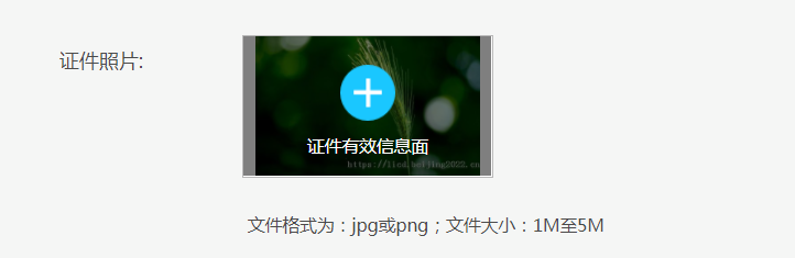
根据图片原始尺寸等比缩放,不拉伸图片宽高;
前端使用vue框架:图片上传完成后渲染
updated(){

            $(".register-container img").each(function(){

                if(!!$(this).attr("src") && $(this).attr("src").indexOf("http")>-1){

                    var imgid= $(this).attr("id")
                     //添加遮罩可忽略

                    $("#"+imgid+"+ div:first").addClass("upload-img-success-bg-change");

                    //图片id
                    var img = $(this);

                    //图片自适应宽高

                    imgSuite(imgid,img);

                }

            });

        },
公共js方法
function imgSuite(imgid,img) {

	var realWidth;//真实的宽度

	var realHeight;//真实的高度
    //虚拟img标签

	$("<img/>").attr("src", $(img).attr("src")).on('load',function() {

		realWidth = this.width;

		realHeight = this.height;

		var upPercent = realWidth/realHeight;

		var parentDiv = $("#"+imgid).parent();

		var parentWidth =  parentDiv.width();//父级宽

		var parentHeight =  parentDiv.height();//父级高

		var orgPercent = parentWidth/parentHeight;

		if(upPercent<orgPercent){

			$("#"+imgid).css({width:"auto",height:parentHeight+"px",margin:"0 auto",display:"block"});

		}else {

			var differHeight = parentWidth*realHeight/realWidth;//父级高度减去图片高度差

			var marginTop = (parentHeight - differHeight)/2;//距离顶部高

			$("#"+imgid).css({height:"auto",width:parentWidth+"px",marginTop: marginTop + "px",display:"block"});

		}

	});

}
css图片根据div宽高比例自适应的更多相关文章
- css实现左边定宽右边自适应的5种方法总汇
在网页布局中,通常需要实现左边定宽右边自适应布局,默认html的结构如下: <div class="box"> <div class="left&quo ...
- css布局:定宽,自适应
css三栏布局:1.中自:float,absolute,margin三种方法.2.中固:margin,table两种方法. 两边定宽,中间自适应: float: #left{ float:left; ...
- jq获取图片的原始尺寸,自适应布局
原理: each()遍历,width().height()获取宽高, load() 注意: 由于页面加载完了,但图片不一定加载完了,所以直接通过 $("img").width(), ...
- UIImageView圆角,自适应图片宽高比例,图片拉伸,缩放比例和图片缩微图
/* 设置圆角,通过layer中的cornerRadius和masksToBounds即可. 自适应图片宽高比例.通过UIViewContentModeScaleAsp ...
- 【CSS】318- CSS实现宽高等比自适应容器
点击上方"前端自习课"关注,学习起来~ 在最近开发移动端页面,遇到这么一个情况:当页面宽度 100% 时,高度为宽度一半,并随手机宽度变化依然是一半. 于是我们就需要实现一个宽度自 ...
- 漂亮的自适应宽度的多色彩CSS图片按钮
一.素材 二.效果 三.CSS *{padding:0;margin:0} /*----------------------------------- 自适应宽度图片按钮 ...
- 从零开始学习前端开发 — 7、CSS宽高自适应
一.宽度自适应 语法:width:100%; 注: a)块状元素的默认宽度为100% b) 当给元素设置宽度为100%时,继承父元素的宽度 c) 通常使用宽度自适应实现通栏效果 二.高度自适应 语法: ...
- 纯Css实现Div高度根据自适应宽度(百分比)调整
在如今响应式布局的要求下,很多能自动调整尺寸的元素能够做到高宽自适应,如img,通过{width:50%;height:auto;}实现图片高度跟随宽度比例调整. 然而,用的最多的标签一哥Div却不能 ...
- 使用CSS让元素尺寸缩小时保持宽高比例一致
CSS中有一个属性padding对元素宽度存在依存关系.如果一个元素的 padding属性以百分比形式表示,padding 的大小是以该元素自身宽度为参照的. 若想要元素尺寸变化时,宽高比例不变,可以 ...
随机推荐
- FileStorage
1. 函数说明 功能 函数声明 参数 FileStorage构造函数 cv::FileStorage:: FileStorage(const String& ...
- Confluence 6 配置数据库查询超时时间
如果数据库的查询时间太长同时你的应用程序显示没有响应,你可以配置数据库的查询超时时间.在默认情况下 Confluence 没有超时时间.希望配置数据库查询超时时间,在你的测试服务器上进行下面的操作: ...
- Confluence 6 用户目录图例 - 连接 Jira
上面的图:Confluence 连接到 JIRA 为用户管理. https://www.cwiki.us/display/CONFLUENCEWIKI/Diagrams+of+Possible+Con ...
- Vue.extend和Vue.component的联系与差异
extend 是构造一个组件的语法器. 你给它参数 他给你一个组件 然后这个组件 你可以作用到Vue.component 这个全局注册方法里, 也可以在任意vue模板里使用apple组件 var ap ...
- Git- 连接远程仓库
如何使用Git 连接远程仓库呢?远程仓库->一般指的是代码托管平台.那就先来瞅瞅三个较熟悉的版本(代码)托管服务平台. 版本(代码)托管服务平台: 码云(gitee.com):是开源中国社区团队 ...
- bat如何实现多台android设备同时安装多个apk
背景:在做预置资源(安装apk)时,有多台android设备需要做相同的资源(如:10台,安装10个apk).一台一台去预置的话(当然也可以每人一台去预置),耗时较长有重复性. 问题:如何去实现多台同 ...
- asynicio模块以及爬虫应用asynicio模块(高性能爬虫)
一.背景知识 爬虫的本质就是一个socket客户端与服务端的通信过程,如果我们有多个url待爬取,只用一个线程且采用串行的方式执行,那只能等待爬取一个结束后才能继续下一个,效率会非常低. 需要强调的是 ...
- 高斯消元处理无解|多解情况 poj1830
高斯消元结束后,若存在系数为0,常数不为0的行,则方程无解 若系数不为0的行有k个,则说明主元有k个,自由元有n-k个,方程多解 /* 给定n个开关的初始状态si,要求将其变成目标状态di 规定: 每 ...
- 开始接触python
1.什么是语言? 语言是一个事物与另一个事物交流的介质 python是人与计算机交流的介质 能够被计算机所识别的表达方式即是编程语言 2.什么是编程? 编程就是程序员将想让计算机做的事情用编程语言表达 ...
- Android播放功能的实现
Android播放语言功能的实现 需要用到的类文件TextToSpeech,此类可以实现播放语言的功能 支持播放的语言1.英语 2.法语 3.德语 4.意语 5.西班牙语 1.实例化此类,添加上下文对 ...