
css transition transform animation例子讲解
1.transition属性:
transition-duration: transition效果需要指定多少秒或毫秒才能完成
transition-timing-function: 指定transition效果的转速曲线
transition-delay: 定义transition效果开始的时候
例子:
div

{

    width:100px;

    height:100px;

    background:red;

    transition:transform 1s ease 1s;

    -webkit-transition:transform 2s ease 1s;

}

div:hover

{

    transform:translate(200px, 0px);

}
当鼠标移在div上,1s延迟后,div向右以ease方式,在2s内,移动200px。
还有transition属性的分解写法:
<style>

div

{

    width:100px;

    height:100px;

    background:red;

    transition-property:width;

    transition-duration:2s;

    transition-delay:2s;

    transition-timing-function: ease;

/* Safari/Chrome */

-webkit-transition-property:width;

-webkit-transition-duration:2s;

-webkit-transition-delay:2s;

-webkit-transition-timing-function: ease;

}

div:hover

{

    width:300px;

}

</style>
注意:
该属性不兼容IE9以及更早版本的浏览器;
该过度效果开始前会停顿2s;
| 值 | 描述 |
|---|---|
| linear | 规定以相同速度开始至结束的过渡效果(等于 cubic-bezier(0,0,1,1))。 |
| ease | 规定慢速开始,然后变快,然后慢速结束的过渡效果(cubic-bezier(0.25,0.1,0.25,1))。 |
| ease-in | 规定以慢速开始的过渡效果(等于 cubic-bezier(0.42,0,1,1))。 |
| ease-out | 规定以慢速结束的过渡效果(等于 cubic-bezier(0,0,0.58,1))。 |
| ease-in-out | 规定以慢速开始和结束的过渡效果(等于 cubic-bezier(0.42,0,0.58,1))。 |
| cubic-bezier(n,n,n,n) | 在 cubic-bezier 函数中定义自己的值。可能的值是 0 至 1 之间的数值。 |
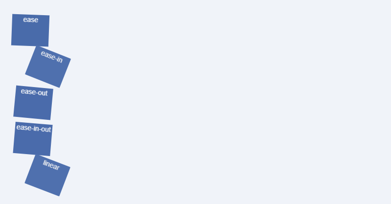
关于这几个速度的例子,看下面:
<!doctype html>

<html>

<head>

<meta charset="utf-8">

<title>transaction</title>

<link rel="stylesheet" type="text/css" href="bootstrap/bootstrap.min.css">

<style type="text/css">

.trans_box {

    padding: 20px;

    background-color: #f0f3f9;

    width: 800px;

}

.trans_list {

    width: 10%;

    height: 64px;

    margin:10px 0;

    background-color:#486AAA;

    color:#fff;

    text-align:center;

}

.ease {

    -webkit-transition: all 4s ease;

    -moz-transition: all 4s ease;

    -o-transition: all 4s ease;

    transition: all 4s ease;

}

.ease_in {

    -webkit-transition: all 4s ease-in;

    -moz-transition: all 4s ease-in;

    -o-transition: all 4s ease-in;

    transition: all 4s ease-in;

}

.ease_out {

    -webkit-transition: all 4s ease-out;

    -moz-transition: all 4s ease-out;

    -o-transition: all 4s ease-out;

    transition: all 4s ease-out;

}

.ease_in_out {

    -webkit-transition: all 4s ease-in-out;

    -moz-transition: all 4s ease-in-out;

    -o-transition: all 4s ease-in-out;

    transition: all 4s ease-in-out;

}

.linear {

    -webkit-transition: all 4s linear;

    -moz-transition: all 4s linear;

    -o-transition: all 4s linear;

    transition: all 4s linear;

}

.trans_box:hover .trans_list{

    margin-left: 89%;

    background-color: #beceeb;

    color: #333;

    -webkit-border-radius: 25px;

    -moz-border-radius: 25px;

    -o-border-radius: 25px;

    border-radius: 25px;

    -webkit-transform: rotate(360deg);

    -moz-transform: rotate(360deg);

    -o-transform: rotate(360deg);

    transform: rotate(360deg);

}

</style>

</head>

<body>

<div id="transBox" class="trans_box">

    <div class="trans_list ease">ease</div>

    <div class="trans_list ease_in">ease-in</div>

    <div class="trans_list ease_out">ease-out</div>

    <div class="trans_list ease_in_out">ease-in-out</div>

    <div class="trans_list linear">linear</div>

</div>

</body>

<script src="jquery/jquery.min.js"></script>

<script src="bootstrap/bootstrap.min.js"></script>

<script type="text/javascript">

</script>

</html>
<!doctype html>

<html>

<head>

<meta charset="utf-8">

<title>transform</title>

<link rel="stylesheet" type="text/css" href="bootstrap/bootstrap.min.css">

<style type="text/css">

.demo {

    padding: 10px;

    margin-top: 100px;

}

.trans_box {

    display: inline-block;

    margin: 10px;

    padding: 20px 10px;

    border: 1px solid #beceeb;

    background-color: #f0f3f9;

}

.trans_skew {

    -moz-transform: skew(35deg);

    -webkit-transform: skew(35deg);

    -o-transform: skew(35deg);

    transform: skew(35deg);

}

.trans_scale {

    -moz-transform: scale(1,0.5);

    -webkit-transform: scale(1,0.5);

    -o-transform: scale(1,0.5);

    transform: scale(1,0.5);

}

.trans_rotate {

    -moz-transform: rotate(45deg);

    -webkit-transform: rotate(45deg);

    -o-transform: rotate(45deg);

    transform: rotate(45deg);

}

.trans_translate {

    -moz-transform: translate(10px, 20px);

    -webkit-transform: translate(10px, 20px);

    -o-transform: translate(10px, 20px);

    transform: translate(10px, 20px);

}

.trans_rotate_skew_scale_translate {

    -moz-transform: skew(30deg) scale(1.1,1.1) rotate(40deg) translate(10px, 20px);

    -webkit-transform: skew(30deg) scale(1.1,1.1) rotate(40deg) translate(10px, 20px);

    -o-transform: skew(30deg) scale(1.1,1.1) rotate(40deg) translate(10px, 20px);

    transform: skew(30deg) scale(1.1,1.1) rotate(40deg) translate(10px, 20px);

}

</style>

</head>

<body>

<div class="demo">

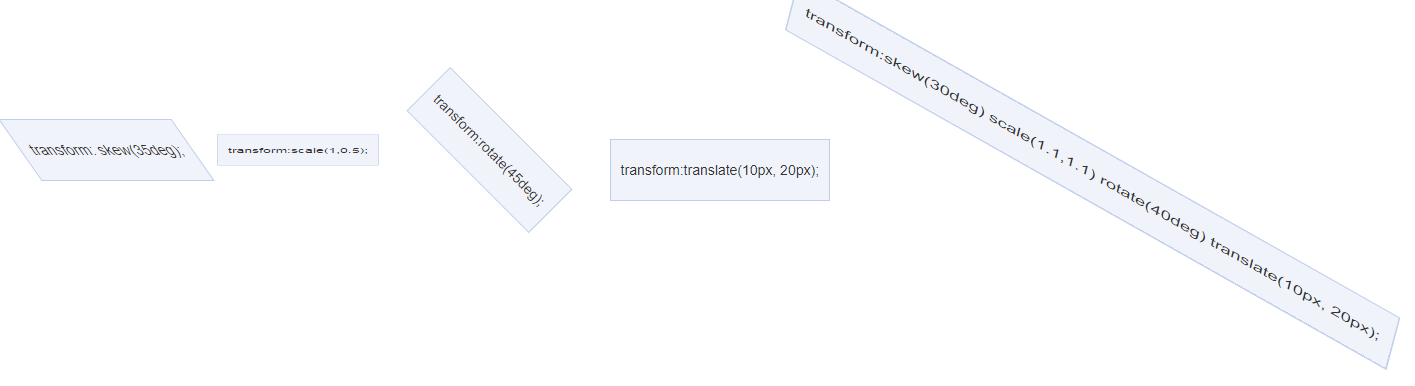
    <span class="trans_box trans_skew">transform: skew(35deg);</span>

    <span class="trans_box trans_scale">transform:scale(1,0.5);</span>

    <span class="trans_box trans_rotate">transform:rotate(45deg);</span>

    <span class="trans_box trans_translate">transform:translate(10px, 20px);</span>

    <span class="trans_box trans_rotate_skew_scale_translate">transform:skew(30deg) scale(1.1,1.1) rotate(40deg) translate(10px, 20px);</span>

</div>

</body>

<script src="jquery/jquery.min.js"></script>

<script src="bootstrap/bootstrap.min.js"></script>

<script type="text/javascript">

</script>

</html>
<!doctype html>

<html>

<head>

<meta charset="utf-8">

<title>transform</title>

<link rel="stylesheet" type="text/css" href="bootstrap/bootstrap.min.css">

<style type="text/css">

.demo {

    padding: 10px;

    margin-top: 100px;

}

.trans_effect {

    display: block;

    line-height: 100px;

    width: 100px;

    background: #beceeb;

    margin: 30px auto;

    text-align: center;

    -webkit-transition: all 2s ease-in-out;

    -moz-transition: all 2s ease-in-out;

    -o-transition: all 2s ease-in-out;

    -ms-transition: all 2s ease-in-out;

    transition: transform 2s ease-in-out;

}

.trans_effect:hover {

    -webkit-transform: rotate(720deg) scale(2,2);

    -moz-transform: rotate(720deg) scale(2,2);

    -o-transform: rotate(720deg) scale(2,2);

    -ms-transform: rotate(720deg) scale(2,2);

    transform: rotate(720deg) scale(2,2);

}

</style>

</head>

<body>

<div class="demo">

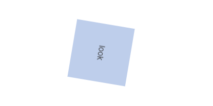
    <div class="trans_effect">look</div>

</body>

<script src="jquery/jquery.min.js"></script>

<script src="bootstrap/bootstrap.min.js"></script>

<script type="text/javascript">

</script>

</html>
三、animation
- animation-name
- animation-duration
- animation-timing-function
- animation-delay
- animation-iteration-count
- animation-direction
animation: name duration timing-function delay iteration-count direction;
animation-name: 规定需要绑定到选择器的 keyframe 名称。
animation-duration: 规定完成动画所花费的时间,以秒或毫秒计。
animation-timing-function: 规定动画的速度曲线。
animation-delay: 规定在动画开始之前的延迟。
animation-iteration-count: 规定动画应该播放的次数。
animation-direction: 规定是否应该轮流反向播放动画。
CSS3 @keyframes 规则
浏览器支持情况:
Internet Explorer 10、Firefox 以及 Opera 支持 @keyframes 规则和 animation 属性。
Chrome 和 Safari 需要前缀 -webkit-。
注释:Internet Explorer 9,以及更早的版本,不支持 @keyframe 规则或 animation 属性。
下面的表格列出了 @keyframes 规则和所有动画属性:
| 属性 | 描述 | CSS |
|---|---|---|
| @keyframes | 规定动画。 | 3 |
| animation | 所有动画属性的简写属性,除了 animation-play-state 属性。 | 3 |
| animation-name | 规定 @keyframes 动画的名称。 | 3 |
| animation-duration | 规定动画完成一个周期所花费的秒或毫秒。默认是 0。 | 3 |
| animation-timing-function | 规定动画的速度曲线。默认是 "ease"。 | 3 |
| animation-delay | 规定动画何时开始。默认是 0。 | 3 |
| animation-iteration-count | 规定动画被播放的次数。默认是 1。 infinite 无限; | 3 |
| animation-direction | 规定动画是否在下一周期逆向地播放。默认是 "normal"。
alternate 反向播放;
|
3 |
| animation-play-state | 规定动画是否正在运行或暂停。默认是 "running"。 | 3 |
| animation-fill-mode | 规定对象动画时间之外的状态。 | 3 |
下面是例子使用:
<!doctype html>

<html>

<head>

<meta charset="utf-8">

<title>transform</title>

<link rel="stylesheet" type="text/css" href="bootstrap/bootstrap.min.css">

<style type="text/css">

.demo {

    padding: 10px;

    margin-top: 100px;

}

#animated_div {

    width: 80px;

    height: 60px;

    background: #92B901;

    color: #ffffff;

    position: relative;

    font-weight: bold;

    font-size: 12px;

    padding: 20px 10px 0px 10px;

    animation: animated_div 5s infinite alternate;

    -moz-animation: animated_div 5s infinite alternate;

    -webkit-animation: animated_div 5s infinite alternate;

    -o-animation: animated_div 5s infinite alternate;

    border-radius: 5px;

    -webkit-border-radius: 5px;

}

@keyframes animated_div{

    0% {transform: rotate(0deg);left: 0px;}

    25% {transform: rotate(20deg);left: 0px;}

    50% {transform: rotate(0deg);left: 500px;}

    55% {transform: rotate(0deg);left: 500px;}

    70% {transform: rotate(0deg);left: 500px;background: #1ec7e6;}

    100% {transform: rotate(-360deg);left: 0px;}

}

@-moz-keyframes animated_div{        /* Firefox */

    0% {transform: rotate(0deg);left: 0px;}

    25% {transform: rotate(20deg);left: 0px;}

    50% {transform: rotate(0deg);left: 500px;}

    55% {transform: rotate(0deg);left: 500px;}

    70% {transform: rotate(0deg);left: 500px;background: #1ec7e6;}

    100% {transform: rotate(-360deg);left: 0px;}

}

@-webkit-keyframes animated_div{        /* Safari and Chrome */

    0% {transform: rotate(0deg);left: 0px;}

    25% {transform: rotate(20deg);left: 0px;}

    50% {transform: rotate(0deg);left: 500px;}

    55% {transform: rotate(0deg);left: 500px;}

    70% {transform: rotate(0deg);left: 500px;background: #1ec7e6;}

    100% {transform: rotate(-360deg);left: 0px;}

}

@-o-keyframes animated_div{            /* Opera */

    0% {transform: rotate(0deg);left: 0px;}

    25% {transform: rotate(20deg);left: 0px;}

    50% {transform: rotate(0deg);left: 500px;}

    55% {transform: rotate(0deg);left: 500px;}

    70% {transform: rotate(0deg);left: 500px;background: #1ec7e6;}

    100% {transform: rotate(-360deg);left: 0px;}

}

</style>

</head>

<body>

<div class="demo">

   <p id="animated_div">CSS3 动画</p>

</div>

</body>

<script src="jquery/jquery.min.js"></script>

<script src="bootstrap/bootstrap.min.js"></script>

<script type="text/javascript">

</script>

</html>

=====================================下面是例子 有些是摘抄的================================================
例子1:头像照片发光:
animations不仅适用于CSS2中的属性,CSS3也是支持的,例如box-shadow盒阴影效果,所以,我们可以实现外发光效果的。使用过web qq的人应该有印象,当鼠标移到聊天对象脑袋上的时候会有蓝色外发光的动画,但是那是gif动画图片实现的(现在自动跳转到web qq 2.0已看不到效果)。但是gif的重用性有限而且制作破费功夫,如果简单几行CSS代码就可以实现高性能高扩展的效果岂不更加,现在animations就可以搞定这一些。
例子:
<!doctype html>

<html>

<head>

<meta charset="utf-8">

<title>照片外发光动画demo</title>

<link rel="stylesheet" type="text/css" href="bootstrap/bootstrap.min.css">

<style type="text/css">

.demo {

    padding: 10px;

    margin: 100px 0 0 100px;

}

.anim_image {

    padding: 3px;

    border: 1px solid #beceeb;

    background-color: white;

    -moz-box-shadow: 0 0 8px rgba(72, 106, 170, 0.5);

    -webkit-box-shadow: 0 0 8px rgba(72, 106, 170, 0.5);

    box-shadow: 0 0 8px rgba(72, 106, 170, 0.5);

}

.anim_image:hover {

    background-color: #f0f3f9;

    -webkit-animation-name: glow;

    -webkit-animation-duration: 1s;

    -webkit-animation-iteration-count: infinite;

    -webkit-animation-direction: alternate;

    -webkit-animation-timing-function: ease-in-out;

}

@-webkit-keyframes glow {

    0% {

        -webkit-box-shadow: 0 0 12px rgba(72, 106, 170, 0.5);

        border-color: rgba(160, 179, 214, 0.5);

    }

    100% {

        -webkit-box-shadow: 0 0 12px rgba(72, 106, 170, 1.0), 0 0 18px rgba(0, 140, 255, 1.0);

        border-color: rgba(160, 179, 214, 1.0);

    }

}

</style>

</head>

<body>

<div class="demo">

   <img class="anim_image" src="data:images/head14.jpg">

</div>

</body>

<script src="jquery/jquery.min.js"></script>

<script src="bootstrap/bootstrap.min.js"></script>

<script type="text/javascript">

</script>

</html>

例子2:图片轮转缩放显示动画demo
下面这个实例是与图片位置,比例尺寸挂钩的,聪明的你是不是想到了transform属性呢。对的,transform+tranisition,双剑合璧,天下无敌。下面这个效果是很酷很酷的,以前基本上只能在Flash中可以看到。
<!doctype html>

<html>

<head>

<meta charset="utf-8">

<title>图片轮转缩放显示动画demo</title>

<link rel="stylesheet" type="text/css" href="bootstrap/bootstrap.min.css">

<style type="text/css">

.demo {

    padding: 10px;

    margin: 100px 0 0 100px;

}

.anim_box {

    width: 200px;

    cursor: pointer;

}

.anim_image {

    -webkit-transition: all 1s ease-in-out;

    -moz-transition: all 1s ease-in-out;

    -o-transition: all 1s ease-in-out;

    transition: all 1s ease-in-out;

    cursor:pointer;

}

.anim_image_top {

    position: absolute;

    -webkit-transform: scale(0, 0);

    opacity: 0;

    filter: Alpha(opacity=0);

}

.anim_box:hover .anim_image_top{

    opacity: 1;

    filter: Alpha(opacity=100);

    -webkit-transform: scale(1, 1);

    -webkit-transform-origin: top right;

}

.anim_box:hover .anim_image_bottom{

    -webkit-transform: scale(0, 0);

    -webkit-transform-origin: bottom left;

}

</style>

</head>

<body>

<div class="demo">

   <div id="testBox" class="demo anim_box">

        <img class="anim_image anim_image_top" src="data:images/ps6.jpg">

        <img class="anim_image anim_image_bottom" src="data:images/ps4.jpg">

    </div>

</div>

</body>

<script src="jquery/jquery.min.js"></script>

<script src="bootstrap/bootstrap.min.js"></script>

<script type="text/javascript">

</script>

</html>

transform-origin: x-axis y-axis z-axis;
- left
- center
- right
- length
- %
- top
- center
- bottom
- length
- %
- length
例子3:选项卡切换
我们平时的选项卡切换基本上都是很生硬的,直接啪啪啪,切换过来了,没有点过渡啊什么的(毕竟写JavaScript动画成本较高),现在,有了transitions,实现过渡效果就是几行CSS代码的事情,不多说了,直接上实例。
<!doctype html>

<html>

<head>

<meta charset="utf-8">

<title>平滑选项卡切换demo</title>

<link rel="stylesheet" type="text/css" href="bootstrap/bootstrap.min.css">

<style type="text/css">

.demo {

    padding: 10px;

    margin: 100px 0 0 100px;

}

.trans_image_box {

    width: 1600px;

    height: 300px;

    -webkit-transition: all 1s ease-in-out;

    -moz-transition: all 1s ease-in-out;

    -o-transition: all 1s ease-in-out;

    transition: all 1s ease-in-out;

}

.trans_box {

    width: 400px;

    margin: 20px;

    overflow: hidden;

}

.trans_image {

    width: 400px;

    float: left;

}

.trans_image_trigger {

    padding-top: 10px;

    text-align: center;

}

</style>

</head>

<body>

<div class="demo">

        <div class="trans_box">

            <div id="transImageBox" class="trans_image_box">

                <img class="trans_image" src="data:images/ps1.jpg">

                <img class="trans_image" src="data:images/ps2.jpg">

                <img class="trans_image" src="data:images/ps3.jpg">

                <img class="trans_image" src="data:images/ps4.jpg">

            </div>

            <div id="transImageTrigger" class="trans_image_trigger">

                <a href="#1">图片1</a>

                <a href="#2">图片2</a>

                <a href="#3">图片3</a>

                <a href="#4">图片4</a>

            </div>

        </div>

</div>

</body>

<script src="jquery/jquery.min.js"></script>

<script src="bootstrap/bootstrap.min.js"></script>

<script type="text/javascript">

(function() {

    var $ = function(id) {

        return document.getElementById(id);

    };

    var oBox = $("transImageBox"),

        oTrigger = $("transImageTrigger").getElementsByTagName("a"),

        lTrigger = oTrigger.length;

    if (oBox && lTrigger) {

        for (var i = 0; i<lTrigger; i+=1) {

            oTrigger[i].onclick = function() {

                var index = Number(this.href.replace(/.*#/g, "")) || 1;

                oBox.style.marginLeft = (1 - index) * 400 + "px";

                return false;

            };

        }

    }

})();

</script>

</html>
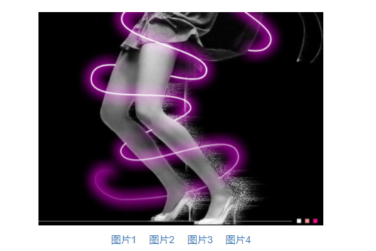
CSS其作用的就是那个值以all开头的transition属性;
这里点击控制transImageBox的margin-left,而由于transition对all都有效果,所以改变margin-left也是有动画效果的;
只要是CSS值变换的,只要是额外有transition属性设置的,都是平滑效果,都是动画。
-------------
css transition transform animation例子讲解的更多相关文章
- css动画(transition/transform/animation)
在开发中,一个好的用户操作界面,总会夹杂着一些动画.css用对少的代码,来给用户最佳的体验感,下面我总结了一些css动画属性的使用方法及用例代码供大家参考,在不对的地方,希望大佬直接拍砖评论. 1 t ...
- css010 css的transform transition和animation
css010 css的transform transition和animation 看着没有一个能想起他们是干什么的.. 1. Transform Transform(变形) r ...
- css 动画 transform transition animation
1.transform transform 是通过在浏览器里面让网页元素 移动 旋转 透明 模糊 等方法来实现改变其外观的技术 -webkit-transform : translate(3em,0 ...
- CSS动画transform、transition和animation的区别
CSS3属性中关于制作动画的三个属性:Transform,Transition,Animation. 1.transform:描述了元素的静态样式,本身不会呈现动画效果,可以对元素进行 旋转rotat ...
- CSS製作動畫效果(Transition、Animation、Transform)
CSS 2D Transforms https://www.w3schools.com/css/css3_2dtransforms.asp CSS 3D Transforms https://www. ...
- css3实践之图片轮播(Transform,Transition和Animation)
楼主喜欢追求视觉上的享受,虽常以牺牲性能无法兼容为代价却也乐此不疲.本文就通过一个个的demo演示来简单了解下css3下的Transform,Transition和Animation. 本文需要实现效 ...
- 区别Transform、Transition、Animation
另一篇参考文章:http://www.7755.me/Article/CSS3/39/ 近来上班之外就是研究研究CSS动画,下面是第一阶段总结.话说为加强记忆,实则想抛砖引玉! 标题直译一下就是: ...
- Atitti css transition Animation differ区别
Atitti css transition Animation differ区别 1.1. transition的优点在于简单易用,但是它有几个很大的局限. 1 1.2. Transition ...
- Atitti css transition Animation differ区别
Atitti css transition Animation differ区别 1.1. transition的优点在于简单易用,但是它有几个很大的局限. 1 1.2. js 动态改变 st ...
随机推荐
- Yii1.1测试环境配置(一)
一.安装wampserver wampserver集成了PHP.Apacha.MySql,可以省去分别安装的麻烦.wampserver的安装配置方法可以自行搜索. wampserver安装完成后需要手 ...
- LINUX文件格式化读写(文件指针,缓冲)
body, table{font-family: 微软雅黑; font-size: 10pt} table{border-collapse: collapse; border: solid gray; ...
- 一张图告诉你为何必须学Python?
互联网行业的薪资高.发展前景好,已经是人尽皆知的事了.越来越多的人对编程有了兴趣,想通过加入大公司实现人生逆袭,我们身边也涌现出了一些从零学习.变身大神的励志故事. 但更多的人还是选择观望:有人觉得编 ...
- Spring学习笔记之Testing
测试嘛,一般也就两种,一种就是单元测试,另外一个就是集成测试.都是废话 一.单元测试 以前也就是搞个模拟,main函数一写搞定. 现在呢,有了个spring,也有了个推荐规范?这个是个什么东西?什么叫 ...
- 部署和编写简单web项目
初学的时候,使用默认的Web应用和默认的Servlet URL.对于正式的应用,则应使用定制的Web应用和URL(在部署描述文件web,xml中指定) 仿照默认Web应用的目录结构,创建目录 HTML ...
- js前台数据校验
1.脚本 Validator = { exp:{ numWord:/^[A-Za-z0-9]+$/, //数字或字母 numWordM:/^[\-]*[A-Za-z0-9]+$/, //数字或字母可为 ...
- SharePoint 2013的100个新功能之内容管理(一)
一:拖拽 现在在任意的文档库中,你可以拖拽文档到文档库区域,它会以进度条显示上传到文档库中.第一步鼠标点击文档拖动到文档库区域时,它会变成"拖到此处",第二步放开鼠标,上传. 二: ...
- python3.6 ubuntu
apt-get install python3.6-dev 安装 pip install mysqlclient 必备
- 自定义$('#form').serialize() var params = $('#xxx_form').serializeObject();
//注意:获取之前 $("#id").removeAttr("disabled"); $.fn.serializeObject = function () { ...
- DZY Loves Math系列
link 好久没写数学题了,再这样下去吃枣药丸啊. 找一套应该还比较有意思的数学题来做. [bzoj3309]DZY Loves Math 简单推一下. \[\sum_{i=1}^n\sum_{j=1 ...